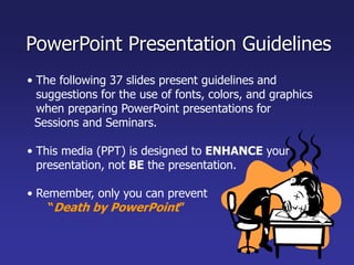
The document provides guidelines for creating effective PowerPoint presentations, including:
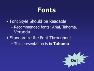
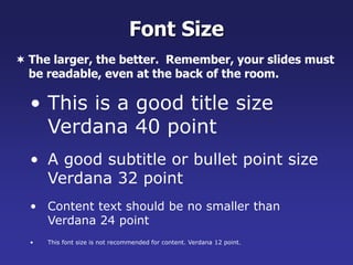
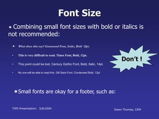
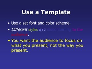
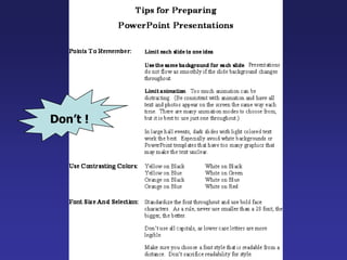
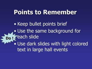
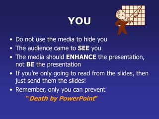
- Use readable fonts, consistent layouts, and limit text on slides to highlight key points.
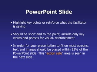
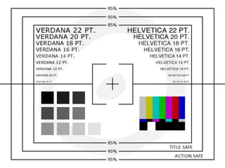
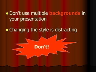
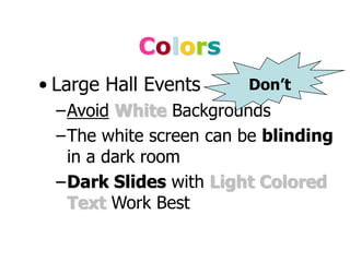
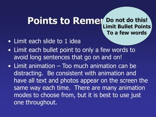
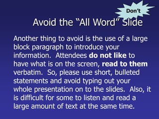
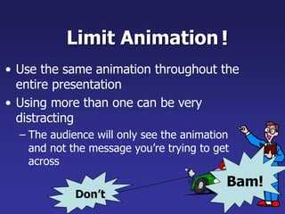
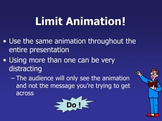
- Avoid small or hard to read fonts, cluttered slides, and animated transitions that distract from the message.
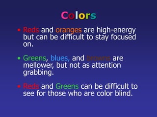
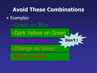
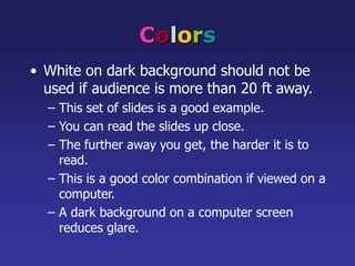
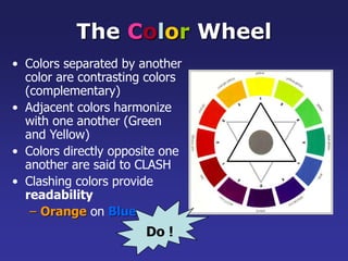
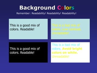
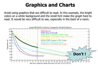
- Use colors, graphics and tables sparingly and in a way that enhances readability, not detracts from it.
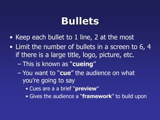
- Limit each slide to one main idea with bullet points to reinforce the presenter, not replace them.
I am currently working at AGT Graphics as their senior Graphics Designer. My job responsibilities include designing different graphics for AGT's clients and helping them with day to day tasks. I have worked with clients all over the world including North America, Dubai, Australia.
The following 37 slides present guidelines and suggestions f.docxoreo10
The following 37 slides present guidelines and suggestions for the use of fonts, colors, and graphics when preparing PowerPoint presentations for
Sessions and Seminars.
This media (PPT) is designed to ENHANCE your presentation, not BE the presentation.
Remember, only you can prevent
“Death by PowerPoint”
PowerPoint Presentation Guidelines
Highlight key points or reinforce what the facilitator is saying
Should be short and to the point, include only key words and phases for visual, reinforcement
In order for your presentation to fit on most screens, text and images should be placed within 95% of the PowerPoint slide. This “action safe” area is seen in the next slide.
PowerPoint Slide
*
Layout continuity from frame to frame conveys a sense of completenessHeadings, subheadings, and logos should show up in the same spot on each frameMargins, fonts, font size, and colors should be consistent with graphics located in the same general position on each frameLines, boxes, borders, and open space also should be consistent throughout
PowerPoint Layout
Fonts Font Style Should be ReadableRecommended fonts: Arial, Tahoma, VerandaStandardize the Font ThroughoutThis presentation is in Tahoma
Do !
This is a good title size Verdana 40 point
A good subtitle or bullet point size Verdana 32 point
Content text should be no smaller than
Verdana 24 point
This font size is not recommended for content. Verdana 12 point.
Font SizeThe larger, the better. Remember, your slides must be readable, even at the back of the room.
TIPS Presentation: 3/8/2004
Dawn Thomas, CRM
Font Size
What does this say? Garamond Font, Italic, Bold 12pt.
This is very difficult to read. Times Font, Bold, 12pt.
This point could be lost. Century Gothic Font, Bold, Italic, 14pt.
No one will be able to read this. Gill Sans Font, Condensed Bold, 12pt Combining small font sizes with bold or italics is not recommended:Small fonts are okay for a footer, such as:
Don’t !
FontsDon’t Sacrifice Readability for StyleDon’t Sacrifice Readability for StyleDon’t Sacrifice Readability for StyleDon’t Sacrifice Readability for Style
Don’t !
Caps and ItalicsDO NOT USE ALL CAPITAL LETTERSMakes text hard to readConceals acronymsDenies their use for EMPHASISItalicsUsed for “quotes”Used to highlight thoughts or ideasUsed for book, journal, or magazine titles
Use a TemplateUse a set font and color scheme.Different styles are disconcerting to the audience.You want the audience to focus on what you present, not the way you present.
Use the Same Background
on Each Slide
Do !!
Don’t use multiple backgrounds in your presentation
Changing the style is distracting
Don’t!
ColorsReds and oranges are high-energy but can be difficult to stay focused on.
Greens, blues, and browns are mellower, but not as attention grabbing.
Reds and Greens can be difficult to see for those who are color blind.
Avoid These Combinations
Examples:Green on BlueDark Yellow on GreenPurple on ...
This is a slideshow on using PPT that I downloaded a while ago, I have not been able to find it again but I thought I would reshare it. (I did not create it and I wish I know who did.)
Using visual aids in the public speaking or in presentations would increase the successfulness and the creditability of the event if and only if we choose the right thing at the right moment in the right manner. This presentation will help to choose the visual aids effectively
Welcome to WIPAC Monthly the magazine brought to you by the LinkedIn Group Water Industry Process Automation & Control.
In this month's edition, along with this month's industry news to celebrate the 13 years since the group was created we have articles including
A case study of the used of Advanced Process Control at the Wastewater Treatment works at Lleida in Spain
A look back on an article on smart wastewater networks in order to see how the industry has measured up in the interim around the adoption of Digital Transformation in the Water Industry.
Industrial Training at Shahjalal Fertilizer Company Limited (SFCL)MdTanvirMahtab2
This presentation is about the working procedure of Shahjalal Fertilizer Company Limited (SFCL). A Govt. owned Company of Bangladesh Chemical Industries Corporation under Ministry of Industries.
Water scarcity is the lack of fresh water resources to meet the standard water demand. There are two type of water scarcity. One is physical. The other is economic water scarcity.
Hierarchical Digital Twin of a Naval Power SystemKerry Sado
A hierarchical digital twin of a Naval DC power system has been developed and experimentally verified. Similar to other state-of-the-art digital twins, this technology creates a digital replica of the physical system executed in real-time or faster, which can modify hardware controls. However, its advantage stems from distributing computational efforts by utilizing a hierarchical structure composed of lower-level digital twin blocks and a higher-level system digital twin. Each digital twin block is associated with a physical subsystem of the hardware and communicates with a singular system digital twin, which creates a system-level response. By extracting information from each level of the hierarchy, power system controls of the hardware were reconfigured autonomously. This hierarchical digital twin development offers several advantages over other digital twins, particularly in the field of naval power systems. The hierarchical structure allows for greater computational efficiency and scalability while the ability to autonomously reconfigure hardware controls offers increased flexibility and responsiveness. The hierarchical decomposition and models utilized were well aligned with the physical twin, as indicated by the maximum deviations between the developed digital twin hierarchy and the hardware.
1. • The following 37 slides present guidelines and
suggestions for the use of fonts, colors, and graphics
when preparing PowerPoint presentations for
Sessions and Seminars.
• This media (PPT) is designed to ENHANCE your
presentation, not BE the presentation.
• Remember, only you can prevent
“Death by PowerPoint”
PowerPoint Presentation Guidelines
2. • Highlight key points or reinforce what the facilitator
is saying
• Should be short and to the point, include only key
words and phases for visual, reinforcement
• In order for your presentation to fit on most screens,
text and images should be placed within 95% of the
PowerPoint slide. This “action safe” area is seen in
the next slide.
PowerPoint Slide
3.
4. • Layout continuity from frame to frame conveys a
sense of completeness
• Headings, subheadings, and logos should show up in
the same spot on each frame
• Margins, fonts, font size, and colors should be
consistent with graphics located in the same general
position on each frame
• Lines, boxes, borders, and open space also should
be consistent throughout
PowerPoint Layout
5. Fonts
• Font Style Should be Readable
– Recommended fonts: Arial, Tahoma,
Veranda
• Standardize the Font Throughout
– This presentation is in Tahoma
Do !
6. • This is a good title size
Verdana 40 point
• A good subtitle or bullet point size
Verdana 32 point
• Content text should be no smaller than
Verdana 24 point
• This font size is not recommended for content. Verdana 12 point.
Font Size
The larger, the better. Remember, your slides must
be readable, even at the back of the room.
7. TIPS Presentation: 3/8/2004 Dawn Thomas, CRM
Don’t !
Font Size
What does this say? Garamond Font, Italic, Bold 12pt.
• This is very difficult to read. Times Font, Bold, 12pt.
• This point could be lost. Century Gothic Font, Bold, Italic, 14pt.
• No one will be able to read this. Gill Sans Font, Condensed Bold, 12pt
Combining small font sizes with bold or italics is
not recommended:
Small fonts are okay for a footer, such as:
8. Fonts
• Don’t Sacrifice Readability for Style
Don’t !
9. Caps and Italics
• DO NOT USE ALL CAPITAL LETTERS
– Makes text hard to read
– Conceals acronyms
– Denies their use for EMPHASIS
• Italics
– Used for “quotes”
– Used to highlight thoughts or ideas
– Used for book, journal, or magazine titles
10. Use a Template
• Use a set font and color scheme.
• Different styles are disconcerting to the
audience.
• You want the audience to focus on
what you present, not the way you
present.
12. Don’t!
Don’t use multiple backgrounds in
your presentation
Changing the style is distracting
13. Colors
• Reds and oranges are high-energy
but can be difficult to stay focused
on.
• Greens, blues, and browns are
mellower, but not as attention
grabbing.
• Reds and Greens can be difficult to
see for those who are color blind.
14. Avoid These Combinations
• Examples:
–Green on Blue
–Dark Yellow on Green
–Purple on Blue
–Orange on Green
–Red on Green
Don’t !
15. Colors
• White on dark background should not be
used if audience is more than 20 ft away.
– This set of slides is a good example.
– You can read the slides up close.
– The further away you get, the harder it is to
read.
– This is a good color combination if viewed on a
computer.
– A dark background on a computer screen
reduces glare.
16. Colors
• Large Hall Events
–Avoid White Backgrounds
–The white screen can be blinding
in a dark room
–Dark Slides with Light Colored
Text Work Best
Don’t
17. The Color Wheel
• Colors separated by another
color are contrasting colors
(complementary)
• Adjacent colors harmonize
with one another (Green
and Yellow)
• Colors directly opposite one
another are said to CLASH
• Clashing colors provide
readability
– Orange on Blue
Do !
18. This is a good mix of
colors. Readable!
Background Colors
Remember: Readability! Readability! Readability!
This is a bad mix of
colors. Low contrast.
Unreadable!
This is a good mix of
colors. Readable!
This is a bad mix of
colors. Avoid bright
colors on white.
Unreadable!
20. Avoid using graphics that are difficult to read. In this example, the bright
colors on a white background and the small font make the graph hard to
read. It would be very difficult to see, especially in the back of a room.
8
Don’t !
Graphics and Charts
21. This graph contains too much information in an
unreadable format.
10
Don’t !
22. These are examples of
good graphs, with nice
line widths and good
colors.
Good Graph
Do !
25. This is a good, readable table. Tables, especially large ones,
should be placed on a separate slide.
4/19 Fri 109 NICMOS restarted, Ne-loop control
continues
4/22 Mon 112 Change to mounting cup control
4/23 Tue 134 Return to Ne control, Filter wheel test
begins
4/24 Wed 155 Increase control temperature to allow
for +2 K variations
4/25 Thur 165 Begin darks every 3rd orbit
4/26 Fri 174 DQE test visit 1; Control temp +0.5 K
Do !
26. Illustrations
• Use only when needed, otherwise they
become distracters instead of communicators
• They should relate to the message and help
make a point
• Ask yourself if it makes the message clearer
• Simple diagrams are great communicators
Do !
28. Limit Each Slide to One Idea
• Use Bullet Points to Cover
Components of Each Idea
29. Bullets
• Keep each bullet to 1 line, 2 at the most
• Limit the number of bullets in a screen to 6, 4
if there is a large title, logo, picture, etc.
– This is known as “cueing”
– You want to “cue” the audience on what
you’re going to say
• Cues are a a brief “preview”
• Gives the audience a “framework” to build upon
30. Bullets (con.)
• If you crowd too much text, the audience
won’t read it
– Too much text looks busy and is hard to read
– Why read it, when you’re going to tell them
what it says?
– Our reading speed does not match our
listening speed; hence, they confuse instead
of reinforce
31. Points to Remember
• Limit each slide to 1 idea
• Limit each bullet point to only a few words to
avoid long sentences that go on and on!
• Limit animation – Too much animation can be
distracting. Be consistent with animation and
have all text and photos appear on the screen the
same way each time. There are many animation
modes to choose from, but it is best to use just
one throughout.
Do not do this!
Limit Bullet Points
To a few words
32. Points to Remember
• Keep bullet points brief
• Use the same background for
each slide
• Use dark slides with light colored
text in large hall events
Do !
33. Avoid the “All Word” Slide
Another thing to avoid is the use of a large
block paragraph to introduce your
information. Attendees do not like to
have what is on the screen, read to them
verbatim. So, please use short, bulleted
statements and avoid typing out your
whole presentation on to the slides. Also, it
is difficult for some to listen and read a
large amount of text at the same time.
Don’t
34. • To make a slide stand out, change
the font, background, or add
animation.
35. Limit Animation
• Use the same animation throughout the
entire presentation
• Using more than one can be very
distracting
– The audience will only see the animation
and not the message you’re trying to get
across
!
Bam!
Don’t
36. Limit Animation
• Use the same animation throughout the
entire presentation
• Using more than one can be very
distracting
– The audience will only see the animation
and not the message you’re trying to get
across
!
Do !
37. YOU
• Do not use the media to hide you
• The audience came to SEE you
• The media should ENHANCE the presentation,
not BE the presentation
• If you’re only going to read from the slides, then
just send them the slides!
• Remember, only you can prevent
“Death by PowerPoint”