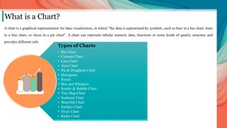
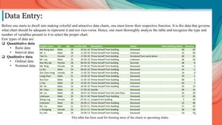
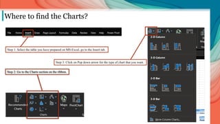
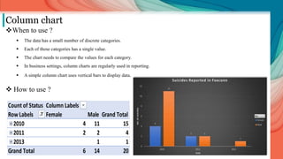
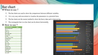
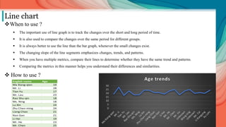
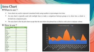
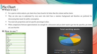
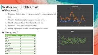
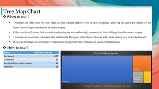
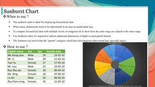
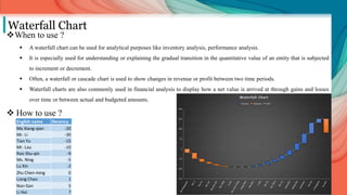
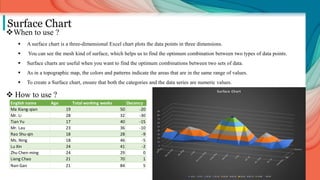
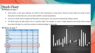
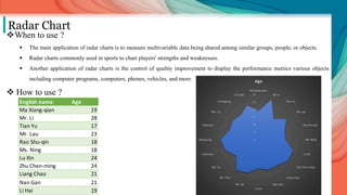
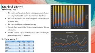
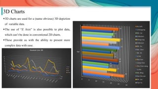
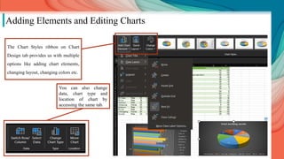
The document discusses various types of charts used for data visualization in MS Excel, outlining their purposes, when to use them, and how to create them. It provides detailed insights into specific chart types such as bar, line, pie, and scatter charts, among others, along with examples and data to illustrate their usage. Additionally, the document includes a table with data related to suicides, highlighting the importance of selecting the appropriate chart based on the characteristics of the data.