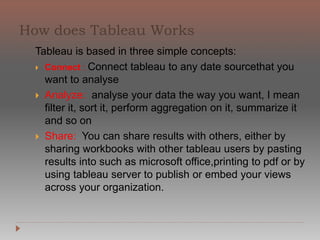
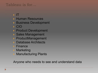
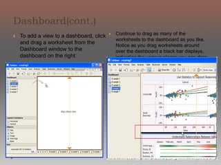
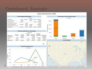
Tableau is business intelligence software that
allows anyone to easily connect to data, then
visualize and create interactive, sharable
dashboards. It's easy enough that any Excel
user can learn it, but powerful enough to
satisfy even the most complex analytical
problems. Securely sharing your findings with
others only takes seconds.
Tableau is based in three simple concepts:
Connect : Connect tableau to any date sourcethat
you want to analyse
Analyze: analyse your data the way you want, I
mean filter it, sort it, perform aggregation on it,
summarize it and so on
Share: You can share results with others, either by
sharing workbooks with other tableau users by
pasting results into such as microsoft
office,printing to pdf or by using tableau server to
publish or embed your views across your
organization.
Anyone who needs to see and understand data
IT
Human Resources
Business Development
CIO
Product Development
Sales Management
ProductManagement
Database Architects
Finance
Marketing
Anyone who needs to see and understand data
Manufacturing Plants
Anyone who needs to see and understand data
Connect to data
Dimensions and Measures
Rows and Columns
Charts
The Marks Card
Filters
Dashboard
To build views of your data, you must first connect Tableau to
a data source. You can connect to any supported data source
with the Connect to Data dialog box.
Select Data > Connect to Data or press Ctrl + D on your
keyboard You can also select the Open Data option on the
start page
On the Connect to Data page, select
the type of data you want to connect to.
he
ce
he
A data source-specific dialog box opens that allows you to
complete the connection process.
Another way to connect to data is to import from a workbook.
A workbook can contain multiple connections to different
data
sources. To import a connection from a workbook
click the Import from Workbook button at the
bottom of the Select Saved Connection tab in t
Connect to Data dialog box.
After the connection is established, the data sour
fields display on the left side of the workbook in
t Data window
Dimensions
◦ Dimensions typically produce headers when added to the rows or
columns shelves in the view. By default, Tableau treats any field
containing qualitative, categorical information as a dimension.
This includes, for instance, any field with text or dates values.
◦ For instance, you might calculate the Sum of “Sales” for every
“State”. In this case the State field is acting as a dimension
because you want to aggregate sales for each state.
◦ Measures
◦ Measures typically produce axes when added to the rows or
columns shelves. By default, Tableau treats any field containing
numeric (quantitative) information as a measure.
◦ For instance, you might calculate the Sum of “Sales” for every
“State”. In this case, the Sales field is acting as a measure because
you want to aggregate the field for each state.
The Columns shelf creates the columns of
a table, while the Rows shelf creates the
rows of a table. You can place an
unlimited number of fields on these
shelves.
When you place a dimension on the Rows
or Columns shelf, headers for the
members of that dimension are created.
When you place a measure on the Rows or
Columns shelf, quantitative axes for that
measure are created. As you build up your
data view with more fields, additional
headers and axes are included in the table
and you get an increasingly detailed
picture of your data.
In the view shown below, the members of
the Customer Segment dimension are
displayed as column headers, while the
Profit measure is displayed as a vertical
quantitative axis.
Adding more fields to the
Rows and Columns
shelves adds more rows,
columns, and panes to
the table.
Show Me creates a view
based on the fields
already used in the view
and any fields you’ve
selected in the Data
window. Open Show Me
by clicking Show Me on
the toolbar.
When you use Show Me!
simply select fields you
want to analyze in the
Data window and then
select the type of view
you want to create.
Tableau automatically
evaluates the selected
fields and gives you the
option of several types
of views that would be
appropriate for those
fields
View the Result. Tableau automatically
creates a view of the data
When you drag fields to the view, the resulting data points are
displayed using marks. Each mark represents the intersection of all
of the dimensions in the view. For example, in a view
with Region and Year dimensions, there is a mark for every
combination of those two field--for example, East 2011, East 2012,
West 2011, West 2012, etc.
consistently more profitable than other regions
Marks can be displayed in many different ways including lines,
shapes, bars, maps, and so on. You can show additional
information about your data using mark properties such as color,
size, shape, and labels. The type of mark you use and the mark
properties are controlled by the Marks card. Drag fields to the
Marks card to show more data. For example, you can enhance the
view above by dragging Profit to Color. With this additional
information, it becomes apparent that the International region is
Basic Categorical Filters
Drag a field from the Data window to the Filters shelf. You can
also right-click a field on any shelf and select Filter
Create Dashboard
Select Edit > New Dashboard
Adding Views to a Dashboard
When you open a dashboard the Dashboard window replaces the
Data window on the left side of the workbook. The Dashboard
window lists the worksheets that are currently in the workbook. As
you create new worksheets, the Dashboard window updates so you
always have all worksheets available when adding to a dashboard.
bar displays, indicating the various
places you can drop it.
To add a view to a dashboard,
click and drag a worksheet
from the Dashboard window to
the dashboard on the right:
Continue to drag as many of the
worksheets to the dashboard as you
like. Notice as you drag worksheets
around over the dashboard a black
Mission: Help people see & understand data
Based on a breakthrough from Stanford University, Tableau
makes visualanalyticsandrapid-firebusinessintelligence makes
visual analytics and rapid-fire business intelligence software
that delivers:
10-100X productivity improvements
amazing multi-dimensional discoveries
webanalyticsat1/10ththecostofa“BIPlatform”
In a new era of BI, Tableau:
Is infrastructure light isITandanalystappropriateKeyPartners
is IT and analyst appropriate
works when you have fast databases and when you don’t Key
Partner
Tableau online training

Tableau online training

  • 2.
    Tableau is businessintelligence software that allows anyone to easily connect to data, then visualize and create interactive, sharable dashboards. It's easy enough that any Excel user can learn it, but powerful enough to satisfy even the most complex analytical problems. Securely sharing your findings with others only takes seconds.
  • 3.
    Tableau is basedin three simple concepts: Connect : Connect tableau to any date sourcethat you want to analyse Analyze: analyse your data the way you want, I mean filter it, sort it, perform aggregation on it, summarize it and so on Share: You can share results with others, either by sharing workbooks with other tableau users by pasting results into such as microsoft office,printing to pdf or by using tableau server to
  • 4.
    publish or embedyour views across your organization.
  • 6.
    Anyone who needsto see and understand data IT Human Resources Business Development CIO Product Development Sales Management ProductManagement Database Architects Finance Marketing
  • 7.
    Anyone who needsto see and understand data Manufacturing Plants
  • 8.
    Anyone who needsto see and understand data Connect to data Dimensions and Measures Rows and Columns Charts The Marks Card Filters Dashboard
  • 9.
    To build viewsof your data, you must first connect Tableau to a data source. You can connect to any supported data source with the Connect to Data dialog box. Select Data > Connect to Data or press Ctrl + D on your keyboard You can also select the Open Data option on the start page On the Connect to Data page, select the type of data you want to connect to.
  • 10.
    he ce he A data source-specificdialog box opens that allows you to complete the connection process. Another way to connect to data is to import from a workbook. A workbook can contain multiple connections to different data sources. To import a connection from a workbook click the Import from Workbook button at the bottom of the Select Saved Connection tab in t Connect to Data dialog box. After the connection is established, the data sour fields display on the left side of the workbook in t Data window
  • 11.
    Dimensions ◦ Dimensions typicallyproduce headers when added to the rows or columns shelves in the view. By default, Tableau treats any field containing qualitative, categorical information as a dimension. This includes, for instance, any field with text or dates values. ◦ For instance, you might calculate the Sum of “Sales” for every “State”. In this case the State field is acting as a dimension because you want to aggregate sales for each state. ◦ Measures ◦ Measures typically produce axes when added to the rows or columns shelves. By default, Tableau treats any field containing numeric (quantitative) information as a measure. ◦ For instance, you might calculate the Sum of “Sales” for every “State”. In this case, the Sales field is acting as a measure because you want to aggregate the field for each state.
  • 12.
    The Columns shelfcreates the columns of a table, while the Rows shelf creates the rows of a table. You can place an unlimited number of fields on these shelves. When you place a dimension on the Rows or Columns shelf, headers for the members of that dimension are created. When you place a measure on the Rows or Columns shelf, quantitative axes for that measure are created. As you build up your data view with more fields, additional headers and axes are included in the table and you get an increasingly detailed picture of your data. In the view shown below, the members of the Customer Segment dimension are displayed as column headers, while the Profit measure is displayed as a vertical quantitative axis.
  • 13.
    Adding more fieldsto the Rows and Columns shelves adds more rows, columns, and panes to the table.
  • 14.
    Show Me createsa view based on the fields already used in the view and any fields you’ve selected in the Data window. Open Show Me by clicking Show Me on the toolbar. When you use Show Me! simply select fields you want to analyze in the Data window and then select the type of view you want to create. Tableau automatically evaluates the selected fields and gives you the option of several types of views that would be appropriate for those fields
  • 15.
    View the Result.Tableau automatically creates a view of the data
  • 16.
    When you dragfields to the view, the resulting data points are displayed using marks. Each mark represents the intersection of all of the dimensions in the view. For example, in a view with Region and Year dimensions, there is a mark for every combination of those two field--for example, East 2011, East 2012, West 2011, West 2012, etc.
  • 17.
    consistently more profitablethan other regions Marks can be displayed in many different ways including lines, shapes, bars, maps, and so on. You can show additional information about your data using mark properties such as color, size, shape, and labels. The type of mark you use and the mark properties are controlled by the Marks card. Drag fields to the Marks card to show more data. For example, you can enhance the view above by dragging Profit to Color. With this additional information, it becomes apparent that the International region is
  • 18.
    Basic Categorical Filters Draga field from the Data window to the Filters shelf. You can also right-click a field on any shelf and select Filter
  • 19.
    Create Dashboard Select Edit> New Dashboard Adding Views to a Dashboard When you open a dashboard the Dashboard window replaces the Data window on the left side of the workbook. The Dashboard window lists the worksheets that are currently in the workbook. As you create new worksheets, the Dashboard window updates so you always have all worksheets available when adding to a dashboard.
  • 20.
    bar displays, indicatingthe various places you can drop it. To add a view to a dashboard, click and drag a worksheet from the Dashboard window to the dashboard on the right: Continue to drag as many of the worksheets to the dashboard as you like. Notice as you drag worksheets around over the dashboard a black
  • 22.
    Mission: Help peoplesee & understand data Based on a breakthrough from Stanford University, Tableau makes visualanalyticsandrapid-firebusinessintelligence makes visual analytics and rapid-fire business intelligence software that delivers: 10-100X productivity improvements amazing multi-dimensional discoveries webanalyticsat1/10ththecostofa“BIPlatform” In a new era of BI, Tableau: Is infrastructure light isITandanalystappropriateKeyPartners is IT and analyst appropriate works when you have fast databases and when you don’t Key Partner