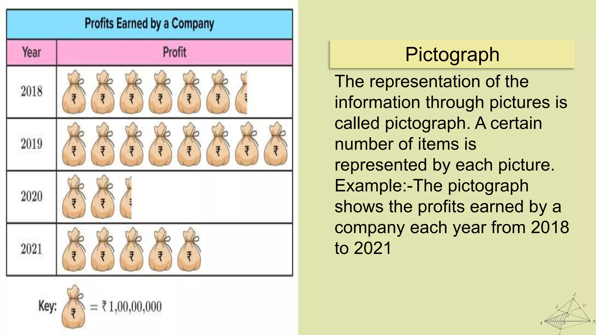
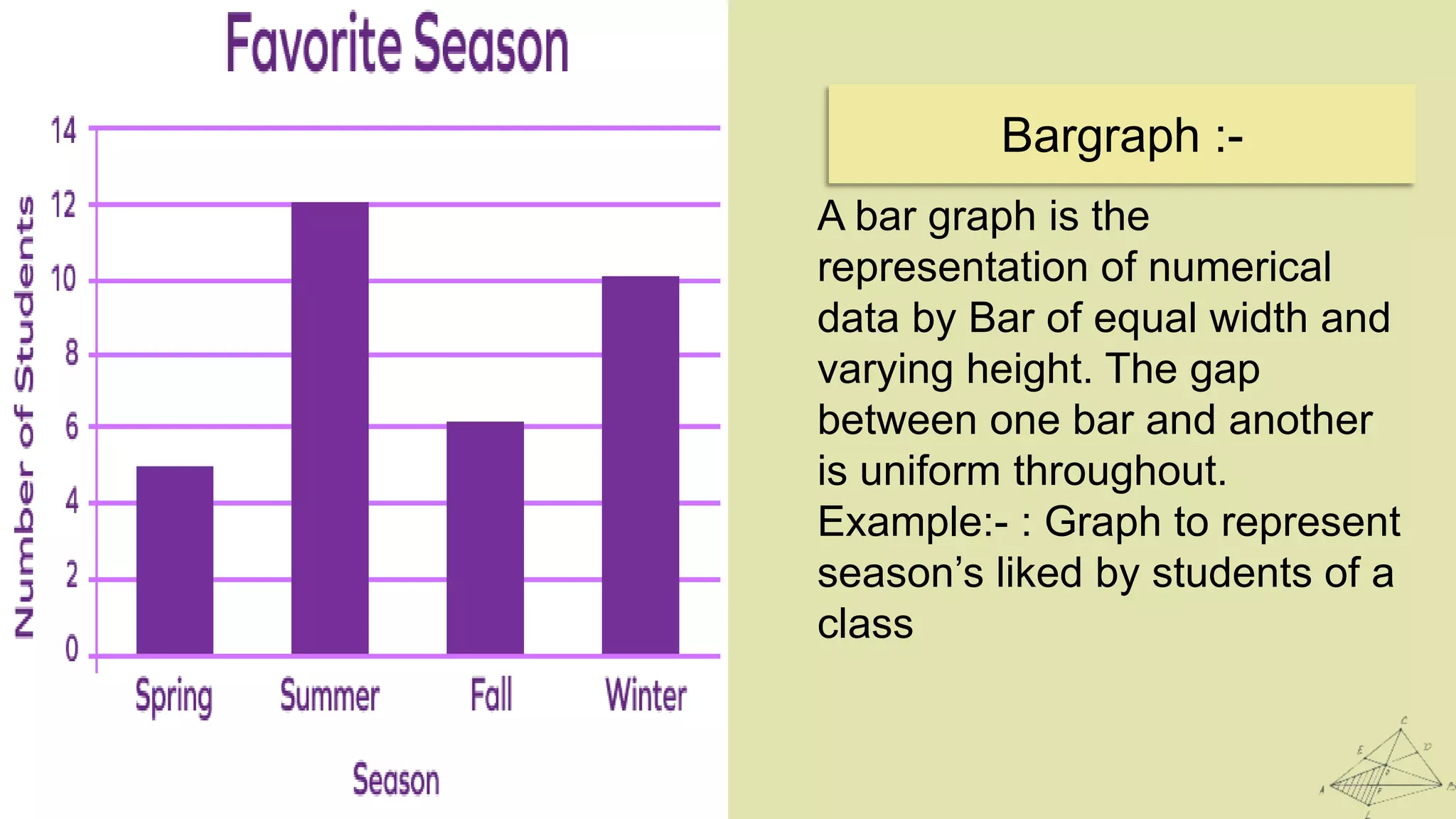
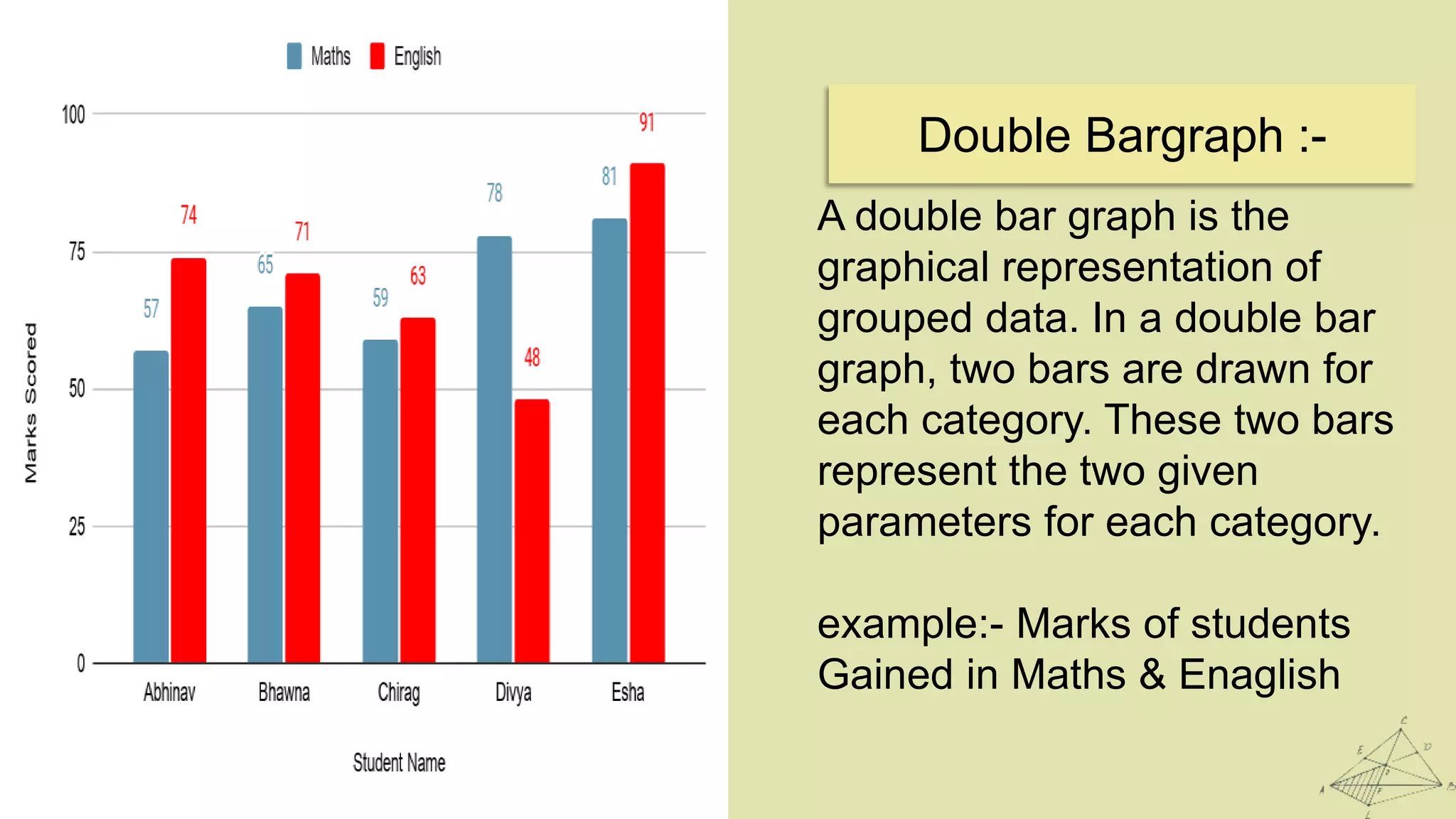
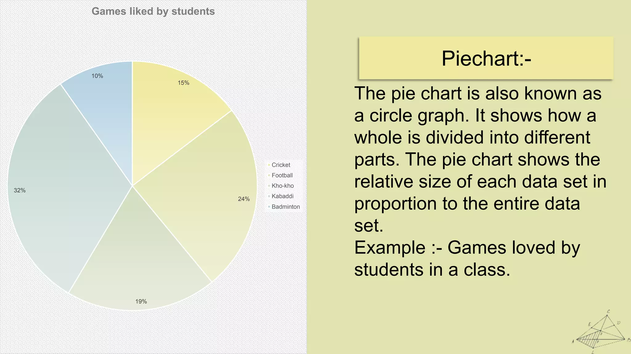
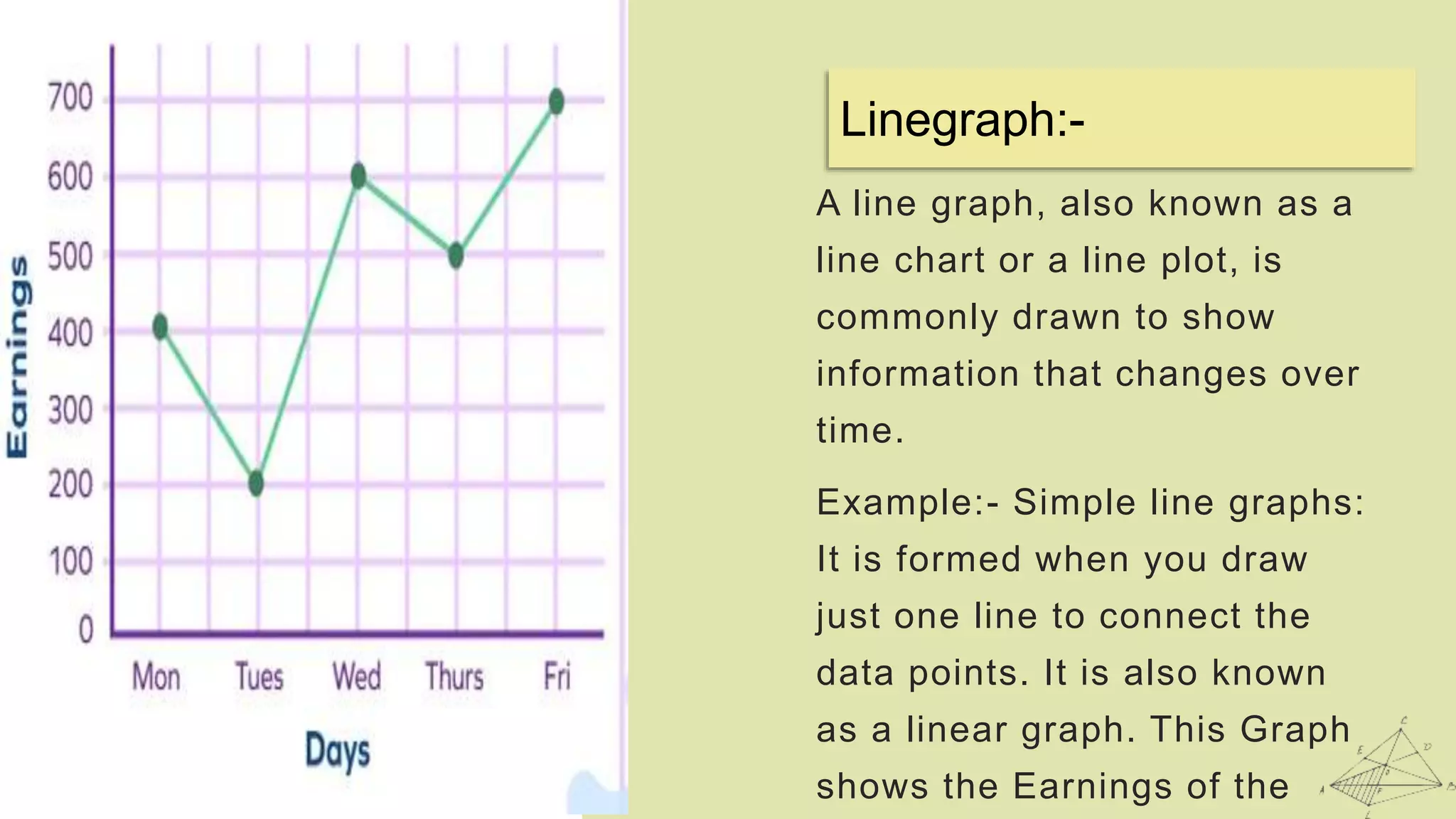
N a m e = S u r a j M a h t o
C l a s s = 9 t h
R o l l N o . = 6
S u b j e c t = M a t h s
A s s i g n e d b y = k e v a l s i r
Introduction
Topic = Data Handling
Data handling means collecting the
set of data and presenting in a
different form. Data is a collection of
numerical figures that represents a
particular kind of information. The
collection of observations which are
gathered initially is called the raw
data. Data can be in any form. It
may be words, numbers,
measurements, descriptions or
observations.
What is a Data handing?
I mention 6 Data graphs in this
presentation :-
1. Pictograph
2. Bargraph
3. Double Bar Graph
4. Pie Chart
5. Histogram
6. Line Garph
Types of Data :-
The representation of the
information through pictures is
called pictograph. A certain
number of items is
represented by each picture.
Example:-The pictograph
shows the profits earned by a
company each year from 2018
to 2021
Pictograph
A bar graph is the
representation of numerical
data by Bar of equal width and
varying height. The gap
between one bar and another
is uniform throughout.
Example:- : Graph to represent
season’s liked by students of a
class
Bargraph :-
Double Bargraph :-
A double bar graph is the
graphical representation of
grouped data. In a double bar
graph, two bars are drawn for
each category. These two bars
represent the two given
parameters for each category.
example:- Marks of students
Gained in Maths & Enaglish
Piechart:-
The pie chart is also known as
a circle graph. It shows how a
whole is divided into different
parts. The pie chart shows the
relative size of each data set in
proportion to the entire data
set.
Example :- Games loved by
students in a class.
15%
24%
19%
32%
10%
Games liked by students
Cricket
Football
Kho-kho
Kabaddi
Badminton
A histogram is a graphical
representation of data points
organized into user-specified
ranges. Similar in appearance
to a bar graph, the histogram
condenses a data series into
an easily interpreted visual by
taking many data points and
grouping them into logical
ranges or bins.
Histogram:-
Linegraph:-
A line graph, also known as a
line chart or a line plot, is
commonly drawn to show
information that changes over
time.
Example:- Simple line graphs:
It is formed when you draw
just one line to connect the
data points. It is also known
as a linear graph. This Graph
shows the Earnings of the
THANK YOU

Data Handling

  • 1.
    N a me = S u r a j M a h t o C l a s s = 9 t h R o l l N o . = 6 S u b j e c t = M a t h s A s s i g n e d b y = k e v a l s i r Introduction Topic = Data Handling
  • 2.
    Data handling meanscollecting the set of data and presenting in a different form. Data is a collection of numerical figures that represents a particular kind of information. The collection of observations which are gathered initially is called the raw data. Data can be in any form. It may be words, numbers, measurements, descriptions or observations. What is a Data handing?
  • 3.
    I mention 6Data graphs in this presentation :- 1. Pictograph 2. Bargraph 3. Double Bar Graph 4. Pie Chart 5. Histogram 6. Line Garph Types of Data :-
  • 4.
    The representation ofthe information through pictures is called pictograph. A certain number of items is represented by each picture. Example:-The pictograph shows the profits earned by a company each year from 2018 to 2021 Pictograph
  • 5.
    A bar graphis the representation of numerical data by Bar of equal width and varying height. The gap between one bar and another is uniform throughout. Example:- : Graph to represent season’s liked by students of a class Bargraph :-
  • 6.
    Double Bargraph :- Adouble bar graph is the graphical representation of grouped data. In a double bar graph, two bars are drawn for each category. These two bars represent the two given parameters for each category. example:- Marks of students Gained in Maths & Enaglish
  • 7.
    Piechart:- The pie chartis also known as a circle graph. It shows how a whole is divided into different parts. The pie chart shows the relative size of each data set in proportion to the entire data set. Example :- Games loved by students in a class. 15% 24% 19% 32% 10% Games liked by students Cricket Football Kho-kho Kabaddi Badminton
  • 8.
    A histogram isa graphical representation of data points organized into user-specified ranges. Similar in appearance to a bar graph, the histogram condenses a data series into an easily interpreted visual by taking many data points and grouping them into logical ranges or bins. Histogram:-
  • 9.
    Linegraph:- A line graph,also known as a line chart or a line plot, is commonly drawn to show information that changes over time. Example:- Simple line graphs: It is formed when you draw just one line to connect the data points. It is also known as a linear graph. This Graph shows the Earnings of the
  • 10.