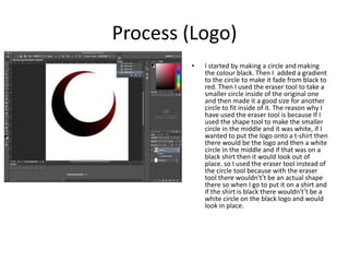
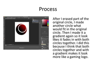
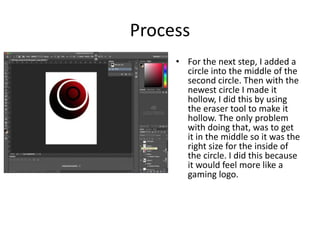
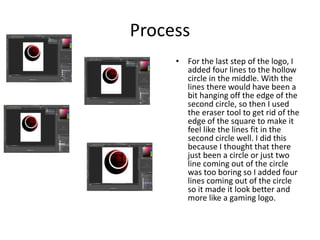
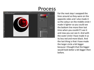
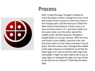
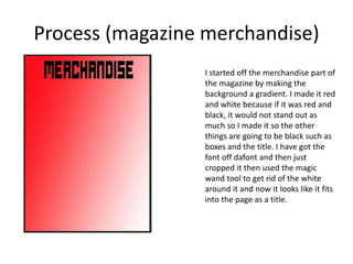
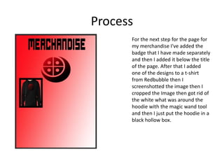
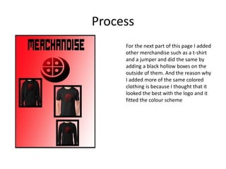
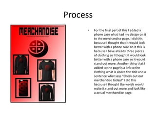
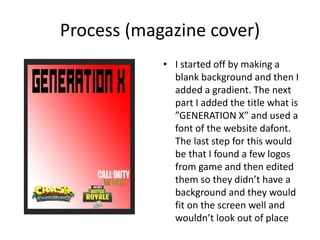
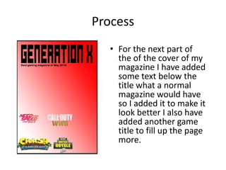
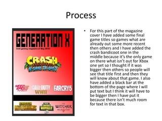
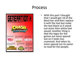
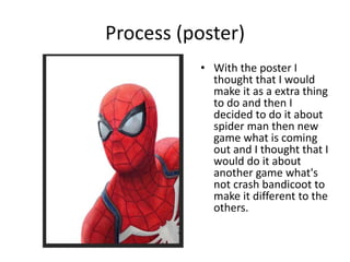
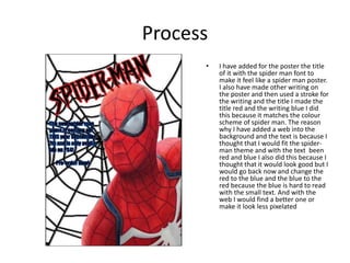
Production Reflection
Luke young
Process (Logo)
• I started by making a circle and making
the colour black. Then I added a gradient
to the circle to make it fade from black to
red. Then I used the eraser tool to take a
smaller circle inside of the original one
and then made it a good size for another
circle to fit inside of it. The reason why I
have used the eraser tool is because If I
used the shape tool to make the smaller
circle in the middle and it was white, if I
wanted to put the logo onto a t-shirt then
there would be the logo and then a white
circle in the middle and if that was on a
black shirt then it would look out of
place. so I used the eraser tool instead of
the circle tool because with the eraser
tool there wouldn't’t be an actual shape
there so when I go to put it on a shirt and
if the shirt is black there wouldn't’t be a
white circle on the black logo and would
look in place.
Process
After I erased part of the
original circle, I made
another circle what
would fit in the original
circle. Then I made it a
gradient again so it look
likes it fades in with both
circles together. I did this
because I think that both
circles together and with
a gradient makes it look
more like a gaming logo.
Process
• For the next step, I added a
circle into the middle of the
second circle. Then with the
newest circle I made it
hollow, I did this by using
the eraser tool to make it
hollow. The only problem
with doing that, was to get
it in the middle so it was the
right size for the inside of
the circle. I did this because
it would feel more like a
gaming logo.
Process
• For the last step of the logo, I
added four lines to the hollow
circle in the middle. With the
lines there would have been a
bit hanging off the edge of the
second circle, so then I used
the eraser tool to get rid of the
edge of the square to make it
feel like the lines fit in the
second circle well. I did this
because I thought that there
just been a circle or just two
line coming out of the circle
was too boring so I added four
lines coming out of the circle
so it made it look better and
more like a gaming logo.
Process
For the next step I swapped the
lines around so they were on the
opposite sides and I also made it
so the colour on the middle circle I
made it lighter so you could see
the bottom line more then last
time when you couldn't’t see it
and now you can see it. And with
the outer circle I have made it so
its less red and more black. And
the last thing is that I have made
the larger circle a bit bigger
because I thought that the bigger
would look better a bit bigger then
before.
Process
After I made the logo I thought it looked to
much like beats so then I change the inner circle
and made it have a cross in it and mini circles in
the triangle parts I did this because it fitted the
Xbox theme more because it had a cross in it
now and also circles in it. I also have made it so
the outer circle is on the other side of the
middle circle I did this because I thought it
looked better in my own opinion. With the lines
and circles in the middle I used the ruler and
the eraser tool so it was inline and wasn’t out of
place. And the reason why I changed the middle
of the logo is because it looked to much like the
beats logo so if I was to put the older logo onto
red bubble I might not been able to do it due to
copy right so I changed the logo so it was similar
to the old one so it doesn't’t look like the beats
logo.
Process (magazine merchandise)
I started off the merchandise part of
the magazine by making the
background a gradient. I made it red
and white because if it was red and
black, it would not stand out as
much so I made it so the other
things are going to be black such as
boxes and the title. I have got the
font off dafont and then just
cropped it then used the magic
wand tool to get rid of the white
around it and now it looks like it fits
into the page as a title.
Process
For the next step for the page for
my merchandise I've added the
badge that I have made separately
and then I added it below the title
of the page. After that I added
one of the designs to a t-shirt
from Redbubble then I
screenshotted the image then I
cropped the Image then got rid of
the white what was around the
hoodie with the magic wand tool
and then I just put the hoodie in a
black hollow box.
Process
For the next part of this page I added
other merchandise such as a t-shirt
and a jumper and did the same by
adding a black hollow boxes on the
outside of them. And the reason why
I added more of the same colored
clothing is because I thought that it
looked the best with the logo and it
fitted the colour scheme
Process
• For the final part of this I added a
phone case what had my design on it
to the merchandise page. I did this
because I thought that It would look
better with a phone case on it this is
because I have already three pieces
of clothing so I thought it would look
better with a phone case so it would
stand out more. Another thing that I
added to the page is a link to the
clothing what is above the title and a
sentence what says “Check out our
merchandise today!” I did this
because I thought the words would
make it stand out more and look like
a actual merchandise page.
Process (magazine cover)
• I started off by making a
blank background and then I
added a gradient. The next
part I added the title what is
”GENERATION X” and used a
font of the website dafont.
The last step for this would
be that I found a few logos
from game and then edited
them so they didn’t have a
background and they would
fit on the screen well and
wouldn’t look out of place
Process
• For the next part of
the of the cover of my
magazine I have added
some text below the
title what a normal
magazine would have
so I added it to make it
look better I also have
added another game
title to fill up the page
more.
Process
• For this part of the magazine
cover I have added some final
game titles so games what are
already out some more recent
then others and I have added the
crash bandicoot one in the
middle because it’s the only game
on there what isn’t out for Xbox
one yet so I thought if it was
bigger then others so people will
see that title first and then they
will know about that game. I also
have added a black bar at the
bottom of the page where I will
put text but I think it will have to
be bigger then I have put it
because there isn’t much room
for text in that box.
Process
• With this part I thought
that I would get rid of the
black bar and then replace
it with the text but make
the text black so it stood
out more then white text
would. Another thing is
that the logos for the
games are more spaced
out so it looks less
crammed. And when its
more spaced out its easier
to read for the people.
Process
• For this part I have changed the cover of the
magazine a lot. I have completely changed the
background from the gradient to a picture of crash
bandicoot the new game and with the font I have
made it so the apple what he is spinning on his finger
is in front of the title. I did this by making a new layer
of the background and circling the apple with the
lasso tool and then when I did that I inverted it so
everything else but the apple would get deleted.
Then I would of dragged the apple layer in front of
the title layer and that’s how I did that. And with the
title logos for the game and the text of the games all I
did with that was add a stroke to it and I did that
with all of them except the logo for crash bandicoot
because I thought that stood out enough and with
the others I added a white stroke so it would stand
out from the background and you could know what it
said and the same with the logos I just made is so it
was a black stroke instead of white. And another
reason why I changed the background from the red
and white theme is because I wanted the front cover
to be different and also so there isnt a receptiveness
on the magazine with it been the same background.
Process (double page spread)
• For the double page spread I found
an image online of crash bandicoot
what would fit the screen correctly
and I made it crash bandicoot
because people know this game
well from the old crash bandicoots
and want to be able to play it again
on Xbox one. I also have made it so
there are some new games coming
out later this year I did this because
that would fit a double page spread
well and will have a lot to talk about
on the double page spread about
the games. Another thing that I
have done is add a stroke to all of
the pictures of the games except
borderlands I did this because I
thought it would look better and
they would stand out more.
Process
• For this step all I have
done is move the
images of the game so
it looks more
interesting and so I
would have more
room to type about
the games and it
would look more like a
double page spread
they way I have done
it having the images
more spread out. And
not in a straight line.
Process
• For this part I have added text
to the double page spread to
make it look like a double page
spread and I when I was talking
out them I was typing in white
to make it stand out more from
the darker colours from the
background and when the text
was over bright colours such
as the ice and the lightning I
made the font black so it would
stand out more then been
white in that area. I also have
moved the Jurassic world
image so it didn't’t cover a lot
of the image so I moved it to
the top of the screen so it
would make it so crash
bandicoot stood out more.
Process (poster)
• With the poster I
thought that I would
make it as a extra thing
to do and then I
decided to do it about
spider man then new
game what is coming
out and I thought that I
would do it about
another game what's
not crash bandicoot to
make it different to the
others.
Process
• I have added for the poster the title
of it with the spider man font to
make it feel like a spider man poster.
I also have made other writing on
the poster and then used a stroke for
the writing and the title I made the
title red and the writing blue I did
this because it matches the colour
scheme of spider man. The reason
why I have added a web into the
background and the text is because I
thought that I would fit the spider-
man theme and with the text been
red and blue I also did this because I
thought that it would look good but I
would go back now and change the
red to the blue and the blue to the
red because the blue is hard to read
with the small text. And with the
web I would find a better one or
make it look less pixelated
Process (Contents page)
• When I started out
making the contents
page I thought that It
would be good to
make it the Xbox
theme colours what
are black, green and
white I did this
because my magazine
is about Xbox and Xbox
games so I thought
that it would look
better if the theme
was the Xbox one.
Process
• For the next step to making the
contents page I added the title to
the page what is the same as the
cover page for my magazine. I
made the colour of the text black
because the colour scheme is
green, white and black and that’s
the colour scheme for xbox and I
already had green and white so I
thought that I would make the
colour of the text black so It fitted
the theme of the magazine. And
the other thing that I did is add the
title for the contents part and
made the o in contents the logo
that I had made and my logo is
round so it fitted it well. I did this
because I wanted to put a logo in
my work but I didn't’t know where
so I thought that I would just put it
where people would see it and you
can still read what the word says.
Process
With the next step that I added
to the contents page I added
information about the xbox one x
so people would know the
difference between the old one
and the new one. I did this
because if people was to buy the
new one they would know what
the difference is in them. And
with the other part I added the
title of games and then put
numbers on them so you would
know where to find them in the
magazine I did this because I
thought that I would make the
contents page look organized and
so then you know where to find
the pages for the specific game.
Process
• For this step I added
the pictures of a few
games that only have
just come out and
games that are coming
out. I did this so
people knew what the
games kind of looked
like and so it would
make the page look
more full and more
like a contents page in
a magazine.
process
• For the final part of making the
contents page. Firstly I added and
image of an Xbox one x, I did this
because because I talked about the
Xbox one x but then didn't’t add a
picture into it so I thought that I
would so it would make sense and
people would know what it looked
like and I added a box above it and in
it says Xbox one x enhanced. The
next step I did is added a green circle
and added a competition to it, I did
this because I thought that it would
fill the page up more and it would
look like a gaming magazine as well.
And the last step for the contents
page was to add a link in the bottom
left hand corner I did this because I
thought that if people was to look at
the things that I have made they
would go to look on the website and
they would get the link by looking at
the contents page.

6. fmp production reflection

  • 1.
  • 2.
    Process (Logo) • Istarted by making a circle and making the colour black. Then I added a gradient to the circle to make it fade from black to red. Then I used the eraser tool to take a smaller circle inside of the original one and then made it a good size for another circle to fit inside of it. The reason why I have used the eraser tool is because If I used the shape tool to make the smaller circle in the middle and it was white, if I wanted to put the logo onto a t-shirt then there would be the logo and then a white circle in the middle and if that was on a black shirt then it would look out of place. so I used the eraser tool instead of the circle tool because with the eraser tool there wouldn't’t be an actual shape there so when I go to put it on a shirt and if the shirt is black there wouldn't’t be a white circle on the black logo and would look in place.
  • 3.
    Process After I erasedpart of the original circle, I made another circle what would fit in the original circle. Then I made it a gradient again so it look likes it fades in with both circles together. I did this because I think that both circles together and with a gradient makes it look more like a gaming logo.
  • 4.
    Process • For thenext step, I added a circle into the middle of the second circle. Then with the newest circle I made it hollow, I did this by using the eraser tool to make it hollow. The only problem with doing that, was to get it in the middle so it was the right size for the inside of the circle. I did this because it would feel more like a gaming logo.
  • 5.
    Process • For thelast step of the logo, I added four lines to the hollow circle in the middle. With the lines there would have been a bit hanging off the edge of the second circle, so then I used the eraser tool to get rid of the edge of the square to make it feel like the lines fit in the second circle well. I did this because I thought that there just been a circle or just two line coming out of the circle was too boring so I added four lines coming out of the circle so it made it look better and more like a gaming logo.
  • 6.
    Process For the nextstep I swapped the lines around so they were on the opposite sides and I also made it so the colour on the middle circle I made it lighter so you could see the bottom line more then last time when you couldn't’t see it and now you can see it. And with the outer circle I have made it so its less red and more black. And the last thing is that I have made the larger circle a bit bigger because I thought that the bigger would look better a bit bigger then before.
  • 7.
    Process After I madethe logo I thought it looked to much like beats so then I change the inner circle and made it have a cross in it and mini circles in the triangle parts I did this because it fitted the Xbox theme more because it had a cross in it now and also circles in it. I also have made it so the outer circle is on the other side of the middle circle I did this because I thought it looked better in my own opinion. With the lines and circles in the middle I used the ruler and the eraser tool so it was inline and wasn’t out of place. And the reason why I changed the middle of the logo is because it looked to much like the beats logo so if I was to put the older logo onto red bubble I might not been able to do it due to copy right so I changed the logo so it was similar to the old one so it doesn't’t look like the beats logo.
  • 8.
    Process (magazine merchandise) Istarted off the merchandise part of the magazine by making the background a gradient. I made it red and white because if it was red and black, it would not stand out as much so I made it so the other things are going to be black such as boxes and the title. I have got the font off dafont and then just cropped it then used the magic wand tool to get rid of the white around it and now it looks like it fits into the page as a title.
  • 9.
    Process For the nextstep for the page for my merchandise I've added the badge that I have made separately and then I added it below the title of the page. After that I added one of the designs to a t-shirt from Redbubble then I screenshotted the image then I cropped the Image then got rid of the white what was around the hoodie with the magic wand tool and then I just put the hoodie in a black hollow box.
  • 10.
    Process For the nextpart of this page I added other merchandise such as a t-shirt and a jumper and did the same by adding a black hollow boxes on the outside of them. And the reason why I added more of the same colored clothing is because I thought that it looked the best with the logo and it fitted the colour scheme
  • 11.
    Process • For thefinal part of this I added a phone case what had my design on it to the merchandise page. I did this because I thought that It would look better with a phone case on it this is because I have already three pieces of clothing so I thought it would look better with a phone case so it would stand out more. Another thing that I added to the page is a link to the clothing what is above the title and a sentence what says “Check out our merchandise today!” I did this because I thought the words would make it stand out more and look like a actual merchandise page.
  • 12.
    Process (magazine cover) •I started off by making a blank background and then I added a gradient. The next part I added the title what is ”GENERATION X” and used a font of the website dafont. The last step for this would be that I found a few logos from game and then edited them so they didn’t have a background and they would fit on the screen well and wouldn’t look out of place
  • 13.
    Process • For thenext part of the of the cover of my magazine I have added some text below the title what a normal magazine would have so I added it to make it look better I also have added another game title to fill up the page more.
  • 14.
    Process • For thispart of the magazine cover I have added some final game titles so games what are already out some more recent then others and I have added the crash bandicoot one in the middle because it’s the only game on there what isn’t out for Xbox one yet so I thought if it was bigger then others so people will see that title first and then they will know about that game. I also have added a black bar at the bottom of the page where I will put text but I think it will have to be bigger then I have put it because there isn’t much room for text in that box.
  • 15.
    Process • With thispart I thought that I would get rid of the black bar and then replace it with the text but make the text black so it stood out more then white text would. Another thing is that the logos for the games are more spaced out so it looks less crammed. And when its more spaced out its easier to read for the people.
  • 16.
    Process • For thispart I have changed the cover of the magazine a lot. I have completely changed the background from the gradient to a picture of crash bandicoot the new game and with the font I have made it so the apple what he is spinning on his finger is in front of the title. I did this by making a new layer of the background and circling the apple with the lasso tool and then when I did that I inverted it so everything else but the apple would get deleted. Then I would of dragged the apple layer in front of the title layer and that’s how I did that. And with the title logos for the game and the text of the games all I did with that was add a stroke to it and I did that with all of them except the logo for crash bandicoot because I thought that stood out enough and with the others I added a white stroke so it would stand out from the background and you could know what it said and the same with the logos I just made is so it was a black stroke instead of white. And another reason why I changed the background from the red and white theme is because I wanted the front cover to be different and also so there isnt a receptiveness on the magazine with it been the same background.
  • 17.
    Process (double pagespread) • For the double page spread I found an image online of crash bandicoot what would fit the screen correctly and I made it crash bandicoot because people know this game well from the old crash bandicoots and want to be able to play it again on Xbox one. I also have made it so there are some new games coming out later this year I did this because that would fit a double page spread well and will have a lot to talk about on the double page spread about the games. Another thing that I have done is add a stroke to all of the pictures of the games except borderlands I did this because I thought it would look better and they would stand out more.
  • 18.
    Process • For thisstep all I have done is move the images of the game so it looks more interesting and so I would have more room to type about the games and it would look more like a double page spread they way I have done it having the images more spread out. And not in a straight line.
  • 19.
    Process • For thispart I have added text to the double page spread to make it look like a double page spread and I when I was talking out them I was typing in white to make it stand out more from the darker colours from the background and when the text was over bright colours such as the ice and the lightning I made the font black so it would stand out more then been white in that area. I also have moved the Jurassic world image so it didn't’t cover a lot of the image so I moved it to the top of the screen so it would make it so crash bandicoot stood out more.
  • 20.
    Process (poster) • Withthe poster I thought that I would make it as a extra thing to do and then I decided to do it about spider man then new game what is coming out and I thought that I would do it about another game what's not crash bandicoot to make it different to the others.
  • 21.
    Process • I haveadded for the poster the title of it with the spider man font to make it feel like a spider man poster. I also have made other writing on the poster and then used a stroke for the writing and the title I made the title red and the writing blue I did this because it matches the colour scheme of spider man. The reason why I have added a web into the background and the text is because I thought that I would fit the spider- man theme and with the text been red and blue I also did this because I thought that it would look good but I would go back now and change the red to the blue and the blue to the red because the blue is hard to read with the small text. And with the web I would find a better one or make it look less pixelated
  • 22.
    Process (Contents page) •When I started out making the contents page I thought that It would be good to make it the Xbox theme colours what are black, green and white I did this because my magazine is about Xbox and Xbox games so I thought that it would look better if the theme was the Xbox one.
  • 23.
    Process • For thenext step to making the contents page I added the title to the page what is the same as the cover page for my magazine. I made the colour of the text black because the colour scheme is green, white and black and that’s the colour scheme for xbox and I already had green and white so I thought that I would make the colour of the text black so It fitted the theme of the magazine. And the other thing that I did is add the title for the contents part and made the o in contents the logo that I had made and my logo is round so it fitted it well. I did this because I wanted to put a logo in my work but I didn't’t know where so I thought that I would just put it where people would see it and you can still read what the word says.
  • 24.
    Process With the nextstep that I added to the contents page I added information about the xbox one x so people would know the difference between the old one and the new one. I did this because if people was to buy the new one they would know what the difference is in them. And with the other part I added the title of games and then put numbers on them so you would know where to find them in the magazine I did this because I thought that I would make the contents page look organized and so then you know where to find the pages for the specific game.
  • 25.
    Process • For thisstep I added the pictures of a few games that only have just come out and games that are coming out. I did this so people knew what the games kind of looked like and so it would make the page look more full and more like a contents page in a magazine.
  • 26.
    process • For thefinal part of making the contents page. Firstly I added and image of an Xbox one x, I did this because because I talked about the Xbox one x but then didn't’t add a picture into it so I thought that I would so it would make sense and people would know what it looked like and I added a box above it and in it says Xbox one x enhanced. The next step I did is added a green circle and added a competition to it, I did this because I thought that it would fill the page up more and it would look like a gaming magazine as well. And the last step for the contents page was to add a link in the bottom left hand corner I did this because I thought that if people was to look at the things that I have made they would go to look on the website and they would get the link by looking at the contents page.

Editor's Notes

  • #3 Discuss the tools and processes used in your production. Log your thoughts and feelings about your work.
  • #4 Discuss the tools and processes used in your production. Log your thoughts and feelings about your work.
  • #5 Discuss the tools and processes used in your production. Log your thoughts and feelings about your work.
  • #6 Discuss the tools and processes used in your production. Log your thoughts and feelings about your work.
  • #7 Discuss the tools and processes used in your production. Log your thoughts and feelings about your work.