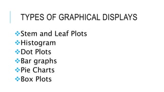
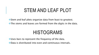
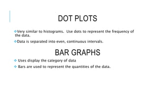
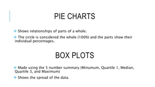
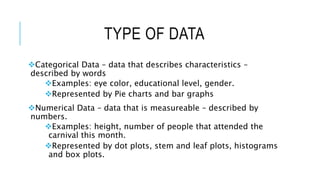
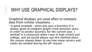
GRAPHICAL
REPRESENTATIONS OF
UNIVARIATE DATA
By: Natasha Farrow
TYPES OF GRAPHICAL DISPLAYS
Stem and Leaf Plots
Histogram
Dot Plots
Bar graphs
Pie Charts
Box Plots
STEM AND LEAF PLOT
Stem and leaf plots organize data from least to greatest.
The stems and leaves are formed from the digits in the data.
HISTOGRAMS
Uses bars to represent the frequency of the data.
Data is distributed into even and continuous intervals.
BAR GRAPHS
Very similar to histograms. Use dots to represent the frequency of
the data.
Data is separated into even, continuous intervals.
DOT PLOTS
 Uses display the category of data
 Bars are used to represent the quantities of the data.
PIE CHARTS
 Shows relationships of parts of a whole.
 The circle is considered the whole (100%) and the parts show their
individual percentages.
BOX PLOTS
 Made using the 5 number summary (Minumum, Quartile 1, Median,
Quartile 3, and Maximum)
 Shows the spread of the data.
TYPE OF DATA
Categorical Data – data that describes characteristics –
described by words
Examples: eye color, educational level, gender.
Represented by Pie charts and bar graphs
Numerical Data – data that is measureable – described by
numbers.
Examples: height, number of people that attended the
carnival this month.
Represented by dot plots, stem and leaf plots, histograms
and box plots.
WHY USE GRAPHICAL DISPLAYS?
Graphical displays are used often to compare
data from similar situations. .
 A good example : when you own a business it is
always good to compare graphs from previous years
in order to predict business for the current year. I
worked in a restaurant when I was in high school and
college, and we would always use this method when
the season slowed down to see how many servers and
cooks we needed during the off-season.

Graphical representations

  • 1.
  • 2.
    TYPES OF GRAPHICALDISPLAYS Stem and Leaf Plots Histogram Dot Plots Bar graphs Pie Charts Box Plots
  • 3.
    STEM AND LEAFPLOT Stem and leaf plots organize data from least to greatest. The stems and leaves are formed from the digits in the data. HISTOGRAMS Uses bars to represent the frequency of the data. Data is distributed into even and continuous intervals.
  • 4.
    BAR GRAPHS Very similarto histograms. Use dots to represent the frequency of the data. Data is separated into even, continuous intervals. DOT PLOTS  Uses display the category of data  Bars are used to represent the quantities of the data.
  • 5.
    PIE CHARTS  Showsrelationships of parts of a whole.  The circle is considered the whole (100%) and the parts show their individual percentages. BOX PLOTS  Made using the 5 number summary (Minumum, Quartile 1, Median, Quartile 3, and Maximum)  Shows the spread of the data.
  • 6.
    TYPE OF DATA CategoricalData – data that describes characteristics – described by words Examples: eye color, educational level, gender. Represented by Pie charts and bar graphs Numerical Data – data that is measureable – described by numbers. Examples: height, number of people that attended the carnival this month. Represented by dot plots, stem and leaf plots, histograms and box plots.
  • 7.
    WHY USE GRAPHICALDISPLAYS? Graphical displays are used often to compare data from similar situations. .  A good example : when you own a business it is always good to compare graphs from previous years in order to predict business for the current year. I worked in a restaurant when I was in high school and college, and we would always use this method when the season slowed down to see how many servers and cooks we needed during the off-season.