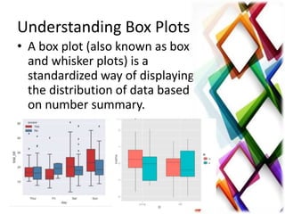
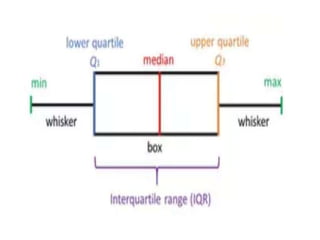
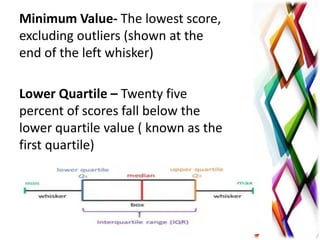
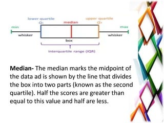
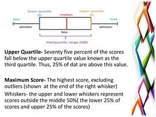
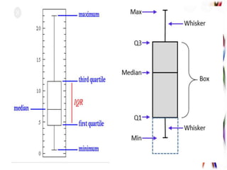
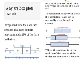
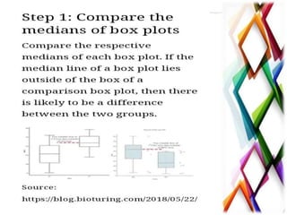
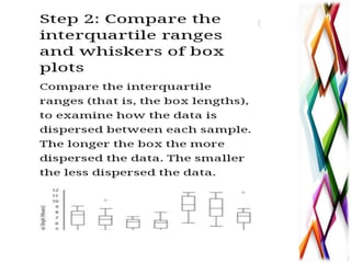
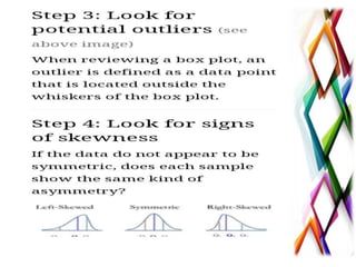
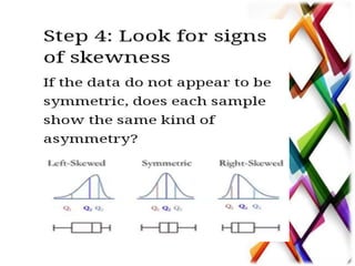
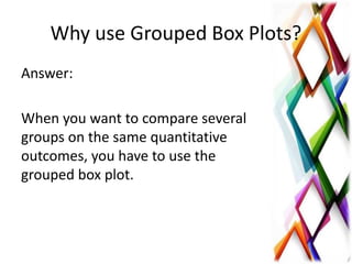
Box plots provide a standardized way to display data distribution based on number summaries. They show outliers and values, whether data is symmetrical or skewed, and how tightly grouped data is. A box plot constructs from minimum, first quartile, median, third quartile, and maximum values. It divides data into sections containing approximately 25% of values each. Box plots summarize data in a way that allows researchers to quickly identify mean values, dispersion, and signs of skewness. Grouped box plots are used to compare multiple groups on the same quantitative outcomes.
Introduction to Statistics - Basic concepts
- How to be a good doctor - A step in Health promotion
- By Ibrahim A. Abdelhaleem - Zagazig Medical Research Society (ZMRS)
A binomial random variable is the number of successes x in n repeated trials of a binomial experiment. The probability distribution of a binomial random variable is called a binomial distribution. Suppose we flip a coin two times and count the number of heads (successes).
It is most useful for the students of BBA for the subject of "Data Analysis and Modeling"/
It has covered the content of chapter- Data regression Model
Visit for more on www.ramkumarshah.com.np/
The ppt cover General Introduction to the topic,
Description of CHI-SQUARE TEST, Contingency table, Degree of Freedom, Determination of Chi – square test, Assumption for validity of chi - square test, Characteristics , Applications, Limitations
What is a Box Plot ?
In descriptive statistics, a boxplot is a method for graphically depicting groups of numerical data through their quartiles. Box plots may also have lines extending from the boxes (whiskers) indicating variability outside the upper and lower quartiles, hence the terms box-and-whisker plot and box-and-whisker diagram
Box plots are non-parametric: they display variation in samples of a statistical population without making any assumptions of the underlying statistical distribution
The spacings between the different parts of the box indicate the degree of dispersion (spread) and skewness in the data, and show outliers.
Box Plot Requirement
Minimum : the lowest data point excluding any outliers.
Maximum : the largest data point excluding any outliers.
Median (Q2 / 50th percentile) : the middle value of the dataset.
First quartile (Q1 / 25th percentile) : also known as the lower quartile qn(0.25), is the median of the lower half of the dataset.
Third quartile (Q3 / 75th percentile) : also known as the upper quartile qn(0.75), is the median of the upper half of the dataset.
Interquartile range (IQR) : is the distance between the upper and lower quartiles
IQR =Q3-Q1= qn(0.75) –qn(0.25)
A boxplot is constructed of two parts, a box and a set of whiskers . The lowest point is the minimum of the data set and the highest point is the maximum of the data set. The box is drawn from Q1 to Q3 with a horizontal line drawn in the middle to denote the median.
Why Box Plot is useful ?
Box plots divide the data into sections that each contain approximately 25% of the data in that set.
When the median is in the middle of the box, and the whiskers are about the same on both sides of the box, then the distribution is symmetric
When the median is closer to the bottom of the box, and if the whisker is shorter on the lower end of the box, then the distribution is positively skewed (skewed right)
When the median is closer to the top of the box, and if the whisker is shorter on the upper end of the box, then the distribution is negatively skewed (skewed left)
How to compare box plot
How to draw box plot on Excel
Step 2: Calculate quartile differences
Next, calculate the differences between each phase. In effect, you have to calculate the differentials between the following:
First quartile and minimum value
Median and first quartile
Third quartile and median
Maximum value and third quartile
Step 3: Create a stacked column chart
The data in the third table is well suited for a box plot, and we'll start by creating a stacked column chart which we'll then modify.
Select all the data from the third table, and click Insert > Insert Column Chart > Stacked Column.
To reverse the chart axes, right-click on the chart, and click Select Data.
Click Switch Row/Column.
Click OK.
The next step is to replace the topmost and second-from-bottom (the deep blue and orange areas in the image) data series with lines, or whiskers.
Select the to
Lecture on Introduction to Descriptive Statistics - Part 1 and Part 2. These slides were presented during a lecture at the Colombo Institute of Research and Psychology.
Summarizing Data : Listing and Grouping pdfJustynOwen
Introduction
Descriptive Statistics describe basic features of the data gathered from an experimental study in various ways.
They provide simple summaries about the sample via graphs and numbers, mainly measures of center and variation.
Together with graphics analysis (histograms, bar plots, pie-charts), they are the cornerstone of quantitative data analysis.
Tables (frequency distributions, stem-and-leaf plots, …) that summarize the data.
Graphical representations of the data (histograms, bar plots, pie-charts).
Summary statistics (numbers) which summarize the data
TSTD 6251 Fall 2014SPSS Exercise and Assignment 120 PointsI.docxnanamonkton
TSTD 6251 Fall 2014
SPSS Exercise and Assignment 1
20 Points
In this class, we are going to study descriptive summary statistics and learn how to construct box plot. We are still working with univariate variable for this exercise.
Practice Example:
Admission receipts (in million of dollars) for a recent season are given below for the
n =
30 major league baseball teams:
19.4 26.6 22.9 44.5 24.4 19.0 27.5 19.9 22.8 19.0 16.9 15.2 25.7 19.0 15.5 17.1 15.6 10.6 16.2 15.6 15.4 18.2 15.5 14.2 9.5 9.9
10.7 11.9 26.7 17.5
Require:
a. Compute the mean, variance and standard deviation.
b. Find the sample median, first quartile, and third quartile.
c. Construct a boxplot and interpret the distribution of the data.
d. Discuss the distribution of this set of data by examining kurtosis and skewness
statistics, such as if the distribution is skewed to one side of the distribution, and if the
distribution shows a peaked/skinny curve or a spread out/flat curve.
SPSS Procedures for Computing Summary Statistics
:
Enter the 30 data values in the first column of SPSS
Data View
Tab
Variable View
and name this variable
receipts
Adjust
Decimals
to 3 decimal points
Type
Admission Receipts
($ mn)
in the
Label
column for output viewer
Return to
Data View
and click
A
nalyze
on the menu bar
Click the second menu
D
e
scriptive Statistics
Click
F
requencies …
Move
Admission Receipts
to the
Variable(s)
list by clicking the arrow button
Click
S
tatistics …
button at the top of the dialog box
Now, you can select the descriptive statistics according to what the question requires. For this practice question, it requires central tendency, dispersion, percentile and distribution statistics, so we click all the boxes
except for
P
ercentile(s): and Va
l
ues are group midpoints
.
Click
Continue
to return to the
Frequencies
dialog box
Click
OK
to generate descriptive statistic output which is pasted below:
The first table provides summary statistics and the second table lists frequencies, relative frequencies and cumulative frequencies. The statistics required for solving this problem are highlighted in red.
Statistics
Admission Receipts
N
Valid
30
Missing
0
Mean
18.76333
Std. Error of Mean
1.278590
Median
17.30000
Mode
19.000
Std. Deviation
7.003127
Variance
49.043782
Skewness
1.734
Std. Error of Skewness
.427
Kurtosis
5.160
Std. Error of Kurtosis
.833
Range
35.000
Minimum
9.500
Maximum
44.500
Sum
562.900
Percentiles
10
10.61000
20
14.40000
25
15.35000
30
15.50000
40
15.84000
50
17.30000
60
19.00000
70
19.75000
75
22.82500
80
24.10000
90
26.69000
Admission Receipts
Frequency
Percent
Valid Percent
Cumulative Percent
Valid
9.500
1
3.3
3.3
3.3
9.900
1
3.3
3.3
6.7
10.600
1
3.3
3.3
10.0
10.700
1
3.3
3.3
13.3
11.900
1
3.3
3.3
16.7
14.200
1
3.3
3.3
20.0
15.2.
Descriptive statistics helps users to describe and understand the features of a specific dataset, by providing short summaries and a graphic depiction of the measured data. Descriptive Statistical algorithms are sophisticated techniques that, within the confines of a self-serve analytical tool, can be simplified in a uniform, interactive environment to produce results that clearly illustrate answers and optimize decisions.
This presentation educates you about Tableau - Box Plot and its uses, Uses of Bullet Graph, Creating a Box Plot and Box Plot with Two Dimensions.
For more topics stay tuned with Learnbay.
Synthetic Fiber Construction in lab .pptxPavel ( NSTU)
Synthetic fiber production is a fascinating and complex field that blends chemistry, engineering, and environmental science. By understanding these aspects, students can gain a comprehensive view of synthetic fiber production, its impact on society and the environment, and the potential for future innovations. Synthetic fibers play a crucial role in modern society, impacting various aspects of daily life, industry, and the environment. ynthetic fibers are integral to modern life, offering a range of benefits from cost-effectiveness and versatility to innovative applications and performance characteristics. While they pose environmental challenges, ongoing research and development aim to create more sustainable and eco-friendly alternatives. Understanding the importance of synthetic fibers helps in appreciating their role in the economy, industry, and daily life, while also emphasizing the need for sustainable practices and innovation.
Ethnobotany and Ethnopharmacology:
Ethnobotany in herbal drug evaluation,
Impact of Ethnobotany in traditional medicine,
New development in herbals,
Bio-prospecting tools for drug discovery,
Role of Ethnopharmacology in drug evaluation,
Reverse Pharmacology.
Instructions for Submissions thorugh G- Classroom.pptxJheel Barad
This presentation provides a briefing on how to upload submissions and documents in Google Classroom. It was prepared as part of an orientation for new Sainik School in-service teacher trainees. As a training officer, my goal is to ensure that you are comfortable and proficient with this essential tool for managing assignments and fostering student engagement.
The Roman Empire A Historical Colossus.pdfkaushalkr1407
The Roman Empire, a vast and enduring power, stands as one of history's most remarkable civilizations, leaving an indelible imprint on the world. It emerged from the Roman Republic, transitioning into an imperial powerhouse under the leadership of Augustus Caesar in 27 BCE. This transformation marked the beginning of an era defined by unprecedented territorial expansion, architectural marvels, and profound cultural influence.
The empire's roots lie in the city of Rome, founded, according to legend, by Romulus in 753 BCE. Over centuries, Rome evolved from a small settlement to a formidable republic, characterized by a complex political system with elected officials and checks on power. However, internal strife, class conflicts, and military ambitions paved the way for the end of the Republic. Julius Caesar’s dictatorship and subsequent assassination in 44 BCE created a power vacuum, leading to a civil war. Octavian, later Augustus, emerged victorious, heralding the Roman Empire’s birth.
Under Augustus, the empire experienced the Pax Romana, a 200-year period of relative peace and stability. Augustus reformed the military, established efficient administrative systems, and initiated grand construction projects. The empire's borders expanded, encompassing territories from Britain to Egypt and from Spain to the Euphrates. Roman legions, renowned for their discipline and engineering prowess, secured and maintained these vast territories, building roads, fortifications, and cities that facilitated control and integration.
The Roman Empire’s society was hierarchical, with a rigid class system. At the top were the patricians, wealthy elites who held significant political power. Below them were the plebeians, free citizens with limited political influence, and the vast numbers of slaves who formed the backbone of the economy. The family unit was central, governed by the paterfamilias, the male head who held absolute authority.
Culturally, the Romans were eclectic, absorbing and adapting elements from the civilizations they encountered, particularly the Greeks. Roman art, literature, and philosophy reflected this synthesis, creating a rich cultural tapestry. Latin, the Roman language, became the lingua franca of the Western world, influencing numerous modern languages.
Roman architecture and engineering achievements were monumental. They perfected the arch, vault, and dome, constructing enduring structures like the Colosseum, Pantheon, and aqueducts. These engineering marvels not only showcased Roman ingenuity but also served practical purposes, from public entertainment to water supply.
Unit 8 - Information and Communication Technology (Paper I).pdfThiyagu K
This slides describes the basic concepts of ICT, basics of Email, Emerging Technology and Digital Initiatives in Education. This presentations aligns with the UGC Paper I syllabus.
Palestine last event orientationfvgnh .pptxRaedMohamed3
An EFL lesson about the current events in Palestine. It is intended to be for intermediate students who wish to increase their listening skills through a short lesson in power point.
2. Understanding Box Plots
• A box plot (also known as box
and whisker plots) is a
standardized way of displaying
the distribution of data based
on number summary.
3. Understanding Box Plots
It can tell you about the
outliers and what their values
are.
It can also tell you if your data
is symmetrical, how tightly your
data is grouped, and if and how
your data is skewed.
4. • In origin, a grouped box plot can be created
from either indexed data or raw data.
• The indexed data is arranged as one data
column and one or more group columns,
while the raw data is arranged as multiple
data columns grouped according to the
column label row (s).
5. A box plot is constructed
from five values:
• the minimum value
• the first value
• the first quartile
• the maximum value
We use these values to
compare how close other data
values are to them.
6.
7. Minimum Value- The lowest score,
excluding outliers (shown at the
end of the left whisker)
Lower Quartile – Twenty five
percent of scores fall below the
lower quartile value ( known as the
first quartile)
8. Median- The median marks the midpoint of
the data ad is shown by the line that divides
the box into two parts (known as the second
quartile). Half the scores are greater than
equal to this value and half are less.
9. Upper Quartile- Seventy five percent of the scores
fall below the upper quartile value known as the
third quartile. Thus, 25% of dat are above this value.
Maximum Score- The highest score, excluding
outliers (shown at the end of the right whisker)
Whiskers- the upper and lower whiskers represent
scores outside the middle 50%( the lower 25% of
scores and upper 25% of the scores)
10. The Interquartile Range (IQR)
This is the box plot showing the
middle 50% of the scores (the
range between the 25th and 75th
percentile.
11. • Box plots divide the data into
sections that each contain
approximately 25% data in a set.
• Box plots are useful as they provide
summary of the data enabling
researchers to quickly identify
mean values, the dispersion of the
data set and signs and skewness.
12.
13.
14.
15.
16.
17.
18. Why use Grouped Box Plots?
Answer:
When you want to compare several
groups on the same quantitative
outcomes, you have to use the
grouped box plot.