graphical representation 2
•Download as PPTX, PDF•
0 likes•12 views
The document discusses different methods of graphically representing frequency distributions: histograms, frequency polygons, and frequency curves. It provides examples of how to construct each type of graph using sample data on times taken to travel to school, net worth over years, and ages of pensioners. Students will learn how to analyze and interpret these graphs as well as how to present data using histograms, frequency polygons, frequency curves, and pie charts. The document concludes with sample multiple choice questions to test comprehension.
Report
Share
Report
Share

Recommended
graphical representation 4
This document discusses constructing cumulative frequency (ogive) curves from data. It begins by recapping how to create histograms, frequency polygons, and pie charts. Then it provides learning objectives and outcomes around analyzing and presenting data graphically using these visualizations. The main content explains how to calculate less than and more than cumulative frequencies and draw the corresponding ogive curves. It gives examples of drawing less than ogive curves for two data sets listing number of workers by daily wage and number of pensioners by age group. Finally, it presents multiple choice questions to test understanding of ogive curves.
graphical representation 3
This document discusses quantitative techniques for constructing graphs such as histograms, frequency polygons, and frequency curves from data. It provides examples of problems involving drawing these different types of graphs based on data about student heights, company net worth, and pensioner ages. The document also includes multiple choice questions about histograms, frequency polygons, pie charts, and other graphical representations of data.
graphical representation 5
This document discusses cumulative frequency curves or ogives. It provides examples of how to construct more than ogive curves using data from frequency distributions. Specifically, it discusses how the more than cumulative frequency is plotted against the lower limit of each class to form the curve. Two example problems are worked through demonstrating how to draw the more than ogive curve from data on test marks and pensioner ages. Multiple choice questions are also provided to assess understanding of key concepts like the different types of ogive curves and how cumulative frequency polygons are used.
Diagrams part 4
This document discusses different types of two-dimensional bar diagrams that can be used to represent data graphically, including squares, pie diagrams, and rectangle bar diagrams. It provides examples of how to construct these diagrams from sample data about sales over time and expenditures by schools. Students learn how to analyze and interpret these diagrams within their given contexts. The document also includes multiple choice questions to test comprehension.
graphical representation 6
This document discusses quantitative techniques and constructing graphs from data. It covers constructing less than and more than ogive curves, which are cumulative frequency curves. An ogive curve shows the cumulative frequency distribution and can be used to find the median. Two problems are presented on drawing less than and more than ogive curves from data on weights of items and ages of pensioners. Multiple choice questions are also provided to test understanding of ogives and cumulative frequency polygons.
633e639cc8efda0018e1ca63_##_Graphical Representation 01 _ Class Notes __ (Vic...
This document discusses different methods of graphically representing statistical data, including histograms, frequency polygons, and ogives (cumulative frequency curves). It provides examples of how to construct each type of graph using sample data. Histograms involve drawing rectangles with bases proportional to class intervals and heights proportional to frequencies. Ogives involve plotting cumulative frequencies on the y-axis against upper class limits on the x-axis and joining the points with a curve. Examples and step-by-step instructions are given for drawing each graph.
Diagrams part 3
This document discusses quantitative techniques for a B.Com program. It covers one dimensional bar diagrams, including percentage and multiple bar diagrams. It provides examples of problems involving percentage and multiple bar diagrams with solutions. It also includes learning objectives and outcomes about presenting and interpreting data graphically using various charts and diagrams. There are example problems and solutions for constructing percentage and multiple bar diagrams from given data. The document concludes with multiple choice questions and answers about different types of bar diagrams.
Diagrams part 5
This document discusses different types of diagrams that can be used to represent data graphically, including two-dimensional bar diagrams, histograms, frequency polygons, pie charts, and cumulative frequency curves. It provides examples of using square diagrams, rectangle bar diagrams, and pie diagrams to illustrate household expenditure data for different families with multiple categories. Students learning quantitative techniques will be able to analyze and interpret these different types of diagrams to graphically present various data sets. The document concludes with sample multiple choice questions related to the topics covered.
Diagrams part 2
This document discusses one dimensional bar diagrams, including simple and subdivided bar diagrams. It provides examples of how to construct simple and component bar diagrams to present statistical data comparing production costs between companies and expenditures across categories for two schools. Multiple choice questions are also included at the end to test understanding of diagrammatic data presentation.
diagrams theory
This document discusses the presentation of quantitative data through diagrams. It begins by stating the learning objectives, which are for students to learn how to present data graphically using various charts and diagrams and calculate cumulative frequency. It then discusses different types of diagrams used for data presentation, including bar diagrams, pie charts, and two-dimensional diagrams. The key advantages of diagrams over tables are that they can more quickly and easily convey complex ideas in numbers and trends may be more noticeable. Guidelines for effective diagrams include giving them a clear title, using an appropriate size and scale, including a legend if multiple variables are shown, and selecting the correct type of diagram for the data. Common one-dimensional and two-dimensional diagram types are also listed.
Presentation of statistics
Bio-statistics, Present Quantitative Data using different diagrams and graphs
Histogram, Frequency polygon, Ogive curves, Scatter Diagram
Epidemic curve
Median from Ogive Curves,
Mode from Histogram
Visual Techniques
Developing visual material can help to recall memory and also be a quick way to show lots of information. Visualization helps us remember (like when we try to picture where we’ve parked our car, and what's in our cupboards when writing a shopping list). We can create diagrams and visual aids depicting module materials and put them up around the house so that we are constantly reminded of our learning
frequency distribution table 1
This document discusses the preparation of a frequency distribution table from a discrete data series. It provides an example of survey data from 20 homes on the number of cars registered to each household. The data is organized into a frequency distribution table with columns for the number of cars, tally marks, and frequencies. The table shows that 0 cars were recorded 3 times, 1 car was recorded 4 times, 2 cars 6 times, and so on, with the total of all frequencies equaling the 20 total data points. The document also provides the meaning and steps for creating a frequency distribution table, including organizing the data values and tallying the frequency of each value.
Frequency Distribution Table 1
This document discusses a lesson on quantitative techniques for a B.Com program. It covers preparing a frequency distribution table from a discrete data series. An example is given of survey results from 20 homes on the number of cars registered to each household. The data is presented in a frequency distribution table with columns for the number of cars, tally marks, and frequencies. Key steps discussed are forming a three column table, placing values in the first column, tallying occurrences in the second column, and counting tallies to record frequencies in the third column. The document also includes several multiple choice questions to test understanding.
graphical representation 1
This document discusses graphical representation of quantitative data. It explains that graphs are better suited than diagrams for statistical analysis as they allow interpolation, extrapolation and locating values like the median and quartiles. Diagrams are only for comparison. The document then contrasts key differences between diagrams and graphs. Finally, it provides general rules for creating graphs and examples of questions to test comprehension.
Frequency Distribution Table 3
This document discusses the preparation of frequency distribution tables for continuous data series. It provides examples and steps for creating a grouped frequency distribution table, including deciding the number of classes, determining the range and class interval, and obtaining the class limits and frequencies to summarize the distribution. An example is given using test marks from 60 students to demonstrate creating a table with 10 class intervals. The document also includes review questions to assess understanding of key concepts like discrete versus continuous frequency distributions, exclusive classification limits, and how the number of classes is determined.
frequency distribution table 3
This document discusses the preparation of frequency distribution tables for continuous data series. It provides examples and steps for creating a grouped frequency distribution table, including deciding the number of classes, determining the range and class interval, and obtaining the class limits and frequencies to summarize the distribution. An example is given using test marks from 60 students to demonstrate creating a table with 10 class intervals. The document also includes review questions to assess understanding of key concepts like discrete versus continuous frequency distributions, exclusive classification limits, and how the number of classes is determined.
Presentation1.pptx
frequency curve and ogive which is used in the quantitative research during survey method which is useful for B.ed and M.ed students. which is helpful for decantation work
Chapter Two (PART ONE).pptx
The document describes descriptive statistics and methods for presenting qualitative and quantitative data. It discusses frequency distributions, relative frequencies, percentages and graphs including bar charts, pie charts, and line graphs. Examples show how to construct these graphs and calculate values for datasets. Exercises provide practice creating frequency tables, determining relative frequencies and percentages, and representing data using pie charts.
PRESENTATION OF DATA.pptx
The document discusses different methods of presenting data, including textual, tabular, and diagrammatic/graphical presentation. There are three main types of diagrams: geometric diagrams like bar charts and pie charts; frequency diagrams which include histograms, frequency polygons, and frequency curves; and time series graphs. Each method has advantages for presenting certain types of data clearly and effectively.
Tabular and Graphical Representation of Data
This slideshow describes about type of data, its tabular and graphical representation by various ways. It is slideshow is useful for bio statisticians and students.
Frequency Polygon
Topic: Frequency Polygon
Student Name: Kubra
Class: B.Ed. 2.5
Project Name: “Young Teachers' Professional Development (TPD)"
"Project Founder: Prof. Dr. Amjad Ali Arain
Faculty of Education, University of Sindh, Pakistan
Sqqs1013 ch2-a122
This document provides an introduction to descriptive statistics. It discusses organizing and presenting both qualitative and quantitative data. For qualitative data, it describes frequency distribution tables, relative frequencies, percentages, and graphs like bar charts and pie charts. For quantitative data, it covers stem-and-leaf displays, frequency distributions, class widths and midpoints, relative frequencies and percentages. It also discusses histograms for presenting grouped quantitative data. Examples are provided to illustrate these concepts and techniques.
Statistik Chapter 2
This chapter discusses descriptive statistics including organizing and graphing qualitative and quantitative data, measures of central tendency, and measures of dispersion. It covers frequency distributions, histograms, polygons, measures of central tendency (mean, median, mode), measures of dispersion (range, variance, standard deviation), skewness, and cumulative frequency distributions. The objectives are to describe and interpret graphical displays of data, compute various statistical measures, and identify shapes of distributions.
COMPUTER GRAPHICS
REVIEW OF GRAPHICS FUNDAMENTALS
Basic raster graphical algorithm for 2D primitives, Line drawing algorithm, Circle drawing algorithm, Ellipse drawing algorithm, 2D and 3D transformations; Window, Viewport, Clipping algorithm, Bezier curve, b-spline curve, surfaces and Solid modeling
Graphical representation of data mohit verma
This document discusses various methods of graphically representing data, including bar diagrams, pie charts, histograms, and line graphs. It describes the construction and purposes of simple bar diagrams, multiple bar diagrams, compound bar diagrams, pie charts, and histograms. The document emphasizes that graphical representations are important for conveying insights from data more effectively than tables alone and for understanding patterns.
Image quality assessment and statistical evaluation
This document discusses image quality assessment and statistical evaluation of remote sensing data. It explains that remote sensing data can contain errors introduced by the environment, sensor issues, or processing errors. Assessing image quality and statistical characteristics is important and can be done by examining histograms, pixel values, and univariate and multivariate statistics to identify anomalies or redundancy in the data. The document also provides mathematical notation for describing remote sensing data and discusses concepts like populations, samples, sampling error, and the importance of metadata for image analysis.
Bi variate Table 2
This document discusses a quantitative techniques course covering bi-variate frequency distribution tables. It provides two examples of creating bi-variate tables using students' exam marks and husbands and wives ages. The first example uses data on 20 students' marks in two subjects to create a table grouping the marks into class intervals of 10. The second example uses ages of 22 husbands and wives, creating a table grouping both spouses' ages into class intervals of 5 years. The document ends with multiple choice questions to test understanding of frequency distributions, classifications and bi-variate tables.
Tabulation 2
This document provides an overview of a quantitative techniques course for a B.Com program. It discusses the objectives of learning about tabulation, including presenting data in textual and tabular formats and constructing frequency distributions. It also covers types of tables like general tables and summary tables, as well as simple and complex tables. An example is provided for constructing a blank table to show employee distribution by sex, grade, age group, and year for a nationalized bank. Finally, it concludes with some multiple choice questions about topics like bivariate frequency distributions and the components of a statistical table.
More Related Content
Similar to graphical representation 2
Diagrams part 2
This document discusses one dimensional bar diagrams, including simple and subdivided bar diagrams. It provides examples of how to construct simple and component bar diagrams to present statistical data comparing production costs between companies and expenditures across categories for two schools. Multiple choice questions are also included at the end to test understanding of diagrammatic data presentation.
diagrams theory
This document discusses the presentation of quantitative data through diagrams. It begins by stating the learning objectives, which are for students to learn how to present data graphically using various charts and diagrams and calculate cumulative frequency. It then discusses different types of diagrams used for data presentation, including bar diagrams, pie charts, and two-dimensional diagrams. The key advantages of diagrams over tables are that they can more quickly and easily convey complex ideas in numbers and trends may be more noticeable. Guidelines for effective diagrams include giving them a clear title, using an appropriate size and scale, including a legend if multiple variables are shown, and selecting the correct type of diagram for the data. Common one-dimensional and two-dimensional diagram types are also listed.
Presentation of statistics
Bio-statistics, Present Quantitative Data using different diagrams and graphs
Histogram, Frequency polygon, Ogive curves, Scatter Diagram
Epidemic curve
Median from Ogive Curves,
Mode from Histogram
Visual Techniques
Developing visual material can help to recall memory and also be a quick way to show lots of information. Visualization helps us remember (like when we try to picture where we’ve parked our car, and what's in our cupboards when writing a shopping list). We can create diagrams and visual aids depicting module materials and put them up around the house so that we are constantly reminded of our learning
frequency distribution table 1
This document discusses the preparation of a frequency distribution table from a discrete data series. It provides an example of survey data from 20 homes on the number of cars registered to each household. The data is organized into a frequency distribution table with columns for the number of cars, tally marks, and frequencies. The table shows that 0 cars were recorded 3 times, 1 car was recorded 4 times, 2 cars 6 times, and so on, with the total of all frequencies equaling the 20 total data points. The document also provides the meaning and steps for creating a frequency distribution table, including organizing the data values and tallying the frequency of each value.
Frequency Distribution Table 1
This document discusses a lesson on quantitative techniques for a B.Com program. It covers preparing a frequency distribution table from a discrete data series. An example is given of survey results from 20 homes on the number of cars registered to each household. The data is presented in a frequency distribution table with columns for the number of cars, tally marks, and frequencies. Key steps discussed are forming a three column table, placing values in the first column, tallying occurrences in the second column, and counting tallies to record frequencies in the third column. The document also includes several multiple choice questions to test understanding.
graphical representation 1
This document discusses graphical representation of quantitative data. It explains that graphs are better suited than diagrams for statistical analysis as they allow interpolation, extrapolation and locating values like the median and quartiles. Diagrams are only for comparison. The document then contrasts key differences between diagrams and graphs. Finally, it provides general rules for creating graphs and examples of questions to test comprehension.
Frequency Distribution Table 3
This document discusses the preparation of frequency distribution tables for continuous data series. It provides examples and steps for creating a grouped frequency distribution table, including deciding the number of classes, determining the range and class interval, and obtaining the class limits and frequencies to summarize the distribution. An example is given using test marks from 60 students to demonstrate creating a table with 10 class intervals. The document also includes review questions to assess understanding of key concepts like discrete versus continuous frequency distributions, exclusive classification limits, and how the number of classes is determined.
frequency distribution table 3
This document discusses the preparation of frequency distribution tables for continuous data series. It provides examples and steps for creating a grouped frequency distribution table, including deciding the number of classes, determining the range and class interval, and obtaining the class limits and frequencies to summarize the distribution. An example is given using test marks from 60 students to demonstrate creating a table with 10 class intervals. The document also includes review questions to assess understanding of key concepts like discrete versus continuous frequency distributions, exclusive classification limits, and how the number of classes is determined.
Presentation1.pptx
frequency curve and ogive which is used in the quantitative research during survey method which is useful for B.ed and M.ed students. which is helpful for decantation work
Chapter Two (PART ONE).pptx
The document describes descriptive statistics and methods for presenting qualitative and quantitative data. It discusses frequency distributions, relative frequencies, percentages and graphs including bar charts, pie charts, and line graphs. Examples show how to construct these graphs and calculate values for datasets. Exercises provide practice creating frequency tables, determining relative frequencies and percentages, and representing data using pie charts.
PRESENTATION OF DATA.pptx
The document discusses different methods of presenting data, including textual, tabular, and diagrammatic/graphical presentation. There are three main types of diagrams: geometric diagrams like bar charts and pie charts; frequency diagrams which include histograms, frequency polygons, and frequency curves; and time series graphs. Each method has advantages for presenting certain types of data clearly and effectively.
Tabular and Graphical Representation of Data
This slideshow describes about type of data, its tabular and graphical representation by various ways. It is slideshow is useful for bio statisticians and students.
Frequency Polygon
Topic: Frequency Polygon
Student Name: Kubra
Class: B.Ed. 2.5
Project Name: “Young Teachers' Professional Development (TPD)"
"Project Founder: Prof. Dr. Amjad Ali Arain
Faculty of Education, University of Sindh, Pakistan
Sqqs1013 ch2-a122
This document provides an introduction to descriptive statistics. It discusses organizing and presenting both qualitative and quantitative data. For qualitative data, it describes frequency distribution tables, relative frequencies, percentages, and graphs like bar charts and pie charts. For quantitative data, it covers stem-and-leaf displays, frequency distributions, class widths and midpoints, relative frequencies and percentages. It also discusses histograms for presenting grouped quantitative data. Examples are provided to illustrate these concepts and techniques.
Statistik Chapter 2
This chapter discusses descriptive statistics including organizing and graphing qualitative and quantitative data, measures of central tendency, and measures of dispersion. It covers frequency distributions, histograms, polygons, measures of central tendency (mean, median, mode), measures of dispersion (range, variance, standard deviation), skewness, and cumulative frequency distributions. The objectives are to describe and interpret graphical displays of data, compute various statistical measures, and identify shapes of distributions.
COMPUTER GRAPHICS
REVIEW OF GRAPHICS FUNDAMENTALS
Basic raster graphical algorithm for 2D primitives, Line drawing algorithm, Circle drawing algorithm, Ellipse drawing algorithm, 2D and 3D transformations; Window, Viewport, Clipping algorithm, Bezier curve, b-spline curve, surfaces and Solid modeling
Graphical representation of data mohit verma
This document discusses various methods of graphically representing data, including bar diagrams, pie charts, histograms, and line graphs. It describes the construction and purposes of simple bar diagrams, multiple bar diagrams, compound bar diagrams, pie charts, and histograms. The document emphasizes that graphical representations are important for conveying insights from data more effectively than tables alone and for understanding patterns.
Image quality assessment and statistical evaluation
This document discusses image quality assessment and statistical evaluation of remote sensing data. It explains that remote sensing data can contain errors introduced by the environment, sensor issues, or processing errors. Assessing image quality and statistical characteristics is important and can be done by examining histograms, pixel values, and univariate and multivariate statistics to identify anomalies or redundancy in the data. The document also provides mathematical notation for describing remote sensing data and discusses concepts like populations, samples, sampling error, and the importance of metadata for image analysis.
Similar to graphical representation 2 (20)
collectionandrepresentationofdata1-200904192336.pptx
collectionandrepresentationofdata1-200904192336.pptx
Image quality assessment and statistical evaluation
Image quality assessment and statistical evaluation
More from AkkiMaruthi2
Bi variate Table 2
This document discusses a quantitative techniques course covering bi-variate frequency distribution tables. It provides two examples of creating bi-variate tables using students' exam marks and husbands and wives ages. The first example uses data on 20 students' marks in two subjects to create a table grouping the marks into class intervals of 10. The second example uses ages of 22 husbands and wives, creating a table grouping both spouses' ages into class intervals of 5 years. The document ends with multiple choice questions to test understanding of frequency distributions, classifications and bi-variate tables.
Tabulation 2
This document provides an overview of a quantitative techniques course for a B.Com program. It discusses the objectives of learning about tabulation, including presenting data in textual and tabular formats and constructing frequency distributions. It also covers types of tables like general tables and summary tables, as well as simple and complex tables. An example is provided for constructing a blank table to show employee distribution by sex, grade, age group, and year for a nationalized bank. Finally, it concludes with some multiple choice questions about topics like bivariate frequency distributions and the components of a statistical table.
Classification Theory
This document provides an overview of quantitative techniques taught in a B.Com program. It discusses types of classification, including classification by time, space, and attributes. It also discusses types of frequency distributions, including individual, discrete, and continuous distributions. Specifically, it defines continuous distributions as those where variables can take any value between minimum and maximum, and defines key terms for continuous distributions like class limits, class intervals, class frequency, and cumulative frequency. The document aims to help students understand how to present and analyze data through classification and frequency distributions.
tabulation 3
This document summarizes a session on tabulation of data from a quantitative techniques course. It defines tabulation as systematically organizing data in rows and columns in a table. The objectives of tabulation are to simplify complex data, highlight essential features, facilitate comparison and statistical analysis, and save space. Rules for effective tabulation include using an appropriate table size, arranging column and row headers systematically, clearly defining units of measurement, rounding figures, avoiding unnecessary details, making the table self-explanatory, and avoiding abbreviations. Multiple choice questions are provided to test understanding.
Blank Table 1
This document discusses presenting data in textual and tabular formats. It provides two examples of presenting comparative data from two towns about coffee drinking habits in a table. It also gives an example of drafting a blank table to show the number of candidates by sex, faculty, class and year appearing for degree examinations at a university. The document concludes with multiple choice questions about statistical tables.
Bivariate table 1
This document discusses bi-variate frequency distribution tables. It begins with recapping univariate frequency distributions and introducing bi-variate distributions, which involve classifying data based on two variables simultaneously. The steps for creating a bi-variate frequency distribution table are described, including determining class intervals for each variable and placing them on the table axes to create cells for tallying observations. An example of population height and weight data classified into a bi-variate table is shown. Multiple choice questions reviewing key concepts of frequency distributions are also presented.
Frequency Distribution Table 4
The document summarizes a lesson on creating frequency distribution tables from quantitative data. It includes two examples of constructing frequency tables from lists of marks and parts used in a mill. The class intervals are grouped and the frequency of data points within each interval is counted. Multiple choice questions at the end review key concepts like calculating the number of classes and identifying class intervals versus class limits.
Frequency Distribution Table 5
This document discusses frequency distribution tables and includes three examples of creating frequency distribution tables from raw data. It summarizes the key steps as: 1) Preparation of Frequency Distribution Table - Continuous Series(Inclusive) Problems -03; 2) Three examples are provided of constructing frequency distribution tables from raw data by grouping the data into class intervals; 3) Multiple choice questions are then provided to test understanding of concepts related to frequency distribution tables like class intervals, class boundaries, and class limits.
Frequency Distribution Table 2
This document discusses preparing frequency distribution tables from discrete data series. It provides examples of creating frequency distribution tables from survey data on family sizes and word counts in a passage. The learning objectives are to present data in tables and calculate bi-variate distributions. Students will learn about classification, frequency distributions, class intervals, and sorting data into tables. Multiple choice questions review key concepts like discrete vs continuous distributions and the form of frequency data.
Mean, median & mode 2
This document discusses measures of central tendency and dispersion such as mean, median, mode, range, standard deviation, and quartile deviation. It provides examples of calculating the mean, median, and mode for continuous data series. One example calculates the mean as 36.31, median as 34.5, and mode using the formula Z = 3Me - 2X as 30.88. The document also includes multiple choice questions related to relationships between averages and identifying averages based on values given. It recommends statistics textbooks for additional reference on topics discussed.
KPC skewness 1
This document discusses Karl Pearson's Coefficient of Skewness, a method for measuring the skewness of a data distribution. It provides examples of calculating the coefficient under individual and discrete series. For an individual series with data points ranging from 35 to 75 and a mean of 55, the coefficient is calculated to be 0.77, indicating positive skewness. For a discrete series with wage data, the coefficient is calculated to be -0.26, indicating negative skewness. The document also includes multiple choice questions to test understanding of skewness and the relationships between the mean, median and mode of a distribution.
mean median mode 3
This document outlines a course on quantitative techniques for a B.Com program. It discusses key concepts students will learn, including different measures of central tendency (mean, median, mode) and dispersion. It covers the merits and demerits of each measure of central tendency. Example problems are provided to demonstrate calculating and comparing means, medians, and modes. Multiple choice questions at the end test understanding of these concepts.
Mean, median & mode 1
This document discusses a quantitative techniques course for a B.Com program. It covers measures of central tendency and dispersion, including the mean, median, mode, and standard deviation. The learning objectives are to understand these concepts and apply them to sample data. The session discusses calculating the mean, median, and mode for individual and discrete data series. It provides an example of calculating these values for a set of wage and employee data. Multiple choice questions review key aspects of the measures discussed.
Range, Q.D and Co-efficient 2
This document outlines the key topics and objectives of a Quantitative Techniques course for a B.Com program. The learning objectives are to understand measures of central tendency and dispersion such as mean, median, mode, range, mean deviation, standard deviation, and quartile deviation. Example problems are provided to calculate range, quartile deviation, and the coefficient of quartile deviation from wage distribution data. Multiple choice questions are also included as a review of the concepts taught.
KPC skewness 2
This document discusses Karl Pearson's Coefficient of Skewness. It provides the formula for Karl Pearson's Coefficient of Skewness as SK= Mean - Mode/ S.D. An example calculation is shown to demonstrate computing the coefficient from sample data. Multiple choice questions are also provided to test understanding. The learning objectives are to understand measures of skewness including Karl Pearson's Coefficient of Skewness and how to apply it to sample data to analyze the normalcy and skewness of distributions.
Measures of Dispersion
This document discusses quantitative techniques as part of a B.Com program. It covers measures of central tendency and dispersion, including the mean, median, mode, range, mean deviation, and standard deviation. The learning objectives are to understand different measures of central tendency and dispersion. The learning outcomes are to differentiate, determine, and identify relationships between averages, and apply measures of dispersion to data by comparing standard deviation to mean deviation. The document also provides examples and practice questions on these topics.
Missing frequency 1
This document discusses a quantitative techniques course for a B.Com program. It covers measures of central tendency like mean, median, and mode. The learning objectives are to understand different measures of central tendency and dispersion. The learning outcomes are to differentiate, determine, and identify relationships between averages, and apply measures of dispersion to sample data. The session covers problems calculating missing frequencies and variables in the mean under discrete series. It provides two examples of finding missing values when the mean is given. The document concludes with multiple choice questions reviewing the material.
KPC skewness 2
This document discusses measures of skewness, including Bowley's coefficient of skewness. It provides examples of calculating Bowley's coefficient using quartiles to determine if a distribution is skewed or symmetrical. The document also includes review questions related to skewness, Bowley's coefficient formula, and examples of its calculation using quartile data from continuous distributions.
Mean Deviation and Co- efficient
This document discusses quantitative techniques for a B.Com program. It covers measures of central tendency and dispersion such as mean, median, mode, range, mean deviation, standard deviation, and quartile deviation. The learning objectives are to understand these concepts and apply them to sample data. An example is provided to calculate the mean deviation and coefficient of mean deviation from the mean, median, and mode for household income data. Multiple choice questions review key concepts like the definition of mean deviation and properties of variance. References for further reading on statistics are also included.
More from AkkiMaruthi2 (19)
Recently uploaded
BÀI TẬP BỔ TRỢ TIẾNG ANH LỚP 8 - CẢ NĂM - FRIENDS PLUS - NĂM HỌC 2023-2024 (B...
BÀI TẬP BỔ TRỢ TIẾNG ANH LỚP 8 - CẢ NĂM - FRIENDS PLUS - NĂM HỌC 2023-2024 (B...Nguyen Thanh Tu Collection
https://app.box.com/s/nrwz52lilmrw6m5kqeqn83q6vbdp8yzpCapTechTalks Webinar Slides June 2024 Donovan Wright.pptx
Slides from a Capitol Technology University webinar held June 20, 2024. The webinar featured Dr. Donovan Wright, presenting on the Department of Defense Digital Transformation.
BIOLOGY NATIONAL EXAMINATION COUNCIL (NECO) 2024 PRACTICAL MANUAL.pptx
Practical manual for National Examination Council, Nigeria.
Contains guides on answering questions on the specimens provided
How to Download & Install Module From the Odoo App Store in Odoo 17
Custom modules offer the flexibility to extend Odoo's capabilities, address unique requirements, and optimize workflows to align seamlessly with your organization's processes. By leveraging custom modules, businesses can unlock greater efficiency, productivity, and innovation, empowering them to stay competitive in today's dynamic market landscape. In this tutorial, we'll guide you step by step on how to easily download and install modules from the Odoo App Store.
How to Manage Reception Report in Odoo 17
A business may deal with both sales and purchases occasionally. They buy things from vendors and then sell them to their customers. Such dealings can be confusing at times. Because multiple clients may inquire about the same product at the same time, after purchasing those products, customers must be assigned to them. Odoo has a tool called Reception Report that can be used to complete this assignment. By enabling this, a reception report comes automatically after confirming a receipt, from which we can assign products to orders.
A Visual Guide to 1 Samuel | A Tale of Two Hearts
These slides walk through the story of 1 Samuel. Samuel is the last judge of Israel. The people reject God and want a king. Saul is anointed as the first king, but he is not a good king. David, the shepherd boy is anointed and Saul is envious of him. David shows honor while Saul continues to self destruct.
Geography as a Discipline Chapter 1 __ Class 11 Geography NCERT _ Class Notes...
Geography as discipline
Accounting for Restricted Grants When and How To Record Properly
In this webinar, member learned how to stay in compliance with generally accepted accounting principles (GAAP) for restricted grants.
Temple of Asclepius in Thrace. Excavation results
The temple and the sanctuary around were dedicated to Asklepios Zmidrenus. This name has been known since 1875 when an inscription dedicated to him was discovered in Rome. The inscription is dated in 227 AD and was left by soldiers originating from the city of Philippopolis (modern Plovdiv).
Wound healing PPT
This document provides an overview of wound healing, its functions, stages, mechanisms, factors affecting it, and complications.
A wound is a break in the integrity of the skin or tissues, which may be associated with disruption of the structure and function.
Healing is the body’s response to injury in an attempt to restore normal structure and functions.
Healing can occur in two ways: Regeneration and Repair
There are 4 phases of wound healing: hemostasis, inflammation, proliferation, and remodeling. This document also describes the mechanism of wound healing. Factors that affect healing include infection, uncontrolled diabetes, poor nutrition, age, anemia, the presence of foreign bodies, etc.
Complications of wound healing like infection, hyperpigmentation of scar, contractures, and keloid formation.
Elevate Your Nonprofit's Online Presence_ A Guide to Effective SEO Strategies...
Whether you're new to SEO or looking to refine your existing strategies, this webinar will provide you with actionable insights and practical tips to elevate your nonprofit's online presence.
Recently uploaded (20)
Juneteenth Freedom Day 2024 David Douglas School District
Juneteenth Freedom Day 2024 David Douglas School District
BÀI TẬP BỔ TRỢ TIẾNG ANH LỚP 8 - CẢ NĂM - FRIENDS PLUS - NĂM HỌC 2023-2024 (B...
BÀI TẬP BỔ TRỢ TIẾNG ANH LỚP 8 - CẢ NĂM - FRIENDS PLUS - NĂM HỌC 2023-2024 (B...
CapTechTalks Webinar Slides June 2024 Donovan Wright.pptx
CapTechTalks Webinar Slides June 2024 Donovan Wright.pptx
BIOLOGY NATIONAL EXAMINATION COUNCIL (NECO) 2024 PRACTICAL MANUAL.pptx
BIOLOGY NATIONAL EXAMINATION COUNCIL (NECO) 2024 PRACTICAL MANUAL.pptx
SWOT analysis in the project Keeping the Memory @live.pptx
SWOT analysis in the project Keeping the Memory @live.pptx
How to Download & Install Module From the Odoo App Store in Odoo 17
How to Download & Install Module From the Odoo App Store in Odoo 17
220711130088 Sumi Basak Virtual University EPC 3.pptx
220711130088 Sumi Basak Virtual University EPC 3.pptx
Geography as a Discipline Chapter 1 __ Class 11 Geography NCERT _ Class Notes...
Geography as a Discipline Chapter 1 __ Class 11 Geography NCERT _ Class Notes...
Accounting for Restricted Grants When and How To Record Properly
Accounting for Restricted Grants When and How To Record Properly
spot a liar (Haiqa 146).pptx Technical writhing and presentation skills
spot a liar (Haiqa 146).pptx Technical writhing and presentation skills
Elevate Your Nonprofit's Online Presence_ A Guide to Effective SEO Strategies...
Elevate Your Nonprofit's Online Presence_ A Guide to Effective SEO Strategies...
graphical representation 2
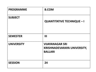
- 1. PROGRAMME B.COM SUBJECT QUANTITATIVE TECHNIQUE – I SEMESTER III UNIVERSITY VIJAYANAGAR SRI KRISHNADEVARAYA UNIVERSITY, BALLARI SESSION 24
- 2. RECAP • Graphical Representation, Meaning, Graph V/S Diagrams, General Rules of Graph
- 3. LEARNING OBJECTIVES • After Studying this unit, the students able to know how to present data Graphically using Histogram, Frequency Polygon and Curve, and Pie charts and working out cumulative frequency
- 4. LEARNING OUTCOMES • Students will be able to analyze and interpret with in the Contexts they are written in Diagrams and to present data Graphically using Histogram, Frequency Polygon and Curve, and Pie charts
- 5. SESSION - 23 • Construction of Graphs ( Histogram, Frequency Polygon and Curve) Problems---------------01
- 6. Construction of Graphs • Types of Graphs Histogram Frequency polygon Frequency curve Ogives or Cumulative frequency curve HISTOGRAM; A histogram is an attached bar chart or graph displaying the distribution of a frequency distribution in visual form. Take classes along the X-axis and the frequencies along the Y-axis. Corresponding to each class interval, a vertical bar is drawn whose height is proportional to the class frequency.
- 7. CONTD We cannot construct a histogram for distribution with open-ended classes. The histogram is also quite misleading, if the distribution has unequal intervals. PROBLEM 01 The following table shows the time taken (in minutes) by 100 students to travel to school on a particular day. Draw Histogram.
- 8. CONTD
- 9. CONTD • FREQUENCY POLYGON Frequency polygon is drawn after drawing histogram for a given frequency distribution. The area covered under the polygon is equal to the area of the histogram. Vertices of the polygon represent the class frequencies. Frequency polygon helps to determine the classes with higher frequencies. PROBLEM 02. A firm reported that its Net Worth in the years 2011-2016 are as follows. Draw frequency polygon
- 10. CONTD
- 11. CONTD • FREQUENCY CURVE Frequency curve is a smooth and free-hand curve drawn to represent a frequency distribution. Frequency curve is drawn by smoothing the vertices of the frequency polygon. Frequency curve provides better understanding about the properties of the data than frequency polygon and histogram.
- 12. CONTD PROBLEM 03 The ages of group of pensioners are given in the table below. Draw the Frequency curve to the following data.
- 13. CONTD
- 14. SUMMARY As we already discussed and learnt today on Diagrammatic and Graphical Representation as below • Construction of Graphs ( Histogram, Frequency Polygon and Curve) Problems---------------01
- 15. MCQs 1 . Histogram can be drawn only for: (a) Discrete frequency distribution (b) Continuous frequency distribution (c) Cumulative frequency distribution (d) Relative frequency distribution 2. Histogram is a graph of: (a) Frequency distribution (b) Time series (c) Qualitative data (d) Ogive
- 16. MCQs 3 . When successive mid-points in a histogram are connected by straight lines, the graph is called a: (a) Histogram (b) Ogive (c) Frequency curve (d) Frequency polygon 4. A frequency polygon is a closed figure which is: (a) One sided (b) Two sided (c) Three sided (d) Many sided
- 17. MCQs 5 . Frequency polygon can be drawn with the help of: (a) Historigram (b) Histogram (c) Circle (d) Percentage
- 18. CONTD ANSWERS 1. B 2. A 3. D 4. D 5. B
- 19. REFERENCES • S.P. Gupta, Sultan Chand and Sons Publications, 2017 • S. C. Gupta, Himalaya Publishing House, Fundamentals of Statistics, 2018 • R.S.N Pillai and Bagavathi, S.Chand publications, 2010
- 20. THANK YOU