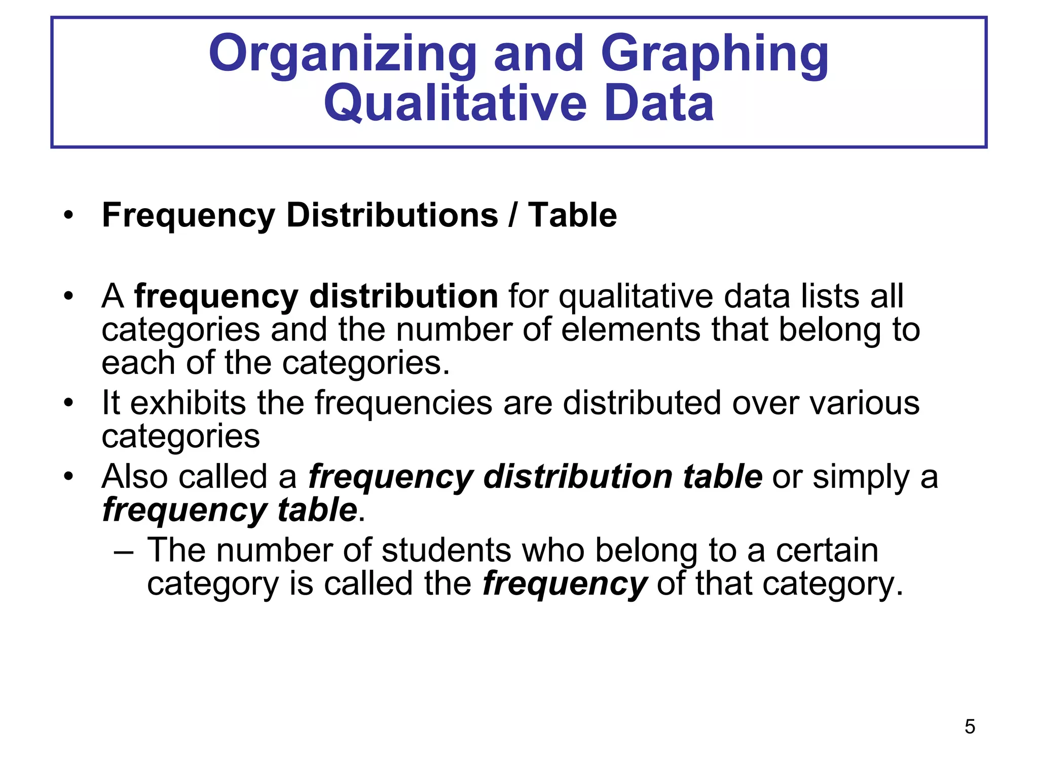
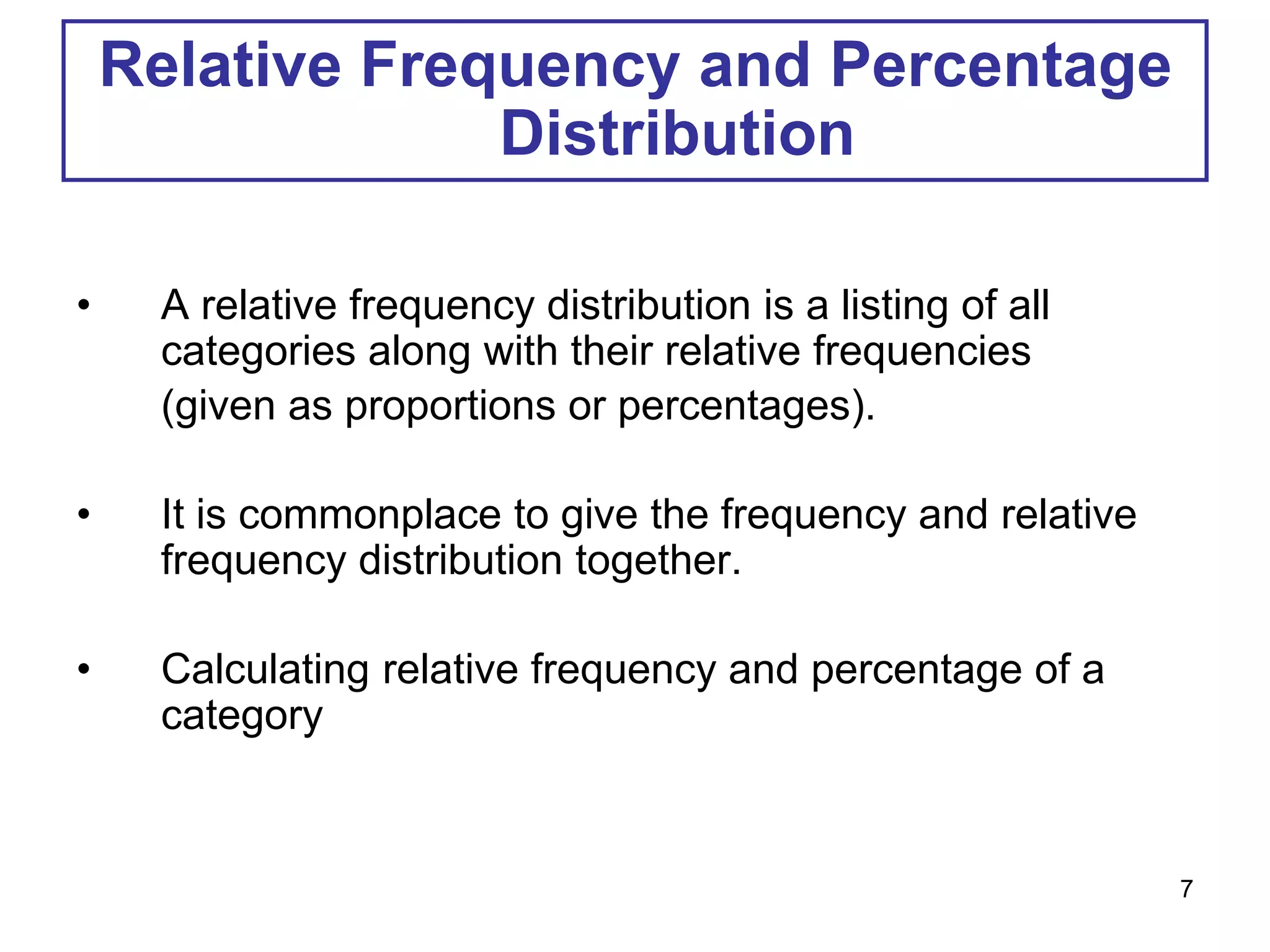
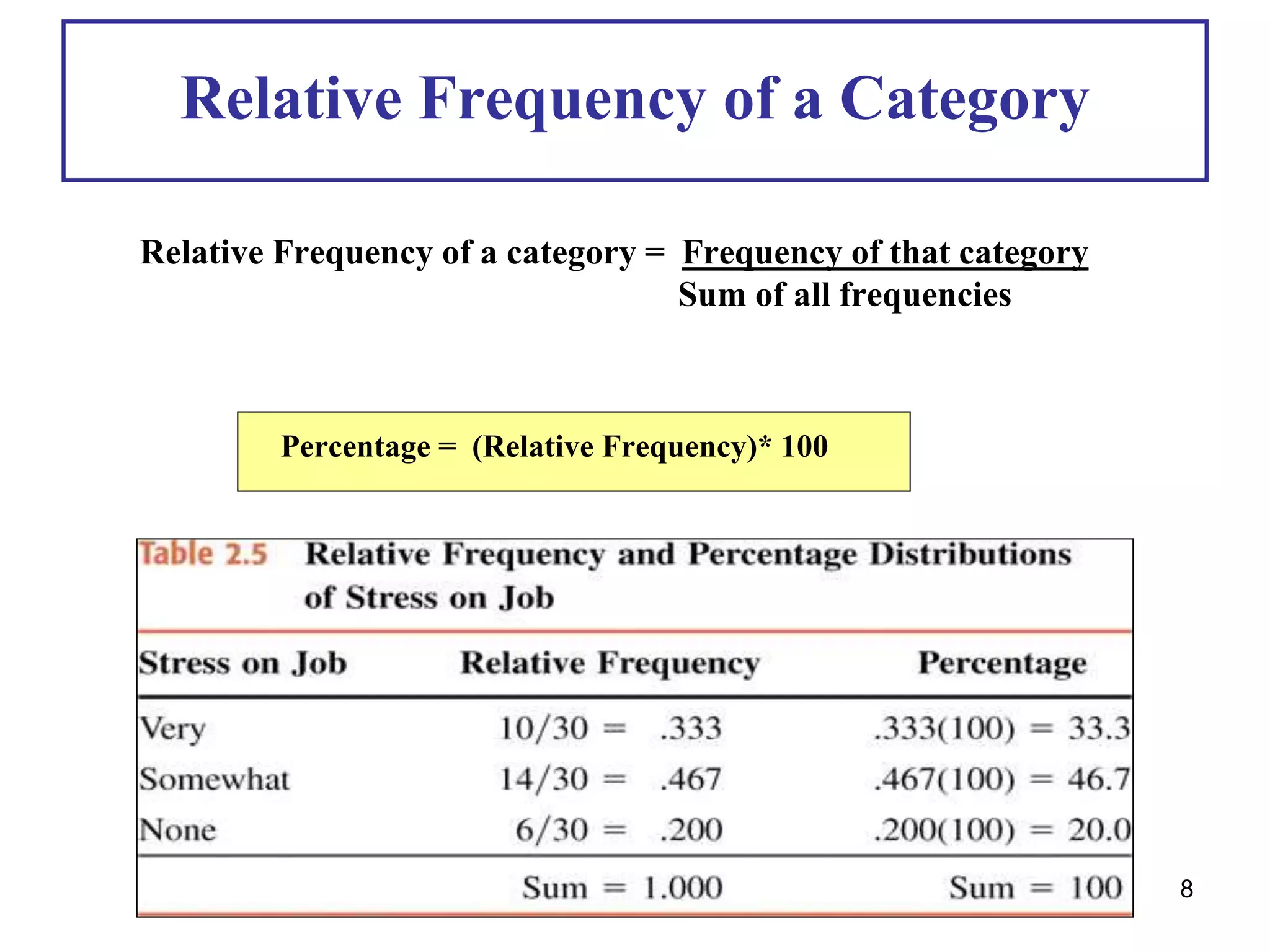
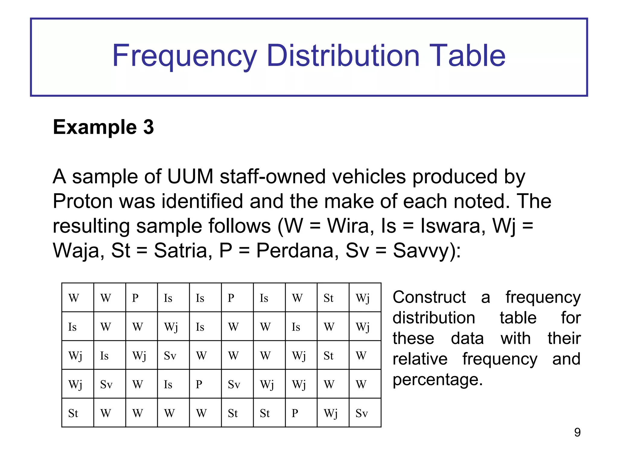
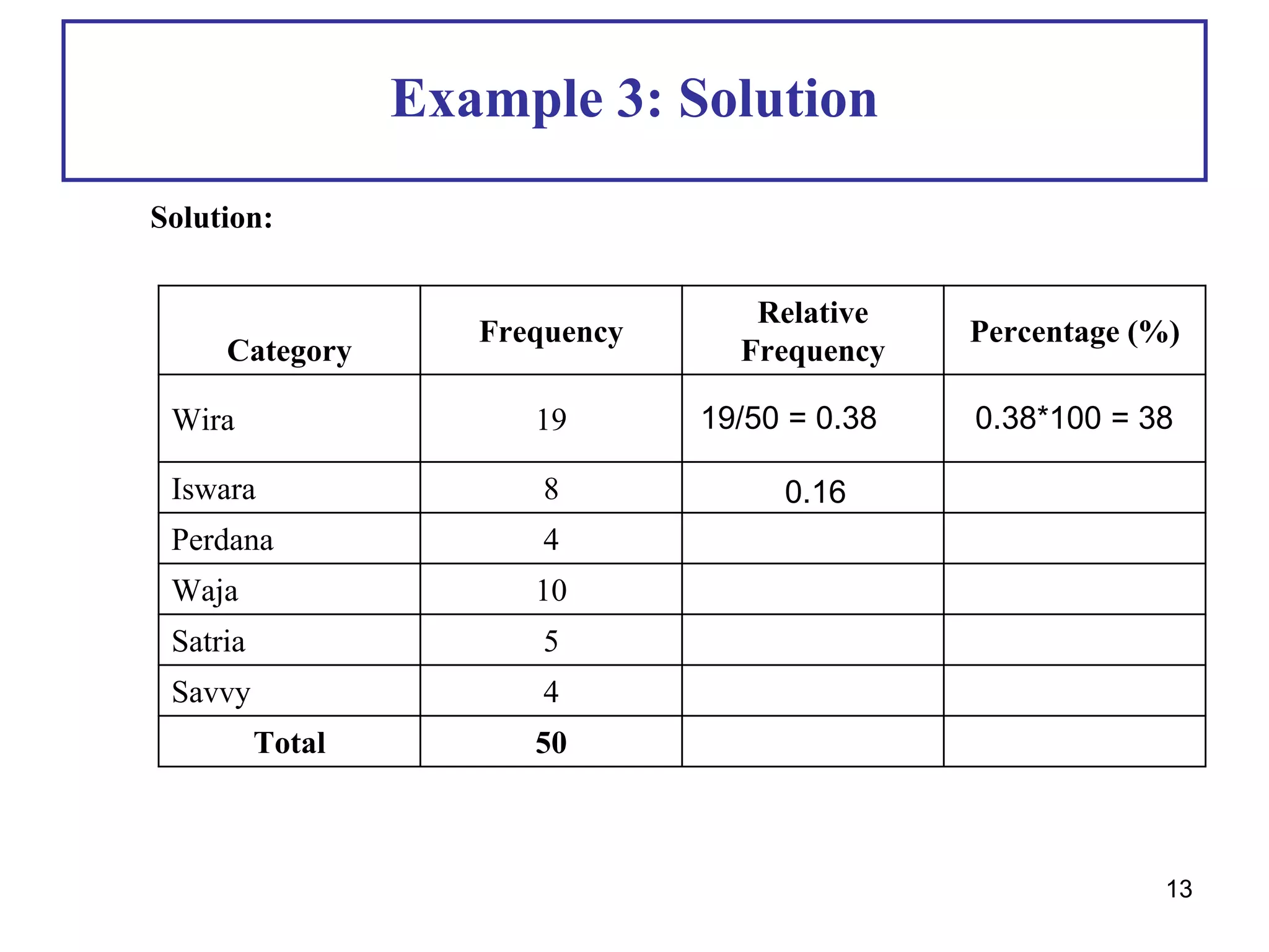
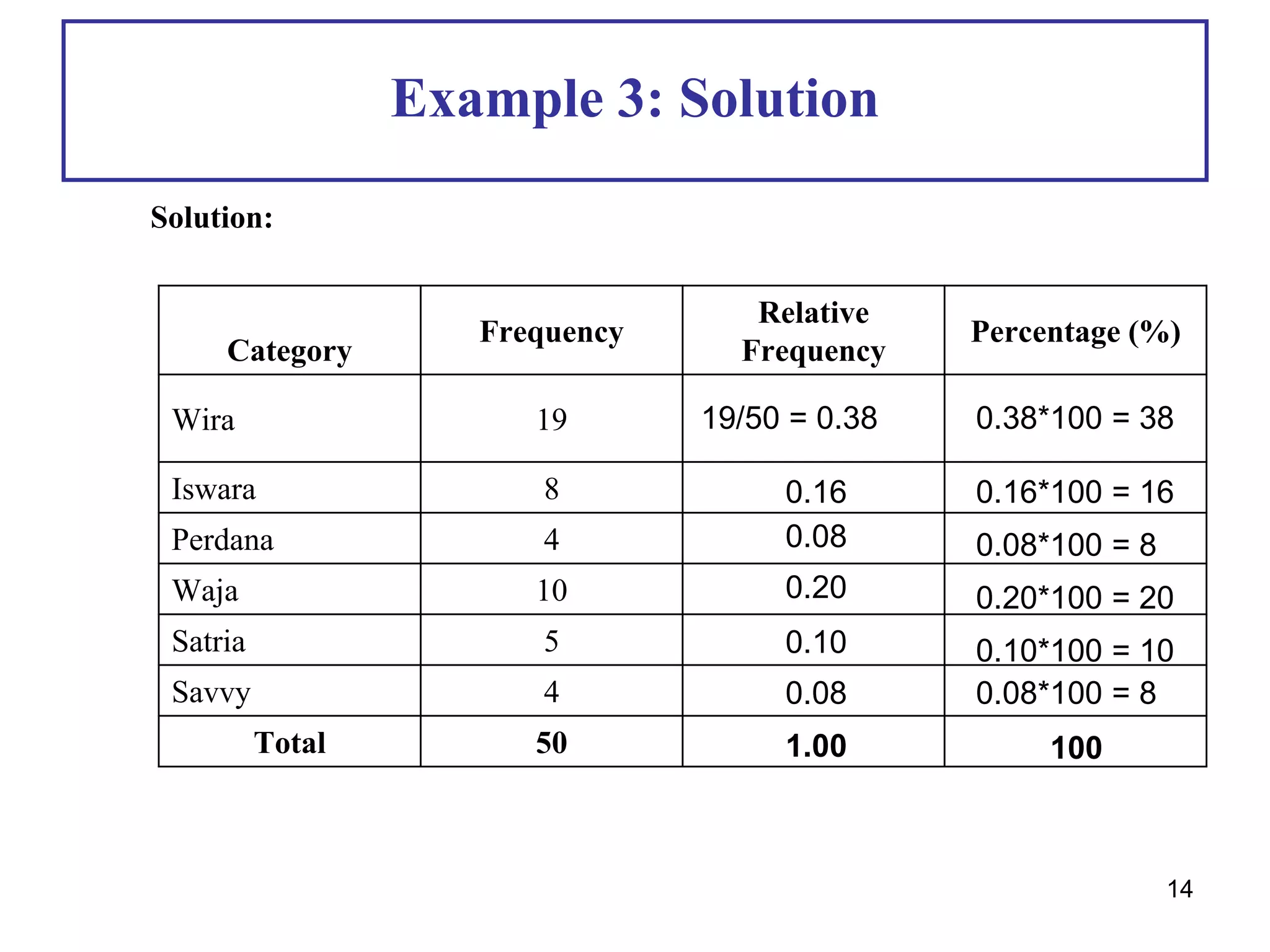
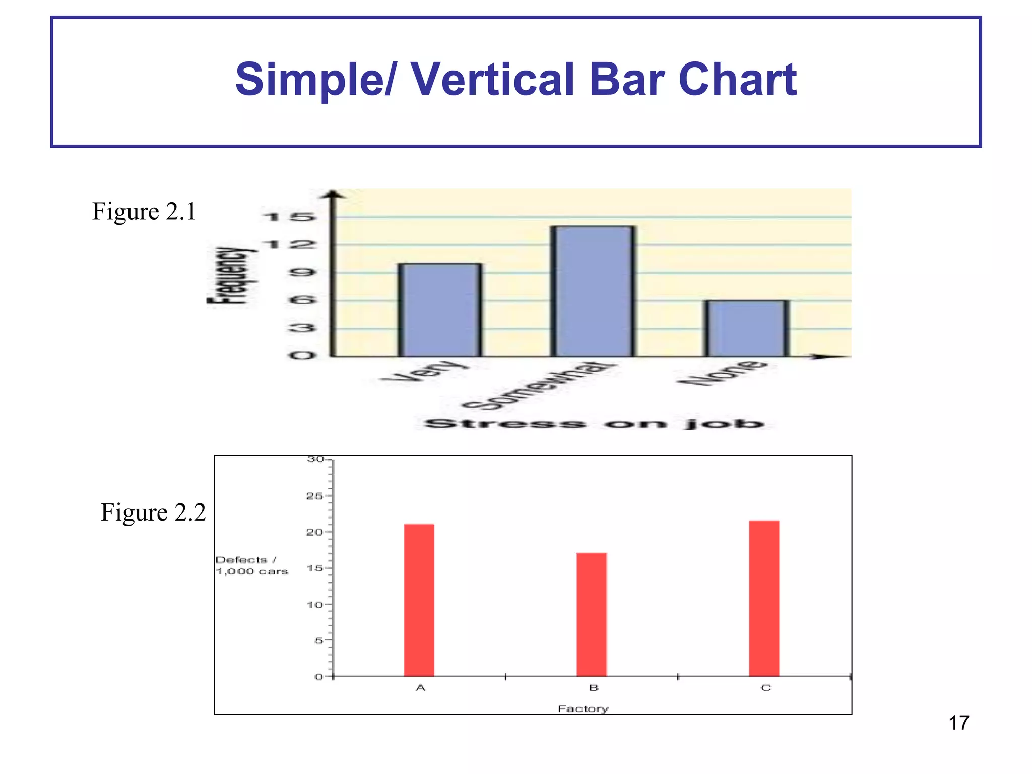
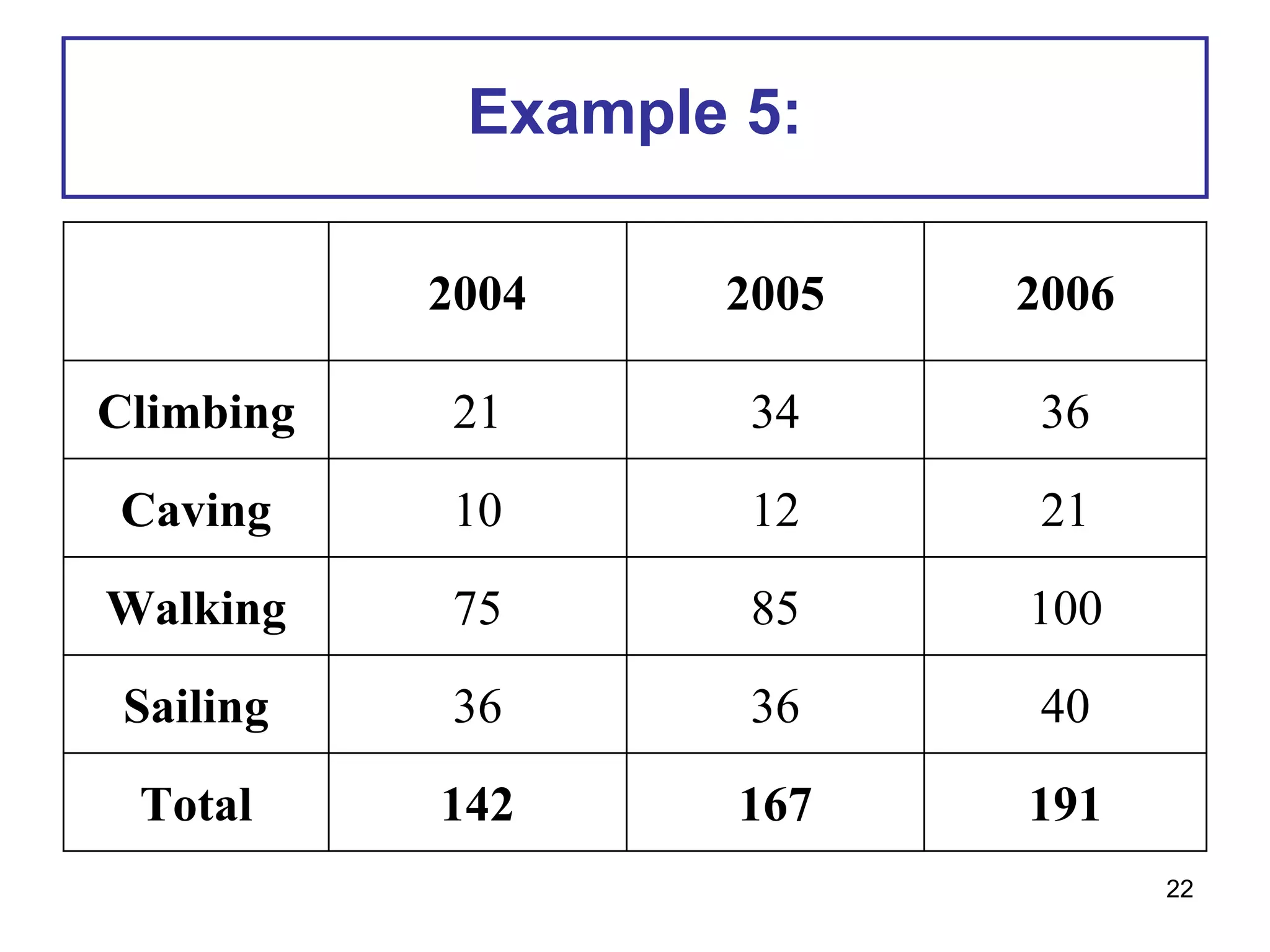
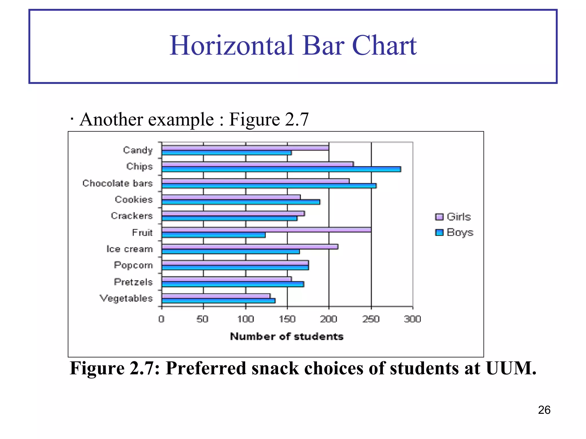
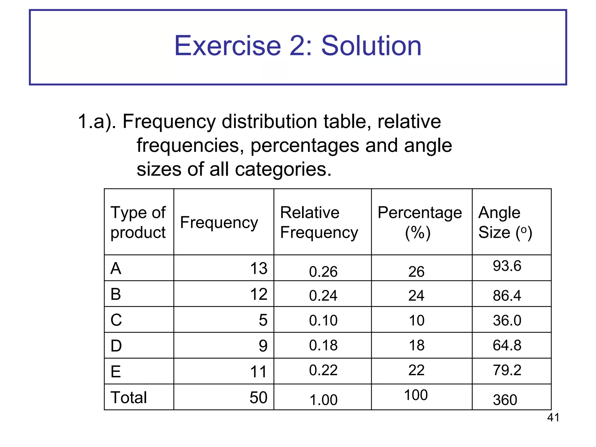
The document describes descriptive statistics and methods for presenting qualitative and quantitative data. It discusses frequency distributions, relative frequencies, percentages and graphs including bar charts, pie charts, and line graphs. Examples show how to construct these graphs and calculate values for datasets. Exercises provide practice creating frequency tables, determining relative frequencies and percentages, and representing data using pie charts.
This document provides an introduction to descriptive statistics. It discusses organizing and presenting both qualitative and quantitative data. For qualitative data, it describes frequency distribution tables, relative frequencies, percentages, and graphs like bar charts and pie charts. For quantitative data, it covers stem-and-leaf displays, frequency distributions, class widths and midpoints, relative frequencies and percentages. It also discusses histograms for presenting grouped quantitative data. Examples are provided to illustrate these concepts and techniques.
This chapter discusses descriptive statistics including organizing and graphing qualitative and quantitative data, measures of central tendency, and measures of dispersion. It covers frequency distributions, histograms, polygons, measures of central tendency (mean, median, mode), measures of dispersion (range, variance, standard deviation), skewness, and cumulative frequency distributions. The objectives are to describe and interpret graphical displays of data, compute various statistical measures, and identify shapes of distributions.
This document discusses various methods of graphically representing data, including bar diagrams, pie charts, histograms, and line graphs. It describes the construction and purposes of simple bar diagrams, multiple bar diagrams, compound bar diagrams, pie charts, and histograms. The document emphasizes that graphical representations are important for conveying insights from data more effectively than tables alone and for understanding patterns.
1. The document discusses various methods for summarizing categorical and quantitative data through tables and graphs, including frequency distributions, relative frequency distributions, bar charts, pie charts, dot plots, histograms, and ogives.
2. An example using data on customer ratings from a hotel illustrates frequency distributions and pie charts.
3. Another example using costs of auto parts demonstrates frequency distributions, histograms, and ogives.
Frequency Tables, Frequency Distributions, and Graphic PresentationConflagratioNal Jahid
This document provides an overview of key concepts for describing data through frequency tables, distributions, and graphs. It defines important terms like frequency table, distribution, class, interval and discusses how to organize both qualitative and quantitative data. Guidelines for data collection are provided. Examples are given to demonstrate how to construct frequency tables and distributions and convert them to relative frequencies. Finally, different types of graphs for presenting frequency distributions are described, including histograms, polygons and cumulative distributions.
Please Subscribe to this Channel for more solutions and lectures
http://www.youtube.com/onlineteaching
Chapter 2: Exploring Data with Tables and Graphs
2.3: Graphs that Enlighten and Graphs that Deceive
Summarizing Data : Listing and Grouping pdfJustynOwen
Introduction
Descriptive Statistics describe basic features of the data gathered from an experimental study in various ways.
They provide simple summaries about the sample via graphs and numbers, mainly measures of center and variation.
Together with graphics analysis (histograms, bar plots, pie-charts), they are the cornerstone of quantitative data analysis.
Tables (frequency distributions, stem-and-leaf plots, …) that summarize the data.
Graphical representations of the data (histograms, bar plots, pie-charts).
Summary statistics (numbers) which summarize the data
Graphs, charts, and tables ppt @ bec domsBabasab Patil
This document discusses various methods for organizing and presenting quantitative data, including frequency distributions, histograms, stem-and-leaf diagrams, pie charts, bar charts, line charts, scatter plots, and strategies for grouping continuous data into classes. Key topics covered include constructing frequency distributions, interpreting relative frequencies, guidelines for determining class widths and intervals, and using graphs and charts to visualize categorical and multivariate data.
This document discusses organizing and presenting data through descriptive statistics. It describes various types of descriptive statistics including measures to condense data like frequency distributions and graphic presentations. It then provides examples and steps for creating frequency distribution tables and different types of graphs like bar charts, histograms, line graphs, scatterplots and pie charts to summarize both qualitative and quantitative data.
This document discusses methods for organizing and presenting qualitative and quantitative data using frequency tables, charts, and graphs. It covers:
1. Creating frequency tables to organize qualitative and quantitative data, and presenting qualitative data as bar charts or pie charts.
2. Constructing frequency distributions to organize quantitative data into class intervals and determining class frequencies, and presenting quantitative data using histograms, frequency polygons, and cumulative frequency polygons.
3. An example of creating a frequency table and histogram based on sales price data from 80 vehicles to compare typical selling prices on dealer lots.
This document discusses methods for organizing and presenting qualitative and quantitative data, including:
1. Organizing qualitative data into frequency tables and presenting them as bar charts or pie charts.
2. Organizing quantitative data into frequency distributions by grouping data into classes and showing the number of observations in each class. Frequency distributions can be presented as histograms, frequency polygons, or cumulative frequency distributions.
3. An example is provided of constructing a frequency distribution table by determining the number of classes, class interval, class limits, and tallying data into classes using vehicle selling prices. Relative frequency distributions are also discussed.
The document discusses different methods of presenting data, including textual, tabular, and diagrammatic/graphical presentation. There are three main types of diagrams: geometric diagrams like bar charts and pie charts; frequency diagrams which include histograms, frequency polygons, and frequency curves; and time series graphs. Each method has advantages for presenting certain types of data clearly and effectively.
The document provides information on methods for summarizing qualitative and quantitative data through tables, graphs, and exploratory data analysis techniques. Key methods discussed include frequency distributions, relative frequency distributions, bar graphs, pie charts, histograms, cumulative distributions, ogives, stem-and-leaf displays, and exploratory data analysis techniques. Worked examples using guest rating and auto repair cost data illustrate how to construct and interpret these various summarization methods.
This document discusses graphs that can effectively and objectively summarize data versus graphs that can potentially mislead or deceive the viewer. Effective graphs discussed include dot plots, stem-and-leaf plots, time-series graphs, bar graphs, Pareto charts, pie charts, histograms, frequency polygons and ogives. Potentially deceptive graphs discussed are those that do not start the vertical axis at zero, exaggerating differences, and pictographs that depict one-dimensional data with multi-dimensional objects.
The document discusses methods for organizing and presenting both qualitative and quantitative data, including frequency tables, bar charts, pie charts, and different types of frequency distributions. It provides examples of how to construct a frequency table by determining the number of classes, class intervals, and class limits based on a set of data. It also describes how to create histograms, frequency polygons, and cumulative frequency distributions to graphically display a frequency distribution and highlights key terms such as class frequency, class interval, and relative frequency.
Control charts are statistical tools used to monitor processes and distinguish between common and special cause variations. They graphically display process stability over time and can provide early warnings if a process becomes out of control. The X-bar and R chart is used for variables data with subgroup sizes of 2-15. It involves calculating the mean and range for each subgroup, then determining control limits based on the grand mean and average range. Patterns outside the control limits or showing trends over time indicate the process may need investigation.
This document defines variables and different types of variables. It explains that a variable is something that varies or can be manipulated or measured for research purposes. Variables can be dependent or independent. Dependent variables are measured in relation to independent variables, which are intentionally manipulated. Examples of different types of graphs like bar graphs, pie charts and surface graphs are provided, along with rules for plotting graphs and sample problems involving constructing tables of data and plotting graphs.
This document contains slides summarizing concepts for summarizing qualitative and quantitative data. For qualitative data, it discusses frequency distributions, relative frequency distributions, bar graphs, and pie charts. For quantitative data, it discusses frequency distributions, histograms, measures of central tendency including mean, median, and mode, and measures of variability. Examples are provided to illustrate these concepts using data on guest ratings at a hotel and costs of car repairs.
This document discusses various methods for summarizing and exploring qualitative and quantitative data through tabular and graphical techniques, including frequency distributions, relative frequency distributions, bar graphs, pie charts, histograms, scatter plots, and cross-tabulations. It provides examples and explanations of how to construct and interpret these summaries and graphs using sample customer satisfaction and automobile repair data. The goal is to gain insights about relationships within the data that are not evident from just looking at the original values.
Present the data using various diagram and graphs
Simple Bar Diagram, Multiple Bar Diagram, Compound/ Subdivided Bar Diagram, Proportional Bar Diagram,Pie-chart
Pictogram,Line Diagram, Population Pyramid.
This document provides examples and explanations of various graphical methods for describing data, including frequency distributions, bar charts, pie charts, stem-and-leaf diagrams, histograms, and cumulative relative frequency plots. It demonstrates how to construct these graphs using sample data on student weights, grades, ages, and other examples. The goal is to help readers understand different ways to visually represent data distributions and patterns.
Graphs are used to visually represent data and relationships between variables. There are various types of graphs that can be used for different purposes. Histograms represent the distribution of continuous variables. Bar graphs display the distribution of categorical variables or allow for comparisons between categories. Line graphs show trends and patterns over time. Pie charts summarize categorical data as percentages of a whole. Cubic graphs refer to graphs where all vertices have a degree of three. Response surface plots visualize the relationship between multiple independent variables and a response variable.
It's about statistical methods.
Data analysis,Grouped-Ungrouped data,Mean,Median,Mode,Percentile,Standard Deviation,Variance,Frequency Distribution Graphs,Corelation
This chapter discusses how to organize and present both qualitative and quantitative data using frequency tables, bar charts, pie charts, histograms, frequency polygons, and cumulative frequency distributions. It provides examples of how to construct frequency tables by determining the number of classes, class width, and class limits. It also explains how to convert frequency distributions to relative frequency distributions and how to represent the distributions graphically.
This is a book of probability and statisticsThis is a book of probability and statisticsThis is a book of probability and statisticsThis is a book of probability and statistics
This chapter discusses regression models, including simple and multiple linear regression. It covers developing regression equations from sample data, measuring the fit of regression models, and assumptions of regression analysis. Key aspects covered include using scatter plots to examine relationships between variables, calculating the slope, intercept, coefficient of determination, and correlation coefficient, and performing hypothesis tests to determine if regression models are statistically significant. The chapter objectives are to help students understand and appropriately apply simple, multiple, and nonlinear regression techniques.
This document provides an overview of common quantitative data summarization techniques taught in a statistics course, including histograms, polygons, stem-and-leaf plots, and ogives. Histograms and polygons are used to graphically summarize frequency distributions through bar charts and line graphs. Stem-and-leaf plots organize raw data to show the shape of a distribution. Ogives graph cumulative relative frequencies to illustrate the proportion of data values below certain points. Examples are provided and steps are outlined for constructing each type of graphical summary.
This presentation includes basic of PCOS their pathology and treatment and also Ayurveda correlation of PCOS and Ayurvedic line of treatment mentioned in classics.
Strategies for Effective Upskilling is a presentation by Chinwendu Peace in a Your Skill Boost Masterclass organisation by the Excellence Foundation for South Sudan on 08th and 09th June 2024 from 1 PM to 3 PM on each day.
This slide is special for master students (MIBS & MIFB) in UUM. Also useful for readers who are interested in the topic of contemporary Islamic banking.
Introduction to AI for Nonprofits with Tapp NetworkTechSoup
Dive into the world of AI! Experts Jon Hill and Tareq Monaur will guide you through AI's role in enhancing nonprofit websites and basic marketing strategies, making it easy to understand and apply.
How to Build a Module in Odoo 17 Using the Scaffold MethodCeline George
Odoo provides an option for creating a module by using a single line command. By using this command the user can make a whole structure of a module. It is very easy for a beginner to make a module. There is no need to make each file manually. This slide will show how to create a module using the scaffold method.
How to Fix the Import Error in the Odoo 17Celine George
An import error occurs when a program fails to import a module or library, disrupting its execution. In languages like Python, this issue arises when the specified module cannot be found or accessed, hindering the program's functionality. Resolving import errors is crucial for maintaining smooth software operation and uninterrupted development processes.
A Strategic Approach: GenAI in EducationPeter Windle
Artificial Intelligence (AI) technologies such as Generative AI, Image Generators and Large Language Models have had a dramatic impact on teaching, learning and assessment over the past 18 months. The most immediate threat AI posed was to Academic Integrity with Higher Education Institutes (HEIs) focusing their efforts on combating the use of GenAI in assessment. Guidelines were developed for staff and students, policies put in place too. Innovative educators have forged paths in the use of Generative AI for teaching, learning and assessments leading to pockets of transformation springing up across HEIs, often with little or no top-down guidance, support or direction.
This Gasta posits a strategic approach to integrating AI into HEIs to prepare staff, students and the curriculum for an evolving world and workplace. We will highlight the advantages of working with these technologies beyond the realm of teaching, learning and assessment by considering prompt engineering skills, industry impact, curriculum changes, and the need for staff upskilling. In contrast, not engaging strategically with Generative AI poses risks, including falling behind peers, missed opportunities and failing to ensure our graduates remain employable. The rapid evolution of AI technologies necessitates a proactive and strategic approach if we are to remain relevant.
How to Manage Your Lost Opportunities in Odoo 17 CRMCeline George
Odoo 17 CRM allows us to track why we lose sales opportunities with "Lost Reasons." This helps analyze our sales process and identify areas for improvement. Here's how to configure lost reasons in Odoo 17 CRM
How to Add Chatter in the odoo 17 ERP ModuleCeline George
In Odoo, the chatter is like a chat tool that helps you work together on records. You can leave notes and track things, making it easier to talk with your team and partners. Inside chatter, all communication history, activity, and changes will be displayed.
বাংলাদেশের অর্থনৈতিক সমীক্ষা ২০২৪ [Bangladesh Economic Review 2024 Bangla.pdf] কম্পিউটার , ট্যাব ও স্মার্ট ফোন ভার্সন সহ সম্পূর্ণ বাংলা ই-বুক বা pdf বই " সুচিপত্র ...বুকমার্ক মেনু 🔖 ও হাইপার লিংক মেনু 📝👆 যুক্ত ..
আমাদের সবার জন্য খুব খুব গুরুত্বপূর্ণ একটি বই ..বিসিএস, ব্যাংক, ইউনিভার্সিটি ভর্তি ও যে কোন প্রতিযোগিতা মূলক পরীক্ষার জন্য এর খুব ইম্পরট্যান্ট একটি বিষয় ...তাছাড়া বাংলাদেশের সাম্প্রতিক যে কোন ডাটা বা তথ্য এই বইতে পাবেন ...
তাই একজন নাগরিক হিসাবে এই তথ্য গুলো আপনার জানা প্রয়োজন ...।
বিসিএস ও ব্যাংক এর লিখিত পরীক্ষা ...+এছাড়া মাধ্যমিক ও উচ্চমাধ্যমিকের স্টুডেন্টদের জন্য অনেক কাজে আসবে ...
ISO/IEC 27001, ISO/IEC 42001, and GDPR: Best Practices for Implementation and...PECB
Denis is a dynamic and results-driven Chief Information Officer (CIO) with a distinguished career spanning information systems analysis and technical project management. With a proven track record of spearheading the design and delivery of cutting-edge Information Management solutions, he has consistently elevated business operations, streamlined reporting functions, and maximized process efficiency.
Certified as an ISO/IEC 27001: Information Security Management Systems (ISMS) Lead Implementer, Data Protection Officer, and Cyber Risks Analyst, Denis brings a heightened focus on data security, privacy, and cyber resilience to every endeavor.
His expertise extends across a diverse spectrum of reporting, database, and web development applications, underpinned by an exceptional grasp of data storage and virtualization technologies. His proficiency in application testing, database administration, and data cleansing ensures seamless execution of complex projects.
What sets Denis apart is his comprehensive understanding of Business and Systems Analysis technologies, honed through involvement in all phases of the Software Development Lifecycle (SDLC). From meticulous requirements gathering to precise analysis, innovative design, rigorous development, thorough testing, and successful implementation, he has consistently delivered exceptional results.
Throughout his career, he has taken on multifaceted roles, from leading technical project management teams to owning solutions that drive operational excellence. His conscientious and proactive approach is unwavering, whether he is working independently or collaboratively within a team. His ability to connect with colleagues on a personal level underscores his commitment to fostering a harmonious and productive workplace environment.
Date: May 29, 2024
Tags: Information Security, ISO/IEC 27001, ISO/IEC 42001, Artificial Intelligence, GDPR
-------------------------------------------------------------------------------
Find out more about ISO training and certification services
Training: ISO/IEC 27001 Information Security Management System - EN | PECB
ISO/IEC 42001 Artificial Intelligence Management System - EN | PECB
General Data Protection Regulation (GDPR) - Training Courses - EN | PECB
Webinars: https://pecb.com/webinars
Article: https://pecb.com/article
-------------------------------------------------------------------------------
For more information about PECB:
Website: https://pecb.com/
LinkedIn: https://www.linkedin.com/company/pecb/
Facebook: https://www.facebook.com/PECBInternational/
Slideshare: http://www.slideshare.net/PECBCERTIFICATION
Assessment and Planning in Educational technology.pptxKavitha Krishnan
In an education system, it is understood that assessment is only for the students, but on the other hand, the Assessment of teachers is also an important aspect of the education system that ensures teachers are providing high-quality instruction to students. The assessment process can be used to provide feedback and support for professional development, to inform decisions about teacher retention or promotion, or to evaluate teacher effectiveness for accountability purposes.
Physiology and chemistry of skin and pigmentation, hairs, scalp, lips and nail, Cleansing cream, Lotions, Face powders, Face packs, Lipsticks, Bath products, soaps and baby product,
Preparation and standardization of the following : Tonic, Bleaches, Dentifrices and Mouth washes & Tooth Pastes, Cosmetics for Nails.
Executive Directors Chat Leveraging AI for Diversity, Equity, and InclusionTechSoup
Let’s explore the intersection of technology and equity in the final session of our DEI series. Discover how AI tools, like ChatGPT, can be used to support and enhance your nonprofit's DEI initiatives. Participants will gain insights into practical AI applications and get tips for leveraging technology to advance their DEI goals.
2. 2.0 DESCRIPTIVE DATA
2.1.Presentation of qualitative data: tables, bar chart (simple,
component and multiple), pie chart and line graph; benefits and
interpretation.
2.2.Presentation of quantitative data: stem and leaf display, frequency
table, histogram, polygon, frequency curve, ogive and box plot; benefits
and interpretation.
2.3.Central tendency measurement: mean, mode and median;
weighted mean.
2.4.Dispersion measurement: range, quartile, percentile, interquartile
range, mean deviation, variance, standard deviation, coefficient of
variation.
2.5.Mean, variance and standard deviation for grouped data.
2.6.Measure of skewness and kurtosis: Pearson’ coefficient of
skewness.
2
3. Introduction
Raw data - Data recorded in the sequence in which
they were originally collected,
before being processed or ranked.
Array data - Raw data that are arranged in
ascending or descending order.
3
5. Organizing and Graphing
Qualitative Data
• Frequency Distributions / Table
• A frequency distribution for qualitative data lists all
categories and the number of elements that belong to
each of the categories.
• It exhibits the frequencies are distributed over various
categories
• Also called a frequency distribution table or simply a
frequency table.
– The number of students who belong to a certain
category is called the frequency of that category.
5
7. Relative Frequency and Percentage
Distribution
• A relative frequency distribution is a listing of all
categories along with their relative frequencies
(given as proportions or percentages).
• It is commonplace to give the frequency and relative
frequency distribution together.
• Calculating relative frequency and percentage of a
category
7
8. Relative Frequency of a Category
Relative Frequency of a category = Frequency of that category
Sum of all frequencies
Percentage = (Relative Frequency)* 100
8
SQQS1013 W2 L3
9. Frequency Distribution Table
W W P Is Is P Is W St Wj
Is W W Wj Is W W Is W Wj
Wj Is Wj Sv W W W Wj St W
Wj Sv W Is P Sv Wj Wj W W
St W W W W St St P Wj Sv
Example 3
A sample of UUM staff-owned vehicles produced by
Proton was identified and the make of each noted. The
resulting sample follows (W = Wira, Is = Iswara, Wj =
Waja, St = Satria, P = Perdana, Sv = Savvy):
Construct a frequency
distribution table for
these data with their
relative frequency and
percentage.
9
15. Graphical Presentation of
Qualitative Data
• Bar Graphs
• A graph made of bars whose heights represent the frequencies of
respective categories.
• Such a graph is most helpful when you have many categories to
represent.
• Notice that a gap is inserted between each of the bars.
• It has
• => simple/ vertical bar chart
• => horizontal bar chart
• => component bar chart
• => multiple bar chart
15
16. Simple/ Vertical Bar Chart
• To construct a vertical bar chart, mark the various
categories on the horizontal axis and mark the
frequencies on the vertical axis
• Refer to Figure 2.1 and Figure 2.2,
16
18. Horizontal Bar Chart
• To construct a horizontal bar chart, mark the various
categories on the vertical axis and mark the frequencies
on the horizontal axis.
• Example 4: Refer Example 3.
18
20. Horizontal Bar Chart
∙ Another example of horizontal bar chart: Figure 2.4
Figure 2.4: Number of students at Diversity College
who are immigrants, by last country of
permanent residence.
20
21. Component Bar Chart
• To construct a component bar chart, all categories are
in one bar and each bar is divided into components.
• The height of components should be tally with the
representative frequencies.
• Example 5:
• Suppose we want to illustrate the information below,
representing the number of people participating in the
activities offered by an outdoor pursuits centre during
June of three consecutive years.
21
24. Multiple Bar Chart
• To construct a multiple bar chart, each bar that is
representative of any categories are gathered in groups.
• The height of the bar represents the frequencies of
categories.
• Useful for making comparisons (two or more values).
• Example 6: Refer example 5.
24
26. Horizontal Bar Chart
∙ Another example : Figure 2.7
Figure 2.7: Preferred snack choices of students at UUM.
26
27. Pie Chart
– A circle divided into portions that represent the relative
frequencies or percentages of a population or a
sample belonging to different categories.
– An alternative to the bar chart and useful for
summarizing a single categorical variable if there
are not too many categories.
– The chart makes it easy to compare relative sizes of
each class/category.
27
28. Pie Chart
– The whole pie represents the total sample or population. The
pie is divided into different portions that represent the different
categories.
– To construct a pie chart, we multiply 360 by the relative
frequency for each category to obtain the degree measure or
size of the angle for the corresponding categories.
– Example 7 (Table 2.6 and Figure 2.8):
28
32. Line Graph/Time Series Graph
• A graph represents data that occur over a specific
period time of time.
• Line graphs are more popular than all other graphs
combined because their visual characteristics reveal
data trends clearly and these graphs are easy to
create.
• When analyzing the graph, look for a trend or pattern
that occurs over the time period.
32
33. Line Graph/Time Series Graph
• Example is the line ascending (indicating an increase
over time) or descending (indicating a decrease over
time).
• Another thing to look for is the slope, or steepness, of
the line. A line that is steep over a specific time period
indicates a rapid increase or decrease over that period.
• Two data sets can be compared on the same graph
(called a compound time series graph) if two lines are
used.
• Data collected on the same element for the same
variable at different points in time or for different periods
of time are called time series data. 33
34. Line Graph/Time Series Graph
• A line graph is a visual comparison of how two
variables—shown on the x- and y-axes—are related or
vary with each other. It shows related information by
drawing a continuous line between all the points on a
grid.
• Line graphs compare two variables: one is plotted along
the x-axis (horizontal) and the other along the y-axis
(vertical).
• The y-axis in a line graph usually indicates quantity (e.g.,
RM, numbers of sales litres) or percentage, while the
horizontal x-axis often measures units of time. As a
result, the line graph is often viewed as a time series
graph
34
35. Time Series Graph
Example 9
A transit manager wishes to use the following data for a
presentation showing how Port Authority Transit
ridership has changed over the years. Draw a time series
graph for the data and summarize the findings.
Year
Ridership
(in millions)
1990
1991
1992
1993
1994
88.0
85.0
75.7
76.6
75.4
35
36. Example 9: Solution
Solution:
The graph shows a decline in ridership through 1992 and
then leveling off for the years 1993 and 1994.
36
37. Lets Exercise
Exercise 1
1.The following data show the method of payment by 16
customers in a supermarket checkout line. Here, C =
cash, CK = check, CC = credit card, D = debit and O =
other.
C CK CK C CC D O C
CK CC D CC C CK CK CC
a.Construct a frequency distribution table.
b.Calculate the relative frequencies and percentages for all
categories.
c.Draw a pie chart for the percentage distribution.
37
38. Exercise 1: Solution
1.a). Frequency distribution table, relative
frequencies, percentages and angle sizes of all
categories.
Method of
payment
Frequency, f
Relative
frequency
Percentage
(%)
Angle
Size (o)
Cash
Check
Credit Card
Debit
Other
4
5
4
2
1
Total 16
0.2500
0.3125
0.2500
0.1250
0.0625
1
25.00
31.25
25.00
12.50
100
6.25
90
112.5
90
45
22.5
360
38
40. Exercise 2
Exercise 2:
The frequency distribution table represents the sale of
certain product in ZeeZee Company.
Each of the products was given the frequency of the
sales in certain period.
Find the relative frequency and the percentage of each
product.
Then, construct a pie chart using the information.
40
41. Exercise 2: Solution
1.a). Frequency distribution table, relative
frequencies, percentages and angle
sizes of all categories.
Type of
product
Frequency
Relative
Frequency
Percentage
(%)
Angle
Size (o)
A 13
B 12
C 5
D 9
E 11
Total 50
0.24
0.26
0.10
0.18
0.22
1.00
26
24
10
18
22
100
93.6
86.4
36.0
64.8
79.2
360
41