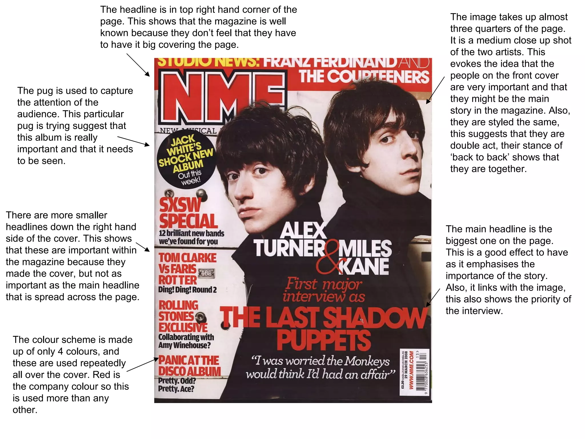
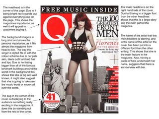
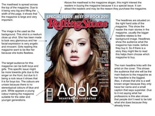
The document provides an analysis of the layout and design elements of two magazine covers. Key elements highlighted include the placement of the masthead, headlines of varying sizes to indicate importance of stories, images of artists that fill much of the cover and establish prominence, and color schemes that tie the elements together and connect to the publication brand. Facial expressions and poses are also described as aiming to present the featured artists in a certain light to appeal to readers.


