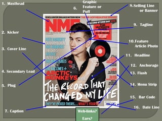
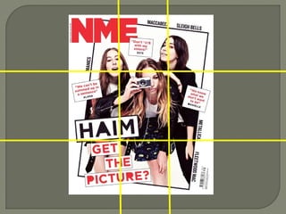
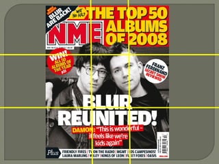
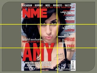
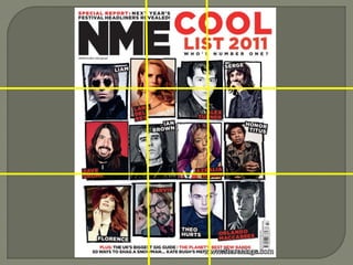
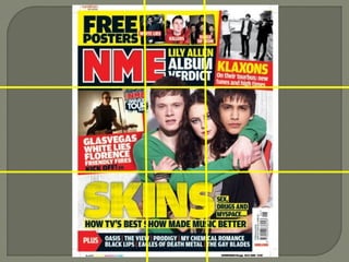
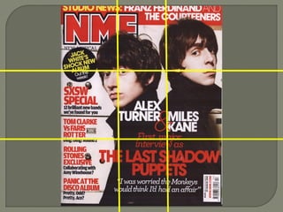
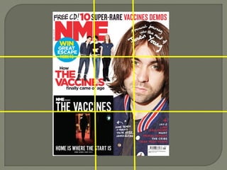
The document discusses the layout and design of magazine covers, using the music magazine NME as an example. It notes that NME typically uses a color scheme of red, yellow, white, and black. The masthead is usually red and prominently displayed. Captions and kickers typically use white for visibility. There are usually 3 fonts used - a bold font for the masthead and headlines, and a more decorative font for secondary lines. The cover image is key to conveying the magazine's style and feel of being carefree and different. Layouts sometimes follow conventions like the rule of thirds but often break conventions for uniqueness. The chaotic yet coordinated design is meant to emphasize the cover and convey the magazine's cool and