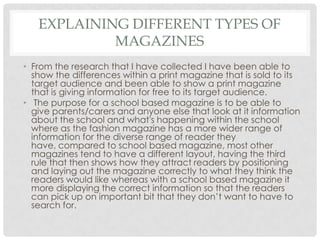
SlideShare a Scribd company logo
1 of 12
E M I L Y G A U N T
MAGAZINE RESEARCH
INTRODUCTION
• I have begun to look into a broad range of magazines, I am using
inductive research to look for a patterns throughout the magazine range,
for example:
• Common Conventions:
• The masthead
• The main image
• Heading
• Cover lines
• Barcode
• By looking at a broad range of magazines I have then analysed a fashion
magazine and a school based magazine I have shown how they are
different to each other with the convection and the way they are
produced for their target audience, I have also explained how most
general magazines like fashion magazines are sold for profit to their
target audience whereas school based magazines are not sold they are
purely for information to be given to their target audience.
RESEARCH
• Looking into different magazines there are patterns of
common conventions throughout here are some examples:
• Here are a couple of different magazines to show the
common conventions and how they are shown on a
magazine front cover.
• First is the fashion magazine, I have explained the different
conventions that are shown on the front cover but also
show, by using the centre, third left third and right third
etc, how they are laid out to then attract the reader.
• I have also deconstructed a school based magazine, I have
shown how they have laid it out to attract the reader but also
how they have displayed information effectively to then give
the audience a clearer reading of the school magazine as it is
only used on information rather than general magazines
which use profit as well.
The masthead is separated by the model on the front
cover however the name of the magazine still clearly
stands out and is recognisable for the client. The
masthead is located in the top third of the magazine
drawing in the eye when readers pick it up.
The plug here entices the
reader to want to read the
magazine because of what
they are offering . As the
main target market for this
magazine is women
advertising “win you whole
fall wardrobe” appeals to
women who may need a
new fall wardrobe and
could possibly win it for
free, so its hooking them in
with different offers or
competitions
The main image on this magazine
is used as a ploy to draw in readers
attention to buy the magazine its
purpose is to give the
representation of the genre of
magazine. Having this model on
the front gives the connotation
that this is a fashion magazines as
she is dressed up in relation to this
weeks ethos. Having this model on
the front of the magazine which is
a fashion magazine gives the
connotation that she is a fashion
model it becomes the selling point
for the magazine
The colour scheme for this
magazines is linking in with
the ELLE style, the
masthead is the
connotation of ELLE
because its in keeping with
logo of ELLE, the colours
that they have used
A common convention of a
magazine is to have cover
lines, cover lines are used to
show snippets of information
that is within the magazines or to
show different offers that the
magazine are advertising, as
you can see the cover lines on
this magazine are located most
commonly down the left and
right hand third of the
magazines, this gives room for
an image to be in the middle
but also catching the eye as
most people skim read across
the page.
The barcode is another common
convention of a magazine, this is
commonly displayed at the
bottom right third of the
magazine, this is then used for the
magazines to be purchased, most
magazine will have this
convention on however free
magazines sometimes don’t have
this.
The target audience for this
magazine would be a niche
market, this is because this
magazine targets women as
their audience, by appealing
to women they can offer
different diets that most
women swear by , they can
show what shirt goes with
which skirt so it gives them
something that women want
to read that they know will
have good content.
Adele is the artist on this front
cover of this music
magazine, she is a well known
artist worldwide, this would
drawn the attention of the
audience of Adele and
Billboard readers as she is
recognisable as a worldwide
star. Having a close up shot of
her face would attract the
reader in because her eye line
is the first thing that is seen
when looking at the
magazine, this is because her
eyes are in the centre third of
the magazine straight where
the eye first looks.
The main title of the film is “Billboard” even though Adele is
covering the middle part of the title it is still recognisable that it is a
billboard magazine, this is because the title stands out even
though there is a picture blocking it. Having the white writing on
the black background means that it stands out more, it also has
that highlight of colour within which gives it that edge as well.
The cover lines, which on this
magazine are down the
side, follow they typical
convections of a magazine. It
has typical cover lines set out
around the page in white
writing which stand out on the
darkened background. It also
has flowered outlines around
the writing which make the
page more appealing for the
reader.
Down the bottom left hand
corner of the magazine, there
is a barcode that is situated
next to the issue of the
magazine, the date of the
magazine, the cost and the
website that links to the
magazine, these are all
typical convections that work
with the front cover of the
magazine. As the barcode is
situated at the bottom it isn't
to overpowering on the cover
so doesn’t draw attention
away from the artist. It also
gives clear information that
the reader can look at but
not have to read to much
detail because its just quick
and precise information.
The colour scheme for this
magazine is predominantly
colourful however has the
darkened background which
means that the colours stand
out more, this also enhances
the picture to make her stand
out more. Also she is wearing
dark coloured clothes which
suggest that the magazine
what's to make her stand out
rather than what she is wearing
because it is more about who
she is rather than what she is
wearing. They have also made
sure that her eyes stand out on
the page, this is because they
want the reader to focus in on
her. They have done this by
making her eyes stand out on
the cover this means that when
the reader picks up the
magazine they will look straight
Adele.
Masthead-this shows what the
organisation is for in this case
it’s the school “Hampton”. It
gives a clear indication to who
produced it. Also because its in
the top third
Logo- this shows/advertises the
school towards the parents so
the recognise when they are
given the magazine, it also
advertises it to other parents as
well.
Main image- the main image on
here shows a school performance
of Les Miserables, this gives the
parents an incite into what kind of
performances they do at the school
and different types of arts they can
get involved in.
Les Miserables is a well know
musical, so having this on the front
of the school magazine gives the
school a more appealing and
creative aspect that will make the
school more well rounded and
interesting whereas if it was
something no one knew then
parent would be disinterested.
Using columns are a typical
convection of magazines, this
gives the magazines a better
look, cleaner and shaper cut.
It also makes it easier for the
reader to flow through the
article rather than be looking
for the start and end.
Using original images give a better
interpretation of what the magazine
is trying to convey, it makes the
reader more interested because
they become more appealing if
they can see photos and recognise
the children that were within the
play.
As this is a school magazine
there is no barcode situated
on the front of the cover, this is
because a school magazines
purpose is for giving
information only this means
that it doesn’t gain any profit
from the magazine, it just
informs parents and advertises
the school to others who may
see this magazine.
On the cover of this school magazine it shows
what will be in this issue this is listed as a column
down the side of the cover. This isn't typical for a
normal school magazine however this just may be
a small informant of what may be more detailed
inside .
The colour scheme for this school
magazine is mostly yellow, black and
grey suggests that as these are similar
colour to the logo then it suggest that
the school magazine would want to
keep in theme with the colours of the
logo so the reader wouldn’t be
confused if the was a completely
different colour scheme.
The logo at the top right hand
corner of the magazine, gives
continual advertisement for
the magazine Q. going across
the top of the contents page
of the magazine is the
heading of the page it gives
a clear banner with the date
of the magazine and then the
issue No. etc.
This gives clear indications
that this is the contents page
and makes sure that the
reader is reading a recent
magazine not an out of date
one.
The main image on the page is of a recognisable band
“The Courteeners“ this picture shows the band on top
of what seems to be a hill, this shows them as quite an
outdoors band. The main image takes up half of the
page which draws attention to the picture for the
reader. It shows that they are the main feature.
Down the left hand side of the
magazine, there is a column of
the articles/interveiws that are
within the magazine. Its in the
typical convection of a magazine
and has a features sub-heading
that informs the reader of where
to find the features are, it gives
the page numbers of the
magazine in red which make
them stand out on the page,
making it easier for the reader to
identify where each article is. It
also splits the contents page into
three parts, the features, every
month and review. The subtitles of
the “Q contents” and “Q review”
are both the same text and the
same font so they are consistent
with the theme and style of the
magazine. This will make the
reader feel like they can read
through the magazine with a flow
and it wont feel like everything is
all over the place.
The way the contents page is
laid out gives the whole page
enough space so that it
doesn’t feel to crowded on
the page. This makes it easier
for the reader to pick up
different page number and
the different articles that they
want to read without feeling
like they are all jumbled up at
the side of the page.
Having the numbers in red
and the “features” and
“every month” in red and
white suggest that the
magazine wants the reader to
be attracted to these
important parts of the
contents page.
The language used on his content
page where they used “you” and
“we” suggest that the magazine
want to draw them in and feel like
they are involved. It uses this
language to persuade them to buy
the magazine because it makes the
reader feel like they are reaching
out to them. Also the layout on the
page is very organised this means it
wouldn’t confuse any of the reader
when they are reading them.
Heading at the top of
the page to show the
title of the
magazine, the title will
always be at the top
because it draws the
reader in at first
glance, it would also
give continual
advertisement for the
product.
Having the sub heading
standing out as sort of a
headline for the reader
also the numbers going
down the side give a
clear indication as to
where the pages start so
its quick and easy for
the reader to navigate
to a certain part of the
magazine. Using the red
writing on the white
background makes the
writing stand out more
and gives the
connotation that the
magazine has a fiery
edge because of the
red on white which can
give the representation
that the magazine is
edgy and outgoing.
The photograph of the
model that is on the
contents page again gives
the magazine an edge
because of the way the
model is dressed, her hair
style is pulled back which
gives he a dramatic edge
to her appearance also the
bright colour in her outfit
makes her stand out on the
page more so it catches the
reader eye line when
turning on to the page, it
also includes a page
number overlaying on the
main image which would
be for the reader if they
wanted a specific
information about the
model e.g. what they wear
or about their makeup then
having the number of the
magazine of the magazine
which the model was on
they then could find it
straight away and gives a
brief incite in to what's on
the page.
This magazine contents
pages has the conventions
of a magazine because the
list of contents , its in simple
conventions of it being in
columns with a main
heading of the name of the
magazine with a main
image which is different to
the main image that is on
the front of the magazine.
Numbers on the side of the articles, this shows the typical
conventions of a contents page, it shows simple direction for the
reader from the contents page to the article that interests them
the most, they are also in a clear eye catching font which would
be easy and simple for the reader to read.
The list is coherent with the style of the magazine the writing
either in black light grey or pink which is in line with the colour
scheme.
The main image on this
double page spread is a
long shot of the “kids in
glass houses” this shot has
been taken by all of the
member of the band
jumping up in the air and
the shot being taken slowly
as to capture the detail
into the photo. As it is set
outside the picture looks
bright because of the
natural light, it brighten the
page up more and links in
with the theme of the
magazine.
The layout of the double page spread is very spaced out, it is also
organised so that when you look at the page you see the title of the
article, but also it means that the reader can get a jest of where to
start the article from. The start of the article is clearly from the bold
white A at the start of the text and there are different pull quotes that
are highlighted throughout the article.
All the band
members are dressed
in a casual way
which suggests that
the band is more
focused on creating
music and having fun
in their career rather
than being all
glammed up, this
would then suggest
that the band was
more materialistic.
This also makes it
easier for the reader
to actually relate
back to them rather
than see them in a
higher status. Using
this picture of the
whole band spread
across the page links
in with the typical
convections of a
magazine and this
makes it easier for the
reader rather than
having loads of
different pictures
spread out all over
the page.
The text on the page is
evenly sized, also the way
it goes around the image
of one of the band
members legs follows the
typical convections of
magazine. It makes it look
more appealing for the
reader. Having them at a
low angle shot means that
they seen in a higher status
because they are
essentially floating in the
air. It means that they are
looking down on the
reader whereas the reader
is looking up to them.
The article title gives
the reader an eye
catching incite in to
what the article is
about, it gives the
reader an added
question as to why
Hayley Williams is on
fire. The relation to fire
may then be towards
how well she is doing
in her career, it gives
the connotation that
she is very successful
at the moment hence
why she “is on fire”.
The article is laid out
in columns which
are a typical
convection of a
magazine double
page spread. As
shown the picture is
presented on the
right side of the
double page
spread and the
writing in the left
side of the page.
As Hayley Williams
is a well known
music artist this
draws the reader
in, it branches out
to that particular
niché audience
which Hayley
Williams is in. this
article would
appeal to the
niché market of
pop punk.
In the article
Hayley Williams
appearance is
very bright, she is
stood in front of a
white
background
which suggest
that the colour
scheme is very
bright and happy
this gives the
connotation that
they want to
portray the
magazine as a
happy theme.
The bold red O at the
start of
article, indicate as
beginning of where
the reader would
read the article from.
It put in a bold
red, not only to go
with the theme of the
magazine but to
attract the eye
towards the start of
the article because
the magazine wants
the reader to be
engaged by the
magazine.
The clothing that Hayley Williams
wear’s gives the connotation
that she is a young artist with a
knowledge of fashion, this is
shown with the floral bodice that
she is wearing it gives of a kind of
flirty sense, also the bracelets
that are on her wrist suggest she
uses those as a statement . Her
stance/ body language shows a
shocked stance which then
could suggest that she is blown
away by her progressions
through her career.
As the artist is
looking straight into
the camera it gives
direct address to
the reader, this
then suggest that
the article is
informing the
reading about this
artist and from the
main title suggest
her specific career
in the music
industry.
In this photograph of this
model, the photographer has put
the model in a relaxed way with
casual clothes this portrays the
model as student type girl all
natural like she would be on the
front of a teen magazine. The
lighting is very bright giving of a
sense that the model is happy
compared to the other photos.
Also because she is natural and
she comes across as innocent.
The photographer in this picture
had portrayed the same
girl, however her body posture is
different because its more of a
sexual stance with her dominant
shoulder which give the
impression that she has a come
and get it attitude , also the
colour red gives the connotation
that this photograph was taken
for a male orientated magazine
because of the clothes she is
wearing, the way her hair is
making her look like she has been
sweating from heat and passion
and the make up blending in with
the background gives off a sexual
presence. Also the colour red on
the background and her lips gives
the connotation of love and
sexual presence
Within this final photograph that has been
taken we see the model in a sideward
stance, she appears to be thinner than in
the rest of the other photograph's he
body posture is very up tight and stiff, we
can then assume because of the white
background and the choice of clothing
that this would be for a fashion magazine
because she gives the connotation of a
fashion model being the size shape and
having that tall stance. Also having the
blank expression upon her face shows no
emotion towards the camera giving her an
unrelaxed feel towards the camera, where
as in the first photograph the girl has a
natural pose that suggest she is free and
independent in this photo she comes
across as she isn't very comfortable and
has been told to stand in that way.
In this photograph, this model is seen with
more of a darker edge, it gives the
connotation that this would be on a
punk/rock magazine, as the lighting they
have used is very dark and moody the
model doesn’t look the same shape as on
the other photographs, as she is wearing
black as well it also blends it so makes it
harder to define her shape, so because of
the lighting and costumes/makeup within
this shot she comes across as
guarded, whereas in the other photos she
came across innocent.
Analysing Different Photographs With The Same Model
EXPLAINING DIFFERENT TYPES OF
MAGAZINES
• From the research that I have collected I have been able to
show the differences within a print magazine that is sold to its
target audience and been able to show a print magazine
that is giving information for free to its target audience.
• The purpose for a school based magazine is to be able to
give parents/carers and anyone else that look at it information
about the school and what's happening within the school
where as the fashion magazine has a more wider range of
information for the diverse range of reader they
have, compared to school based magazine, most other
magazines tend to have a different layout, having the third
rule that then shows how they attract readers by positioning
and laying out the magazine correctly to what they think the
readers would like whereas with a school based magazine it
more displaying the correct information so that the readers
can pick up on important bit that they don’t want to have to
search for.

More Related Content

What's hot

Music magazine research
Music magazine researchMusic magazine research
Music magazine researchbroganlan
 
Evaluation Of Music Magazine
Evaluation Of Music MagazineEvaluation Of Music Magazine
Evaluation Of Music Magazinekelsea66
 
Media research
Media researchMedia research
Media researchalwebley1707
 
GCSE Media Studies Coursework - Magazine research and planning
GCSE Media Studies Coursework - Magazine research and planningGCSE Media Studies Coursework - Magazine research and planning
GCSE Media Studies Coursework - Magazine research and planningNeill Ford
 
Evaluation of blog
Evaluation of blogEvaluation of blog
Evaluation of blogSaskia Healy
 
Magazine Evaluation
Magazine EvaluationMagazine Evaluation
Magazine Evaluationtillynorman1120
 
Magazine Cover Analysis
Magazine Cover AnalysisMagazine Cover Analysis
Magazine Cover AnalysisSoha Ali
 
Magazine Pre-production Planning Stage
Magazine Pre-production Planning StageMagazine Pre-production Planning Stage
Magazine Pre-production Planning StageGeorginaMediaStudies
 
Task 2,3
Task 2,3Task 2,3
Task 2,3akii786
 
Magazine analysis
Magazine analysisMagazine analysis
Magazine analysisnatalieboylan
 
Media Evaluation
Media EvaluationMedia Evaluation
Media Evaluationgeorgiai
 
Evaluation: [Music Magazine]
Evaluation: [Music Magazine]Evaluation: [Music Magazine]
Evaluation: [Music Magazine]rebecca
 
Task 3 research bmth
Task 3 research bmthTask 3 research bmth
Task 3 research bmthasmediae15
 
As media foundation research into existing magazine products
As media foundation research into existing magazine productsAs media foundation research into existing magazine products
As media foundation research into existing magazine productsGeorginaMediaStudies
 
As media music magazine evaluation
As media music magazine evaluationAs media music magazine evaluation
As media music magazine evaluationJamesMarshallCHS
 
Media studies magazine evaluation
Media studies   magazine evaluationMedia studies   magazine evaluation
Media studies magazine evaluationmog11
 
Fashion Magazine Research
Fashion Magazine ResearchFashion Magazine Research
Fashion Magazine ResearchChloe Vincent
 

What's hot (17)

Music magazine research
Music magazine researchMusic magazine research
Music magazine research
 
Evaluation Of Music Magazine
Evaluation Of Music MagazineEvaluation Of Music Magazine
Evaluation Of Music Magazine
 
Media research
Media researchMedia research
Media research
 
GCSE Media Studies Coursework - Magazine research and planning
GCSE Media Studies Coursework - Magazine research and planningGCSE Media Studies Coursework - Magazine research and planning
GCSE Media Studies Coursework - Magazine research and planning
 
Evaluation of blog
Evaluation of blogEvaluation of blog
Evaluation of blog
 
Magazine Evaluation
Magazine EvaluationMagazine Evaluation
Magazine Evaluation
 
Magazine Cover Analysis
Magazine Cover AnalysisMagazine Cover Analysis
Magazine Cover Analysis
 
Magazine Pre-production Planning Stage
Magazine Pre-production Planning StageMagazine Pre-production Planning Stage
Magazine Pre-production Planning Stage
 
Task 2,3
Task 2,3Task 2,3
Task 2,3
 
Magazine analysis
Magazine analysisMagazine analysis
Magazine analysis
 
Media Evaluation
Media EvaluationMedia Evaluation
Media Evaluation
 
Evaluation: [Music Magazine]
Evaluation: [Music Magazine]Evaluation: [Music Magazine]
Evaluation: [Music Magazine]
 
Task 3 research bmth
Task 3 research bmthTask 3 research bmth
Task 3 research bmth
 
As media foundation research into existing magazine products
As media foundation research into existing magazine productsAs media foundation research into existing magazine products
As media foundation research into existing magazine products
 
As media music magazine evaluation
As media music magazine evaluationAs media music magazine evaluation
As media music magazine evaluation
 
Media studies magazine evaluation
Media studies   magazine evaluationMedia studies   magazine evaluation
Media studies magazine evaluation
 
Fashion Magazine Research
Fashion Magazine ResearchFashion Magazine Research
Fashion Magazine Research
 

Similar to Magazine research

Magazine Research
Magazine ResearchMagazine Research
Magazine Researchemily1082
 
media studies Magazine cover analysis
media studies Magazine cover analysis media studies Magazine cover analysis
media studies Magazine cover analysis shrutiramnath1
 
Analaysius of front cover
Analaysius of front coverAnalaysius of front cover
Analaysius of front coverbeth_media
 
Music magazine research
Music magazine researchMusic magazine research
Music magazine researchbroganl4
 
5 magazine front covers
5 magazine front covers5 magazine front covers
5 magazine front coversJack_Chandler
 
Media controlled assesment Magazines
Media controlled assesment MagazinesMedia controlled assesment Magazines
Media controlled assesment MagazinesKate Hurst
 
Evaluation Question 1: In what ways does your media product use, develop or c...
Evaluation Question 1: In what ways does your media product use, develop or c...Evaluation Question 1: In what ways does your media product use, develop or c...
Evaluation Question 1: In what ways does your media product use, develop or c...ALarsen14
 
Analysing music magazines
Analysing music magazinesAnalysing music magazines
Analysing music magazinesasmediag13
 
Question 1 evaluation
Question 1 evaluationQuestion 1 evaluation
Question 1 evaluationgabbieatwal
 
Media magazine cover
Media magazine coverMedia magazine cover
Media magazine coverrebeccaosborne1
 
Front cover analysis
Front cover analysisFront cover analysis
Front cover analysisVarosite
 
Deconstruction of magazines
Deconstruction of magazinesDeconstruction of magazines
Deconstruction of magazinesLauren Holyoak
 
Task1 nme analysis
Task1 nme analysisTask1 nme analysis
Task1 nme analysisdenhamj1
 

Similar to Magazine research (20)

Magazine Research
Magazine ResearchMagazine Research
Magazine Research
 
media studies Magazine cover analysis
media studies Magazine cover analysis media studies Magazine cover analysis
media studies Magazine cover analysis
 
Analaysius of front cover
Analaysius of front coverAnalaysius of front cover
Analaysius of front cover
 
Music magazine research
Music magazine researchMusic magazine research
Music magazine research
 
5 magazine front covers
5 magazine front covers5 magazine front covers
5 magazine front covers
 
Magazine anaylisis
Magazine anaylisisMagazine anaylisis
Magazine anaylisis
 
Media controlled assesment Magazines
Media controlled assesment MagazinesMedia controlled assesment Magazines
Media controlled assesment Magazines
 
Evaluation Question 1: In what ways does your media product use, develop or c...
Evaluation Question 1: In what ways does your media product use, develop or c...Evaluation Question 1: In what ways does your media product use, develop or c...
Evaluation Question 1: In what ways does your media product use, develop or c...
 
Analysing music magazines
Analysing music magazinesAnalysing music magazines
Analysing music magazines
 
Question 1 evaluation
Question 1 evaluationQuestion 1 evaluation
Question 1 evaluation
 
Media magazine cover
Media magazine coverMedia magazine cover
Media magazine cover
 
Fashion Magazine PowerPoint
Fashion Magazine PowerPointFashion Magazine PowerPoint
Fashion Magazine PowerPoint
 
Front cover analysis
Front cover analysisFront cover analysis
Front cover analysis
 
Deconstruction of magazines
Deconstruction of magazinesDeconstruction of magazines
Deconstruction of magazines
 
Task1 nme analysis
Task1 nme analysisTask1 nme analysis
Task1 nme analysis
 
Front cover analysis
Front cover analysisFront cover analysis
Front cover analysis
 
Front cover analysis
Front cover analysisFront cover analysis
Front cover analysis
 
Front cover analysis
Front cover analysisFront cover analysis
Front cover analysis
 
Front cover analysis
Front cover analysisFront cover analysis
Front cover analysis
 
Front cover analysis
Front cover analysisFront cover analysis
Front cover analysis
 

More from emily1082

Testing camera angels within a lift
Testing camera angels within a liftTesting camera angels within a lift
Testing camera angels within a liftemily1082
 
Making of the Poster
Making of the PosterMaking of the Poster
Making of the Posteremily1082
 
Deconstruction of Opening Scequence of Devil
Deconstruction of Opening Scequence of DevilDeconstruction of Opening Scequence of Devil
Deconstruction of Opening Scequence of Devilemily1082
 
Questionnaire Feedback Audience Research
Questionnaire Feedback Audience ResearchQuestionnaire Feedback Audience Research
Questionnaire Feedback Audience Researchemily1082
 
Storyboards For Behind Closed Doors
Storyboards For Behind Closed DoorsStoryboards For Behind Closed Doors
Storyboards For Behind Closed Doorsemily1082
 
Editing in Progression
Editing in ProgressionEditing in Progression
Editing in Progressionemily1082
 
Evaluation - In what ways does your media product use, devlop and challenge f...
Evaluation - In what ways does your media product use, devlop and challenge f...Evaluation - In what ways does your media product use, devlop and challenge f...
Evaluation - In what ways does your media product use, devlop and challenge f...emily1082
 
Feedback Form for 'Behind Closed Doors'
Feedback Form for 'Behind Closed Doors'Feedback Form for 'Behind Closed Doors'
Feedback Form for 'Behind Closed Doors'emily1082
 
How to break down an audience
How to break down an audienceHow to break down an audience
How to break down an audienceemily1082
 
Costume for characters
Costume for charactersCostume for characters
Costume for charactersemily1082
 
Short films
Short filmsShort films
Short filmsemily1082
 
In what ways does your media product
In what ways does your media productIn what ways does your media product
In what ways does your media productemily1082
 
Inital ideas
Inital ideasInital ideas
Inital ideasemily1082
 
Sketches
SketchesSketches
Sketchesemily1082
 
Roland barthes
Roland barthesRoland barthes
Roland barthesemily1082
 
Feedback 3
Feedback 3Feedback 3
Feedback 3emily1082
 
Feedback 2
Feedback 2Feedback 2
Feedback 2emily1082
 

More from emily1082 (20)

Testing camera angels within a lift
Testing camera angels within a liftTesting camera angels within a lift
Testing camera angels within a lift
 
Making of the Poster
Making of the PosterMaking of the Poster
Making of the Poster
 
Deconstruction of Opening Scequence of Devil
Deconstruction of Opening Scequence of DevilDeconstruction of Opening Scequence of Devil
Deconstruction of Opening Scequence of Devil
 
Questionnaire Feedback Audience Research
Questionnaire Feedback Audience ResearchQuestionnaire Feedback Audience Research
Questionnaire Feedback Audience Research
 
Storyboards For Behind Closed Doors
Storyboards For Behind Closed DoorsStoryboards For Behind Closed Doors
Storyboards For Behind Closed Doors
 
Editing in Progression
Editing in ProgressionEditing in Progression
Editing in Progression
 
Evaluation - In what ways does your media product use, devlop and challenge f...
Evaluation - In what ways does your media product use, devlop and challenge f...Evaluation - In what ways does your media product use, devlop and challenge f...
Evaluation - In what ways does your media product use, devlop and challenge f...
 
Feedback Form for 'Behind Closed Doors'
Feedback Form for 'Behind Closed Doors'Feedback Form for 'Behind Closed Doors'
Feedback Form for 'Behind Closed Doors'
 
How to break down an audience
How to break down an audienceHow to break down an audience
How to break down an audience
 
Costume for characters
Costume for charactersCostume for characters
Costume for characters
 
Short films
Short filmsShort films
Short films
 
Indie
IndieIndie
Indie
 
Indie
IndieIndie
Indie
 
Indie
IndieIndie
Indie
 
In what ways does your media product
In what ways does your media productIn what ways does your media product
In what ways does your media product
 
Inital ideas
Inital ideasInital ideas
Inital ideas
 
Sketches
SketchesSketches
Sketches
 
Roland barthes
Roland barthesRoland barthes
Roland barthes
 
Feedback 3
Feedback 3Feedback 3
Feedback 3
 
Feedback 2
Feedback 2Feedback 2
Feedback 2
 

Recently uploaded

Painted Grey Ware.pptx, PGW Culture of India
Painted Grey Ware.pptx, PGW Culture of IndiaPainted Grey Ware.pptx, PGW Culture of India
Painted Grey Ware.pptx, PGW Culture of IndiaVirag Sontakke
 
Computed Fields and api Depends in the Odoo 17
Computed Fields and api Depends in the Odoo 17Computed Fields and api Depends in the Odoo 17
Computed Fields and api Depends in the Odoo 17Celine George
 
How to Configure Email Server in Odoo 17
How to Configure Email Server in Odoo 17How to Configure Email Server in Odoo 17
How to Configure Email Server in Odoo 17Celine George
 
Alper Gobel In Media Res Media Component
Alper Gobel In Media Res Media ComponentAlper Gobel In Media Res Media Component
Alper Gobel In Media Res Media ComponentInMediaRes1
 
CARE OF CHILD IN INCUBATOR..........pptx
CARE OF CHILD IN INCUBATOR..........pptxCARE OF CHILD IN INCUBATOR..........pptx
CARE OF CHILD IN INCUBATOR..........pptxGaneshChakor2
 
CELL CYCLE Division Science 8 quarter IV.pptx
CELL CYCLE Division Science 8 quarter IV.pptxCELL CYCLE Division Science 8 quarter IV.pptx
CELL CYCLE Division Science 8 quarter IV.pptxJiesonDelaCerna
 
call girls in Kamla Market (DELHI) 🔝 >༒9953330565🔝 genuine Escort Service 🔝✔️✔️
call girls in Kamla Market (DELHI) 🔝 >༒9953330565🔝 genuine Escort Service 🔝✔️✔️call girls in Kamla Market (DELHI) 🔝 >༒9953330565🔝 genuine Escort Service 🔝✔️✔️
call girls in Kamla Market (DELHI) 🔝 >༒9953330565🔝 genuine Escort Service 🔝✔️✔️9953056974 Low Rate Call Girls In Saket, Delhi NCR
 
Employee wellbeing at the workplace.pptx
Employee wellbeing at the workplace.pptxEmployee wellbeing at the workplace.pptx
Employee wellbeing at the workplace.pptxNirmalaLoungPoorunde1
 
Final demo Grade 9 for demo Plan dessert.pptx
Final demo Grade 9 for demo Plan dessert.pptxFinal demo Grade 9 for demo Plan dessert.pptx
Final demo Grade 9 for demo Plan dessert.pptxAvyJaneVismanos
 
Presiding Officer Training module 2024 lok sabha elections
Presiding Officer Training module 2024 lok sabha electionsPresiding Officer Training module 2024 lok sabha elections
Presiding Officer Training module 2024 lok sabha electionsanshu789521
 
Historical philosophical, theoretical, and legal foundations of special and i...
Historical philosophical, theoretical, and legal foundations of special and i...Historical philosophical, theoretical, and legal foundations of special and i...
Historical philosophical, theoretical, and legal foundations of special and i...jaredbarbolino94
 
KSHARA STURA .pptx---KSHARA KARMA THERAPY (CAUSTIC THERAPY)————IMP.OF KSHARA ...
KSHARA STURA .pptx---KSHARA KARMA THERAPY (CAUSTIC THERAPY)————IMP.OF KSHARA ...KSHARA STURA .pptx---KSHARA KARMA THERAPY (CAUSTIC THERAPY)————IMP.OF KSHARA ...
KSHARA STURA .pptx---KSHARA KARMA THERAPY (CAUSTIC THERAPY)————IMP.OF KSHARA ...M56BOOKSTORE PRODUCT/SERVICE
 
EPANDING THE CONTENT OF AN OUTLINE using notes.pptx
EPANDING THE CONTENT OF AN OUTLINE using notes.pptxEPANDING THE CONTENT OF AN OUTLINE using notes.pptx
EPANDING THE CONTENT OF AN OUTLINE using notes.pptxRaymartEstabillo3
 
Interactive Powerpoint_How to Master effective communication
Interactive Powerpoint_How to Master effective communicationInteractive Powerpoint_How to Master effective communication
Interactive Powerpoint_How to Master effective communicationnomboosow
 
Capitol Tech U Doctoral Presentation - April 2024.pptx
Capitol Tech U Doctoral Presentation - April 2024.pptxCapitol Tech U Doctoral Presentation - April 2024.pptx
Capitol Tech U Doctoral Presentation - April 2024.pptxCapitolTechU
 
POINT- BIOCHEMISTRY SEM 2 ENZYMES UNIT 5.pptx
POINT- BIOCHEMISTRY SEM 2 ENZYMES UNIT 5.pptxPOINT- BIOCHEMISTRY SEM 2 ENZYMES UNIT 5.pptx
POINT- BIOCHEMISTRY SEM 2 ENZYMES UNIT 5.pptxSayali Powar
 
“Oh GOSH! Reflecting on Hackteria's Collaborative Practices in a Global Do-It...
“Oh GOSH! Reflecting on Hackteria's Collaborative Practices in a Global Do-It...“Oh GOSH! Reflecting on Hackteria's Collaborative Practices in a Global Do-It...
“Oh GOSH! Reflecting on Hackteria's Collaborative Practices in a Global Do-It...Marc Dusseiller Dusjagr
 

Recently uploaded (20)

Painted Grey Ware.pptx, PGW Culture of India
Painted Grey Ware.pptx, PGW Culture of IndiaPainted Grey Ware.pptx, PGW Culture of India
Painted Grey Ware.pptx, PGW Culture of India
 
Computed Fields and api Depends in the Odoo 17
Computed Fields and api Depends in the Odoo 17Computed Fields and api Depends in the Odoo 17
Computed Fields and api Depends in the Odoo 17
 
How to Configure Email Server in Odoo 17
How to Configure Email Server in Odoo 17How to Configure Email Server in Odoo 17
How to Configure Email Server in Odoo 17
 
Alper Gobel In Media Res Media Component
Alper Gobel In Media Res Media ComponentAlper Gobel In Media Res Media Component
Alper Gobel In Media Res Media Component
 
CARE OF CHILD IN INCUBATOR..........pptx
CARE OF CHILD IN INCUBATOR..........pptxCARE OF CHILD IN INCUBATOR..........pptx
CARE OF CHILD IN INCUBATOR..........pptx
 
CELL CYCLE Division Science 8 quarter IV.pptx
CELL CYCLE Division Science 8 quarter IV.pptxCELL CYCLE Division Science 8 quarter IV.pptx
CELL CYCLE Division Science 8 quarter IV.pptx
 
call girls in Kamla Market (DELHI) 🔝 >༒9953330565🔝 genuine Escort Service 🔝✔️✔️
call girls in Kamla Market (DELHI) 🔝 >༒9953330565🔝 genuine Escort Service 🔝✔️✔️call girls in Kamla Market (DELHI) 🔝 >༒9953330565🔝 genuine Escort Service 🔝✔️✔️
call girls in Kamla Market (DELHI) 🔝 >༒9953330565🔝 genuine Escort Service 🔝✔️✔️
 
Employee wellbeing at the workplace.pptx
Employee wellbeing at the workplace.pptxEmployee wellbeing at the workplace.pptx
Employee wellbeing at the workplace.pptx
 
Final demo Grade 9 for demo Plan dessert.pptx
Final demo Grade 9 for demo Plan dessert.pptxFinal demo Grade 9 for demo Plan dessert.pptx
Final demo Grade 9 for demo Plan dessert.pptx
 
Presiding Officer Training module 2024 lok sabha elections
Presiding Officer Training module 2024 lok sabha electionsPresiding Officer Training module 2024 lok sabha elections
Presiding Officer Training module 2024 lok sabha elections
 
Historical philosophical, theoretical, and legal foundations of special and i...
Historical philosophical, theoretical, and legal foundations of special and i...Historical philosophical, theoretical, and legal foundations of special and i...
Historical philosophical, theoretical, and legal foundations of special and i...
 
Model Call Girl in Tilak Nagar Delhi reach out to us at 🔝9953056974🔝
Model Call Girl in Tilak Nagar Delhi reach out to us at 🔝9953056974🔝Model Call Girl in Tilak Nagar Delhi reach out to us at 🔝9953056974🔝
Model Call Girl in Tilak Nagar Delhi reach out to us at 🔝9953056974🔝
 
9953330565 Low Rate Call Girls In Rohini Delhi NCR
9953330565 Low Rate Call Girls In Rohini  Delhi NCR9953330565 Low Rate Call Girls In Rohini  Delhi NCR
9953330565 Low Rate Call Girls In Rohini Delhi NCR
 
KSHARA STURA .pptx---KSHARA KARMA THERAPY (CAUSTIC THERAPY)————IMP.OF KSHARA ...
KSHARA STURA .pptx---KSHARA KARMA THERAPY (CAUSTIC THERAPY)————IMP.OF KSHARA ...KSHARA STURA .pptx---KSHARA KARMA THERAPY (CAUSTIC THERAPY)————IMP.OF KSHARA ...
KSHARA STURA .pptx---KSHARA KARMA THERAPY (CAUSTIC THERAPY)————IMP.OF KSHARA ...
 
EPANDING THE CONTENT OF AN OUTLINE using notes.pptx
EPANDING THE CONTENT OF AN OUTLINE using notes.pptxEPANDING THE CONTENT OF AN OUTLINE using notes.pptx
EPANDING THE CONTENT OF AN OUTLINE using notes.pptx
 
Model Call Girl in Bikash Puri Delhi reach out to us at 🔝9953056974🔝
Model Call Girl in Bikash Puri  Delhi reach out to us at 🔝9953056974🔝Model Call Girl in Bikash Puri  Delhi reach out to us at 🔝9953056974🔝
Model Call Girl in Bikash Puri Delhi reach out to us at 🔝9953056974🔝
 
Interactive Powerpoint_How to Master effective communication
Interactive Powerpoint_How to Master effective communicationInteractive Powerpoint_How to Master effective communication
Interactive Powerpoint_How to Master effective communication
 
Capitol Tech U Doctoral Presentation - April 2024.pptx
Capitol Tech U Doctoral Presentation - April 2024.pptxCapitol Tech U Doctoral Presentation - April 2024.pptx
Capitol Tech U Doctoral Presentation - April 2024.pptx
 
POINT- BIOCHEMISTRY SEM 2 ENZYMES UNIT 5.pptx
POINT- BIOCHEMISTRY SEM 2 ENZYMES UNIT 5.pptxPOINT- BIOCHEMISTRY SEM 2 ENZYMES UNIT 5.pptx
POINT- BIOCHEMISTRY SEM 2 ENZYMES UNIT 5.pptx
 
“Oh GOSH! Reflecting on Hackteria's Collaborative Practices in a Global Do-It...
“Oh GOSH! Reflecting on Hackteria's Collaborative Practices in a Global Do-It...“Oh GOSH! Reflecting on Hackteria's Collaborative Practices in a Global Do-It...
“Oh GOSH! Reflecting on Hackteria's Collaborative Practices in a Global Do-It...
 

Magazine research

  • 1. E M I L Y G A U N T MAGAZINE RESEARCH
  • 2. INTRODUCTION • I have begun to look into a broad range of magazines, I am using inductive research to look for a patterns throughout the magazine range, for example: • Common Conventions: • The masthead • The main image • Heading • Cover lines • Barcode • By looking at a broad range of magazines I have then analysed a fashion magazine and a school based magazine I have shown how they are different to each other with the convection and the way they are produced for their target audience, I have also explained how most general magazines like fashion magazines are sold for profit to their target audience whereas school based magazines are not sold they are purely for information to be given to their target audience.
  • 3. RESEARCH • Looking into different magazines there are patterns of common conventions throughout here are some examples: • Here are a couple of different magazines to show the common conventions and how they are shown on a magazine front cover. • First is the fashion magazine, I have explained the different conventions that are shown on the front cover but also show, by using the centre, third left third and right third etc, how they are laid out to then attract the reader. • I have also deconstructed a school based magazine, I have shown how they have laid it out to attract the reader but also how they have displayed information effectively to then give the audience a clearer reading of the school magazine as it is only used on information rather than general magazines which use profit as well.
  • 4. The masthead is separated by the model on the front cover however the name of the magazine still clearly stands out and is recognisable for the client. The masthead is located in the top third of the magazine drawing in the eye when readers pick it up. The plug here entices the reader to want to read the magazine because of what they are offering . As the main target market for this magazine is women advertising “win you whole fall wardrobe” appeals to women who may need a new fall wardrobe and could possibly win it for free, so its hooking them in with different offers or competitions The main image on this magazine is used as a ploy to draw in readers attention to buy the magazine its purpose is to give the representation of the genre of magazine. Having this model on the front gives the connotation that this is a fashion magazines as she is dressed up in relation to this weeks ethos. Having this model on the front of the magazine which is a fashion magazine gives the connotation that she is a fashion model it becomes the selling point for the magazine The colour scheme for this magazines is linking in with the ELLE style, the masthead is the connotation of ELLE because its in keeping with logo of ELLE, the colours that they have used A common convention of a magazine is to have cover lines, cover lines are used to show snippets of information that is within the magazines or to show different offers that the magazine are advertising, as you can see the cover lines on this magazine are located most commonly down the left and right hand third of the magazines, this gives room for an image to be in the middle but also catching the eye as most people skim read across the page. The barcode is another common convention of a magazine, this is commonly displayed at the bottom right third of the magazine, this is then used for the magazines to be purchased, most magazine will have this convention on however free magazines sometimes don’t have this. The target audience for this magazine would be a niche market, this is because this magazine targets women as their audience, by appealing to women they can offer different diets that most women swear by , they can show what shirt goes with which skirt so it gives them something that women want to read that they know will have good content.
  • 5. Adele is the artist on this front cover of this music magazine, she is a well known artist worldwide, this would drawn the attention of the audience of Adele and Billboard readers as she is recognisable as a worldwide star. Having a close up shot of her face would attract the reader in because her eye line is the first thing that is seen when looking at the magazine, this is because her eyes are in the centre third of the magazine straight where the eye first looks. The main title of the film is “Billboard” even though Adele is covering the middle part of the title it is still recognisable that it is a billboard magazine, this is because the title stands out even though there is a picture blocking it. Having the white writing on the black background means that it stands out more, it also has that highlight of colour within which gives it that edge as well. The cover lines, which on this magazine are down the side, follow they typical convections of a magazine. It has typical cover lines set out around the page in white writing which stand out on the darkened background. It also has flowered outlines around the writing which make the page more appealing for the reader. Down the bottom left hand corner of the magazine, there is a barcode that is situated next to the issue of the magazine, the date of the magazine, the cost and the website that links to the magazine, these are all typical convections that work with the front cover of the magazine. As the barcode is situated at the bottom it isn't to overpowering on the cover so doesn’t draw attention away from the artist. It also gives clear information that the reader can look at but not have to read to much detail because its just quick and precise information. The colour scheme for this magazine is predominantly colourful however has the darkened background which means that the colours stand out more, this also enhances the picture to make her stand out more. Also she is wearing dark coloured clothes which suggest that the magazine what's to make her stand out rather than what she is wearing because it is more about who she is rather than what she is wearing. They have also made sure that her eyes stand out on the page, this is because they want the reader to focus in on her. They have done this by making her eyes stand out on the cover this means that when the reader picks up the magazine they will look straight Adele.
  • 6. Masthead-this shows what the organisation is for in this case it’s the school “Hampton”. It gives a clear indication to who produced it. Also because its in the top third Logo- this shows/advertises the school towards the parents so the recognise when they are given the magazine, it also advertises it to other parents as well. Main image- the main image on here shows a school performance of Les Miserables, this gives the parents an incite into what kind of performances they do at the school and different types of arts they can get involved in. Les Miserables is a well know musical, so having this on the front of the school magazine gives the school a more appealing and creative aspect that will make the school more well rounded and interesting whereas if it was something no one knew then parent would be disinterested. Using columns are a typical convection of magazines, this gives the magazines a better look, cleaner and shaper cut. It also makes it easier for the reader to flow through the article rather than be looking for the start and end. Using original images give a better interpretation of what the magazine is trying to convey, it makes the reader more interested because they become more appealing if they can see photos and recognise the children that were within the play. As this is a school magazine there is no barcode situated on the front of the cover, this is because a school magazines purpose is for giving information only this means that it doesn’t gain any profit from the magazine, it just informs parents and advertises the school to others who may see this magazine. On the cover of this school magazine it shows what will be in this issue this is listed as a column down the side of the cover. This isn't typical for a normal school magazine however this just may be a small informant of what may be more detailed inside . The colour scheme for this school magazine is mostly yellow, black and grey suggests that as these are similar colour to the logo then it suggest that the school magazine would want to keep in theme with the colours of the logo so the reader wouldn’t be confused if the was a completely different colour scheme.
  • 7. The logo at the top right hand corner of the magazine, gives continual advertisement for the magazine Q. going across the top of the contents page of the magazine is the heading of the page it gives a clear banner with the date of the magazine and then the issue No. etc. This gives clear indications that this is the contents page and makes sure that the reader is reading a recent magazine not an out of date one. The main image on the page is of a recognisable band “The Courteeners“ this picture shows the band on top of what seems to be a hill, this shows them as quite an outdoors band. The main image takes up half of the page which draws attention to the picture for the reader. It shows that they are the main feature. Down the left hand side of the magazine, there is a column of the articles/interveiws that are within the magazine. Its in the typical convection of a magazine and has a features sub-heading that informs the reader of where to find the features are, it gives the page numbers of the magazine in red which make them stand out on the page, making it easier for the reader to identify where each article is. It also splits the contents page into three parts, the features, every month and review. The subtitles of the “Q contents” and “Q review” are both the same text and the same font so they are consistent with the theme and style of the magazine. This will make the reader feel like they can read through the magazine with a flow and it wont feel like everything is all over the place. The way the contents page is laid out gives the whole page enough space so that it doesn’t feel to crowded on the page. This makes it easier for the reader to pick up different page number and the different articles that they want to read without feeling like they are all jumbled up at the side of the page. Having the numbers in red and the “features” and “every month” in red and white suggest that the magazine wants the reader to be attracted to these important parts of the contents page. The language used on his content page where they used “you” and “we” suggest that the magazine want to draw them in and feel like they are involved. It uses this language to persuade them to buy the magazine because it makes the reader feel like they are reaching out to them. Also the layout on the page is very organised this means it wouldn’t confuse any of the reader when they are reading them.
  • 8. Heading at the top of the page to show the title of the magazine, the title will always be at the top because it draws the reader in at first glance, it would also give continual advertisement for the product. Having the sub heading standing out as sort of a headline for the reader also the numbers going down the side give a clear indication as to where the pages start so its quick and easy for the reader to navigate to a certain part of the magazine. Using the red writing on the white background makes the writing stand out more and gives the connotation that the magazine has a fiery edge because of the red on white which can give the representation that the magazine is edgy and outgoing. The photograph of the model that is on the contents page again gives the magazine an edge because of the way the model is dressed, her hair style is pulled back which gives he a dramatic edge to her appearance also the bright colour in her outfit makes her stand out on the page more so it catches the reader eye line when turning on to the page, it also includes a page number overlaying on the main image which would be for the reader if they wanted a specific information about the model e.g. what they wear or about their makeup then having the number of the magazine of the magazine which the model was on they then could find it straight away and gives a brief incite in to what's on the page. This magazine contents pages has the conventions of a magazine because the list of contents , its in simple conventions of it being in columns with a main heading of the name of the magazine with a main image which is different to the main image that is on the front of the magazine. Numbers on the side of the articles, this shows the typical conventions of a contents page, it shows simple direction for the reader from the contents page to the article that interests them the most, they are also in a clear eye catching font which would be easy and simple for the reader to read. The list is coherent with the style of the magazine the writing either in black light grey or pink which is in line with the colour scheme.
  • 9. The main image on this double page spread is a long shot of the “kids in glass houses” this shot has been taken by all of the member of the band jumping up in the air and the shot being taken slowly as to capture the detail into the photo. As it is set outside the picture looks bright because of the natural light, it brighten the page up more and links in with the theme of the magazine. The layout of the double page spread is very spaced out, it is also organised so that when you look at the page you see the title of the article, but also it means that the reader can get a jest of where to start the article from. The start of the article is clearly from the bold white A at the start of the text and there are different pull quotes that are highlighted throughout the article. All the band members are dressed in a casual way which suggests that the band is more focused on creating music and having fun in their career rather than being all glammed up, this would then suggest that the band was more materialistic. This also makes it easier for the reader to actually relate back to them rather than see them in a higher status. Using this picture of the whole band spread across the page links in with the typical convections of a magazine and this makes it easier for the reader rather than having loads of different pictures spread out all over the page. The text on the page is evenly sized, also the way it goes around the image of one of the band members legs follows the typical convections of magazine. It makes it look more appealing for the reader. Having them at a low angle shot means that they seen in a higher status because they are essentially floating in the air. It means that they are looking down on the reader whereas the reader is looking up to them.
  • 10. The article title gives the reader an eye catching incite in to what the article is about, it gives the reader an added question as to why Hayley Williams is on fire. The relation to fire may then be towards how well she is doing in her career, it gives the connotation that she is very successful at the moment hence why she “is on fire”. The article is laid out in columns which are a typical convection of a magazine double page spread. As shown the picture is presented on the right side of the double page spread and the writing in the left side of the page. As Hayley Williams is a well known music artist this draws the reader in, it branches out to that particular nichĂ© audience which Hayley Williams is in. this article would appeal to the nichĂ© market of pop punk. In the article Hayley Williams appearance is very bright, she is stood in front of a white background which suggest that the colour scheme is very bright and happy this gives the connotation that they want to portray the magazine as a happy theme. The bold red O at the start of article, indicate as beginning of where the reader would read the article from. It put in a bold red, not only to go with the theme of the magazine but to attract the eye towards the start of the article because the magazine wants the reader to be engaged by the magazine. The clothing that Hayley Williams wear’s gives the connotation that she is a young artist with a knowledge of fashion, this is shown with the floral bodice that she is wearing it gives of a kind of flirty sense, also the bracelets that are on her wrist suggest she uses those as a statement . Her stance/ body language shows a shocked stance which then could suggest that she is blown away by her progressions through her career. As the artist is looking straight into the camera it gives direct address to the reader, this then suggest that the article is informing the reading about this artist and from the main title suggest her specific career in the music industry.
  • 11. In this photograph of this model, the photographer has put the model in a relaxed way with casual clothes this portrays the model as student type girl all natural like she would be on the front of a teen magazine. The lighting is very bright giving of a sense that the model is happy compared to the other photos. Also because she is natural and she comes across as innocent. The photographer in this picture had portrayed the same girl, however her body posture is different because its more of a sexual stance with her dominant shoulder which give the impression that she has a come and get it attitude , also the colour red gives the connotation that this photograph was taken for a male orientated magazine because of the clothes she is wearing, the way her hair is making her look like she has been sweating from heat and passion and the make up blending in with the background gives off a sexual presence. Also the colour red on the background and her lips gives the connotation of love and sexual presence Within this final photograph that has been taken we see the model in a sideward stance, she appears to be thinner than in the rest of the other photograph's he body posture is very up tight and stiff, we can then assume because of the white background and the choice of clothing that this would be for a fashion magazine because she gives the connotation of a fashion model being the size shape and having that tall stance. Also having the blank expression upon her face shows no emotion towards the camera giving her an unrelaxed feel towards the camera, where as in the first photograph the girl has a natural pose that suggest she is free and independent in this photo she comes across as she isn't very comfortable and has been told to stand in that way. In this photograph, this model is seen with more of a darker edge, it gives the connotation that this would be on a punk/rock magazine, as the lighting they have used is very dark and moody the model doesn’t look the same shape as on the other photographs, as she is wearing black as well it also blends it so makes it harder to define her shape, so because of the lighting and costumes/makeup within this shot she comes across as guarded, whereas in the other photos she came across innocent. Analysing Different Photographs With The Same Model
  • 12. EXPLAINING DIFFERENT TYPES OF MAGAZINES • From the research that I have collected I have been able to show the differences within a print magazine that is sold to its target audience and been able to show a print magazine that is giving information for free to its target audience. • The purpose for a school based magazine is to be able to give parents/carers and anyone else that look at it information about the school and what's happening within the school where as the fashion magazine has a more wider range of information for the diverse range of reader they have, compared to school based magazine, most other magazines tend to have a different layout, having the third rule that then shows how they attract readers by positioning and laying out the magazine correctly to what they think the readers would like whereas with a school based magazine it more displaying the correct information so that the readers can pick up on important bit that they don’t want to have to search for.