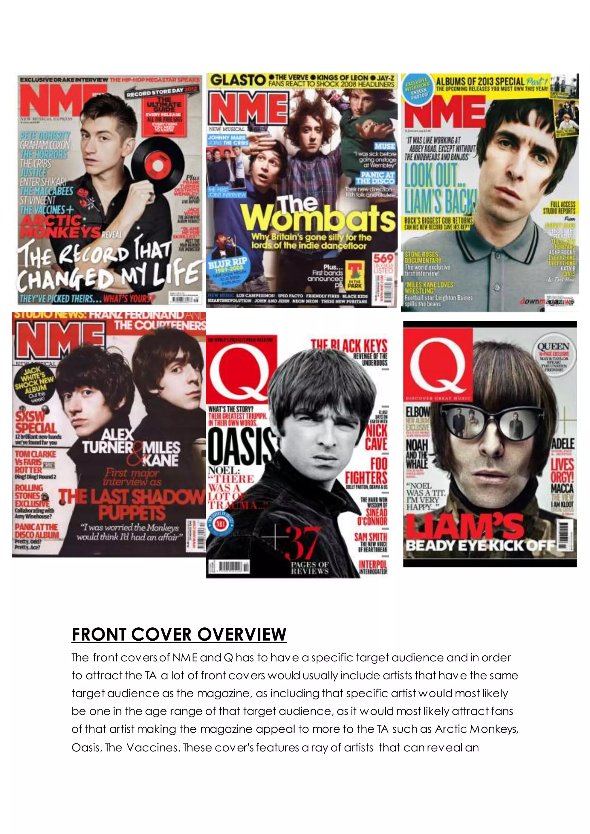
FRONT COVER OVERVIEW
The front coversof NME and Q has to have a specific target audience and in order
to attract the TA a lot of front covers would usually include artists that have the same
target audience as the magazine, as including that specific artist would most likely
be one in the age range of that target audience, as it would most likely attract fans
of that artist making the magazine appeal to more to the TA such as Arctic Monkeys,
Oasis, The Vaccines. These cover'sfeatures a ray of artists that can reveal an
indication of the target audience to being teenage males with a median age of 28
years old as the cover stars are around the same age if not older meaning that the
magazine is aiming for an older target audience. Indie artists usually focuses on
partying, drinking, drugs and live music, so with influence fromthe artists the
readership must live a similar lifestyle. The lifestyle being promoted in an indie rock
magazine is one of hedonism – gigs, festivals, livemusic features.
The main image will usually be a medium close up or a close up with direct address
to the TA, unless it is a band feature which then would use long shot. The similarities is
that usually face expressions are plain on every individual artists featured. Each
artist's featured will have an itemof some sort to represent their genre of music that
is different for each image. The masthead is usually to the top left of the corner of
the page, but it can be centralized in order to fit with the front cover. The colour of
the text is always a bold colour usually red, apart from a few rare occasionswhere
the text is white, blue or black this gives the magazine its brand identity because the
Bold red letters are well known due to the repeated placing of the masthead. Each
featured article is specific to each TA, as it can be a quote fromthe following artists
featured that could entice the TA to read on, or it could be an exclusive interview
which featuresunknown contents that would be revealed to the TA. The featured
articles have to satisfy the needs of the TA's curiosity.
The magazines have a simple colour scheme, the colours used are to represent the
genre of indie that is quite dull so the most dominant colours used are black, red
and white however, you havecertain editions of magazines where the cover
scheme would change coloursof the background, but it is quite rare. These colours
contrast in order to be clearly distinguished. If a pop artist is featured more pastel
colours are used against a solid background to stand out. Some backgrounds are
plain white or dull colours such as grey, black or a pop of colour to contrast against
the text is yellow. Although in some Q magazines the picture is a close up which
takes up the space of the background.
Most magazines offer free posters in order to lure the TA as they would automatically
be drawn to what it is gifted with the magazine that it would most likely spark
interest, as fromhuman nature everyone loves freebies so this would attract them
greatly and this explains how the TA are mainly males as they love freeproducts.
Puffs are placed on the cover to make the text stand out and is used for promoting
something within the magazine, it is quick and easy for readers to see this due to the
bold colours used so it draws the readers in and makes them more aware of the
features inside the magazine, in each magazine the puff placement varies so that it
can be easy to spot.
The mise-en-scene of the images portray the indie and indie-rock genre through the
use of costume, iconography, hair, makeup and facial expressions. The most
common colour for a costume that appears throughout each of the covers is the
colour black be it a long or short-sleeved collared shirt. Dark striped and polo t-shirts
are worn as costume which indicatesthe genre of the magazine as the costume
are very laid-back and simple that it's very casual as indie artists are shown to be
very chill in their costume option and opting for something that's more comfortable
which resonates with the readership. These colours are used as the genre is simple,
these colour's shows that this genre is more calmed and chilled rather than upbeat.
In one of the magazines Liam is wearing rounded sunglasseswhich covers his eyes
and it gives a cool vibe as weare unable to see his eyes and it makes him feel more
confident as we can't stare directly at him. The makeup is very natural and toned
down and instead the hairstyles are more accentuate. The hairstyles vary on
different artist's ,but it shows that they do not follow trends and have their own
unique individual style such as Liam where his hair is similar to a bob, but it shows that
the artists are not afraid to stand out and give more of a retro feel with their
costume, hair and makeup. But, their hair is also well-groomed and combed being
very polished and sleek. The mode of address each image has is direct address
where the cover artist is staring directly into the camera so it gives an impression that
they are staring directly at the target audience who then would be more attracted
to the magazine as it feels more personal to them. Each of the artists maintain the
same facial expressions which, is very bland and plain, they are in aspect
emotionless. The presence of a record CD shows that the genre is very retroand
vintage giving a sense of nostalgia towards the older target audience.
The design and the layout conventions for each of the magazine's front covers are
identical. For NME and Q the masthead is always positioned on the top left of the
page and is continually the same colour, which is red representing the genre. For all
of the NME covers there is always a skyline featured and the positioning of the skyline
is always featured at the space abovethe masthead, the text all incorporate the
NME colour scheme of using the following colours red, black, yellow, white and blue.
3 of the skyline are placed on a strip of colour, which is usually red or yellow a
common convention used in every cover.
The placement of the main sell-line for both magazines are positioned which the
same area the bottom third of the magazine and it also has to be the boldest and
second biggest text on the front cover, the name of the artist or the band featured
on the main sell-line uses a different colour to stand out and is a different size. All of
the magazines use the same positioning for the bar-code and the pug by positioning
it either on the bottom left or right hand side of the page wherethe target
audience's eyes will least be drawn to look at. For both of the magazines the
placement of the sell-lines are in the same position, which are the left and the right
hand side of the page. For both of the magazines the sell-lines that feature's artists,
band's and uses pull quotes will be in a different bold colour to stand out from the
rest of the text so that the reader's eyes can be drawn to seeing the artist's name
straightaway. Four magazine uses puff and the placement varieswhich each issue,
but is a commonly featured convention that uses bright colours to draw in readers
and is placed on an empty space to stand out. Occasionally the front covers would
also feature a graphic shape or another smaller image to intrigue the reader.

Front cover overview

  • 1.
    FRONT COVER OVERVIEW Thefront coversof NME and Q has to have a specific target audience and in order to attract the TA a lot of front covers would usually include artists that have the same target audience as the magazine, as including that specific artist would most likely be one in the age range of that target audience, as it would most likely attract fans of that artist making the magazine appeal to more to the TA such as Arctic Monkeys, Oasis, The Vaccines. These cover'sfeatures a ray of artists that can reveal an
  • 2.
    indication of thetarget audience to being teenage males with a median age of 28 years old as the cover stars are around the same age if not older meaning that the magazine is aiming for an older target audience. Indie artists usually focuses on partying, drinking, drugs and live music, so with influence fromthe artists the readership must live a similar lifestyle. The lifestyle being promoted in an indie rock magazine is one of hedonism – gigs, festivals, livemusic features. The main image will usually be a medium close up or a close up with direct address to the TA, unless it is a band feature which then would use long shot. The similarities is that usually face expressions are plain on every individual artists featured. Each artist's featured will have an itemof some sort to represent their genre of music that is different for each image. The masthead is usually to the top left of the corner of the page, but it can be centralized in order to fit with the front cover. The colour of the text is always a bold colour usually red, apart from a few rare occasionswhere the text is white, blue or black this gives the magazine its brand identity because the Bold red letters are well known due to the repeated placing of the masthead. Each featured article is specific to each TA, as it can be a quote fromthe following artists featured that could entice the TA to read on, or it could be an exclusive interview which featuresunknown contents that would be revealed to the TA. The featured articles have to satisfy the needs of the TA's curiosity. The magazines have a simple colour scheme, the colours used are to represent the genre of indie that is quite dull so the most dominant colours used are black, red and white however, you havecertain editions of magazines where the cover scheme would change coloursof the background, but it is quite rare. These colours contrast in order to be clearly distinguished. If a pop artist is featured more pastel colours are used against a solid background to stand out. Some backgrounds are plain white or dull colours such as grey, black or a pop of colour to contrast against the text is yellow. Although in some Q magazines the picture is a close up which takes up the space of the background. Most magazines offer free posters in order to lure the TA as they would automatically be drawn to what it is gifted with the magazine that it would most likely spark interest, as fromhuman nature everyone loves freebies so this would attract them greatly and this explains how the TA are mainly males as they love freeproducts. Puffs are placed on the cover to make the text stand out and is used for promoting something within the magazine, it is quick and easy for readers to see this due to the bold colours used so it draws the readers in and makes them more aware of the features inside the magazine, in each magazine the puff placement varies so that it can be easy to spot.
  • 3.
    The mise-en-scene ofthe images portray the indie and indie-rock genre through the use of costume, iconography, hair, makeup and facial expressions. The most common colour for a costume that appears throughout each of the covers is the colour black be it a long or short-sleeved collared shirt. Dark striped and polo t-shirts are worn as costume which indicatesthe genre of the magazine as the costume are very laid-back and simple that it's very casual as indie artists are shown to be very chill in their costume option and opting for something that's more comfortable which resonates with the readership. These colours are used as the genre is simple, these colour's shows that this genre is more calmed and chilled rather than upbeat. In one of the magazines Liam is wearing rounded sunglasseswhich covers his eyes and it gives a cool vibe as weare unable to see his eyes and it makes him feel more confident as we can't stare directly at him. The makeup is very natural and toned down and instead the hairstyles are more accentuate. The hairstyles vary on different artist's ,but it shows that they do not follow trends and have their own unique individual style such as Liam where his hair is similar to a bob, but it shows that the artists are not afraid to stand out and give more of a retro feel with their costume, hair and makeup. But, their hair is also well-groomed and combed being very polished and sleek. The mode of address each image has is direct address where the cover artist is staring directly into the camera so it gives an impression that they are staring directly at the target audience who then would be more attracted to the magazine as it feels more personal to them. Each of the artists maintain the same facial expressions which, is very bland and plain, they are in aspect emotionless. The presence of a record CD shows that the genre is very retroand vintage giving a sense of nostalgia towards the older target audience. The design and the layout conventions for each of the magazine's front covers are identical. For NME and Q the masthead is always positioned on the top left of the page and is continually the same colour, which is red representing the genre. For all of the NME covers there is always a skyline featured and the positioning of the skyline is always featured at the space abovethe masthead, the text all incorporate the NME colour scheme of using the following colours red, black, yellow, white and blue. 3 of the skyline are placed on a strip of colour, which is usually red or yellow a common convention used in every cover. The placement of the main sell-line for both magazines are positioned which the same area the bottom third of the magazine and it also has to be the boldest and second biggest text on the front cover, the name of the artist or the band featured on the main sell-line uses a different colour to stand out and is a different size. All of the magazines use the same positioning for the bar-code and the pug by positioning
  • 4.
    it either onthe bottom left or right hand side of the page wherethe target audience's eyes will least be drawn to look at. For both of the magazines the placement of the sell-lines are in the same position, which are the left and the right hand side of the page. For both of the magazines the sell-lines that feature's artists, band's and uses pull quotes will be in a different bold colour to stand out from the rest of the text so that the reader's eyes can be drawn to seeing the artist's name straightaway. Four magazine uses puff and the placement varieswhich each issue, but is a commonly featured convention that uses bright colours to draw in readers and is placed on an empty space to stand out. Occasionally the front covers would also feature a graphic shape or another smaller image to intrigue the reader.