Download to read offline

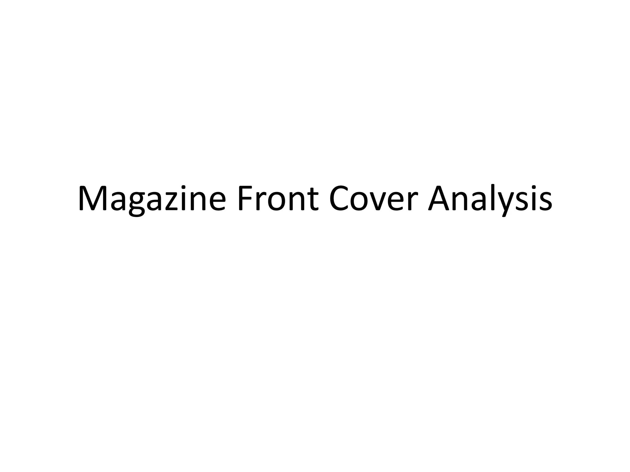
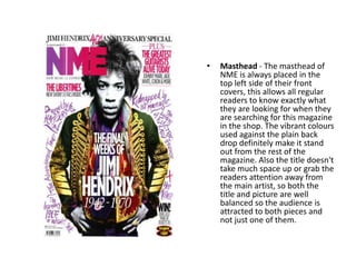
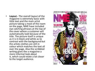
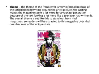

The document analyzes the front cover of the NME magazine. It notes that the masthead is always placed in the top left corner for easy recognition. The layout focuses on a large central artist picture with minimal text to draw attention. Cover lines relate to the main article and artist in colorful matching text. The informal scribbled handwriting style creates a theme that targets younger readers and stands out from rival publications.


