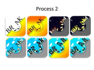
Experiments
Your Name
Process 1
For my experiment I made a game that
would be made similarly to my own, to
do this I used basketball, and I made a
very quick character in order to make a
walk cycle. I made the character using
the brush and pencil tool, to design a
pixel art style cartoonish character, this
was just made quickly as I didn’t want
the main focus to be on the character
design for this experiment, I wanted
the main focus to be on the animation
of the player. I then used the timeline
on Photoshop in order to create the
walk cycle, I did this through
duplicating layers and changing the
designs on each layer to make it look
like the character is moving into a shot.
Reflection 1
• What elements of your experiments will you
include in your final product?
– The walk cycle designs that I used in the experiment
will be similar to what I use in my final product, as
they will be made in a similar way, just in a different
sport. As well as this the speed of the movements was
done well and I think I will use similar timings in my
final product.
– Also the style of the animation and the design of the
character may be slightly similar, the character in this
was made very quickly, but in my main product I may
make a similar character, just in a lot more detail.
Process 2
Process 2
• In these experiments I am creating an app logo as I will do this for my final game.
• The first is a simplistic design, of a game called Break, where the logo itself is breaking, which plays
on the name of the game, from there I expanded this logo and made it more colourful with another
gradient added in the other part of the background. After that I decided to make the background
look like a little town, with the third design I used this in a night time setting and made the
buildings also look like they were crashing into the hole that the E of BREAK was falling into. The
next design, the 4th one, is the same as the previous one, but I changed the font to be a brighter
colour as the dark red made it a little harder to read. From there I decided to change the
background to being in the day rather than at night, so that the font can be easier to read and
everything looks brighter and has a better mood around it. The next one was similar to this but has
a different font, this is the same with the next one, as the font for this seemed better than the
others, I also changed to bottom half to a gradient here, but then in the last one I changed it back
to the grey colour, as I thought the gradient clashed with the colour of the sky.
• I put them all in a vote to my class and each person got to vote for the two they liked best, the first
received one vote, second received two votes, the third received no votes, the fourth received six
votes, the fifth received seven votes, the sixth received no votes, the seventh received eleven
votes, and the eighth received five votes, this will also be used in my final product as it gives the
audience a say on what my product is, making them connect more with the product.
Reflection 2
• What elements of your experiments will you
include in your final product?
– I will use the same design techniques from this
experiment in my real product, I think the way the
logo’s look is good, the way the logo is split in two I
think looks good also.
– I will also design a few logo’s when it comes to my
final design, and put them to a vote again, this means
I will get a lot of opinions other than my own, and this
will also mean I will give my audience a say on my
product, making them feel more towards the product
as they have had a say on the final design aspects of
the product.
Process 3
• For my third experiment I designed a
games case cover, I used the NBA game
that I animated for my first experiment.
• To do this I first found a template for the
cover online, then I put that into
Photoshop and took images from a real
basketball game of the crowd behind the
hoop, I then blurred this image and used it
as a background for the cover, to blur it I
used the Gaussian blur effect. From there I
used a pixelated text, as it fits the nature
of the game, to write the title “NBA
Takeover”. I then got a pixelated basketball
player, which also is similar to the game
itself, and used him on the front cover of
the case. I then designed the back of the
case, I did this with just text, a little blurb
on the back about the game, with a few
lines of large text showing what the game
is all about.
Reflection 3
• What elements of your experiments will you
include in your final product?
– I will use the same kind of design work with the pixel
art that is on this cover of my experiment as I will if I
design a cover for my final product, I believe this was
done well as the pixel art of the basketball player fit in
well with the rest of the cover and therefore if I design
a cover for my final game I will use the same kind of
spacing and designs that were used in this one, as
they all fit very well together and with each other,
such as the text and the pixel art character that is on
the front, and they also fit very well with the
background.
All Experiments Reflection
I think completing all of these experiments was very
beneficial to me and will be beneficial to my final
product. Firstly the animation experiment was good as it
gave me experience in animating a sports game, this is
good as it shows me how to design and how to make a
walk cycle for a sports style game. Next I designed some
app logos, this was beneficial as I have no prior
experience in this and I will need to make one for my final
game. Finally I made a games case cover, which I also
have no experience in making, and therefore this is
beneficial in making me know how to design this kind of
product, using all the spacings and specific templates.

FMP - 4. Production Experiments

  • 1.
  • 2.
    Process 1 For myexperiment I made a game that would be made similarly to my own, to do this I used basketball, and I made a very quick character in order to make a walk cycle. I made the character using the brush and pencil tool, to design a pixel art style cartoonish character, this was just made quickly as I didn’t want the main focus to be on the character design for this experiment, I wanted the main focus to be on the animation of the player. I then used the timeline on Photoshop in order to create the walk cycle, I did this through duplicating layers and changing the designs on each layer to make it look like the character is moving into a shot.
  • 3.
    Reflection 1 • Whatelements of your experiments will you include in your final product? – The walk cycle designs that I used in the experiment will be similar to what I use in my final product, as they will be made in a similar way, just in a different sport. As well as this the speed of the movements was done well and I think I will use similar timings in my final product. – Also the style of the animation and the design of the character may be slightly similar, the character in this was made very quickly, but in my main product I may make a similar character, just in a lot more detail.
  • 4.
  • 5.
    Process 2 • Inthese experiments I am creating an app logo as I will do this for my final game. • The first is a simplistic design, of a game called Break, where the logo itself is breaking, which plays on the name of the game, from there I expanded this logo and made it more colourful with another gradient added in the other part of the background. After that I decided to make the background look like a little town, with the third design I used this in a night time setting and made the buildings also look like they were crashing into the hole that the E of BREAK was falling into. The next design, the 4th one, is the same as the previous one, but I changed the font to be a brighter colour as the dark red made it a little harder to read. From there I decided to change the background to being in the day rather than at night, so that the font can be easier to read and everything looks brighter and has a better mood around it. The next one was similar to this but has a different font, this is the same with the next one, as the font for this seemed better than the others, I also changed to bottom half to a gradient here, but then in the last one I changed it back to the grey colour, as I thought the gradient clashed with the colour of the sky. • I put them all in a vote to my class and each person got to vote for the two they liked best, the first received one vote, second received two votes, the third received no votes, the fourth received six votes, the fifth received seven votes, the sixth received no votes, the seventh received eleven votes, and the eighth received five votes, this will also be used in my final product as it gives the audience a say on what my product is, making them connect more with the product.
  • 6.
    Reflection 2 • Whatelements of your experiments will you include in your final product? – I will use the same design techniques from this experiment in my real product, I think the way the logo’s look is good, the way the logo is split in two I think looks good also. – I will also design a few logo’s when it comes to my final design, and put them to a vote again, this means I will get a lot of opinions other than my own, and this will also mean I will give my audience a say on my product, making them feel more towards the product as they have had a say on the final design aspects of the product.
  • 7.
    Process 3 • Formy third experiment I designed a games case cover, I used the NBA game that I animated for my first experiment. • To do this I first found a template for the cover online, then I put that into Photoshop and took images from a real basketball game of the crowd behind the hoop, I then blurred this image and used it as a background for the cover, to blur it I used the Gaussian blur effect. From there I used a pixelated text, as it fits the nature of the game, to write the title “NBA Takeover”. I then got a pixelated basketball player, which also is similar to the game itself, and used him on the front cover of the case. I then designed the back of the case, I did this with just text, a little blurb on the back about the game, with a few lines of large text showing what the game is all about.
  • 8.
    Reflection 3 • Whatelements of your experiments will you include in your final product? – I will use the same kind of design work with the pixel art that is on this cover of my experiment as I will if I design a cover for my final product, I believe this was done well as the pixel art of the basketball player fit in well with the rest of the cover and therefore if I design a cover for my final game I will use the same kind of spacing and designs that were used in this one, as they all fit very well together and with each other, such as the text and the pixel art character that is on the front, and they also fit very well with the background.
  • 9.
    All Experiments Reflection Ithink completing all of these experiments was very beneficial to me and will be beneficial to my final product. Firstly the animation experiment was good as it gave me experience in animating a sports game, this is good as it shows me how to design and how to make a walk cycle for a sports style game. Next I designed some app logos, this was beneficial as I have no prior experience in this and I will need to make one for my final game. Finally I made a games case cover, which I also have no experience in making, and therefore this is beneficial in making me know how to design this kind of product, using all the spacings and specific templates.

Editor's Notes

  • #3 Discuss the tools and processes used in your experiments