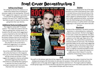
The magazine cover uses bold colors and fonts to attract attention. The skyline features famous artists' names in white that stand out against the black background. The masthead is the largest red font that connotes awareness in a demanding tone. The main sell line below uses a specialized font and teases an exclusive opportunity to see the featured band of the issue. Overall the cover employs attention-grabbing design elements to appeal to its target audience of 16-24 year old females interested in new artists, concerts, and gossip.
This is my media presentation of an analysis of the music magazine NME. The analyisist is of the front cover, contents page, and a double page spread. I looked at the language and images used, also the layout of the pages and who the magazine is targetted at.
This is my media presentation of an analysis of the music magazine NME. The analyisist is of the front cover, contents page, and a double page spread. I looked at the language and images used, also the layout of the pages and who the magazine is targetted at.
We all have good and bad thoughts from time to time and situation to situation. We are bombarded daily with spiraling thoughts(both negative and positive) creating all-consuming feel , making us difficult to manage with associated suffering. Good thoughts are like our Mob Signal (Positive thought) amidst noise(negative thought) in the atmosphere. Negative thoughts like noise outweigh positive thoughts. These thoughts often create unwanted confusion, trouble, stress and frustration in our mind as well as chaos in our physical world. Negative thoughts are also known as “distorted thinking”.
The Art Pastor's Guide to Sabbath | Steve ThomasonSteve Thomason
What is the purpose of the Sabbath Law in the Torah. It is interesting to compare how the context of the law shifts from Exodus to Deuteronomy. Who gets to rest, and why?
Ethnobotany and Ethnopharmacology:
Ethnobotany in herbal drug evaluation,
Impact of Ethnobotany in traditional medicine,
New development in herbals,
Bio-prospecting tools for drug discovery,
Role of Ethnopharmacology in drug evaluation,
Reverse Pharmacology.
Read| The latest issue of The Challenger is here! We are thrilled to announce that our school paper has qualified for the NATIONAL SCHOOLS PRESS CONFERENCE (NSPC) 2024. Thank you for your unwavering support and trust. Dive into the stories that made us stand out!
Unit 8 - Information and Communication Technology (Paper I).pdfThiyagu K
This slides describes the basic concepts of ICT, basics of Email, Emerging Technology and Digital Initiatives in Education. This presentations aligns with the UGC Paper I syllabus.
How to Split Bills in the Odoo 17 POS ModuleCeline George
Bills have a main role in point of sale procedure. It will help to track sales, handling payments and giving receipts to customers. Bill splitting also has an important role in POS. For example, If some friends come together for dinner and if they want to divide the bill then it is possible by POS bill splitting. This slide will show how to split bills in odoo 17 POS.
Synthetic Fiber Construction in lab .pptxPavel ( NSTU)
Synthetic fiber production is a fascinating and complex field that blends chemistry, engineering, and environmental science. By understanding these aspects, students can gain a comprehensive view of synthetic fiber production, its impact on society and the environment, and the potential for future innovations. Synthetic fibers play a crucial role in modern society, impacting various aspects of daily life, industry, and the environment. ynthetic fibers are integral to modern life, offering a range of benefits from cost-effectiveness and versatility to innovative applications and performance characteristics. While they pose environmental challenges, ongoing research and development aim to create more sustainable and eco-friendly alternatives. Understanding the importance of synthetic fibers helps in appreciating their role in the economy, industry, and daily life, while also emphasizing the need for sustainable practices and innovation.
Operation “Blue Star” is the only event in the history of Independent India where the state went into war with its own people. Even after about 40 years it is not clear if it was culmination of states anger over people of the region, a political game of power or start of dictatorial chapter in the democratic setup.
The people of Punjab felt alienated from main stream due to denial of their just demands during a long democratic struggle since independence. As it happen all over the word, it led to militant struggle with great loss of lives of military, police and civilian personnel. Killing of Indira Gandhi and massacre of innocent Sikhs in Delhi and other India cities was also associated with this movement.
2024.06.01 Introducing a competency framework for languag learning materials ...Sandy Millin
http://sandymillin.wordpress.com/iateflwebinar2024
Published classroom materials form the basis of syllabuses, drive teacher professional development, and have a potentially huge influence on learners, teachers and education systems. All teachers also create their own materials, whether a few sentences on a blackboard, a highly-structured fully-realised online course, or anything in between. Despite this, the knowledge and skills needed to create effective language learning materials are rarely part of teacher training, and are mostly learnt by trial and error.
Knowledge and skills frameworks, generally called competency frameworks, for ELT teachers, trainers and managers have existed for a few years now. However, until I created one for my MA dissertation, there wasn’t one drawing together what we need to know and do to be able to effectively produce language learning materials.
This webinar will introduce you to my framework, highlighting the key competencies I identified from my research. It will also show how anybody involved in language teaching (any language, not just English!), teacher training, managing schools or developing language learning materials can benefit from using the framework.
The French Revolution, which began in 1789, was a period of radical social and political upheaval in France. It marked the decline of absolute monarchies, the rise of secular and democratic republics, and the eventual rise of Napoleon Bonaparte. This revolutionary period is crucial in understanding the transition from feudalism to modernity in Europe.
For more information, visit-www.vavaclasses.com
TESDA TM1 REVIEWER FOR NATIONAL ASSESSMENT WRITTEN AND ORAL QUESTIONS WITH A...
FCD 2
1. Skyline
The skyline is positioned at the top of the page
therefore one of the initial features that is seen.
It includes famous artists that will draw in the
readers attention and the broad selection will
help to appeal to individual people. The artists
font is bold, capitalized and white, contrasting
from the black background and standing out.
The brief summary is in yellow which is less bold
suggesting it is the artists name alone that sells
the story.
Masthead
The font of the masthead is red which connotes
awareness in a demanding tone, making the
audience stop and look. The font is the biggest
on the cover, simple and capitalized. This gives
it a more formal approach suggesting the target
audience is of an older age range such as 16 –
25 year olds. The capital letters symbolize the
excessive volume of rock music. The masthead
is partially hidden by the artists head suggesting
the magazine relies on the fame of the artist to
attract the audience. Around the edges of the
font, it is slightly scratched and faded to show
the edginess of rock. It gives this impress in a
subtle way so that it doesn't’t cross the
borderline of becoming a heavy metal rock
magazine.
Selling Line/Slogan
The selling line attracts the audience as it
makes them believe they are getting an
exclusive insight to the latest gossip. The word
“new” suggests the magazine is up to date and
in trend with the developing generation.
Similarly, the word “first” makes the readers
feel they are part of a special minority thus
giving them their own identity.
Puff
The puff is in the bottom right third of the magazine. The red text shape box makes it stand out from the
background and gives the information its own place for purpose. It links with the red title and is the
brightest color on the page which triggers the audiences attention to it. The target audiences hobbies
include going to gigs and concerts therefore will want the opportunity to win free tickets especially if they
have student lifestyles with low incomes.
Additional features/selling point
The magazine comes with “3 massive
posters.” This makes the audience feel like
they are getting their moneys worth. It is
located in the left center third suggesting it
is just as important as the main sell line to
attract the reader. It includes sub-images of
the posters however they are too small to to
see clearly therefore the reader would have
to buy the magazine to find out more. It is
the only text on the screen that is
underlined suggesting it is an exclusive
opportunity for the reader.
Cover-lines
One of the cover lines includes a list of all
the artists that feature in the magazine.
There are 14 artists therefore the audience
will like at least one of them. It also
suggest the magazine is diverse and widely
spectated suggesting they have the
information on everything that is going on.
It switches from blue to white font
showing to separate each artist and show
they have their own importance.
2. Main Sell line
Main sell line is below the mast head and
stretches over the top of the dominant image.
The font is specialized and individual to the page
making it stand out. It has an enigma code; “the
only band you need to see this summer” which
makes the reader question what is so good
about this band. It also suggests there is an
opportunity for a festival or gig which is one of
their main hobbies.
Cover-Lines
Each cover line has its own color scheme
that links in with the main theme. For
example, one is yellow, one is white and
one is blue. This makes the stories stand out
from each other instead of just a long list of
writing that the reader gets lost in. The
stories differ in significance depending on
their location and color. For example the
conventionally the reader reads from top to
bottom so the most important cover lines
are closer to the top thirds and have a
bolder font to stand out more. One of the
cover lines includes a pull quote from an
artist suggesting the magazine has an insight
on exclusive information with direct
evidence. The cover lines have small sub-
heads to give away a little but not a lot.
Dominant Image
The dominant image of the magazine is
the band “The Gaslight Anthem.” In the
foreground of the image is the main
singer/artist. He is the most well-known in
the group therefore will draw the most
attention. The medium shot of the main
singer fills the entire center thirds and his
eye line is in the central upper third.
Conventionally this is one of the first
places that you look therefore a direct eye
line and shot makes the reader feel they
interacting personally with the band. The
other members of the band are in the
background yet still part of the dominant
image. They are all looking directly at the
camera and at the reader. Hey key
professional studio lighting has been used
so that they stand out from the black
backdrop. Their practical facial expressions
suggest they are passionate about the
music alone which is what their main
concern is. Their clothing includes plain
tees, layered jackets and beanie hats that
are are toned dark colors. The members
have tattoos, messy hair and unshaven
faces demonstrating that the rock genre is
edgy and realistic; they don’t dress up for
the cameras.
Sub-dominant
images
The images have
borders/outlines so
that they stand out
as being individual
images and belong
to their own
article.
General Information
The price of the magazine, issue
number and dateline are essential
information that should be
included on the cover. It also has
the website address which means
the magazine is accessible to an
even wider target audience on the
social media platforms.
Overall color scheme
The overall color scheme of the cover is black, red,
yellow and blue. This gives a serious tone and
demanding tone that grabs attention. The magazine
is aimed mainly towards females because of the
language and stories presented however males
would be in the secondary audience. The text is also
more feminine as it is curved and less aggressive.
Target audience
16-24 year olds. Mainly
female. Young bands and
artists attract attention.
Events for young people such
as gigs and social media
opportunities.