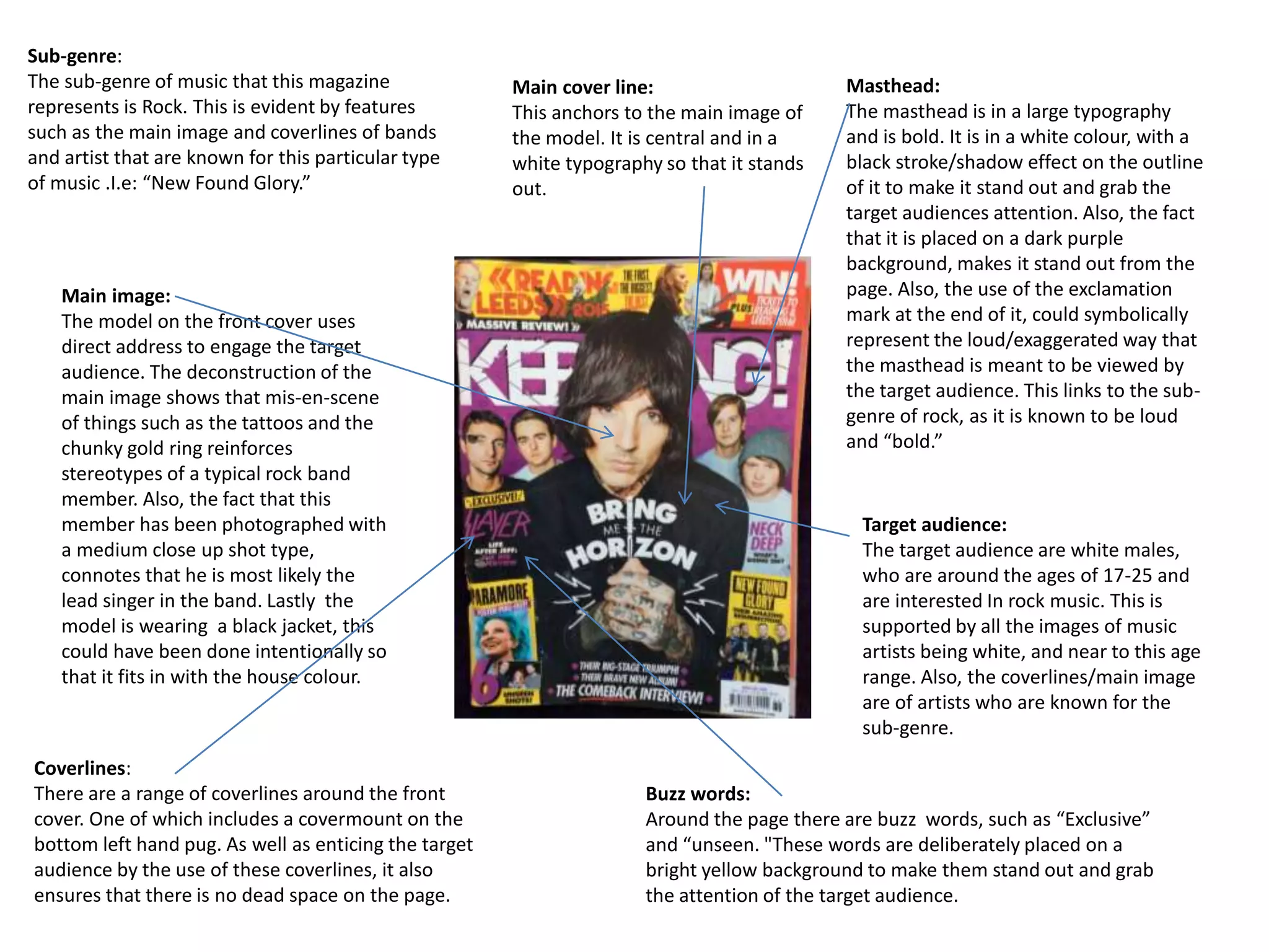
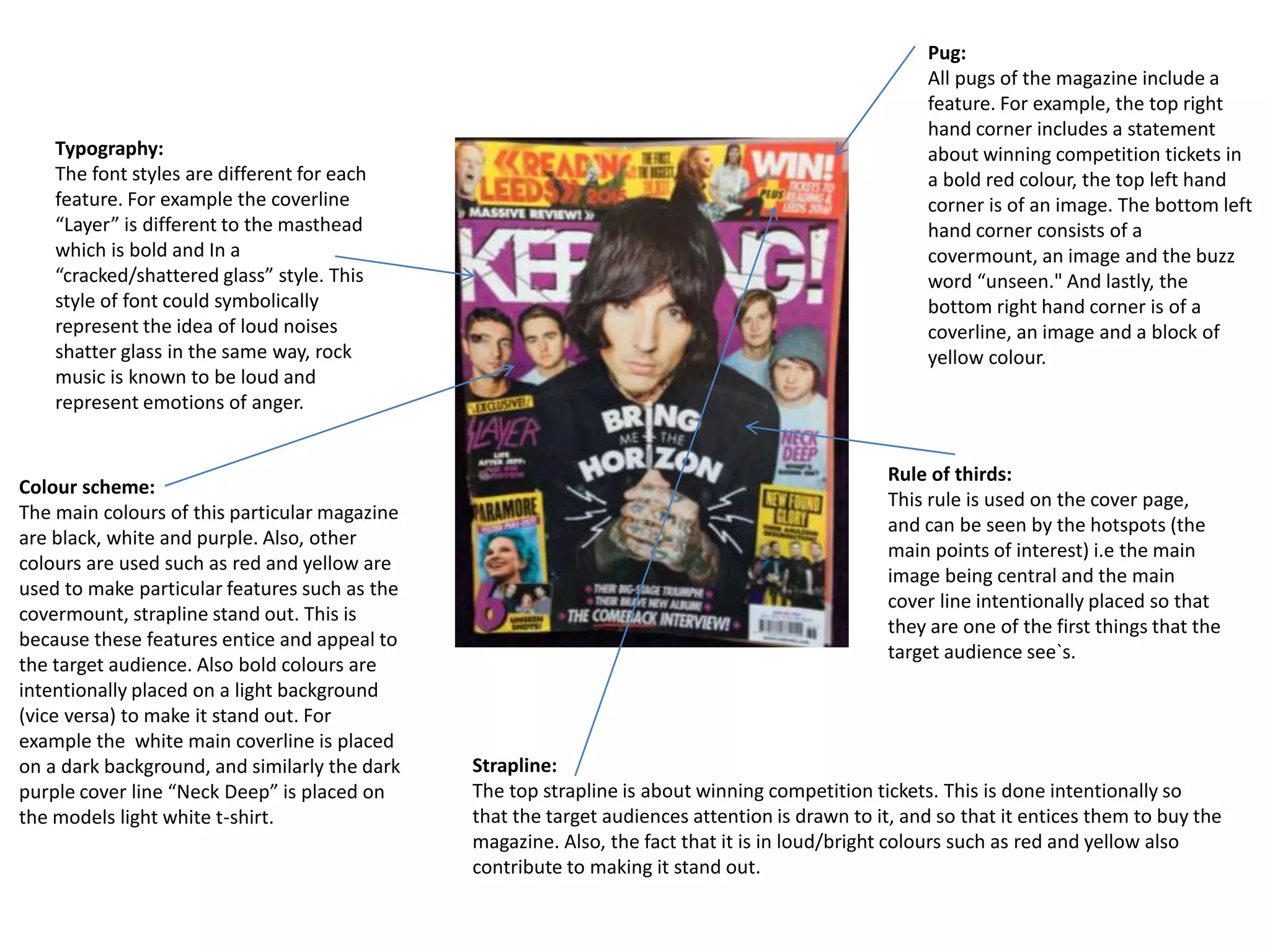
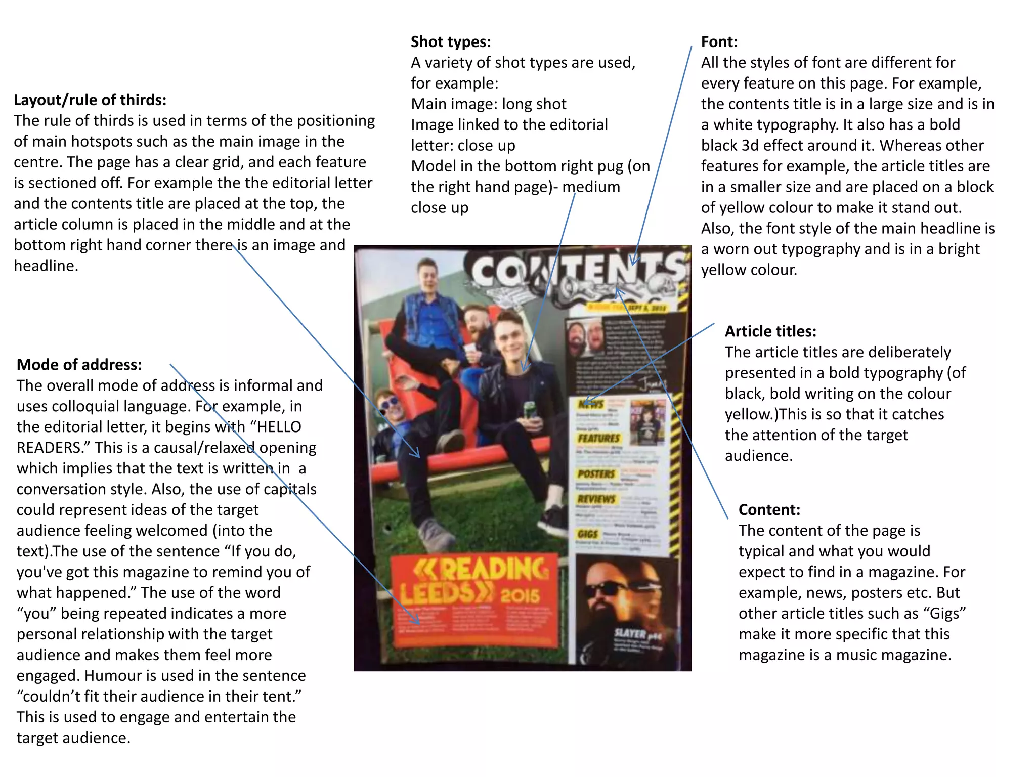
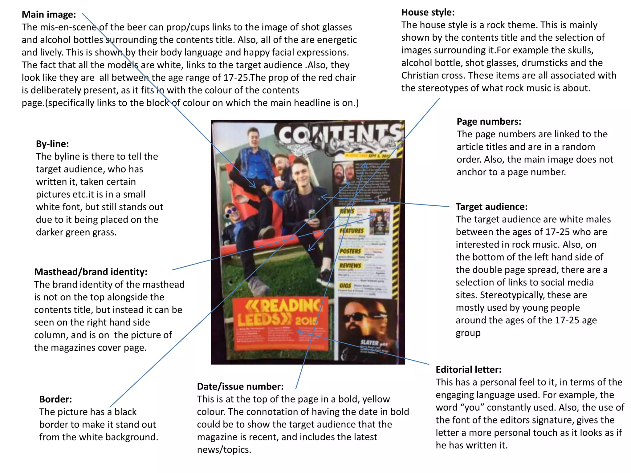
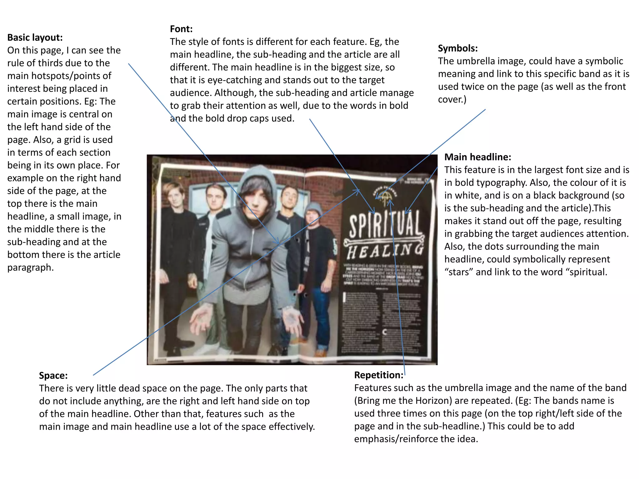
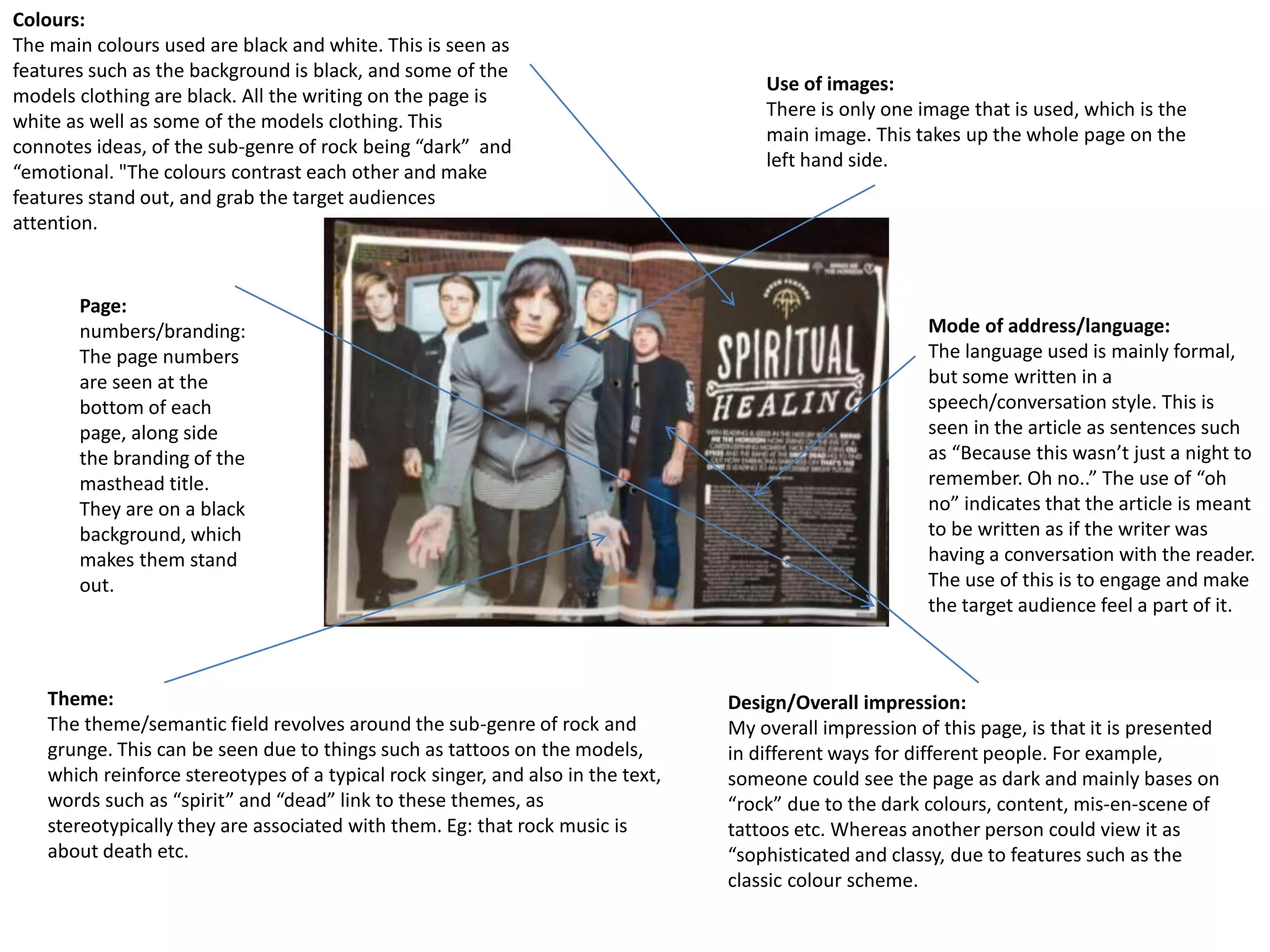
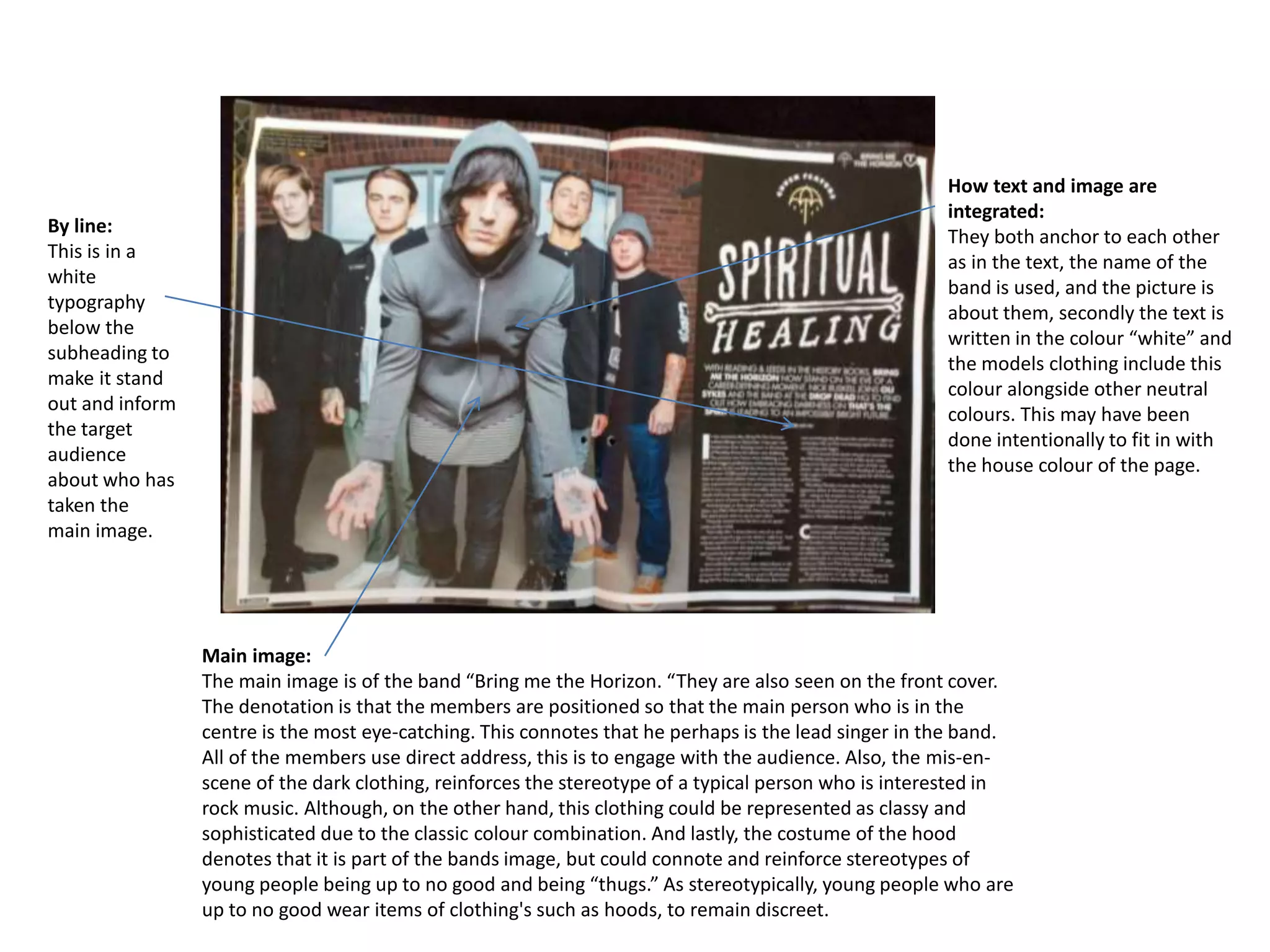
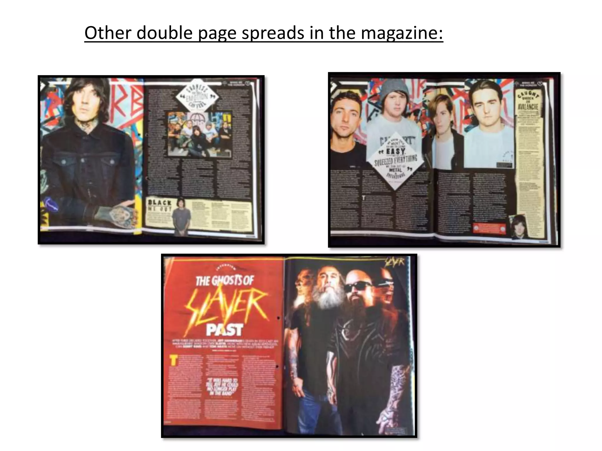
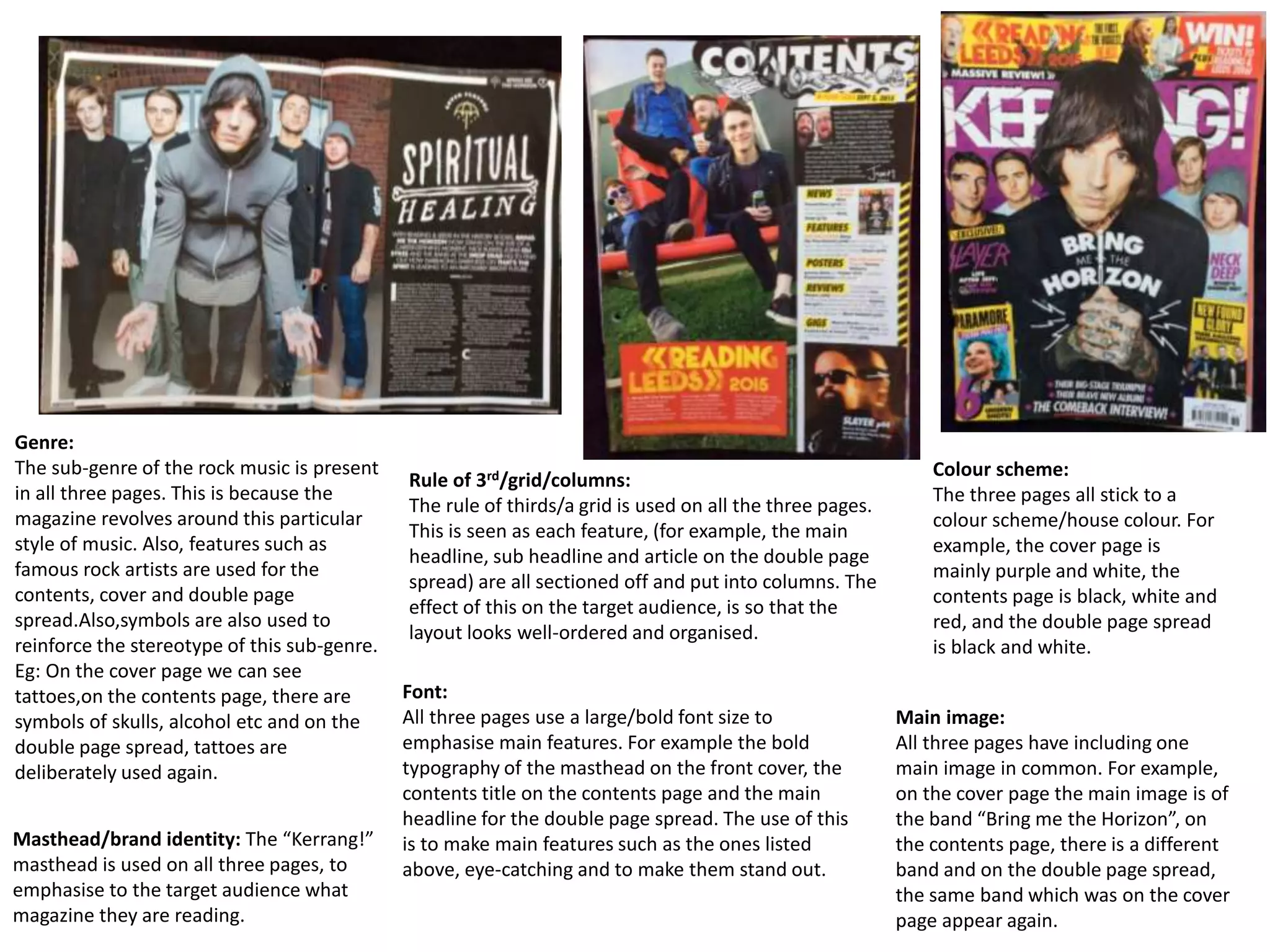
The document summarizes key design elements across three pages (cover, contents, and double page spread) of a rock music magazine called "Kerrang!." There are several similarities in design across the pages, including adherence to the rock music genre and use of symbols associated with it. Additionally, all three pages employ a grid layout using the rule of thirds, feature the magazine's masthead, utilize different fonts for headings, and maintain a consistent color scheme. The pages also each include a main image of a rock band and integrate other design elements like fonts, images and colors to effectively engage the target audience of young white males interested in rock music.