2. Background and Facts Published weekly since March 1952 First British paper to include a singles chart In the 1970s it became the best-selling British music magazine. Target audience: 65% Male* 50% 16-24* 23% 25-34* 79% ABC1*
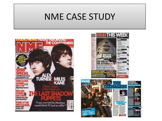
3. Front Cover Analysis Offers tend to overlay in circles making them stand out and easily identified as offers. NME’s brand logo is always featured at the top left of the magazine helping to create a continuous brand identity. Both its colourand font remains the samefrom issue to issue also. The 3 main colours throughout NME are black, red and yellow all working together to create a professional magazine. Using the majority of the page for a photo is key for separating the writing, and also being the eye catcher for potential readers. Having their names in bold white font against the black clothing, attracts readers straight away as to who the article is about and make assosication. Having The Last Shadow Puppets’‘first major interview not only grounds the image, but sets the major interview straight away with a sense that this is the only place to hear their first interview as a new band. Throughout this analysis you will see that similar layouts occur throughout the NME pages. This column for example has resemblance on the contents page layout making it clear with the headers, and informative with the summary writing. The photo used, it is important to think about clothing and setting as NME would want it to tie in with their brand identity. By having black as their clothing colour allows all writing on top to stand out. And also still have them a key feature as they are against a white background. Barcode important part is placement so it doesn’t distract attention but still stands out for price and issue information.
4. Contents Page Analysis Having a band index down the left hand side enables the readers to find where the specific information about a specific band is in the magazine making it easy to navigate to reviews and interviews on bands they follow or new bands they may want to know more about. Down the right hand side; the typical convention for NME is to have a list of sub-headings helping the reader navigate around the magazine and find the information they're most interested in fast. Specific information is also given underneath each sub heading. Why? As then they can find out exactly what the article/page is about. With a target audience of 16+, advertising a way to save money on their magazine is great! All contact details are there making it seem easy to subscribe and if you’re new to NME this is placed very well being on the contents page as straight away you know how to get more of the magazine. Having the photo centre, splits up the writing and sets the main focus story straight away. Bold writing also helps the article stand out and usually the image will have some relation to the front page. The page number stands out being in red and also fitting in with the rest of the page. Similar to the right hand column, there is a quick summary of what to expect in the article making it very handy for the reader and easy to skip straight to. Breaking the conventional theme of red and black we see throughout this page, by adding their other primary colour, it allows the yellow to stand out amongst the whole page yet still look part of the contents page overall theme.
5. Double page analysis Research shows that audiences appreciate big images on one side- whether this be to pull out and stick on their wall or just because it means less reading. It makes sense to have an image take up the whole page in a magazine such as NME as it is the main focus and interviews are colloquial and just finding out more about them. With the relaxing pose given, relates to the colour blue used and also the general feel of the informal interview. This makes the article more approachable for a wider audience. The high angle shot is also interesting for the reader. Having this column is also important for the readers as if they like the teenagers, these may be bands they might like. Always giving the readers information and new music. Breaking expected conventions of using reds and yellows for pull quotes and stand out information, within NME articles they tend to choose colours that fit the tone of writing and the band. Throughout this double page monochrome colours are used to encourage a vibrant article. Blue also has connotations of having association with the indie genre and a natural calm mood making this not a bombarded with information article but relates to their image of being on a bed. Everything is well thought about during double page spreads and links are attempted to be made. Very colloquial language tone and mode of address throughout this article relating to the target audience and also band themselves. Stressing that this particular magazine may not be suited for older generations. The font is a mix between serif and sans serif. Very simple meaning it doesn’t distract the attention from the images and the pull quotes which are highlighted if readers are skim reading.
6. Other things to influence your own magazine. Drop capitals are used in most articles giving it a sense of formality and organisation. Article title formatting- drawing attention to which article about which band they have come across. Pull quote- very common in almost all magazines. If deciding to read the whole article- these quotes could be the deciders- they may not make sense on their own and make the reader want to find out what context the quote is in. It should always link back to what is going to attract your target audience. Colour is important and mis en scene of the image used.