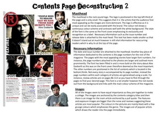
The document summarizes different elements of a magazine contents page layout. The masthead logo is small to emphasize the appealing artist images. Necessary information like the date and issue number are attached to the masthead, and page numbers are prominently displayed for key stories. Images of popular artists draw readers in and are organized by category. The contents text previews articles and uses direct address to entice readers. Linguistic features like rhetorical questions and an inclusive tone connect with the audience. The editor's note uses an image and informal language to seem approachable. Red, white, and black create a consistent colour scheme throughout.
Here I have analysed different Rock related contents pages and double page spread's so I could see how they were structured for the production of my own magazine.
Here I have analysed different Rock related contents pages and double page spread's so I could see how they were structured for the production of my own magazine.
My magazine analysis for my A-Level Media Blog. I have analysed two Music magazines, Metal Hammer and Kerrang, I chose both of these magazines because my magazine will be focused on the same genre of music as these and both of the main articles were Slipknot.
The Roman Empire A Historical Colossus.pdfkaushalkr1407
The Roman Empire, a vast and enduring power, stands as one of history's most remarkable civilizations, leaving an indelible imprint on the world. It emerged from the Roman Republic, transitioning into an imperial powerhouse under the leadership of Augustus Caesar in 27 BCE. This transformation marked the beginning of an era defined by unprecedented territorial expansion, architectural marvels, and profound cultural influence.
The empire's roots lie in the city of Rome, founded, according to legend, by Romulus in 753 BCE. Over centuries, Rome evolved from a small settlement to a formidable republic, characterized by a complex political system with elected officials and checks on power. However, internal strife, class conflicts, and military ambitions paved the way for the end of the Republic. Julius Caesar’s dictatorship and subsequent assassination in 44 BCE created a power vacuum, leading to a civil war. Octavian, later Augustus, emerged victorious, heralding the Roman Empire’s birth.
Under Augustus, the empire experienced the Pax Romana, a 200-year period of relative peace and stability. Augustus reformed the military, established efficient administrative systems, and initiated grand construction projects. The empire's borders expanded, encompassing territories from Britain to Egypt and from Spain to the Euphrates. Roman legions, renowned for their discipline and engineering prowess, secured and maintained these vast territories, building roads, fortifications, and cities that facilitated control and integration.
The Roman Empire’s society was hierarchical, with a rigid class system. At the top were the patricians, wealthy elites who held significant political power. Below them were the plebeians, free citizens with limited political influence, and the vast numbers of slaves who formed the backbone of the economy. The family unit was central, governed by the paterfamilias, the male head who held absolute authority.
Culturally, the Romans were eclectic, absorbing and adapting elements from the civilizations they encountered, particularly the Greeks. Roman art, literature, and philosophy reflected this synthesis, creating a rich cultural tapestry. Latin, the Roman language, became the lingua franca of the Western world, influencing numerous modern languages.
Roman architecture and engineering achievements were monumental. They perfected the arch, vault, and dome, constructing enduring structures like the Colosseum, Pantheon, and aqueducts. These engineering marvels not only showcased Roman ingenuity but also served practical purposes, from public entertainment to water supply.
Palestine last event orientationfvgnh .pptxRaedMohamed3
An EFL lesson about the current events in Palestine. It is intended to be for intermediate students who wish to increase their listening skills through a short lesson in power point.
2024.06.01 Introducing a competency framework for languag learning materials ...Sandy Millin
http://sandymillin.wordpress.com/iateflwebinar2024
Published classroom materials form the basis of syllabuses, drive teacher professional development, and have a potentially huge influence on learners, teachers and education systems. All teachers also create their own materials, whether a few sentences on a blackboard, a highly-structured fully-realised online course, or anything in between. Despite this, the knowledge and skills needed to create effective language learning materials are rarely part of teacher training, and are mostly learnt by trial and error.
Knowledge and skills frameworks, generally called competency frameworks, for ELT teachers, trainers and managers have existed for a few years now. However, until I created one for my MA dissertation, there wasn’t one drawing together what we need to know and do to be able to effectively produce language learning materials.
This webinar will introduce you to my framework, highlighting the key competencies I identified from my research. It will also show how anybody involved in language teaching (any language, not just English!), teacher training, managing schools or developing language learning materials can benefit from using the framework.
June 3, 2024 Anti-Semitism Letter Sent to MIT President Kornbluth and MIT Cor...Levi Shapiro
Letter from the Congress of the United States regarding Anti-Semitism sent June 3rd to MIT President Sally Kornbluth, MIT Corp Chair, Mark Gorenberg
Dear Dr. Kornbluth and Mr. Gorenberg,
The US House of Representatives is deeply concerned by ongoing and pervasive acts of antisemitic
harassment and intimidation at the Massachusetts Institute of Technology (MIT). Failing to act decisively to ensure a safe learning environment for all students would be a grave dereliction of your responsibilities as President of MIT and Chair of the MIT Corporation.
This Congress will not stand idly by and allow an environment hostile to Jewish students to persist. The House believes that your institution is in violation of Title VI of the Civil Rights Act, and the inability or
unwillingness to rectify this violation through action requires accountability.
Postsecondary education is a unique opportunity for students to learn and have their ideas and beliefs challenged. However, universities receiving hundreds of millions of federal funds annually have denied
students that opportunity and have been hijacked to become venues for the promotion of terrorism, antisemitic harassment and intimidation, unlawful encampments, and in some cases, assaults and riots.
The House of Representatives will not countenance the use of federal funds to indoctrinate students into hateful, antisemitic, anti-American supporters of terrorism. Investigations into campus antisemitism by the Committee on Education and the Workforce and the Committee on Ways and Means have been expanded into a Congress-wide probe across all relevant jurisdictions to address this national crisis. The undersigned Committees will conduct oversight into the use of federal funds at MIT and its learning environment under authorities granted to each Committee.
• The Committee on Education and the Workforce has been investigating your institution since December 7, 2023. The Committee has broad jurisdiction over postsecondary education, including its compliance with Title VI of the Civil Rights Act, campus safety concerns over disruptions to the learning environment, and the awarding of federal student aid under the Higher Education Act.
• The Committee on Oversight and Accountability is investigating the sources of funding and other support flowing to groups espousing pro-Hamas propaganda and engaged in antisemitic harassment and intimidation of students. The Committee on Oversight and Accountability is the principal oversight committee of the US House of Representatives and has broad authority to investigate “any matter” at “any time” under House Rule X.
• The Committee on Ways and Means has been investigating several universities since November 15, 2023, when the Committee held a hearing entitled From Ivory Towers to Dark Corners: Investigating the Nexus Between Antisemitism, Tax-Exempt Universities, and Terror Financing. The Committee followed the hearing with letters to those institutions on January 10, 202
Instructions for Submissions thorugh G- Classroom.pptxJheel Barad
This presentation provides a briefing on how to upload submissions and documents in Google Classroom. It was prepared as part of an orientation for new Sainik School in-service teacher trainees. As a training officer, my goal is to ensure that you are comfortable and proficient with this essential tool for managing assignments and fostering student engagement.
Honest Reviews of Tim Han LMA Course Program.pptxtimhan337
Personal development courses are widely available today, with each one promising life-changing outcomes. Tim Han’s Life Mastery Achievers (LMA) Course has drawn a lot of interest. In addition to offering my frank assessment of Success Insider’s LMA Course, this piece examines the course’s effects via a variety of Tim Han LMA course reviews and Success Insider comments.
Acetabularia Information For Class 9 .docxvaibhavrinwa19
Acetabularia acetabulum is a single-celled green alga that in its vegetative state is morphologically differentiated into a basal rhizoid and an axially elongated stalk, which bears whorls of branching hairs. The single diploid nucleus resides in the rhizoid.
1. Masthead
The masthead is the rock sound logo. The logo is positioned in the top left third of
the page and is only small. This suggests that it is the artists that the audience find
most appealing as the images are more dominant. The logo is effective as it is
unique and can be easily associated with the brand. The colour red shows a
continuous colour scheme and contrasts well with the white background. The style
of the font is the same as the front cover emphasising its exclusivity and
recognition as a label. Necessary information such as the issue number and
release date is attached to the mast head. This text has been made smaller so that
it doesn’t stand out at much however is still vital information for reoccurring
readers which is why its at the top of the page.
Necessary Information
The date and issue number are attached to the masthead. Another key piece of
information dedicated to the contents is the page numbers for the rest of the
magazine. The pages with the most appealing stories have larger font numbers. For
instance, the page numbers attached to the photos are larger and outlined more
prominently. The font has been filled in and is more bold on the story about Alex
Gaskarth as this was on the front cover therefore deemed as the most important.
The other numbers are positioned in the list of contents which is located in the
bottom thirds. Not every story is accompanied by its page number, instead the
page numbers within each category of articles are generalised using a scale. For
instance, review articles are on pages 86-113 so you have to flick through the
pages to find your desired page. This font is a lot smaller however the red stands
out from the background and links with the main colour scheme of the magazine.
Images
All of the images seem to have equal importance as they join together to make
a collage. The images are anchored by the contents category titles and then
there is an image for the main article anchored by a pull quote. The features
and exposure images are bigger than the noise and reviews suggesting these
articles are most popular. The colours in the pictures are mainly black with a few
grunge colours which emphasises the genre. The images are of popular artists
which draws the reader into the page immediately.
2. Text
The contents text tells the reader what
they will expect from the magazine and
what different pages have to offer. The
text uses direct address with phrases such
as “get ready” which entice the audience
to read the articles. The purpose of the
text is to show the best bits of the
magazine and to act as a glossary which
the reader can look at to go to certain
pages and find specific artists they want to
read about. The text has 4 subheadings in
which the articles have been organised to
make it easier and more structured for the
reader. The order of the text is in order of
the page numbers. It is positioned in the
bottom thirds of the which suggests the
page is led by the images and anchored
sub categories. This is also seen through
the size of the text which is much smaller
than the images. The colour of the font is
black and names of artists have been
highlighted it bold. This makes them stand
out from the rest of the text suggesting the
artists are what sells the magazine.
Linguistic features
The page uses rhetorical questions such
as “who's going to be your new
favourite band?” This makes the reader
feel more involved. The word “we” is
used frequently which connects the
magazine to the reader and makes them
feel like they are a part of it. It also
suggests the editor shares the same
interests and likes as the audience.
Words such as “exclusive” and “latest”
suggests that the magazine contains
rare information you won’t find
anywhere else. The use of “all” also
suggests that everything is up to date
and nothing has been left out. The name
of the magazine has been included as
well of mentions of rock to link the
genre, brand image and articles
together.
Editors Notes
The editors notes are in the bottom right
third and are supported with an image.
The image is of the editor with a comical
facial expression to illustrate a pun. ( An
article is about the music industry being
dirty work so he is holding on to a mop)
This makes the editor seem more
approachable and down to earth so the
readers can familiarise themselves with
him. He also uses informal and colloquial
language such as “shit” and “hey.” This
makes him look like just a normal person
making the tone of the magazine; it is
more relaxed and laid back.
Colour Scheme
The colour scheme of the page is
red, white and black. This theme
runs throughout the entire
magazine. Specifically on this page,
the red is the most dominant colour
and is used for the most important
information such as the editors
notes, masthead and page
subheadings. The colours are
layered to avoid clashing.