Download to read offline
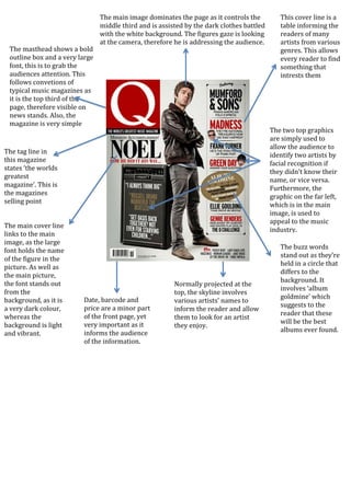

The document summarizes the design elements of a magazine cover. The masthead uses a bold outline and large font to grab attention. The main image dominates the center taking up 1/3 of the page and features an artist looking at the camera to address the audience. Additional graphics and text provide information about artists and articles to interest potential readers.


![Media studies front cover[1]](https://cdn.slidesharecdn.com/ss_thumbnails/mediastudies-frontcover1-120410062901-phpapp01-thumbnail.jpg?width=640&height=640&fit=bounds)


![Presentation[I]Tems Escape](https://cdn.slidesharecdn.com/ss_thumbnails/presentationitemsescape-090705215707-phpapp01-thumbnail.jpg?width=640&height=640&fit=bounds)


