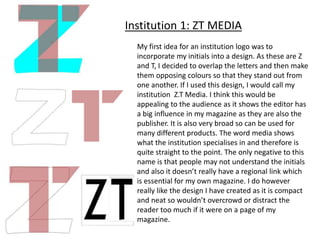
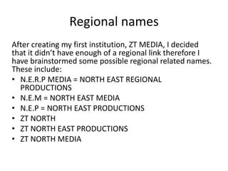
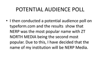
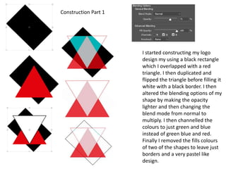
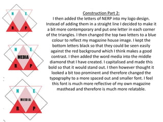
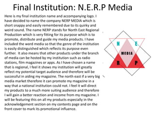
Institution drafts
Zoe Toase
Conventions of an institution name
Before deciding on an institution name, I have outlined
a few conventions that I believe are vital in order to
make it most successful. The name should be:
• Short and simple
• Easy to remember
• Regionally associated
• Personal or relatable
• Unique and unlike any other already out there
• Reflective of my magazines interests
• Broad and adaptable so it can be used on many other
products and branches
Conventions of an institution logo
Before creating my logo for my institution, I have
summarised a few conventions which I think are vital in
order to make it look professional. The logo should:
• Stand out
• Use bright colours
• Be compact and tidy
• Be able to enlarge and shrink without becoming
unreadable so that it can be used on numerous
products
• Look unique and creative
• Not be too complex or overcrowded
My first idea for an institution logo was to
incorporate my initials into a design. As these are Z
and T, I decided to overlap the letters and then make
them opposing colours so that they stand out from
one another. If I used this design, I would call my
institution Z.T Media. I think this would be
appealing to the audience as it shows the editor has
a big influence in my magazine as they are also the
publisher. It is also very broad so can be used for
many different products. The word media shows
what the institution specialises in and therefore is
quite straight to the point. The only negative to this
name is that people may not understand the initials
and also it doesn’t really have a regional link which
is essential for my own magazine. I do however
really like the design I have created as it is compact
and neat so wouldn’t overcrowd or distract the
reader too much if it were on a page of my
magazine.
Institution 1: ZT MEDIA
Regional names
After creating my first institution, ZT MEDIA, I decided
that it didn’t have enough of a regional link therefore I
have brainstormed some possible regional related names.
These include:
• N.E.R.P MEDIA = NORTH EAST REGIONAL
PRODUCTIONS
• N.E.M = NORTH EAST MEDIA
• N.E.P = NORTH EAST PRODUCTIONS
• ZT NORTH
• ZT NORTH EAST PRODUCTIONS
• ZT NORTH MEDIA
POTENTIAL AUDIENCE POLL
• I then conducted a potential audience poll on
typeform.com and the results show that
NERP was the most popular name with ZT
NORTH MEDIA being the second most
popular. Due to this, I have decided that the
name of my institution will be NERP Media.
I started constructing my logo
design my using a black rectangle
which I overlapped with a red
triangle. I then duplicated and
flipped the triangle before filling it
white with a black border. I then
altered the blending options of my
shape by making the opacity
lighter and then changing the
blend mode from normal to
multiply. I then channelled the
colours to just green and blue
instead of green blue and red.
Finally I removed the fills colours
of two of the shapes to leave just
borders and a very pastel like
design.
Construction Part 1
Construction Part 2:
I then added the letters of NERP into my logo design.
Instead of adding them in a straight line I decided to make it
a bit more contemporary and put one letter in each corner
of the triangles. I then changed the top two letters to a blue
colour to reflect my magazine house image. I kept the
bottom letters black so that they could be seen easily
against the red background which I think makes a good
contrast. I then added the word media into the middle
diamond that I have created. I capitalised and made this
bold so that it would stand out. I then however thought it
looked a bit too prominent and therefore changed the
typography to a more spaced out and smaller font. I feel
this font is much more reflective of my own magazine
masthead and therefore is much more relatable.
Final Institution: N.E.R.P Media
Here is my final institution name and accompanying logo. I
have decided to name the company NERP MEDIA which is
short snappy and easily remembered due to its quirky and
weird sound. The name NERP stands for North East Regional
Production which is very fitting for its purpose which is to
promote, distribute and guide my media products. I have
included the word media so that the genre of the institution
is easily distinguished which reflects its purpose even
further. It also means that other products under the branch
of media can be hosted by my institution such as radio
stations, film magazines or apps. As I have chosen a name
that is regional, I feel it shows my institution will greatly
reflect my potential target audience and therefore will be
successful in aiding my magazine. The north east if a very big
media market therefore it can promote my magazine in a
way that a national institution could not. I feel it will direct
my products to a much more suiting audience and therefore
I will gain a better reaction and income from my magazine. I
will be featuring this on all my products especially in the
acknowledgement section on my contents page and on the
front cover to mark its promotional influence.

my own institution

  • 1.
  • 2.
    Conventions of aninstitution name Before deciding on an institution name, I have outlined a few conventions that I believe are vital in order to make it most successful. The name should be: • Short and simple • Easy to remember • Regionally associated • Personal or relatable • Unique and unlike any other already out there • Reflective of my magazines interests • Broad and adaptable so it can be used on many other products and branches
  • 3.
    Conventions of aninstitution logo Before creating my logo for my institution, I have summarised a few conventions which I think are vital in order to make it look professional. The logo should: • Stand out • Use bright colours • Be compact and tidy • Be able to enlarge and shrink without becoming unreadable so that it can be used on numerous products • Look unique and creative • Not be too complex or overcrowded
  • 4.
    My first ideafor an institution logo was to incorporate my initials into a design. As these are Z and T, I decided to overlap the letters and then make them opposing colours so that they stand out from one another. If I used this design, I would call my institution Z.T Media. I think this would be appealing to the audience as it shows the editor has a big influence in my magazine as they are also the publisher. It is also very broad so can be used for many different products. The word media shows what the institution specialises in and therefore is quite straight to the point. The only negative to this name is that people may not understand the initials and also it doesn’t really have a regional link which is essential for my own magazine. I do however really like the design I have created as it is compact and neat so wouldn’t overcrowd or distract the reader too much if it were on a page of my magazine. Institution 1: ZT MEDIA
  • 5.
    Regional names After creatingmy first institution, ZT MEDIA, I decided that it didn’t have enough of a regional link therefore I have brainstormed some possible regional related names. These include: • N.E.R.P MEDIA = NORTH EAST REGIONAL PRODUCTIONS • N.E.M = NORTH EAST MEDIA • N.E.P = NORTH EAST PRODUCTIONS • ZT NORTH • ZT NORTH EAST PRODUCTIONS • ZT NORTH MEDIA
  • 6.
    POTENTIAL AUDIENCE POLL •I then conducted a potential audience poll on typeform.com and the results show that NERP was the most popular name with ZT NORTH MEDIA being the second most popular. Due to this, I have decided that the name of my institution will be NERP Media.
  • 7.
    I started constructingmy logo design my using a black rectangle which I overlapped with a red triangle. I then duplicated and flipped the triangle before filling it white with a black border. I then altered the blending options of my shape by making the opacity lighter and then changing the blend mode from normal to multiply. I then channelled the colours to just green and blue instead of green blue and red. Finally I removed the fills colours of two of the shapes to leave just borders and a very pastel like design. Construction Part 1
  • 8.
    Construction Part 2: Ithen added the letters of NERP into my logo design. Instead of adding them in a straight line I decided to make it a bit more contemporary and put one letter in each corner of the triangles. I then changed the top two letters to a blue colour to reflect my magazine house image. I kept the bottom letters black so that they could be seen easily against the red background which I think makes a good contrast. I then added the word media into the middle diamond that I have created. I capitalised and made this bold so that it would stand out. I then however thought it looked a bit too prominent and therefore changed the typography to a more spaced out and smaller font. I feel this font is much more reflective of my own magazine masthead and therefore is much more relatable.
  • 9.
    Final Institution: N.E.R.PMedia Here is my final institution name and accompanying logo. I have decided to name the company NERP MEDIA which is short snappy and easily remembered due to its quirky and weird sound. The name NERP stands for North East Regional Production which is very fitting for its purpose which is to promote, distribute and guide my media products. I have included the word media so that the genre of the institution is easily distinguished which reflects its purpose even further. It also means that other products under the branch of media can be hosted by my institution such as radio stations, film magazines or apps. As I have chosen a name that is regional, I feel it shows my institution will greatly reflect my potential target audience and therefore will be successful in aiding my magazine. The north east if a very big media market therefore it can promote my magazine in a way that a national institution could not. I feel it will direct my products to a much more suiting audience and therefore I will gain a better reaction and income from my magazine. I will be featuring this on all my products especially in the acknowledgement section on my contents page and on the front cover to mark its promotional influence.