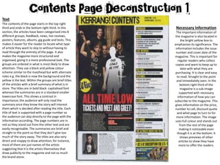
Necessary Information
The important information of
the magazine is also located in
the bright yellow box to
emphasises its significance. The
information includes the issue
number and cover date of the
magazine. This is important for
regular readers who collect
copies and want to keep up to
date with what they are
purchasing. It is clear and easy
to read. Straight to the point
and immediately seen. In the
bottom right third of the
magazine is a sub-image
supported with necessary
information of how you can
subscribe to the magazine. This
gives information on the price,
number to call, discount quote
and what page to turn to for
more information. The image
uses full colour and stands out
from the rest of the page
making it noticeable even
though it is at the bottom. It
shows previews of other
articles to show they have
more to offer the readers.
Text
The contents of the page starts in the top right
third and ends in the bottom right third. In this
section, the articles have been categorised into 8
different groups; feedback, news, live reviews,
posters, features, albums, gig guide and tests. This
makes it easier for the reader to locate what type
of article they want to skip to without having to
read through the entirety of the page. It also
makes the magazine more structured and
organised, giving it a more professional look. The
groups are ordered in what is most likely to draw
attention. They use a black and yellow colour
scheme similar to the masthead but with alternate
roles e.g. the black is now the background and the
yellow is the text. Within the groups are brief titles
of the articles with a brief summary of what is in
store. The titles are in bold black capitalised font
whereas the summaries are in a standard smaller
lowercase font. This shows a contrast in
importance; the audience will only read the
summary once they know the story will interest
them which is decided after reading the title. Each
title of text is supported with a page number so
the audience can skip directly to the page with the
information according. The page numbers are in
red so they stand out from the other text and are
easily recognisable. The summaries are brief and
straight to the point so that they don’t give too
much of the story away. The titles are also very
direct and snappy to draw attention, for instance,
most of them are just names of the artists
suggesting that it is the artists themselves that
draw publicity to the magazine and not so much
the brand alone.
Dominant Image
The dominant image is of a famous band
known as “All Time Low” which will draw
readers attention to the magazine as the
band is very popular. The image is of the
band members who h
Masthead:
The Masthead is positioned at the very top
of the page and reads “Kerrang! Contents.”
This sums up the importance of the page and
reminds us that the contents is exclusive to
the brand. The font style is capitalised, bold,
cracked and worn down. This is the same
font used on the front cover which shows it
is a recognisable feature of the brand. It also
emphasises the violent attitudes of rock. The
black lettering contrasts with the yellow box
background, making it one of the brightest
things on the page.

Contents 1

  • 1.
    Necessary Information The importantinformation of the magazine is also located in the bright yellow box to emphasises its significance. The information includes the issue number and cover date of the magazine. This is important for regular readers who collect copies and want to keep up to date with what they are purchasing. It is clear and easy to read. Straight to the point and immediately seen. In the bottom right third of the magazine is a sub-image supported with necessary information of how you can subscribe to the magazine. This gives information on the price, number to call, discount quote and what page to turn to for more information. The image uses full colour and stands out from the rest of the page making it noticeable even though it is at the bottom. It shows previews of other articles to show they have more to offer the readers. Text The contents of the page starts in the top right third and ends in the bottom right third. In this section, the articles have been categorised into 8 different groups; feedback, news, live reviews, posters, features, albums, gig guide and tests. This makes it easier for the reader to locate what type of article they want to skip to without having to read through the entirety of the page. It also makes the magazine more structured and organised, giving it a more professional look. The groups are ordered in what is most likely to draw attention. They use a black and yellow colour scheme similar to the masthead but with alternate roles e.g. the black is now the background and the yellow is the text. Within the groups are brief titles of the articles with a brief summary of what is in store. The titles are in bold black capitalised font whereas the summaries are in a standard smaller lowercase font. This shows a contrast in importance; the audience will only read the summary once they know the story will interest them which is decided after reading the title. Each title of text is supported with a page number so the audience can skip directly to the page with the information according. The page numbers are in red so they stand out from the other text and are easily recognisable. The summaries are brief and straight to the point so that they don’t give too much of the story away. The titles are also very direct and snappy to draw attention, for instance, most of them are just names of the artists suggesting that it is the artists themselves that draw publicity to the magazine and not so much the brand alone.
  • 2.
    Dominant Image The dominantimage is of a famous band known as “All Time Low” which will draw readers attention to the magazine as the band is very popular. The image is of the band members who h Masthead: The Masthead is positioned at the very top of the page and reads “Kerrang! Contents.” This sums up the importance of the page and reminds us that the contents is exclusive to the brand. The font style is capitalised, bold, cracked and worn down. This is the same font used on the front cover which shows it is a recognisable feature of the brand. It also emphasises the violent attitudes of rock. The black lettering contrasts with the yellow box background, making it one of the brightest things on the page.