
Recommended
More Related Content
Viewers also liked
Viewers also liked (20)
Similar to Billboard codes & conventions
Similar to Billboard codes & conventions (20)
More from daisyfranklinmedia
More from daisyfranklinmedia (13)
Recently uploaded
Recently uploaded (20)
Billboard codes & conventions
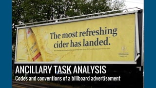
- 1. ANCILLARY TASK ANALYSIS Codes and conventions of a billboard advertisement
- 2. ● LOGO: the Carling logo features very clearly on this billboard advertisement ● COLOURFUL AND ATTRACTIVE: this billboard is bright and would stand out to passersby ● CLEAR AND LARGE IMAGES: the beer bottle that features on this advertisement is big and stands out to the viewers and links directly to the slogan ● GOOD LAYOUT: the layout of this billboard is effective because the writing stands out as it is simple ● FONT: the font is easy to read and strongly coloured so it can be easily read ● COLOUR SCHEME: the colour scheme is attractive to the viewer as they only use 3 colours so the advertisement doesn’t look too busy and distract the viewers from the message. ● SLOGAN: the slogan attracts the audience and also anchors to the image. It talks about a ‘refreshing’ drink ‘landing’ and then the image is a drink splashing and landing which makes them directly link CODES AND CONVENTIONS
- 3. WHAT MEANINGS ARE CREATED BY THE USE CODES AND CONVENTIONS? The conventions of alcohol advertising have to make the viewer want to drink the product and they will try and create the feeling of being relaxed/refreshed when you have it.. The codes and conventions of this advertisement are effective because the words ‘most refreshing’ outweigh the competition of other refreshing ciders. The picture is also effective because the splash signifies being cooled down and quenching your thirst which will further persuade someone to want this drink. The landing of the cider is good because it is as if the cider will change them because they are refreshed and also change them because they will never get a cider better than this.