
Recommended
More Related Content
What's hot
What's hot (20)
Similar to Analysing a Kerrang! Magazine Contents Page
Similar to Analysing a Kerrang! Magazine Contents Page (20)
More from amydinsey
More from amydinsey (19)
Recently uploaded
Recently uploaded (20)
Analysing a Kerrang! Magazine Contents Page
- 1. Analysing A Contents Page By Amy Dinsey Kerrang! Magazine
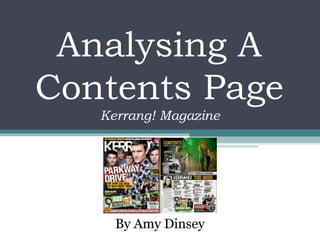
- 2. Layout • The contents page is divided up into pretty much half, with the top half focusing on the review of My Chemical Romance. This is not the cover story, and is hardly shown on the front cover, but is the focus of the contents page, as this is the next page the reader will look at when flicking through the magazine, acting in the same way as the front page, enticing the reader in. • Just over half of the page is filled up with images, and the text is split up into different pages, easily making it visible to the reader what pages the articles are on. • The page also has a section for the editors note at the bottom left side, with an image of the editor just above, the text going down in a column with the editors signature underneath, making more of a connection between the reader and the magazine, and it shows an insight to the creators of the magazine.
- 3. Layout • The headine of the contents page stating ‘contents’ is in the top left hand corner of the page doesn’t take away much of the attention from the main article that this page is portraying. • Generally the images are separated from the text, but headings relating to the pictures sometimes overlap the image, making it clear which image it’s relating to. This appeals to the target audience for this magazine as it gives the page a rebel-like and rocky theme. • By using the layout as half being a picture, and half being the columns with the features listed in, it means that this page does a similar job as the front cover of the magazine. Even though the picture of My Chemical Romance isn’t featured largely on the front cover, it’s the main feature of this page, so the contents page is promoting more features and showing the reader new things they can read inside that they didn't know much about on the front cover.
- 4. Layout • The captions on this page overlap onto the picture they’re referring to , making it obvious to the reader what caption goes with what picture. The reader is also helped by the caption boxes as they have arrows on one side pointing in the direction of the picture it is referring to. • The contents of magazine is listed in columns making it easier for the reader to find quickly what page the article they’re looking for is on. • From this page, the reader is guided to the different features in many ways. Firstly, the main feature at the top of the page informs the reader of this article, and is persuaded that this is a big and interesting as is has a lot of focus. There are also little icon’s saying ‘cover story’ next to the articles which are featured on the front cover, meaning that the reader knows exactly what page they’re looking for when trying to find a story they’ve seen on the front cover.
- 5. Images and Colours • The main images features a popular and famous band of the genre of music (rock) that this magazine is targeting it’s audience at, making it a good decision to use this image as it will appeal to the majority of it’s audience. •The image of the editor helps the reader to engage with the magazine in a more personal form, and also draws their attention to the note, otherwise they probably wouldn’t have noticed the column of text written by the editor. •The vibrant colours used, green, yellow and black compliments the rocky/rebel mood of this page, and means that it all fits in, rather than looking out of place for being in a clashing colour. •There are quite a few smaller pictures that reveal more of what’s inside the magazine, enticing the reader to turn to the full article and read on.
- 6. Images and Colours •The colour of the Kerrang logo is also kept the same even though it’s next to yellow text in the same font and heading, adding fluency to the page, whilst also helping the heading stand out to catch the readers’ eye. •In the bottom right there is a small advert for a subscription for Kerrang directly in front of a known band, connoting that the magazine is up to date and definitely worth buying because of how good the features and who the features are on are. •There are also pictures at the bottom of the page which are actually posters that the audience can tear out and use, and are overlapping each other so you can’t see the whole picture, and also saves space on the page. The text in front of these pictures has a green background, both relating to the band name as well as matching the colour scheme formed by the main image of My Chemical Romance at the top.
- 7. Text and Language • All of the headings on the page are in capitals, making the text stand out and seem really important, enticing the reader into reading that heading, and making them more likely to carry on reading the context underneath. •The mini subheadings make it clear which picture they’re with, as well as the reason/who’s in the pictures being displayed. •The colours that the text is in are in relation to the house style, e.g. the yellow text on the headings. •The language is as if the magazine know the band they’re talking about on a personal basis, making the reader feel closer to the band, and making them more likely to read the article. •The bands names are the subheadings, and then underneath is a bit more information about the article, being effective as the reader get’s more of a hint as to what will be included, making them want to read on.