
Recommended
More Related Content
What's hot
What's hot (17)
Similar to Modern magazine masthead analysis
Similar to Modern magazine masthead analysis (20)
Recently uploaded
Recently uploaded (20)
Modern magazine masthead analysis
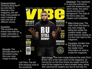
- 1. Masthead : The masthead is very big and bold to catch the audience's eye, which works, the colour stands out from the background. The style of the font is also very modern and noticeable. Main Cover Line : The main cover line links to the main image by telling the reader the content inside, quite small however seeing as it is the main topic to the magazine. Left Third: The left third showing most of the coverlines. Coverline : The coverline also shown here tells the reader what else is inside the magazine. Coverline : Smaller than the other fonts, giving the reader more information on what is inside the magazine. Barcode : The barcode placed at the bottom away from any main image or writing Main Image : The main image features the artist Chris Brown who is the main story for the magazine, so having him on the front shows the reader what this issue of the magazine is about straight away, along with catching the readers eye due to how big it is. Featured Artists : Showing along the top who else is featured in the magazine, this will draw more people to read it seeing as there are lots of different names.
- 2. Main Cover Line : The main coverline is placed right across the page and the only piece of writing that goes over the main image, signalling that the main cover line is linked to the main image. Masthead : The Masthead stands out a lot due to the different colour that is used to set it apart from the rest of the magazine. The title however is covered up by the main image which is not the best seeing as the magazines name can not be fully seen. Coverline : cleverly placed so the main image is not disturbed, It also tells the reader what else features in the magazine. Featured Artists : Are shown for the readers, so they know what else is inside the magazine. It also makes sure that if the reader does not like the main article on 50 Cent, there are more artists in the magazine which the reader could look at. Main Image : The main image features the artist 50 Cent who is the main story for the magazine, so having him on the front shows the reader what this issue of the magazine is about straight away, along with catching the readers eye due to how big it is. Barcode : The barcode placed at the bottom away from any main image or writing Left Third : The left third showing most of the coverlines.
- 3. Masthead : The Masthead does not stand out because of the use of colours, the background is about the same colour as the title. It however is very big and Bold, so will be seen. Coverline : Very small compared to other fonts, but still can be seen easily, to tell what else is in the magazine. Main Cover Line : The second/other main cover line is showing a different award to the one across, but is also in the same font and describes another award that has been given to the person connected to the writing. Main Cover Line : One of the main coverlines is and award for the image that is connected to the writing. This shows who the person is and what they will be talking about inside. Main Image : The main images are a big part of this magazine, because there is not a lot of writing on the front. The reader will be drawn into these TWO main images because of how important and stylish they look. Left Third : The left third showing most of the coverlines. Barcode : The barcode placed at the bottom away from any main image or writing
- 4. Masthead : The masthead is very sharp and modern, not one of the most eye catching, but does stand out from the background Main Cover Line : The main cover line shows who its about by having the main images name as the title, this giving the identity of the main image and why she is on the cover. Coverline : There are a lot of coverlines on each side of the magazine, showing the reader what else is inside, which gives the reader more of a reason to buy the magazine because they could see more than one article that they want to read. Coverline: This side of the magazine has more for the male audience with the coverline showing things such as sport. Main Image : The main image is very stylish and very eye catching to both female and male audience. This shows straight away that the main article is about this artist Rhianna. Left Third : The left third showing most of the coverlines. Barcode : The barcode placed at the bottom away from any main image or writing
- 5. Masthead : The Masthead is very modern and slick, that stands out and has a very stylish, expensive side to it. The colour matches with the clothes that is being worn by the Main Image and along with the font of the cover line and Main Cover Line. Main Cover Line: The main coverline is the biggest font under the title and this then links to the main image, showing what the main article is about and who the main image is. Coverline : more on what is inside for the reader to see. Coverline : The coverline's on the left third all show what else is inside the magazine, which gives the audience more choices to buy the magazine. The font is kept up with the same colours and writing to keep up with the modern image. Main Image : Jay Z is the main image and with the way he is dressed, it gives of a very expensive, stylish, Smart and modern look matching to the magazine's overall concept. Left Third : The left third showing most of the coverlines.