Download as PDF, PPTX

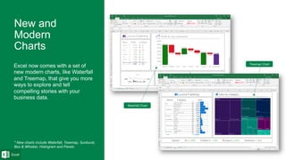
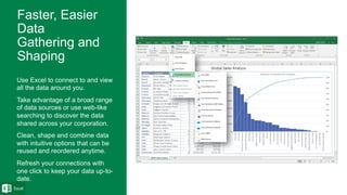
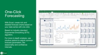
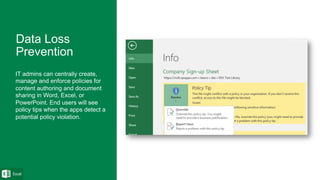
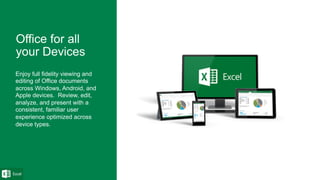
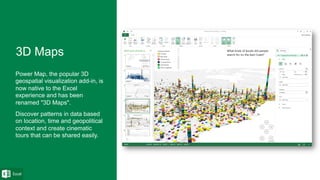
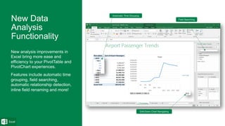
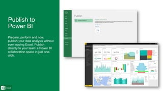
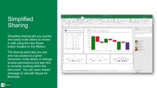
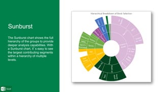
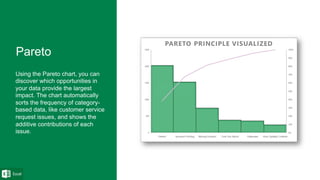
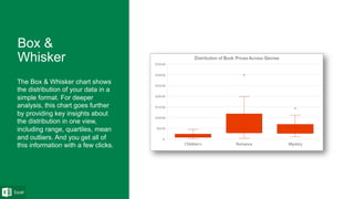

Excel 2016 introduces several new charts (Treemap, Waterfall, Histogram) and capabilities for analyzing, cleaning, and sharing data. Key features include improved data connectivity and transformation tools, one-click forecasting, centralized data loss prevention policies, cross-device compatibility, 3D mapping functionality, enhanced PivotTable analysis, and direct publishing to Power BI. The new charts provide additional options for visualizing hierarchical, financial, distribution, and categorical data.


