Download to read offline


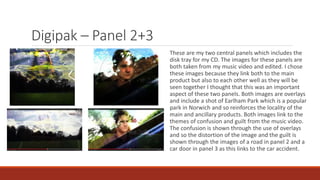

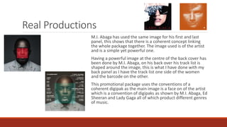


The document discusses the effectiveness of combining ancillary texts like a digipak and magazine advert with a main music product. The digipak uses images from the music video throughout its four panels to create coherence between the products. Panel 1 features a striking image of the performer to familiarize audiences. Panels 2-3 continue linking themes and locations from the video. Panel 4 includes a black and white image and track list. The magazine advert also uses an image from the shooting of the music video. It was chosen over a digipak image because it better conveys themes without showing faces. The first panel of the digipak is also included to link the two ancillary texts and aid recognition for consumers


