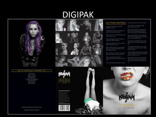
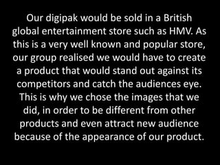
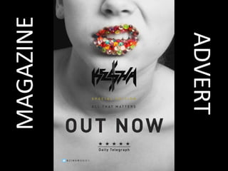
How effective is the combination of
your main product and ancillary
texts?
BY NICOLE OLIVER
For this project, our group wanted to create an
distinctive video with relative and effective
ancillary texts, e.g. magazine advert and digipak.
This was to create an influential media figure
which then would create a loyal fan base to
support the artist. Our group aimed to portray a
believable and effective artist in our digipak and
magazine advert to follow the characteristics of
the artist in our final music video.
DIGIPAK
The first ancillary task that our group made was a digipak, from the beginning of
making this we knew that this would be key in portraying insights to our music video
and the characteristics of the artist, hoping to entice the audience into wanting to
view our final music video.
In one panel, our group decided to show various images of the artist, this is to portray
the several appearances and characteristics
that the artist uses in order to entice a wide range
of people that this artist can appeal to using various
looks. The artist is seen wearing new trends
and statement jewellery which people around
the age of our target audience would be
interested in. This panel in the digipak portrays
the various characteristics of the artist that are
further displayed in our music video. The images
show the artist to be fun, trendy and in some
images she can be seen as rebellious which follows
the actions of the artist in the music video in certain
scenes. Our group believes this digipak gives an effective and relative insight to our music video.
The front and back images for
our digipak include black and
white images shown with the
use of vibrant colour for
certain parts of the image.
Our group believes this idea
portrays the artist perfectly,
as the black and white
aspects of the images show
the sensible working side of
the artist shown in the music
video, then the eye catching use of colour portrays the artists explosive and exciting side, when she
is shown in the music video to be rebellious and fun. The front of the digipak, using the image of
the artists lips displayed using a rebellious expression, is also featured frequently in our music
video as a close up of the artists lips singing along to her song. So this is the biggest insight to our
audience as to what the music video was going to look like, this is why our group chose this image
as the front of our digipak, as well as the fact that we thought this was the most effective image
taken of the artist. The front of our digipak also includes the name of the artist in a bold
outstanding form, along with the title of the single. The back of our digipak has the artists name in
the text that is used for her name in all of this artists products, as seen also on the front of our
digipak. The back image follows the black and white theme with hints of vibrant colour, this is used
on the artists outfit as this outfit is worn in our final music video. The outfit the artist is wearing is
seen to be fashionable by young adults, and as our target audience, they can relate to this and
even aspire to have these trends. The back of our digipak also includes a barcode for the sale of
this product and it also features the name of the single being sold.
The other three panels of our groups digipak was used to say
special thanks to the various people who took part in the
creation of our music video, so they were acknowledged for
the work they had done in participation for our final music
video. On another panel included in our digipak our group
decided to display the lyrics to the single being sold. This is
because the lyrics will give the audience a clear insight to the
type of song and music video that we chose. The lyrics may
be relatable for some of our audience and this may determine
that they believe they would like the song and the music
video giving them the urge to buy this product. Another panel
on our digipak is a single image of the artist, again following
the theme of a black and white image with a vibrant colour,
this time being the artists hair. This is again showing the
artists clashing characteristics
also demonstrated in our
music video. We chose this
image because it had a
different view of the artist as
close ups are frequently used
in our music video and
images, also because the
outfit being worn by the
artist is one that she wears in
the music video.
The target of this digipak was to maintain the image that we portrayed of the artist in
our music video through the use of our ancillary task. I believe we achieved this as the
characteristics were clearly portrayed through the use of colour and various single
images and a collage for one panel of our digipak. We didn’t want to use a lot of images
for each panel because we didn’t want to give everything away about the video, leaving
the audience intrigued as to what the music video would consist of. The characteristics
displayed on this digipak are ones such as fun, lively, trendy, happy, and in other images
the artist is seen as a rebel, for example the image of her pulling chewing gum out of
her mouth in a rebellious fashion. These characteristics are all further portrayed in our
music video. The use of numerous outfits contribute to portraying an adventurous and
unique style that females may aspire to have. The use of exposure of the artists legs and
minimal clothing on the front picture of our digipak shows the use of voyeurism in
order to receive male attention to the artist and the product and create a wider range
of audience. We also believe the use of trendy clothing may cause the artist to become
influential to the female members of our audience. These are examples of branding,
branding is a common convention of a music video as the label of this artist has to
present the artist to the audience as the artist they have been following since the
beginning of their career. This means maintaining the same theme and style of the artist
to the loyal audience as it is familiar to them and is an artist they follow due to this style
and theme that has been used in every product the artist has released.
Our digipak would be sold in a British
global entertainment store such as HMV. As
this is a very well known and popular store,
our group realised we would have to create
a product that would stand out against its
competitors and catch the audiences eye.
This is why we chose the images that we
did, in order to be different from other
products and even attract new audience
because of the appearance of our product.
MAGAZINE
ADVERT
The purpose of our magazine advert is to promote the single ‘All that Matters’. As the main
focus of our video was the artist, we decided that is was best for her to be the main feature
of our magazine advert. We used an image of our artist that relates to our music video, as
she appears looking like this in a scene from our music video. She is displayed with gems on
her lips in bold vibrant colours to stand out to the audience. Also as voyeurism was used in
our music video, we chose an image where the artist has exposure of skin, with the illusion
of nudity, to attract the male audience. Our artist is also pulling a fierce expression,
showing her rebellious and wild side, which is also shown throughout our music video.
For our magazine advert we also chose a black back drop as the background, as we wanted
the main focus to be on the artist and the vibrant colours on her lips, we chose this type of
design because we believe the clash of dark colours with bright vibrant colours was
effective and made the product stand out.
The chosen font for this advert, especially the artists name, was to adhere with her edgy
style and stand out to the audience, this font was also used for the artists name on our
digipak, and therefore this supports the crucial method of ‘Branding.’ For the text on the
advert, we only used vital information to avoid distraction of the artists image, we informed
them of when the single was released, the title of the song and artist of the single, all of the
vital information for them to purchase our product. We also included a five star rating from
the Daily Telegraph, to show the audience that they would not be disappointed with our
product as it is already highly rated by an trustworthy source. The aim of this was to entice
the audience into buying our product. We also included our production company’s twitter
name, so audiences would be able to follow and purchase future music and products from
this artist.
Comparison
After analysing the skills and techniques used in both of our ancillary tasks I believe, that as
a combination, the two work together effectively to promote our music video. Our digipak
focused mainly on the artists image, and gives more of an insight into the content of the
music video. Whereas the magazine advert focuses more on the crucial information on the
releasing of the main product. Both methods work well in promoting the video due to the
magazine advert not giving much information away about our final product, forcing the
audience to want to find out more and purchase the product, whereas the digipak, which
provides more information and images of the artist and music video to want to proceed and
view our final product. All of our products, including the main and both ancillary tasks,
follow the same theme with the use of ‘Branding.’ which means throughout all of our
products, the distinctive artist we have created has been maintained in all products, which
enables us to target a specific audience. There is a strong theme of rebelliousness and
voyeurism throughout our products, also empowerment and independence. Similar fonts
and edits are used in all products, including contrasting images and a vibrant colour scheme
to engage the audience to our product. In conclusion, the theme we portrayed throughout
all three products create a recognisable brand for our target audience to follow. Without an
established visual image, it would be impossible to target a specific market and follow their
needs for future products.

Evaluation 2

  • 1.
    How effective isthe combination of your main product and ancillary texts? BY NICOLE OLIVER
  • 2.
    For this project,our group wanted to create an distinctive video with relative and effective ancillary texts, e.g. magazine advert and digipak. This was to create an influential media figure which then would create a loyal fan base to support the artist. Our group aimed to portray a believable and effective artist in our digipak and magazine advert to follow the characteristics of the artist in our final music video.
  • 3.
  • 4.
    The first ancillarytask that our group made was a digipak, from the beginning of making this we knew that this would be key in portraying insights to our music video and the characteristics of the artist, hoping to entice the audience into wanting to view our final music video. In one panel, our group decided to show various images of the artist, this is to portray the several appearances and characteristics that the artist uses in order to entice a wide range of people that this artist can appeal to using various looks. The artist is seen wearing new trends and statement jewellery which people around the age of our target audience would be interested in. This panel in the digipak portrays the various characteristics of the artist that are further displayed in our music video. The images show the artist to be fun, trendy and in some images she can be seen as rebellious which follows the actions of the artist in the music video in certain scenes. Our group believes this digipak gives an effective and relative insight to our music video.
  • 5.
    The front andback images for our digipak include black and white images shown with the use of vibrant colour for certain parts of the image. Our group believes this idea portrays the artist perfectly, as the black and white aspects of the images show the sensible working side of the artist shown in the music video, then the eye catching use of colour portrays the artists explosive and exciting side, when she is shown in the music video to be rebellious and fun. The front of the digipak, using the image of the artists lips displayed using a rebellious expression, is also featured frequently in our music video as a close up of the artists lips singing along to her song. So this is the biggest insight to our audience as to what the music video was going to look like, this is why our group chose this image as the front of our digipak, as well as the fact that we thought this was the most effective image taken of the artist. The front of our digipak also includes the name of the artist in a bold outstanding form, along with the title of the single. The back of our digipak has the artists name in the text that is used for her name in all of this artists products, as seen also on the front of our digipak. The back image follows the black and white theme with hints of vibrant colour, this is used on the artists outfit as this outfit is worn in our final music video. The outfit the artist is wearing is seen to be fashionable by young adults, and as our target audience, they can relate to this and even aspire to have these trends. The back of our digipak also includes a barcode for the sale of this product and it also features the name of the single being sold.
  • 6.
    The other threepanels of our groups digipak was used to say special thanks to the various people who took part in the creation of our music video, so they were acknowledged for the work they had done in participation for our final music video. On another panel included in our digipak our group decided to display the lyrics to the single being sold. This is because the lyrics will give the audience a clear insight to the type of song and music video that we chose. The lyrics may be relatable for some of our audience and this may determine that they believe they would like the song and the music video giving them the urge to buy this product. Another panel on our digipak is a single image of the artist, again following the theme of a black and white image with a vibrant colour, this time being the artists hair. This is again showing the artists clashing characteristics also demonstrated in our music video. We chose this image because it had a different view of the artist as close ups are frequently used in our music video and images, also because the outfit being worn by the artist is one that she wears in the music video.
  • 7.
    The target ofthis digipak was to maintain the image that we portrayed of the artist in our music video through the use of our ancillary task. I believe we achieved this as the characteristics were clearly portrayed through the use of colour and various single images and a collage for one panel of our digipak. We didn’t want to use a lot of images for each panel because we didn’t want to give everything away about the video, leaving the audience intrigued as to what the music video would consist of. The characteristics displayed on this digipak are ones such as fun, lively, trendy, happy, and in other images the artist is seen as a rebel, for example the image of her pulling chewing gum out of her mouth in a rebellious fashion. These characteristics are all further portrayed in our music video. The use of numerous outfits contribute to portraying an adventurous and unique style that females may aspire to have. The use of exposure of the artists legs and minimal clothing on the front picture of our digipak shows the use of voyeurism in order to receive male attention to the artist and the product and create a wider range of audience. We also believe the use of trendy clothing may cause the artist to become influential to the female members of our audience. These are examples of branding, branding is a common convention of a music video as the label of this artist has to present the artist to the audience as the artist they have been following since the beginning of their career. This means maintaining the same theme and style of the artist to the loyal audience as it is familiar to them and is an artist they follow due to this style and theme that has been used in every product the artist has released.
  • 8.
    Our digipak wouldbe sold in a British global entertainment store such as HMV. As this is a very well known and popular store, our group realised we would have to create a product that would stand out against its competitors and catch the audiences eye. This is why we chose the images that we did, in order to be different from other products and even attract new audience because of the appearance of our product.
  • 9.
  • 10.
    The purpose ofour magazine advert is to promote the single ‘All that Matters’. As the main focus of our video was the artist, we decided that is was best for her to be the main feature of our magazine advert. We used an image of our artist that relates to our music video, as she appears looking like this in a scene from our music video. She is displayed with gems on her lips in bold vibrant colours to stand out to the audience. Also as voyeurism was used in our music video, we chose an image where the artist has exposure of skin, with the illusion of nudity, to attract the male audience. Our artist is also pulling a fierce expression, showing her rebellious and wild side, which is also shown throughout our music video. For our magazine advert we also chose a black back drop as the background, as we wanted the main focus to be on the artist and the vibrant colours on her lips, we chose this type of design because we believe the clash of dark colours with bright vibrant colours was effective and made the product stand out. The chosen font for this advert, especially the artists name, was to adhere with her edgy style and stand out to the audience, this font was also used for the artists name on our digipak, and therefore this supports the crucial method of ‘Branding.’ For the text on the advert, we only used vital information to avoid distraction of the artists image, we informed them of when the single was released, the title of the song and artist of the single, all of the vital information for them to purchase our product. We also included a five star rating from the Daily Telegraph, to show the audience that they would not be disappointed with our product as it is already highly rated by an trustworthy source. The aim of this was to entice the audience into buying our product. We also included our production company’s twitter name, so audiences would be able to follow and purchase future music and products from this artist.
  • 11.
    Comparison After analysing theskills and techniques used in both of our ancillary tasks I believe, that as a combination, the two work together effectively to promote our music video. Our digipak focused mainly on the artists image, and gives more of an insight into the content of the music video. Whereas the magazine advert focuses more on the crucial information on the releasing of the main product. Both methods work well in promoting the video due to the magazine advert not giving much information away about our final product, forcing the audience to want to find out more and purchase the product, whereas the digipak, which provides more information and images of the artist and music video to want to proceed and view our final product. All of our products, including the main and both ancillary tasks, follow the same theme with the use of ‘Branding.’ which means throughout all of our products, the distinctive artist we have created has been maintained in all products, which enables us to target a specific audience. There is a strong theme of rebelliousness and voyeurism throughout our products, also empowerment and independence. Similar fonts and edits are used in all products, including contrasting images and a vibrant colour scheme to engage the audience to our product. In conclusion, the theme we portrayed throughout all three products create a recognisable brand for our target audience to follow. Without an established visual image, it would be impossible to target a specific market and follow their needs for future products.