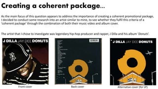
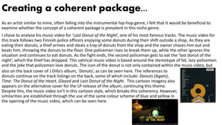
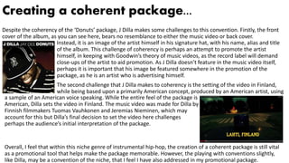
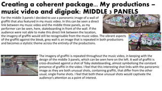
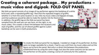
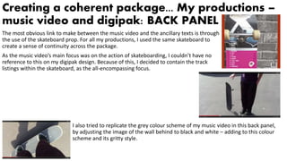
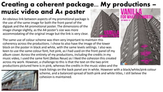
SlideShare a Scribd company logo
Question 2 – How effective is the
combination of your main
product with ancillary texts?
Creating a coherent package...
As the main focus of this question appears to address the importance of creating a coherent promotional package,
I decided to conduct some research into an artist similar to mine, to see whether they fulfil this criteria of a
‘coherent package’ through the combination of both their music video and album cover.
The artist that I chose to investigate was legendary hip-hop producer and rapper, J Dilla and his album ‘Donuts’.
Front cover Back cover Alternative cover (for LP)
Creating a coherent package...
As an artist similar to mine, often falling into the instrumental hip-hop genre, I felt that it would be beneficial to
examine whether the concept of a coherent package is prevalent in this niche genre.
I chose to analyse his music video for ‘Last Donut of the Night’, one of his most famous tracks. The music video for
this track follows two Finnish police officers enjoying some donuts during their shift outside a shop. As they are
eating their donuts, a thief arrives and steals a tray of donuts from the shop and the owner chases him out and
beats him, throwing the donuts to the floor. One policeman rises to break them up, while the other ignores the
situation and continues to eat donuts. As the fight ends, the second policeman gets to eat the ‘last donut of the
night’, which the thief has dropped. This satirical music video is based around the stereotype of fat, lazy policemen
and the joke that policemen love donuts. The icon of the donut is not only contained within the music video, but
also on the back cover of J Dilla’s album, ‘Donuts’, as can be seen here. The references to
donuts continue on the track listings on the back, some of which include: Donuts (Again),
Time: The Donut of the Heart, Glazed and Last Donut of the Night. This cartoon imagery also
appears on the alternative cover for the LP release of the album, continuing this theme.
Despite this, the music video isn’t in this cartoon style, which breaks this coherency. However,
similarities are established through the use of the same colour scheme of blue and yellow in
the opening of the music video, which can be seen here.
Creating a coherent package...
Despite the coherency of the ‘Donuts’ package, J Dilla makes some challenges to this convention. Firstly, the front
cover of the album, as you can see here, bears no resemblance to either the music video or back cover.
Instead, it is an image of the artist himself in his signature hat, with his name, alias and title
of the album. This challenge of coherency is perhaps an attempt to promote the artist
himself, in keeping with Goodwin’s theory of music videos, as the record label will demand
close-ups of the artist to aid promotion. As J Dilla doesn’t feature in the music video itself,
perhaps it is important that his image be featured somewhere in the promotion of the
package, as he is an artist who is advertising himself.
The second challenge that J Dilla makes to coherency is the setting of the video in Finland,
while being based upon a primarily American concept, produced by an American artist, using
a sample of an American voice speaking. While the entire feel of the package is
American, Dilla sets the video in Finland. The music video was made for Dilla by
Finnish filmmakers Tuomas Vauhkonen and Jeremias Nieminen, which may
account for this but Dilla’s final decision to set the video here challenges
perhaps the audience’s initial interpretation of the package.
Overall, I feel that within this niche genre of instrumental hip-hop, the creation of a coherent package is still vital
as a promotional tool that helps make the package memorable. However, the playing with conventions slightly,
like Dilla, may be a convention of the niche, that I feel I have also addressed in my promotional package.
Creating a coherent package... My productions –
music video and digipak: PANEL 1
I feel that the front panel of my album cover is a consolidation of many of the visual and
thematic concepts that are present in my music video. For example, the running urban
theme that is present throughout the music video is captured in the ultimate symbol of
urbanisation: the tower block. Although this specific tower block is not used in my music
video, a similar one is used, and they both highlight the bleak, gritty
conceptual style I was trying to achieve.
The use of perspective was also an important element within both my music video and the front panel of my
digipak. The use of low angle shots is present in both the front panel of my album cover, and also in my music
video, as can be seen here, with the worm’s eye view shot of my performer doing a skateboarding jump. The effect
of these two shots on the audience differs however: with the front panel, you are placed at
the bottom of the tower block, making the audience feel insignificant in comparison with
the effect of the low angle shot pictured on the left which elevates the performers’ status
However, the screenshot from the music video on the right reverses
this effect of elevation, as the high angle shot is more in keeping
with the effect of the front panel, aligning both the performer and
the audience in this sense of insignificance and isolation.
Creating a coherent package... My productions –
music video and digipak: MIDDLE 3 PANELS
For the middle 3 panels I decided to use a panoramic image of a wall of
graffiti that also featured in my music video. In this can be seen a direct
link between my music video and the middle three panels, as my
performer can be seen, here, skateboarding in front of the wall. If the
audience were not able to make this direct link between the location,
the imagery of graffiti would still be recognisable from the music video. The vibrant aspects
of the graffiti against the bleak, grey wall is an image that is repeated in both productions
and becomes a stylistic theme across the entirety of the productions.
The imagery of graffiti is repeated throughout the music video, in keeping with the
design of the middle 3 panels, which can be seen here on the left. A wall of graffiti is
cross-dissolved against a shot of Toby skateboarding, almost symbolising the constant
presence of graffiti in the video. I feel that this interesting shot links with the panoramic
image as they are both unusual shots, containing graffiti, that differ from the other
usual, single frame shots. I feel that both these unusual shots would captivate the
audience’s attention as a point of interest.
Creating a coherent package... My productions –
music video and digipak: FOLD-OUT PANEL
My fold-out panel consists of an image of my performer against the backdrop of a white
brick wall, with a repeated graffiti tag. I feel that the repeated imagery of graffiti,
whether it is from the same location or not, links my music video and digipak strongly,
and that audiences would be able to make the stylistic link for themselves.
In addition, the graffiti tag on the fold-out panel has been
sampled from the wall you can see here, on the right, in my
music video. This creates a direct link between the locations and
style of graffiti, and the use of vibrant graffiti against a plain
backdrop can be seen in both productions.
To create this fold-out panel for my digipak, I needed an image of my performer. As they
were no longer available for a shoot, I had to use a still from my music video and cut the
figure out to form the panel. Not only is a direct link between the productions
established here by using the same image, but also the same costume can be seen on
the performer on the panel, creating a sense of continuity for the audience.
Creating a coherent package... My productions –
music video and digipak: BACK PANEL
The most obvious link to make between the music video and the ancillary texts is through
the use of the skateboard prop. For all my productions, I used the same skateboard to
create a sense of continuity across the package.
As the music video’s main focus was on the action of skateboarding, I couldn’t have no
reference to this on my digipak design. Because of this, I decided to contain the track
listings within the skateboard, as the all-encompassing focus.
I also tried to replicate the grey colour scheme of my music video in this back panel,
by adjusting the image of the wall behind to black and white – adding to this colour
scheme and its gritty style.
Creating a coherent package... My productions –
music video and A4 poster
An obvious link between aspects of my promotional package is
the use of the same image for both the front panel of the
digipak and the A4 promotional poster. The dimensions of the
image change slightly, as the A4 poster’s size was more
accommodating of the original image but the link is very clear.
The same use of colour scheme was then very important to maintain this
coherency across the productions. I chose to also have the image of the tower
block on the poster in black and white, with the same levels settings. I also was
keen to use the same colour font, hot pink, as I had used on the front panel of my
album cover. Across the entirety of my productions, including the credits in my
music video, I used the same font (Bebas Neue) as I liked the cohesion this created
across my work. However, a challenge to this is that the text on the two print
productions pictured here is in pink, whereas the credits in the music video and the
track listings on the back panel are in white. However with a black/white/pink colour
scheme, and a balanced spread of both pink and white titles, I still believe the
cohesion is maintained.
Creating a coherent package... Recurring motifs
and brand style
Across the entire promotional package, I believe that there are
many repeated images and themes, such as the use of the
skateboard prop, the run-down urban locations and the use of
graffiti. Audiences would very easily be able to make this link upon
seeing both sides of the production: the music video and the
ancillary tasks. However, I feel that there are also more specific
areas of coherency across the package, namely in the print
productions that effectively link them together.
Firstly, the use of colouration was extremely important in establishing coherency. Taking
the urban greys from the music video locations, I decided to stick with a mainly
black/white/grey colour scheme to maintain this. This presents itself in the black and white
image of the tower block, the white-washed wall on the fold-out panel, the black and white
wall background of the back panel and the de-saturation of the middle 3 panels. In
addition, the use of pink can be seen consistently across the print productions on every
panel: from the titles to the skateboard and the graffiti. Furthermore, I took the graffiti tag
that I had used on the fold-out panel and used it as a motif for my production, as it appears
as a sticker on the skateboard on the back panel.
I feel that for my artist, I have created a statement brand style through the use of repeated motifs across the
productions and clear stylistic choices that would be recognisable to audiences.

More Related Content

What's hot

What's hot (20)

Evaluation Question 2
Evaluation Question 2Evaluation Question 2
Evaluation Question 2
 
Eval question 2
Eval question 2Eval question 2
Eval question 2
 
Question 2
Question 2Question 2
Question 2
 
Evaluation
EvaluationEvaluation
Evaluation
 
Evaluation q1
Evaluation q1Evaluation q1
Evaluation q1
 
Evaluation of Media Studies Products
Evaluation of Media Studies ProductsEvaluation of Media Studies Products
Evaluation of Media Studies Products
 
Evaluation
EvaluationEvaluation
Evaluation
 
Evaluation
EvaluationEvaluation
Evaluation
 
How effective is the combination of your main product and ancillary tasks?
How effective is the combination of your main product and ancillary tasks?How effective is the combination of your main product and ancillary tasks?
How effective is the combination of your main product and ancillary tasks?
 
Question 2
Question 2Question 2
Question 2
 
Evaluation1 (1)
Evaluation1 (1)Evaluation1 (1)
Evaluation1 (1)
 
Untitleddocument (5)
Untitleddocument (5)Untitleddocument (5)
Untitleddocument (5)
 
Untitleddocument (6)
Untitleddocument (6)Untitleddocument (6)
Untitleddocument (6)
 
Evaluation Question 1
Evaluation Question 1Evaluation Question 1
Evaluation Question 1
 
Evaluation1
Evaluation1Evaluation1
Evaluation1
 
How effective is the combination of your main?
How effective is the combination of your main?How effective is the combination of your main?
How effective is the combination of your main?
 
Evaluation media
Evaluation mediaEvaluation media
Evaluation media
 
Evaluation 2
Evaluation 2 Evaluation 2
Evaluation 2
 
Untitleddocument (3)
Untitleddocument (3)Untitleddocument (3)
Untitleddocument (3)
 
Evaluation question 2: How effective is the combination of your main product ...
Evaluation question 2: How effective is the combination of your main product ...Evaluation question 2: How effective is the combination of your main product ...
Evaluation question 2: How effective is the combination of your main product ...
 

Viewers also liked (14)

Evaluation q.2
Evaluation q.2Evaluation q.2
Evaluation q.2
 
Question 2
Question 2Question 2
Question 2
 
Question 3 audience feedback
Question 3   audience feedbackQuestion 3   audience feedback
Question 3 audience feedback
 
Questionnaire
QuestionnaireQuestionnaire
Questionnaire
 
Audience profile
Audience profileAudience profile
Audience profile
 
Technologies in my coursework
Technologies in my courseworkTechnologies in my coursework
Technologies in my coursework
 
Mulvey Vs. Uchis
Mulvey Vs. UchisMulvey Vs. Uchis
Mulvey Vs. Uchis
 
Indie rock & folk rock album covers
Indie rock & folk rock album coversIndie rock & folk rock album covers
Indie rock & folk rock album covers
 
Final Digipak Design
Final Digipak DesignFinal Digipak Design
Final Digipak Design
 
Question 3
Question 3Question 3
Question 3
 
Digipak Designs and Development
Digipak Designs and DevelopmentDigipak Designs and Development
Digipak Designs and Development
 
Evaluation: Question 1 (rough draft)
Evaluation: Question 1 (rough draft)Evaluation: Question 1 (rough draft)
Evaluation: Question 1 (rough draft)
 
Question 3
Question 3Question 3
Question 3
 
Evaluation Revised
Evaluation RevisedEvaluation Revised
Evaluation Revised
 

Similar to Question 2 – how effective is the combination

In what ways does your media product use
In what ways does your media product useIn what ways does your media product use
In what ways does your media product use
ghorgan545
 
How effective is the combination of your main
How effective is the combination of your mainHow effective is the combination of your main
How effective is the combination of your main
Roseannn19
 
Question 2
Question 2Question 2
Question 2
JR31
 

Similar to Question 2 – how effective is the combination (20)

Evaluation q2
Evaluation q2Evaluation q2
Evaluation q2
 
Evaluation q2
Evaluation q2Evaluation q2
Evaluation q2
 
Evalutaion question 2 powerpoint improved
Evalutaion question 2 powerpoint improvedEvalutaion question 2 powerpoint improved
Evalutaion question 2 powerpoint improved
 
Question 2 (complete)
Question 2 (complete)Question 2 (complete)
Question 2 (complete)
 
Evalutaion Question 2 Powerpoint
Evalutaion Question 2 PowerpointEvalutaion Question 2 Powerpoint
Evalutaion Question 2 Powerpoint
 
Evaluation Question 2
Evaluation Question 2Evaluation Question 2
Evaluation Question 2
 
Evaluation Question 2
Evaluation Question 2Evaluation Question 2
Evaluation Question 2
 
Evaluation Question 1 - Gemma Horgan A2 Media Studies
Evaluation Question 1 - Gemma Horgan A2 Media StudiesEvaluation Question 1 - Gemma Horgan A2 Media Studies
Evaluation Question 1 - Gemma Horgan A2 Media Studies
 
Evaluation Question 4 - Gemma Horgan A2 Media Studies
Evaluation Question 4 - Gemma Horgan A2 Media StudiesEvaluation Question 4 - Gemma Horgan A2 Media Studies
Evaluation Question 4 - Gemma Horgan A2 Media Studies
 
In what ways does your media product use
In what ways does your media product useIn what ways does your media product use
In what ways does your media product use
 
Evaluation Question 2
Evaluation Question 2Evaluation Question 2
Evaluation Question 2
 
Evaluation Question 2
Evaluation Question 2Evaluation Question 2
Evaluation Question 2
 
How effective is the combination of your main
How effective is the combination of your mainHow effective is the combination of your main
How effective is the combination of your main
 
Question 2
Question 2Question 2
Question 2
 
Evaluation Question 2
Evaluation Question 2Evaluation Question 2
Evaluation Question 2
 
Question 2
Question 2Question 2
Question 2
 
Question 2
Question 2Question 2
Question 2
 
Evaluation Question 2
Evaluation Question 2Evaluation Question 2
Evaluation Question 2
 
Evaluation Question 2
Evaluation Question 2Evaluation Question 2
Evaluation Question 2
 
Question two
Question twoQuestion two
Question two
 

More from malhotraellie

More from malhotraellie (6)

Making of print productions
Making of print productions Making of print productions
Making of print productions
 
Ill manors plan b case study
Ill manors  plan b case studyIll manors  plan b case study
Ill manors plan b case study
 
Evaluation question 1
Evaluation question 1Evaluation question 1
Evaluation question 1
 
Evaluation
EvaluationEvaluation
Evaluation
 
Planning our thriller film
Planning our thriller filmPlanning our thriller film
Planning our thriller film
 
Planning our thriller film
Planning our thriller filmPlanning our thriller film
Planning our thriller film
 

Recently uploaded

Industrial Training Report- AKTU Industrial Training Report
Industrial Training Report- AKTU Industrial Training ReportIndustrial Training Report- AKTU Industrial Training Report
Industrial Training Report- AKTU Industrial Training Report
Avinash Rai
 

Recently uploaded (20)

Phrasal Verbs.XXXXXXXXXXXXXXXXXXXXXXXXXX
Phrasal Verbs.XXXXXXXXXXXXXXXXXXXXXXXXXXPhrasal Verbs.XXXXXXXXXXXXXXXXXXXXXXXXXX
Phrasal Verbs.XXXXXXXXXXXXXXXXXXXXXXXXXX
 
PART A. Introduction to Costumer Service
PART A. Introduction to Costumer ServicePART A. Introduction to Costumer Service
PART A. Introduction to Costumer Service
 
How to Create Map Views in the Odoo 17 ERP
How to Create Map Views in the Odoo 17 ERPHow to Create Map Views in the Odoo 17 ERP
How to Create Map Views in the Odoo 17 ERP
 
NCERT Solutions Power Sharing Class 10 Notes pdf
NCERT Solutions Power Sharing Class 10 Notes pdfNCERT Solutions Power Sharing Class 10 Notes pdf
NCERT Solutions Power Sharing Class 10 Notes pdf
 
Pragya Champions Chalice 2024 Prelims & Finals Q/A set, General Quiz
Pragya Champions Chalice 2024 Prelims & Finals Q/A set, General QuizPragya Champions Chalice 2024 Prelims & Finals Q/A set, General Quiz
Pragya Champions Chalice 2024 Prelims & Finals Q/A set, General Quiz
 
Instructions for Submissions thorugh G- Classroom.pptx
Instructions for Submissions thorugh G- Classroom.pptxInstructions for Submissions thorugh G- Classroom.pptx
Instructions for Submissions thorugh G- Classroom.pptx
 
Open Educational Resources Primer PowerPoint
Open Educational Resources Primer PowerPointOpen Educational Resources Primer PowerPoint
Open Educational Resources Primer PowerPoint
 
Students, digital devices and success - Andreas Schleicher - 27 May 2024..pptx
Students, digital devices and success - Andreas Schleicher - 27 May 2024..pptxStudents, digital devices and success - Andreas Schleicher - 27 May 2024..pptx
Students, digital devices and success - Andreas Schleicher - 27 May 2024..pptx
 
The Last Leaf, a short story by O. Henry
The Last Leaf, a short story by O. HenryThe Last Leaf, a short story by O. Henry
The Last Leaf, a short story by O. Henry
 
Matatag-Curriculum and the 21st Century Skills Presentation.pptx
Matatag-Curriculum and the 21st Century Skills Presentation.pptxMatatag-Curriculum and the 21st Century Skills Presentation.pptx
Matatag-Curriculum and the 21st Century Skills Presentation.pptx
 
Telling Your Story_ Simple Steps to Build Your Nonprofit's Brand Webinar.pdf
Telling Your Story_ Simple Steps to Build Your Nonprofit's Brand Webinar.pdfTelling Your Story_ Simple Steps to Build Your Nonprofit's Brand Webinar.pdf
Telling Your Story_ Simple Steps to Build Your Nonprofit's Brand Webinar.pdf
 
slides CapTechTalks Webinar May 2024 Alexander Perry.pptx
slides CapTechTalks Webinar May 2024 Alexander Perry.pptxslides CapTechTalks Webinar May 2024 Alexander Perry.pptx
slides CapTechTalks Webinar May 2024 Alexander Perry.pptx
 
Keeping Your Information Safe with Centralized Security Services
Keeping Your Information Safe with Centralized Security ServicesKeeping Your Information Safe with Centralized Security Services
Keeping Your Information Safe with Centralized Security Services
 
B.ed spl. HI pdusu exam paper-2023-24.pdf
B.ed spl. HI pdusu exam paper-2023-24.pdfB.ed spl. HI pdusu exam paper-2023-24.pdf
B.ed spl. HI pdusu exam paper-2023-24.pdf
 
How to Split Bills in the Odoo 17 POS Module
How to Split Bills in the Odoo 17 POS ModuleHow to Split Bills in the Odoo 17 POS Module
How to Split Bills in the Odoo 17 POS Module
 
2024_Student Session 2_ Set Plan Preparation.pptx
2024_Student Session 2_ Set Plan Preparation.pptx2024_Student Session 2_ Set Plan Preparation.pptx
2024_Student Session 2_ Set Plan Preparation.pptx
 
Jose-Rizal-and-Philippine-Nationalism-National-Symbol-2.pptx
Jose-Rizal-and-Philippine-Nationalism-National-Symbol-2.pptxJose-Rizal-and-Philippine-Nationalism-National-Symbol-2.pptx
Jose-Rizal-and-Philippine-Nationalism-National-Symbol-2.pptx
 
INU_CAPSTONEDESIGN_비밀번호486_업로드용 발표자료.pdf
INU_CAPSTONEDESIGN_비밀번호486_업로드용 발표자료.pdfINU_CAPSTONEDESIGN_비밀번호486_업로드용 발표자료.pdf
INU_CAPSTONEDESIGN_비밀번호486_업로드용 발표자료.pdf
 
Industrial Training Report- AKTU Industrial Training Report
Industrial Training Report- AKTU Industrial Training ReportIndustrial Training Report- AKTU Industrial Training Report
Industrial Training Report- AKTU Industrial Training Report
 
The Art Pastor's Guide to Sabbath | Steve Thomason
The Art Pastor's Guide to Sabbath | Steve ThomasonThe Art Pastor's Guide to Sabbath | Steve Thomason
The Art Pastor's Guide to Sabbath | Steve Thomason
 

Question 2 – how effective is the combination

  • 1. Question 2 – How effective is the combination of your main product with ancillary texts?
  • 2. Creating a coherent package... As the main focus of this question appears to address the importance of creating a coherent promotional package, I decided to conduct some research into an artist similar to mine, to see whether they fulfil this criteria of a ‘coherent package’ through the combination of both their music video and album cover. The artist that I chose to investigate was legendary hip-hop producer and rapper, J Dilla and his album ‘Donuts’. Front cover Back cover Alternative cover (for LP)
  • 3. Creating a coherent package... As an artist similar to mine, often falling into the instrumental hip-hop genre, I felt that it would be beneficial to examine whether the concept of a coherent package is prevalent in this niche genre. I chose to analyse his music video for ‘Last Donut of the Night’, one of his most famous tracks. The music video for this track follows two Finnish police officers enjoying some donuts during their shift outside a shop. As they are eating their donuts, a thief arrives and steals a tray of donuts from the shop and the owner chases him out and beats him, throwing the donuts to the floor. One policeman rises to break them up, while the other ignores the situation and continues to eat donuts. As the fight ends, the second policeman gets to eat the ‘last donut of the night’, which the thief has dropped. This satirical music video is based around the stereotype of fat, lazy policemen and the joke that policemen love donuts. The icon of the donut is not only contained within the music video, but also on the back cover of J Dilla’s album, ‘Donuts’, as can be seen here. The references to donuts continue on the track listings on the back, some of which include: Donuts (Again), Time: The Donut of the Heart, Glazed and Last Donut of the Night. This cartoon imagery also appears on the alternative cover for the LP release of the album, continuing this theme. Despite this, the music video isn’t in this cartoon style, which breaks this coherency. However, similarities are established through the use of the same colour scheme of blue and yellow in the opening of the music video, which can be seen here.
  • 4. Creating a coherent package... Despite the coherency of the ‘Donuts’ package, J Dilla makes some challenges to this convention. Firstly, the front cover of the album, as you can see here, bears no resemblance to either the music video or back cover. Instead, it is an image of the artist himself in his signature hat, with his name, alias and title of the album. This challenge of coherency is perhaps an attempt to promote the artist himself, in keeping with Goodwin’s theory of music videos, as the record label will demand close-ups of the artist to aid promotion. As J Dilla doesn’t feature in the music video itself, perhaps it is important that his image be featured somewhere in the promotion of the package, as he is an artist who is advertising himself. The second challenge that J Dilla makes to coherency is the setting of the video in Finland, while being based upon a primarily American concept, produced by an American artist, using a sample of an American voice speaking. While the entire feel of the package is American, Dilla sets the video in Finland. The music video was made for Dilla by Finnish filmmakers Tuomas Vauhkonen and Jeremias Nieminen, which may account for this but Dilla’s final decision to set the video here challenges perhaps the audience’s initial interpretation of the package. Overall, I feel that within this niche genre of instrumental hip-hop, the creation of a coherent package is still vital as a promotional tool that helps make the package memorable. However, the playing with conventions slightly, like Dilla, may be a convention of the niche, that I feel I have also addressed in my promotional package.
  • 5. Creating a coherent package... My productions – music video and digipak: PANEL 1 I feel that the front panel of my album cover is a consolidation of many of the visual and thematic concepts that are present in my music video. For example, the running urban theme that is present throughout the music video is captured in the ultimate symbol of urbanisation: the tower block. Although this specific tower block is not used in my music video, a similar one is used, and they both highlight the bleak, gritty conceptual style I was trying to achieve. The use of perspective was also an important element within both my music video and the front panel of my digipak. The use of low angle shots is present in both the front panel of my album cover, and also in my music video, as can be seen here, with the worm’s eye view shot of my performer doing a skateboarding jump. The effect of these two shots on the audience differs however: with the front panel, you are placed at the bottom of the tower block, making the audience feel insignificant in comparison with the effect of the low angle shot pictured on the left which elevates the performers’ status However, the screenshot from the music video on the right reverses this effect of elevation, as the high angle shot is more in keeping with the effect of the front panel, aligning both the performer and the audience in this sense of insignificance and isolation.
  • 6. Creating a coherent package... My productions – music video and digipak: MIDDLE 3 PANELS For the middle 3 panels I decided to use a panoramic image of a wall of graffiti that also featured in my music video. In this can be seen a direct link between my music video and the middle three panels, as my performer can be seen, here, skateboarding in front of the wall. If the audience were not able to make this direct link between the location, the imagery of graffiti would still be recognisable from the music video. The vibrant aspects of the graffiti against the bleak, grey wall is an image that is repeated in both productions and becomes a stylistic theme across the entirety of the productions. The imagery of graffiti is repeated throughout the music video, in keeping with the design of the middle 3 panels, which can be seen here on the left. A wall of graffiti is cross-dissolved against a shot of Toby skateboarding, almost symbolising the constant presence of graffiti in the video. I feel that this interesting shot links with the panoramic image as they are both unusual shots, containing graffiti, that differ from the other usual, single frame shots. I feel that both these unusual shots would captivate the audience’s attention as a point of interest.
  • 7. Creating a coherent package... My productions – music video and digipak: FOLD-OUT PANEL My fold-out panel consists of an image of my performer against the backdrop of a white brick wall, with a repeated graffiti tag. I feel that the repeated imagery of graffiti, whether it is from the same location or not, links my music video and digipak strongly, and that audiences would be able to make the stylistic link for themselves. In addition, the graffiti tag on the fold-out panel has been sampled from the wall you can see here, on the right, in my music video. This creates a direct link between the locations and style of graffiti, and the use of vibrant graffiti against a plain backdrop can be seen in both productions. To create this fold-out panel for my digipak, I needed an image of my performer. As they were no longer available for a shoot, I had to use a still from my music video and cut the figure out to form the panel. Not only is a direct link between the productions established here by using the same image, but also the same costume can be seen on the performer on the panel, creating a sense of continuity for the audience.
  • 8. Creating a coherent package... My productions – music video and digipak: BACK PANEL The most obvious link to make between the music video and the ancillary texts is through the use of the skateboard prop. For all my productions, I used the same skateboard to create a sense of continuity across the package. As the music video’s main focus was on the action of skateboarding, I couldn’t have no reference to this on my digipak design. Because of this, I decided to contain the track listings within the skateboard, as the all-encompassing focus. I also tried to replicate the grey colour scheme of my music video in this back panel, by adjusting the image of the wall behind to black and white – adding to this colour scheme and its gritty style.
  • 9. Creating a coherent package... My productions – music video and A4 poster An obvious link between aspects of my promotional package is the use of the same image for both the front panel of the digipak and the A4 promotional poster. The dimensions of the image change slightly, as the A4 poster’s size was more accommodating of the original image but the link is very clear. The same use of colour scheme was then very important to maintain this coherency across the productions. I chose to also have the image of the tower block on the poster in black and white, with the same levels settings. I also was keen to use the same colour font, hot pink, as I had used on the front panel of my album cover. Across the entirety of my productions, including the credits in my music video, I used the same font (Bebas Neue) as I liked the cohesion this created across my work. However, a challenge to this is that the text on the two print productions pictured here is in pink, whereas the credits in the music video and the track listings on the back panel are in white. However with a black/white/pink colour scheme, and a balanced spread of both pink and white titles, I still believe the cohesion is maintained.
  • 10. Creating a coherent package... Recurring motifs and brand style Across the entire promotional package, I believe that there are many repeated images and themes, such as the use of the skateboard prop, the run-down urban locations and the use of graffiti. Audiences would very easily be able to make this link upon seeing both sides of the production: the music video and the ancillary tasks. However, I feel that there are also more specific areas of coherency across the package, namely in the print productions that effectively link them together. Firstly, the use of colouration was extremely important in establishing coherency. Taking the urban greys from the music video locations, I decided to stick with a mainly black/white/grey colour scheme to maintain this. This presents itself in the black and white image of the tower block, the white-washed wall on the fold-out panel, the black and white wall background of the back panel and the de-saturation of the middle 3 panels. In addition, the use of pink can be seen consistently across the print productions on every panel: from the titles to the skateboard and the graffiti. Furthermore, I took the graffiti tag that I had used on the fold-out panel and used it as a motif for my production, as it appears as a sticker on the skateboard on the back panel. I feel that for my artist, I have created a statement brand style through the use of repeated motifs across the productions and clear stylistic choices that would be recognisable to audiences.