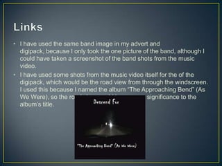
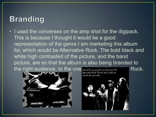
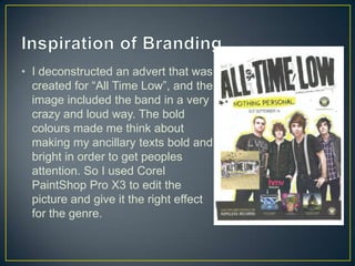
Evaluation Question 2
• I have used the same band image in my advert and
digipack, because I only took the one picture of the band, although I
could have taken a screenshot of the band shots from the music
video.
• I have used some shots from the music video itself for the of the
digipack, which would be the road view from through the windscreen.
I used this because I named the album “The Approaching Bend” (As
We Were), so the road view would have some significance to the
album’s title.
• The road shots happen multiple times in the music video,
so the road would be their recognisable brand image for
that specific song. This is why I have used it on the front
of the digipack instead of on the inside or back, as it will
be the first thing that the audience will see, and therefore
recognise it immediately to be that band’s album.
• I used the converses on the amp shot for the digipack.
This is because I thought it would be a good
representation of the genre I am marketing this album
for, which would be Alternative Rock. The bold black and
white high contrasted of the picture, and the band
picture, are so that the album is also being branded to
the right audience, to the ones that like Alternative Rock.
• I deconstructed an advert that was
created for “All Time Low”, and the
image included the band in a very
crazy and loud way. The bold
colours made me think about
making my ancillary texts bold and
bright in order to get peoples
attention. So I used Corel
PaintShop Pro X3 to edit the
picture and give it the right effect
for the genre.

Evaluation Question 2

  • 1.
  • 2.
    • I haveused the same band image in my advert and digipack, because I only took the one picture of the band, although I could have taken a screenshot of the band shots from the music video. • I have used some shots from the music video itself for the of the digipack, which would be the road view from through the windscreen. I used this because I named the album “The Approaching Bend” (As We Were), so the road view would have some significance to the album’s title.
  • 3.
    • The roadshots happen multiple times in the music video, so the road would be their recognisable brand image for that specific song. This is why I have used it on the front of the digipack instead of on the inside or back, as it will be the first thing that the audience will see, and therefore recognise it immediately to be that band’s album.
  • 4.
    • I usedthe converses on the amp shot for the digipack. This is because I thought it would be a good representation of the genre I am marketing this album for, which would be Alternative Rock. The bold black and white high contrasted of the picture, and the band picture, are so that the album is also being branded to the right audience, to the ones that like Alternative Rock.
  • 5.
    • I deconstructedan advert that was created for “All Time Low”, and the image included the band in a very crazy and loud way. The bold colours made me think about making my ancillary texts bold and bright in order to get peoples attention. So I used Corel PaintShop Pro X3 to edit the picture and give it the right effect for the genre.