MEDIA DECONSTRUCTION - DIGIPACK
The text on the
         front cover is in
         capitals and the
         same font.


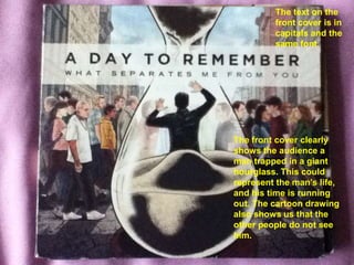
The front cover clearly
shows the audience a
man trapped in a giant
hourglass. This could
represent the man’s life,
and his time is running
out. The cartoon drawing
also shows us that the
other people do not see
him.
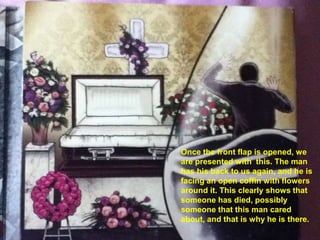
Once the front flap is opened, we
are presented with this. The man
has his back to us again, and he is
facing an open coffin with flowers
around it. This clearly shows that
someone has died, possibly
someone that this man cared
about, and that is why he is there.
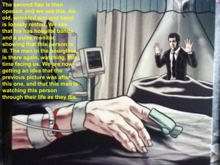
The second flap is then
opened, and we see this. An
old, wrinkled arm and hand
is loosely rested. We see
that his has hospital bands
and a pulse monitor,
showing that this person is
ill. The man in the hourglass
is there again, watching, this
time facing us. We are now
getting an idea that the
previous picture was after
this one, and that this man is
watching this person
through their life as they die.
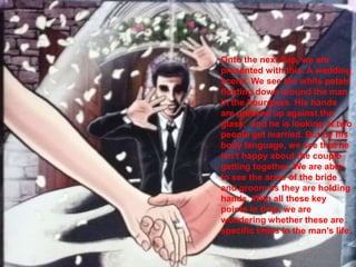
Onto the next flap, we are
presented with this. A wedding
scene. We see the white petals
floating down around the man
in the hourglass. His hands
are pressed up against the
glass, and he is looking at two
people get married. But by his
body language, we see that he
isn’t happy about the couple
getting together. We are able
to see the arms of the bride
and groom as they are holding
hands. With all these key
points in time, we are
wondering whether these are
specific times in the man’s life.
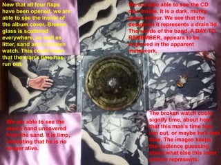
Now that all four flaps       We are also able to see the CD
have been opened, we are      disc inside. It is a dark, murky
able to see the inside of     green colour. We see that the
the album cover. Broken       design on it represents a drain lid.
glass is scattered            The words of the band, A DAY TO
everywhere, as well as        REMEMBER, appears to be
litter, sand and a broken     engraved in the apparent
watch. This could mean        metalwork.
that the man’s time has
run out.


                                      The broken watch could
 We are able to see the               signify time, about how
 man’s hand uncovered                 that this man’s time has
 from the sand. It is limp,           run out, or maybe he’s lost
 indicating that he is no             time. The images keeps
 longer alive.                        the audience guessing
                                      about what else this inner
                                      picture represents.
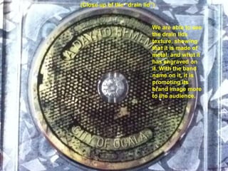
(Close up of the “drain lid”)


                            We are able to see
                            the drain lids
                            texture, showing
                            that it is made of
                            metal, and what it
                            has engraved on
                            it. With the band
                            name on it, it is
                            promoting its
                            brand image more
                            to the audience.
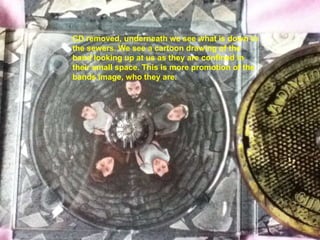
CD removed, underneath we see what is down in
the sewers. We see a cartoon drawing of the
band looking up at us as they are confined in
their small space. This is more promotion of the
bands image, who they are.
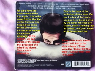
We also have the            This is the back of the
track names at the          folded-up album case. We
top. Again, it is in the    see the top of the man’s
same font as the title      head as he is being buried
on the front, so it is      by the sand. His eyes are
keeping the same            closed, either showing that
theme throughout            he is dead, ready for death
the album as well as        or he is unconscious.
the cartoon
drawings. At the
bottom, we see
                           Three of the track names
names of the people
                           could be linked to the
that produced and
                           album design. These
mixed the album.
                           would be “Better Off This
This is more
                           Way”, “Out Of Time” and
promotion.
                           “If I Leave”.

A Day To Remember – What Separates Me From You

  • 1.
  • 2.
    The text onthe front cover is in capitals and the same font. The front cover clearly shows the audience a man trapped in a giant hourglass. This could represent the man’s life, and his time is running out. The cartoon drawing also shows us that the other people do not see him.
  • 3.
    Once the frontflap is opened, we are presented with this. The man has his back to us again, and he is facing an open coffin with flowers around it. This clearly shows that someone has died, possibly someone that this man cared about, and that is why he is there.
  • 4.
    The second flapis then opened, and we see this. An old, wrinkled arm and hand is loosely rested. We see that his has hospital bands and a pulse monitor, showing that this person is ill. The man in the hourglass is there again, watching, this time facing us. We are now getting an idea that the previous picture was after this one, and that this man is watching this person through their life as they die.
  • 5.
    Onto the nextflap, we are presented with this. A wedding scene. We see the white petals floating down around the man in the hourglass. His hands are pressed up against the glass, and he is looking at two people get married. But by his body language, we see that he isn’t happy about the couple getting together. We are able to see the arms of the bride and groom as they are holding hands. With all these key points in time, we are wondering whether these are specific times in the man’s life.
  • 6.
    Now that allfour flaps We are also able to see the CD have been opened, we are disc inside. It is a dark, murky able to see the inside of green colour. We see that the the album cover. Broken design on it represents a drain lid. glass is scattered The words of the band, A DAY TO everywhere, as well as REMEMBER, appears to be litter, sand and a broken engraved in the apparent watch. This could mean metalwork. that the man’s time has run out. The broken watch could We are able to see the signify time, about how man’s hand uncovered that this man’s time has from the sand. It is limp, run out, or maybe he’s lost indicating that he is no time. The images keeps longer alive. the audience guessing about what else this inner picture represents.
  • 7.
    (Close up ofthe “drain lid”) We are able to see the drain lids texture, showing that it is made of metal, and what it has engraved on it. With the band name on it, it is promoting its brand image more to the audience.
  • 8.
    CD removed, underneathwe see what is down in the sewers. We see a cartoon drawing of the band looking up at us as they are confined in their small space. This is more promotion of the bands image, who they are.
  • 9.
    We also havethe This is the back of the track names at the folded-up album case. We top. Again, it is in the see the top of the man’s same font as the title head as he is being buried on the front, so it is by the sand. His eyes are keeping the same closed, either showing that theme throughout he is dead, ready for death the album as well as or he is unconscious. the cartoon drawings. At the bottom, we see Three of the track names names of the people could be linked to the that produced and album design. These mixed the album. would be “Better Off This This is more Way”, “Out Of Time” and promotion. “If I Leave”.