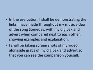
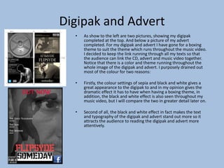
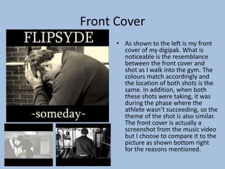
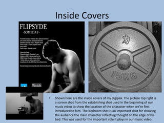
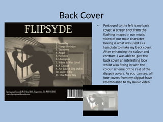
Evaluation Task 2
How effective is the combination of your main
product and ancillary texts?
• In the evaluation, I shall be demonstrating the
links I have made throughout my music video
of the song Someday, with my digipak and
advert when compared next to each other,
showing examples and explanation.
• I shall be taking screen shots of my video,
alongside grabs of my digipak and advert so
that you can see the comparison yourself.
Digipak and Advert
• As show to the left are two pictures, showing my digipak
completed at the top. And below a picture of my advert
completed. For my digipak and advert I have gone for a boxing
theme to suit the theme which runs throughout the music video.
I decided to keep the link running through all my texts so that
the audience can link the CD, advert and music video together.
Notice that there is a color and theme running throughout the
whole image of the digipak and advert. I purposely drained out
most of the colour for two reasons:
• Firstly, the colour settings of sepia and black and white gives a
great appearance to the digipak to and in my opinion gives the
dramatic effect it has to have when having a boxing theme, in
addition, the black and white effect is also seen throughout my
music video, but I will compare the two in greater detail later on.
• Second of all, the black and white effect in fact makes the text
and typography of the digipak and advert stand out more so it
attracts the audience to reading the digipak and advert more
attentively.
Front Cover
• As shown to the left is my front
cover of my digipak. What is
noticeable is the resemblance
between the front cover and
shot as I walk into the gym. The
colours match accordingly and
the location of both shots is the
same. In addition, when both
these shots were taking, it was
during the phase where the
athlete wasn’t succeeding, so the
theme of the shot is also similar.
The front cover is actually a
screenshot from the music video
but I choose to compare it to the
picture as shown bottom right
for the reasons mentioned.
Inside Covers
• Shown here are the inside covers of my digipak. The picture top right is
a screen shot from the establishing shot used in the beginning of our
music video to show the location of the character when we’re first
introduced to him. The bedroom shot is an important shot for showing
the audience the main character reflecting thought on the edge of his
bed. This was used for the important role it plays in our music video.
Back Cover
• Portrayed to the left is my back
cover. A screen shot from the
flashing images in our music
video of our main character
boxing is what was used as a
template to make my back cover.
After enhancing the colour and
contrast, I was able to give the
back cover an interesting look
whilst also fitting in with the
colour scheme of the rest of the
digipak covers. As you can see, all
four covers from my digipak have
resemblance to my music video.

Evaluation task 2

  • 1.
    Evaluation Task 2 Howeffective is the combination of your main product and ancillary texts?
  • 2.
    • In theevaluation, I shall be demonstrating the links I have made throughout my music video of the song Someday, with my digipak and advert when compared next to each other, showing examples and explanation. • I shall be taking screen shots of my video, alongside grabs of my digipak and advert so that you can see the comparison yourself.
  • 3.
    Digipak and Advert •As show to the left are two pictures, showing my digipak completed at the top. And below a picture of my advert completed. For my digipak and advert I have gone for a boxing theme to suit the theme which runs throughout the music video. I decided to keep the link running through all my texts so that the audience can link the CD, advert and music video together. Notice that there is a color and theme running throughout the whole image of the digipak and advert. I purposely drained out most of the colour for two reasons: • Firstly, the colour settings of sepia and black and white gives a great appearance to the digipak to and in my opinion gives the dramatic effect it has to have when having a boxing theme, in addition, the black and white effect is also seen throughout my music video, but I will compare the two in greater detail later on. • Second of all, the black and white effect in fact makes the text and typography of the digipak and advert stand out more so it attracts the audience to reading the digipak and advert more attentively.
  • 4.
    Front Cover • Asshown to the left is my front cover of my digipak. What is noticeable is the resemblance between the front cover and shot as I walk into the gym. The colours match accordingly and the location of both shots is the same. In addition, when both these shots were taking, it was during the phase where the athlete wasn’t succeeding, so the theme of the shot is also similar. The front cover is actually a screenshot from the music video but I choose to compare it to the picture as shown bottom right for the reasons mentioned.
  • 5.
    Inside Covers • Shownhere are the inside covers of my digipak. The picture top right is a screen shot from the establishing shot used in the beginning of our music video to show the location of the character when we’re first introduced to him. The bedroom shot is an important shot for showing the audience the main character reflecting thought on the edge of his bed. This was used for the important role it plays in our music video.
  • 6.
    Back Cover • Portrayedto the left is my back cover. A screen shot from the flashing images in our music video of our main character boxing is what was used as a template to make my back cover. After enhancing the colour and contrast, I was able to give the back cover an interesting look whilst also fitting in with the colour scheme of the rest of the digipak covers. As you can see, all four covers from my digipak have resemblance to my music video.