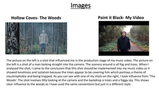
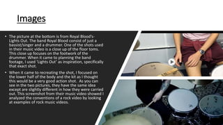
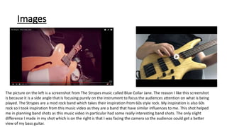
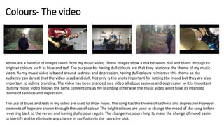
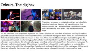
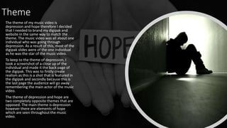
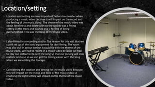
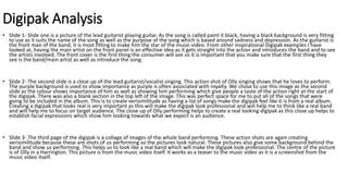
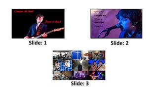
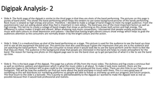
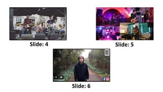
Evaluation 2
How effective is the
combination of your main
product and ancillary texts
Images
The picture on the left is a shot that influenced me in the production stage of my music video. The picture on
the left is a shot of a man looking straight into the camera. The scenery around is all fog and trees. When I
analysed the shot, I came to the conclusion that this shot should be implemented into my music video as it
showed loneliness and isolation because the trees appear to be covering him which portrays a theme of
claustrophobia and being trapped. As you can see with one of my shots on the right, I took influence from ‘The
Woods’. The shot involves Olly looking at the camera and the backdrop is trees and a foggy sky. This shows
clear influence to the woods as I have used the same conventions but just in a different style.
Hollow Coves- The Woods Paint it Black- My Video
Images
• The picture at the bottom is from Royal Blood’s-
Lights Out. The band Royal Blood consist of just a
bassist/singer and a drummer. One of the shots used
in their music video is a close up of the floor toms.
This close up focuses on the footwork of the
drummer. When it came to planning the band
footage, I used ‘Lights Out’ as inspiration, specifically
that exact shot.
• When it came to recreating the shot, I focused on
the lower half of the body and the kit as I thought
this would be a very good action shot. As you can
see in the two pictures, they have the same idea
except are slightly different in how they were carried
out. This screenshot from their music video showed I
analyzed the conventions of a rock video by looking
at examples of rock music videos.
Images
The picture on the left is a screenshot from The Strypes music called Blue Collar Jane. The reason I like this screenshot
is because it is a side angle that is focusing purely on the instrument to focus the audiences attention on what is being
played. The Strypes are a mod rock band which takes their inspiration from 60s style rock. My inspiration is also 60s
rock so I took inspiration from this music video as they are a band that have similar influences to me. This shot helped
me in planning band shots as this music video in particular had some really interesting band shots. The only slight
difference I made in my shot which is on the right is that I was facing the camera so the audience could get a better
view of my bass guitar.
I didn’t have any particular logo however I did feature my two production companies in my digipak. These two
companies I made up were the two companies that assisted in filming and editing the music video. This was done to
create verisimilitude to make the music video feel more professional and create realism as music videos normally feature
at the end the production companies that were assisting in the production of the music video. Both these logos are dark
and dull in colour which matched the theme of my video which was sadness and depression. Creating a consistency I
branding is very important because without consistency the video could be giving mixed message which will take away
from the atmosphere you are trying to create.
Colours- The video
Above are a handful of images taken from my music video. These images show a mix between dull and bland through to
brighter colours such as blue and red. The purpose for having dull colours are that they reinforce the theme of my music
video. As my music video is based around sadness and depression, having dull colours reinforces this theme so the
audience can detect that the video is sad and dull. Not only is the shots important for setting the mood but they are also
important to aid my branding. The video has been branded as a video all about sadness and depression so it is important
that my music video follows the same conventions as my branding otherwise the music video wont have its intended
theme of sadness and depression.
The use of blues and reds in my video are used to show hope. The song has the theme of sadness and depression however
elements of hope are shown through the use of colour. The bright colours are used to change the mood of the song before
reverting back to the verses and having dull colours again. The change in colours help to make the change of mood easier
to identify and to eliminate any chance in confusion in the narrative plot.
Colours- The digipak
The dull colours are used to represent depression and sadness which are the basis of my music video. The colours used are
grey and black as these represent emptiness and loneliness which fit with the negative theme of the. The colourful shots of
the band are also used because these are used to show hope. This is important because hope is featured throughout the
music video as the video is about a lonely guy who has had a troubled past but is hopeful that things will change. The bright
colours are a contrast to the dull colours in other pages which help reinforce the two different themes in my music video. The
colours are really important because different colours have different colours which help the audience to understand the
theme without being told. Using colours will aid the audience in understanding the theme of the music video. Without using
the correct colours for the themes, it will confuse the audience as the colours will contradict the theme of the song.
The colours being used in my digipak are bright and colourful in
half of the panels but the other half are dull in colour. The
reason foe this is that I wanted to follow two different themes
which feature in my music video. They are depression and
hope.
Theme
The theme of my music video is
depression and hope therefore I decided
that I needed to brand my digipak and
website in the same way to match the
theme. The music video was all about one
individual who was going through
depression. As a result of this, most of the
digipak slides were of the one individual
as he was the star of the music video.
To keep to the theme of depression, I
took a screenshot of a close up of the
individual and made it the back page of
the digipak. This was to firstly create
realism as this is a shot that is featured in
the digipak and secondly because this is
the last page the audience will go away
remembering the main actor of the music
video.
The theme of depression and hope are
two completely opposite themes that are
opposed. The main theme is depression
however there are elements of hope
which are seen throughout the music
video.
Font
The font that I decided to use was AR BERKLEY. When I was looking for a font to
use on my digipak I wanted to find looked like it was hand drawn and bold looking
to look mod. The digipak does have a mod theme as my music video is inspired by
60’s mods.
The font is important because it contributes towards the theme of the music video.
So to stick to the roots of my music video and its inspiration, I picked a font that is
similar to other mod fonts to stick to my inspiration.
Location/setting
• Location and setting are very important factors to consider when
producing a music video because it will impact on the mood and
the feeling of the music video. The theme of the music video was
about loneliness and depression so the woods was a fitting
setting as the trees and bushes give a feeling of being
overwhelmed. This was the basis of my music video.
• I also filmed in a recording studio. The reason for this was that we
could set up all the band equipment for the filming. The room
was also dull in colour so that it could fit with the theme of the
music video. We had to record in a music video because we had
to play our instruments over the song so that our playing will look
realistic and also so we can get the timing easier with the song
when we are editing the footage.
• Considering the location and setting for the music video because
this will impact on the mood and tone of the music video so
choosing the right setting will impact on the theme of the music
video.
Digipak Analysis
• Slide 1- Slide one is a picture of the lead guitarist playing guitar. As the song is called paint it black, having a black background is very fitting
to use as it suits the name of the song as well as the purpose of the song which is based around sadness and depression. As the guitarist is
the front man of the band, it is most fitting to make him the star of the music video. From other inspirational Digipak examples I have
looked at, having the main artist on the front panel is an effective idea as it gets straight into the action and introduces the band and to see
the artists involved. The front cover is the first thing the consumer will see so it is important that you make sure that the first thing they
see is the band/main artist as well as introduce the song.
• Slide 2- The second slide is a close up of the lead guitarist/vocalist singing. This action shot of Olly singing shows that he loves to perform.
The purple background is used to show importance as purple is often associated with royalty. We chose to use this image as the second
slide as the colour shows importance of him as well as showing him performing which give people a taste of the action right at the start of
the digipak. There was also a blank section in the top left of the image. This was perfect space for me to put all of the songs that were
going to be included in the album. This is to create verisimilitude as having a list of songs make the digipak feel like it is from a real album.
Creating a digipak that looks real is very important as this will make the digipak look professional and will help me to think like a real band
and will help me to focus on target audience. The close up of Olly performing helps to create a real looking digipak as this close up helps to
establish facial expressions which show him looking towards what we expect is an audience.
• Slide 3- The third page of the digipak is a collage of images of the whole band performing. These action shots are again creating
verisimilitude because these are shots of us performing so the pictures look natural. These pictures also give some background behind the
band and show us performing. This helps us to look like a real band which will make the digipak look professional. The centre of the picture
is of Olly in a Harrington. This picture is from the music video itself. It works as a teaser to the music video as it is a screenshot from the
music video itself.
Slide: 1 Slide: 2
Slide: 3
Digipak Analysis- 2
• Slide 4- The forth page of the digipak is similar to the third page in that they are shots of the band performing. The pictures on this page is
purely of band shots. This shows the band performing which helps the viewers to see some background pictures of the bands performing.
Rock music is viewed as high energy and action. Therefore. I decided to make a collage of band images to meet my target audience. From the
questionnaire I put out asking about what they feel is important in rock videos. The band was one of the most important factors as well as
high energy. This led me to create a collage of band images that show us performing as this shows both action and high energy. The
difference in colour makes it bright and vibrant. When analysing rock music conventions. I discovered that people usually associate rock
music with dark colours to show depression and sadness. I decided that having bright vibrant colours show energy which helps to grab the
audiences attention as the consumers are normally drawn in by the bright colours and the action.
• Slide 5- Slide 5 is a medium/close up shot of the band performing on a stage. This picture is used for the audience to see the band up close
and to see all the equipment the band use. This particular shot was used because it gives the impression that you are in the audience and
are watching the band perform. This helps the consumer to know what it would look like to see the band perform and for them to feel like
that they are there. The audience in the background show that people are interested in the band and helps to create atmosphere for the
band. The reason for having one photo on this digipak page was to see the band close up to get perspective of what it is like to see the band
up close.
• Slide 6- This is the back page of the digipak. This page has a photo of Olly from the music video. The dullness and fog create a ominous feel
as well as reinforce sadness and depression which is what the music video is all about. To make it look more realistic, there are the
production logos in the bottom left to give credit to the 'companies' that produced the music video. There are also links to our Facebook and
Instagram. This will be how the audience can find out more about the band and keep in touch with them. This is a very good way of
marketing as this will distribute our marketing platforms so people will able to follow us and keep up with our progress and future projects.
The final touch to the slide is a barcode. This is purely to add believability to the digipak as I wanted to make the digipak look as real as
possible because then it would look professional and realistic.
Slide: 4 Slide: 5
Slide: 6

Evaluation 2

  • 1.
    Evaluation 2 How effectiveis the combination of your main product and ancillary texts
  • 2.
    Images The picture onthe left is a shot that influenced me in the production stage of my music video. The picture on the left is a shot of a man looking straight into the camera. The scenery around is all fog and trees. When I analysed the shot, I came to the conclusion that this shot should be implemented into my music video as it showed loneliness and isolation because the trees appear to be covering him which portrays a theme of claustrophobia and being trapped. As you can see with one of my shots on the right, I took influence from ‘The Woods’. The shot involves Olly looking at the camera and the backdrop is trees and a foggy sky. This shows clear influence to the woods as I have used the same conventions but just in a different style. Hollow Coves- The Woods Paint it Black- My Video
  • 3.
    Images • The pictureat the bottom is from Royal Blood’s- Lights Out. The band Royal Blood consist of just a bassist/singer and a drummer. One of the shots used in their music video is a close up of the floor toms. This close up focuses on the footwork of the drummer. When it came to planning the band footage, I used ‘Lights Out’ as inspiration, specifically that exact shot. • When it came to recreating the shot, I focused on the lower half of the body and the kit as I thought this would be a very good action shot. As you can see in the two pictures, they have the same idea except are slightly different in how they were carried out. This screenshot from their music video showed I analyzed the conventions of a rock video by looking at examples of rock music videos.
  • 4.
    Images The picture onthe left is a screenshot from The Strypes music called Blue Collar Jane. The reason I like this screenshot is because it is a side angle that is focusing purely on the instrument to focus the audiences attention on what is being played. The Strypes are a mod rock band which takes their inspiration from 60s style rock. My inspiration is also 60s rock so I took inspiration from this music video as they are a band that have similar influences to me. This shot helped me in planning band shots as this music video in particular had some really interesting band shots. The only slight difference I made in my shot which is on the right is that I was facing the camera so the audience could get a better view of my bass guitar.
  • 5.
    I didn’t haveany particular logo however I did feature my two production companies in my digipak. These two companies I made up were the two companies that assisted in filming and editing the music video. This was done to create verisimilitude to make the music video feel more professional and create realism as music videos normally feature at the end the production companies that were assisting in the production of the music video. Both these logos are dark and dull in colour which matched the theme of my video which was sadness and depression. Creating a consistency I branding is very important because without consistency the video could be giving mixed message which will take away from the atmosphere you are trying to create.
  • 6.
    Colours- The video Aboveare a handful of images taken from my music video. These images show a mix between dull and bland through to brighter colours such as blue and red. The purpose for having dull colours are that they reinforce the theme of my music video. As my music video is based around sadness and depression, having dull colours reinforces this theme so the audience can detect that the video is sad and dull. Not only is the shots important for setting the mood but they are also important to aid my branding. The video has been branded as a video all about sadness and depression so it is important that my music video follows the same conventions as my branding otherwise the music video wont have its intended theme of sadness and depression. The use of blues and reds in my video are used to show hope. The song has the theme of sadness and depression however elements of hope are shown through the use of colour. The bright colours are used to change the mood of the song before reverting back to the verses and having dull colours again. The change in colours help to make the change of mood easier to identify and to eliminate any chance in confusion in the narrative plot.
  • 7.
    Colours- The digipak Thedull colours are used to represent depression and sadness which are the basis of my music video. The colours used are grey and black as these represent emptiness and loneliness which fit with the negative theme of the. The colourful shots of the band are also used because these are used to show hope. This is important because hope is featured throughout the music video as the video is about a lonely guy who has had a troubled past but is hopeful that things will change. The bright colours are a contrast to the dull colours in other pages which help reinforce the two different themes in my music video. The colours are really important because different colours have different colours which help the audience to understand the theme without being told. Using colours will aid the audience in understanding the theme of the music video. Without using the correct colours for the themes, it will confuse the audience as the colours will contradict the theme of the song. The colours being used in my digipak are bright and colourful in half of the panels but the other half are dull in colour. The reason foe this is that I wanted to follow two different themes which feature in my music video. They are depression and hope.
  • 8.
    Theme The theme ofmy music video is depression and hope therefore I decided that I needed to brand my digipak and website in the same way to match the theme. The music video was all about one individual who was going through depression. As a result of this, most of the digipak slides were of the one individual as he was the star of the music video. To keep to the theme of depression, I took a screenshot of a close up of the individual and made it the back page of the digipak. This was to firstly create realism as this is a shot that is featured in the digipak and secondly because this is the last page the audience will go away remembering the main actor of the music video. The theme of depression and hope are two completely opposite themes that are opposed. The main theme is depression however there are elements of hope which are seen throughout the music video.
  • 9.
    Font The font thatI decided to use was AR BERKLEY. When I was looking for a font to use on my digipak I wanted to find looked like it was hand drawn and bold looking to look mod. The digipak does have a mod theme as my music video is inspired by 60’s mods. The font is important because it contributes towards the theme of the music video. So to stick to the roots of my music video and its inspiration, I picked a font that is similar to other mod fonts to stick to my inspiration.
  • 10.
    Location/setting • Location andsetting are very important factors to consider when producing a music video because it will impact on the mood and the feeling of the music video. The theme of the music video was about loneliness and depression so the woods was a fitting setting as the trees and bushes give a feeling of being overwhelmed. This was the basis of my music video. • I also filmed in a recording studio. The reason for this was that we could set up all the band equipment for the filming. The room was also dull in colour so that it could fit with the theme of the music video. We had to record in a music video because we had to play our instruments over the song so that our playing will look realistic and also so we can get the timing easier with the song when we are editing the footage. • Considering the location and setting for the music video because this will impact on the mood and tone of the music video so choosing the right setting will impact on the theme of the music video.
  • 11.
    Digipak Analysis • Slide1- Slide one is a picture of the lead guitarist playing guitar. As the song is called paint it black, having a black background is very fitting to use as it suits the name of the song as well as the purpose of the song which is based around sadness and depression. As the guitarist is the front man of the band, it is most fitting to make him the star of the music video. From other inspirational Digipak examples I have looked at, having the main artist on the front panel is an effective idea as it gets straight into the action and introduces the band and to see the artists involved. The front cover is the first thing the consumer will see so it is important that you make sure that the first thing they see is the band/main artist as well as introduce the song. • Slide 2- The second slide is a close up of the lead guitarist/vocalist singing. This action shot of Olly singing shows that he loves to perform. The purple background is used to show importance as purple is often associated with royalty. We chose to use this image as the second slide as the colour shows importance of him as well as showing him performing which give people a taste of the action right at the start of the digipak. There was also a blank section in the top left of the image. This was perfect space for me to put all of the songs that were going to be included in the album. This is to create verisimilitude as having a list of songs make the digipak feel like it is from a real album. Creating a digipak that looks real is very important as this will make the digipak look professional and will help me to think like a real band and will help me to focus on target audience. The close up of Olly performing helps to create a real looking digipak as this close up helps to establish facial expressions which show him looking towards what we expect is an audience. • Slide 3- The third page of the digipak is a collage of images of the whole band performing. These action shots are again creating verisimilitude because these are shots of us performing so the pictures look natural. These pictures also give some background behind the band and show us performing. This helps us to look like a real band which will make the digipak look professional. The centre of the picture is of Olly in a Harrington. This picture is from the music video itself. It works as a teaser to the music video as it is a screenshot from the music video itself.
  • 12.
    Slide: 1 Slide:2 Slide: 3
  • 13.
    Digipak Analysis- 2 •Slide 4- The forth page of the digipak is similar to the third page in that they are shots of the band performing. The pictures on this page is purely of band shots. This shows the band performing which helps the viewers to see some background pictures of the bands performing. Rock music is viewed as high energy and action. Therefore. I decided to make a collage of band images to meet my target audience. From the questionnaire I put out asking about what they feel is important in rock videos. The band was one of the most important factors as well as high energy. This led me to create a collage of band images that show us performing as this shows both action and high energy. The difference in colour makes it bright and vibrant. When analysing rock music conventions. I discovered that people usually associate rock music with dark colours to show depression and sadness. I decided that having bright vibrant colours show energy which helps to grab the audiences attention as the consumers are normally drawn in by the bright colours and the action. • Slide 5- Slide 5 is a medium/close up shot of the band performing on a stage. This picture is used for the audience to see the band up close and to see all the equipment the band use. This particular shot was used because it gives the impression that you are in the audience and are watching the band perform. This helps the consumer to know what it would look like to see the band perform and for them to feel like that they are there. The audience in the background show that people are interested in the band and helps to create atmosphere for the band. The reason for having one photo on this digipak page was to see the band close up to get perspective of what it is like to see the band up close. • Slide 6- This is the back page of the digipak. This page has a photo of Olly from the music video. The dullness and fog create a ominous feel as well as reinforce sadness and depression which is what the music video is all about. To make it look more realistic, there are the production logos in the bottom left to give credit to the 'companies' that produced the music video. There are also links to our Facebook and Instagram. This will be how the audience can find out more about the band and keep in touch with them. This is a very good way of marketing as this will distribute our marketing platforms so people will able to follow us and keep up with our progress and future projects. The final touch to the slide is a barcode. This is purely to add believability to the digipak as I wanted to make the digipak look as real as possible because then it would look professional and realistic.
  • 14.
    Slide: 4 Slide:5 Slide: 6