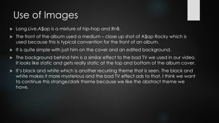
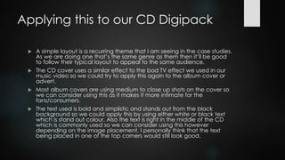
A$AP ROCKY – 
LONG.LIVE.A$AP 
ALBUM CASE STUDY 
BY NATASHA
Use of Images 
 Long.Live.A$ap is a mixture of hip-hop and RnB. 
 The front of the album used a medium – close up shot of A$ap Rocky which is 
used because this is typical convention for the front of an album. 
 It is quite simple with just him on the cover and an edited background. 
 The background behind him is a similar effect to the bad TV we used in our video. 
It looks like static and gets really static at the top and bottom of the album cover. 
 It’s black and white which is another recurring theme that is seen. The black and 
white makes it more mysterious and the bad TV effect ads to that. I think we want 
to continue this strange/dark theme because we like the abstract theme we 
have.
Applying this to our CD Digipack 
 A simple layout is a recurring theme that I am seeing in the case studies. 
As we are doing one that’s the same genre as them then it’ll be good 
to follow their typical layout to appeal to the same audience. 
 The CD cover uses a similar effect to the bad TV effect we used in our 
music video so we could try to apply this again to the album cover or 
advert. 
 Most album covers are using medium to close up shots on the cover so 
we can consider using this as it makes it more intimate for the 
fans/consumers. 
 The text used is bold and simplistic and stands out from the black 
background so we could apply this by using either white or black text 
which is stand out colour. Also the text is right in the middle of the CD 
which is commonly used so we can consider using this however 
depending on the image placement, I personally think that the text 
being placed in one of the top corners would still look good.

Asap rocky - Album cover case study

  • 1.
    A$AP ROCKY – LONG.LIVE.A$AP ALBUM CASE STUDY BY NATASHA
  • 2.
    Use of Images  Long.Live.A$ap is a mixture of hip-hop and RnB.  The front of the album used a medium – close up shot of A$ap Rocky which is used because this is typical convention for the front of an album.  It is quite simple with just him on the cover and an edited background.  The background behind him is a similar effect to the bad TV we used in our video. It looks like static and gets really static at the top and bottom of the album cover.  It’s black and white which is another recurring theme that is seen. The black and white makes it more mysterious and the bad TV effect ads to that. I think we want to continue this strange/dark theme because we like the abstract theme we have.
  • 3.
    Applying this toour CD Digipack  A simple layout is a recurring theme that I am seeing in the case studies. As we are doing one that’s the same genre as them then it’ll be good to follow their typical layout to appeal to the same audience.  The CD cover uses a similar effect to the bad TV effect we used in our music video so we could try to apply this again to the album cover or advert.  Most album covers are using medium to close up shots on the cover so we can consider using this as it makes it more intimate for the fans/consumers.  The text used is bold and simplistic and stands out from the black background so we could apply this by using either white or black text which is stand out colour. Also the text is right in the middle of the CD which is commonly used so we can consider using this however depending on the image placement, I personally think that the text being placed in one of the top corners would still look good.