How effective is the combination of your main product
and ancillary texts?
My music video is muchly based on the
dark and light aspects that people go
through in life. For example all the way
through my music video I used something
that could contribute to the connotations
of the music video such as shadows,
distortion and light. When first starting to
make the ancillary tasks (Poster and
Digipak), I wanted to make them link
together so that my audience will know
that there is a key link between them.
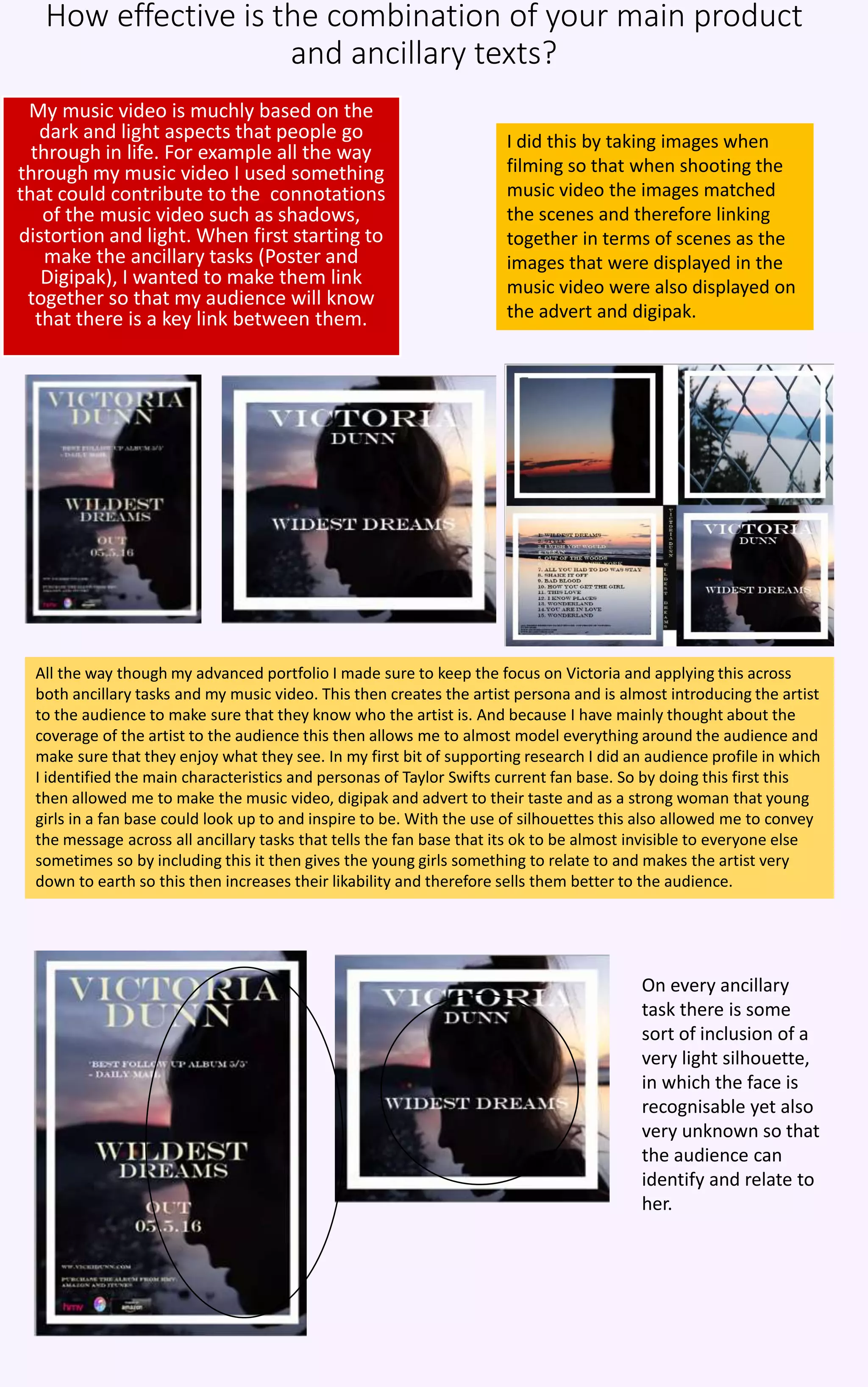
I did this by taking images when
filming so that when shooting the
music video the images matched
the scenes and therefore linking
together in terms of scenes as the
images that were displayed in the
music video were also displayed on
the advert and digipak.
All the way though my advanced portfolio I made sure to keep the focus on Victoria and applying this across
both ancillary tasks and my music video. This then creates the artist persona and is almost introducing the artist
to the audience to make sure that they know who the artist is. And because I have mainly thought about the
coverage of the artist to the audience this then allows me to almost model everything around the audience and
make sure that they enjoy what they see. In my first bit of supporting research I did an audience profile in which
I identified the main characteristics and personas of Taylor Swifts current fan base. So by doing this first this
then allowed me to make the music video, digipak and advert to their taste and as a strong woman that young
girls in a fan base could look up to and inspire to be. With the use of silhouettes this also allowed me to convey
the message across all ancillary tasks that tells the fan base that its ok to be almost invisible to everyone else
sometimes so by including this it then gives the young girls something to relate to and makes the artist very
down to earth so this then increases their likability and therefore sells them better to the audience.
On every ancillary
task there is some
sort of inclusion of a
very light silhouette,
in which the face is
recognisable yet also
very unknown so that
the audience can
identify and relate to
her.
All the way thorough the tasks I made sure to keep everything linked and everything
constant. For example the text that I have used is called Engravers MP and have used that
for both ancillary tasks to keep everything constant and linked and also to keep the
elegance to the theme of the video and the convention of the pop video as it seems like a
text that might be displayed in a pop video. I have also kept my colours that I have used
very neutral or kept them to the black and white / light and dark scheme to connote to the
message behind the music video, I have also changed the colour according to the
background. I have kept most colours within the music video very conventional to pop
videos such as the bright pastel and light colours, with the exception of the shade of black
this then connotes that something is not right and also connotes the main protagonist has
to work to fix it in the plot of the music video.
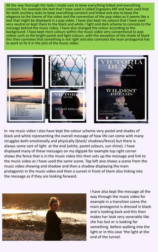
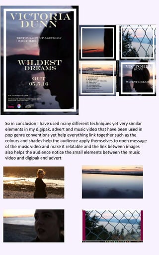
In my music video I also have kept the colour scheme very pastel and shades of
black and white representing the overall message of how life can come with many
struggles both emotionally and physically (black/ shadows/fence) but there is
always some sort of light at the end (white, pastel colours, sun shine). I have
displayed many of these messages on my digipak for example top right corner
shows the fence that is in the music video this then sets up the message and link to
the music video as I have used the same scene. Top left also shows a scene from the
music video showing and shadow and then a shadow displaying the main
protagonist in the music video and then a sunset in front of them also linking into
the message as if they are looking forward.
I have also kept the message all the
way through the music video for
example in a transition scene the
main protagonist is dressed in black
and is looking back and this then
makes her look very venerable like
she has lost or is looking for
something before walking into the
light or in this case ‘the light at the
end of the tunnel.
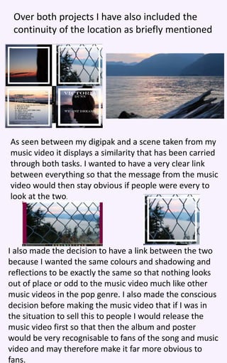
Over both projects I have also included the
continuity of the location as briefly mentioned
As seen between my digipak and a scene taken from my
music video it displays a similarity that has been carried
through both tasks. I wanted to have a very clear link
between everything so that the message from the music
video would then stay obvious if people were every to
look at the two.
I also made the decision to have a link between the two
because I wanted the same colours and shadowing and
reflections to be exactly the same so that nothing looks
out of place or odd to the music video much like other
music videos in the pop genre. I also made the conscious
decision before making the music video that if I was in
the situation to sell this to people I would release the
music video first so that then the album and poster
would be very recognisable to fans of the song and music
video and may therefore make it far more obvious to
fans.
To link further I have also used many transitions
and editing skills over the two.
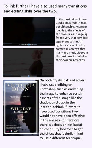
In the music video I have
used a black fade in fade
out although very simple
it adds to the effects of
the colours, as I am going
from a very shadowy dusk
type scene to a much
lighter scene and helps
create the contrast that
many pop music videos in
the past have included in
their own music videos.
On both my digipak and advert
I have used editing on
Photoshop such as darkening
the image to enhance certain
aspects of the image like the
shadow and dusk in the
location behind. If I were to
have used transitions they
would not have been effective
in the image and therefore
there is a decision not based
on continuity however to get
the effect that is similar I had
to use a different technique.
So in conclusion I have used many different techniques yet very similar
elements in my digipak, advert and music video that have been used in
pop genre conventions yet help everything link together such as the
colours and shades help the audience apply themselves to open message
of the music video and make it relatable and the link between images
also helps the audience notice the small elements between the music
video and digipak and advert.

A2 Media Question

  • 1.
    How effective isthe combination of your main product and ancillary texts? My music video is muchly based on the dark and light aspects that people go through in life. For example all the way through my music video I used something that could contribute to the connotations of the music video such as shadows, distortion and light. When first starting to make the ancillary tasks (Poster and Digipak), I wanted to make them link together so that my audience will know that there is a key link between them. I did this by taking images when filming so that when shooting the music video the images matched the scenes and therefore linking together in terms of scenes as the images that were displayed in the music video were also displayed on the advert and digipak. All the way though my advanced portfolio I made sure to keep the focus on Victoria and applying this across both ancillary tasks and my music video. This then creates the artist persona and is almost introducing the artist to the audience to make sure that they know who the artist is. And because I have mainly thought about the coverage of the artist to the audience this then allows me to almost model everything around the audience and make sure that they enjoy what they see. In my first bit of supporting research I did an audience profile in which I identified the main characteristics and personas of Taylor Swifts current fan base. So by doing this first this then allowed me to make the music video, digipak and advert to their taste and as a strong woman that young girls in a fan base could look up to and inspire to be. With the use of silhouettes this also allowed me to convey the message across all ancillary tasks that tells the fan base that its ok to be almost invisible to everyone else sometimes so by including this it then gives the young girls something to relate to and makes the artist very down to earth so this then increases their likability and therefore sells them better to the audience. On every ancillary task there is some sort of inclusion of a very light silhouette, in which the face is recognisable yet also very unknown so that the audience can identify and relate to her.
  • 2.
    All the waythorough the tasks I made sure to keep everything linked and everything constant. For example the text that I have used is called Engravers MP and have used that for both ancillary tasks to keep everything constant and linked and also to keep the elegance to the theme of the video and the convention of the pop video as it seems like a text that might be displayed in a pop video. I have also kept my colours that I have used very neutral or kept them to the black and white / light and dark scheme to connote to the message behind the music video, I have also changed the colour according to the background. I have kept most colours within the music video very conventional to pop videos such as the bright pastel and light colours, with the exception of the shade of black this then connotes that something is not right and also connotes the main protagonist has to work to fix it in the plot of the music video. In my music video I also have kept the colour scheme very pastel and shades of black and white representing the overall message of how life can come with many struggles both emotionally and physically (black/ shadows/fence) but there is always some sort of light at the end (white, pastel colours, sun shine). I have displayed many of these messages on my digipak for example top right corner shows the fence that is in the music video this then sets up the message and link to the music video as I have used the same scene. Top left also shows a scene from the music video showing and shadow and then a shadow displaying the main protagonist in the music video and then a sunset in front of them also linking into the message as if they are looking forward. I have also kept the message all the way through the music video for example in a transition scene the main protagonist is dressed in black and is looking back and this then makes her look very venerable like she has lost or is looking for something before walking into the light or in this case ‘the light at the end of the tunnel.
  • 3.
    Over both projectsI have also included the continuity of the location as briefly mentioned As seen between my digipak and a scene taken from my music video it displays a similarity that has been carried through both tasks. I wanted to have a very clear link between everything so that the message from the music video would then stay obvious if people were every to look at the two. I also made the decision to have a link between the two because I wanted the same colours and shadowing and reflections to be exactly the same so that nothing looks out of place or odd to the music video much like other music videos in the pop genre. I also made the conscious decision before making the music video that if I was in the situation to sell this to people I would release the music video first so that then the album and poster would be very recognisable to fans of the song and music video and may therefore make it far more obvious to fans.
  • 4.
    To link furtherI have also used many transitions and editing skills over the two. In the music video I have used a black fade in fade out although very simple it adds to the effects of the colours, as I am going from a very shadowy dusk type scene to a much lighter scene and helps create the contrast that many pop music videos in the past have included in their own music videos. On both my digipak and advert I have used editing on Photoshop such as darkening the image to enhance certain aspects of the image like the shadow and dusk in the location behind. If I were to have used transitions they would not have been effective in the image and therefore there is a decision not based on continuity however to get the effect that is similar I had to use a different technique.
  • 5.
    So in conclusionI have used many different techniques yet very similar elements in my digipak, advert and music video that have been used in pop genre conventions yet help everything link together such as the colours and shades help the audience apply themselves to open message of the music video and make it relatable and the link between images also helps the audience notice the small elements between the music video and digipak and advert.