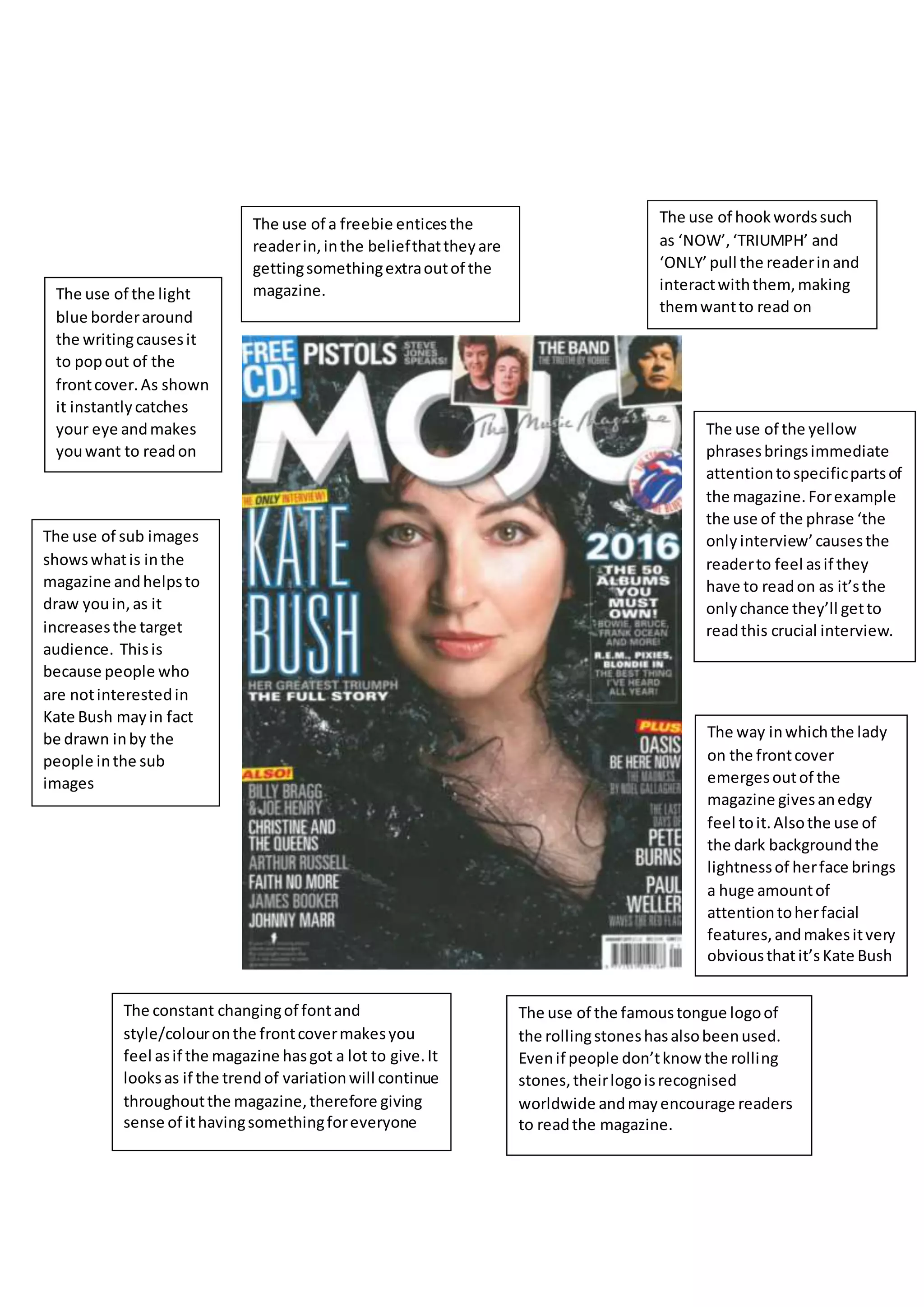
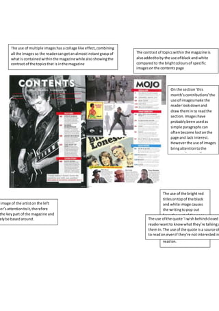
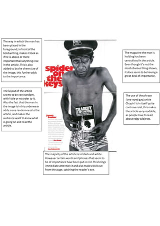
The use of a freebie enticesthe
readerin,inthe beliefthattheyare
gettingsomethingextraoutof the
magazine.
The use of sub images
showswhatis inthe
magazine andhelpsto
draw youin,as it
increasesthe target
audience. Thisis
because people who
are notinterestedin
Kate Bush mayin fact
be drawn inby the
people inthe sub
images
The use of the light
blue borderaround
the writingcausesit
to popout of the
frontcover.As shown
it instantlycatches
your eye andmakes
youwant to readon
The use of the yellow
phrasesbringsimmediate
attentiontospecificpartsof
the magazine.Forexample
the use of the phrase ‘the
only interview’causesthe
readerto feel asif they
have to readon as it’sthe
onlychance they’ll getto
readthis crucial interview.
The way inwhichthe lady
on the frontcover
emergesoutof the
magazine givesanedgy
feel toit.Alsothe use of
the dark backgroundthe
lightnessof herface brings
a huge amountof
attentiontoherfacial
features,andmakesitvery
obviousthatit’sKate Bush
The use of the famoustongue logoof
the rollingstoneshasalsobeenused.
Evenif people don’tknow the rolling
stones,theirlogoisrecognised
worldwide andmayencourage readers
to readthe magazine.
The constant changingof fontand
style/colouronthe frontcovermakesyou
feel asif the magazine hasgot a lot to give.It
looksas if the trendof variationwill continue
throughoutthe magazine,therefore giving
sense of ithavingsomethingforeveryone
The use of hookwordssuch
as ‘NOW’,‘TRIUMPH’ and
‘ONLY’ pull the readerinand
interactwiththem,making
themwantto read on
The use of multiple imageshasacollage like effect,combining
all the imagesso the readercan getan almostinstantgrasp of
whatis containedwithinthe magazinewhile alsoshowingthe
contrast of the topicsthat is inthe magazine
The contrast of topicswithinthe magazine is
alsoaddedto by the use of black and white
comparedto the brightcoloursof specific
imagesonthe contentspage
On the section‘this
month’scontributions’the
use of imagesmake the
readerlookdownand
draw theminto readthe
section.Imageshave
probablybeenusedas
simple paragraphscan
oftenbecome lostonthe
page and lack interest.
Howeverthe use of images
bringattentiontothe
paragraphsas well as
helpingtobreakthemup.
The use of the brightred
titlesontopof the black
and white image causes
the writingtopop out
fromthe restof the page,
as well asadd colourto
the double page spreadto
keepinterestinthe reader
and make themwantto
readon.
image of the artiston the left
der’sattentiontoit,therefore
the keypart of the magazine and
elybe basedaround. The use of the quote ‘I wishbehindclosedd
readerwantto know what they’re talking a
themin.The use of the quote is a source of
to readon evenif they’re notinterestedin
The way inwhich the man has
beenplacedinthe
foreground,infrontof the
boldwriting,makesitlookas
if he is above or more
importantthananythingelse
inthe article.Thisisalso
addedto bythe sheersize of
the image,thisfurtheradds
to the importance.
The layoutof the article
seemstobe veryrandom,
withlittle ornoorder to it.
Alsothe fact that the man in
the image isin hisunderwear
adds more randomnesstothe
article,andmakesthe
audience wanttoknowwhat
isgoingon and readthe
article.
The majorityof the article isinblackand white.
Howevercertainwordsandphrasesthatseemto
be of importance have beenputinred.Thisbrings
immediate attentionitandalsomakesstickout
fromthe page,catchingthe reader’seye.
The use of the phrase
‘one-eyedgayjunkie
Chopin’isinitself quite
controversial,thismakes
the article very readable,
as people love toread
aboutedgysubjects.
The magazine the man is
holdinghasbeen
centralisedinthe article.
Eventhoughit’snot the
mostobviousthingshown,
it doesseemtobe havinga
great deal of importance.

Mojo analysis

  • 1.
    The use ofa freebie enticesthe readerin,inthe beliefthattheyare gettingsomethingextraoutof the magazine. The use of sub images showswhatis inthe magazine andhelpsto draw youin,as it increasesthe target audience. Thisis because people who are notinterestedin Kate Bush mayin fact be drawn inby the people inthe sub images The use of the light blue borderaround the writingcausesit to popout of the frontcover.As shown it instantlycatches your eye andmakes youwant to readon The use of the yellow phrasesbringsimmediate attentiontospecificpartsof the magazine.Forexample the use of the phrase ‘the only interview’causesthe readerto feel asif they have to readon as it’sthe onlychance they’ll getto readthis crucial interview. The way inwhichthe lady on the frontcover emergesoutof the magazine givesanedgy feel toit.Alsothe use of the dark backgroundthe lightnessof herface brings a huge amountof attentiontoherfacial features,andmakesitvery obviousthatit’sKate Bush The use of the famoustongue logoof the rollingstoneshasalsobeenused. Evenif people don’tknow the rolling stones,theirlogoisrecognised worldwide andmayencourage readers to readthe magazine. The constant changingof fontand style/colouronthe frontcovermakesyou feel asif the magazine hasgot a lot to give.It looksas if the trendof variationwill continue throughoutthe magazine,therefore giving sense of ithavingsomethingforeveryone The use of hookwordssuch as ‘NOW’,‘TRIUMPH’ and ‘ONLY’ pull the readerinand interactwiththem,making themwantto read on
  • 2.
    The use ofmultiple imageshasacollage like effect,combining all the imagesso the readercan getan almostinstantgrasp of whatis containedwithinthe magazinewhile alsoshowingthe contrast of the topicsthat is inthe magazine The contrast of topicswithinthe magazine is alsoaddedto by the use of black and white comparedto the brightcoloursof specific imagesonthe contentspage On the section‘this month’scontributions’the use of imagesmake the readerlookdownand draw theminto readthe section.Imageshave probablybeenusedas simple paragraphscan oftenbecome lostonthe page and lack interest. Howeverthe use of images bringattentiontothe paragraphsas well as helpingtobreakthemup. The use of the brightred titlesontopof the black and white image causes the writingtopop out fromthe restof the page, as well asadd colourto the double page spreadto keepinterestinthe reader and make themwantto readon. image of the artiston the left der’sattentiontoit,therefore the keypart of the magazine and elybe basedaround. The use of the quote ‘I wishbehindclosedd readerwantto know what they’re talking a themin.The use of the quote is a source of to readon evenif they’re notinterestedin
  • 3.
    The way inwhichthe man has beenplacedinthe foreground,infrontof the boldwriting,makesitlookas if he is above or more importantthananythingelse inthe article.Thisisalso addedto bythe sheersize of the image,thisfurtheradds to the importance. The layoutof the article seemstobe veryrandom, withlittle ornoorder to it. Alsothe fact that the man in the image isin hisunderwear adds more randomnesstothe article,andmakesthe audience wanttoknowwhat isgoingon and readthe article. The majorityof the article isinblackand white. Howevercertainwordsandphrasesthatseemto be of importance have beenputinred.Thisbrings immediate attentionitandalsomakesstickout fromthe page,catchingthe reader’seye. The use of the phrase ‘one-eyedgayjunkie Chopin’isinitself quite controversial,thismakes the article very readable, as people love toread aboutedgysubjects. The magazine the man is holdinghasbeen centralisedinthe article. Eventhoughit’snot the mostobviousthingshown, it doesseemtobe havinga great deal of importance.