IN WHAT WAYS DOESYOUR
MEDIA PRODUCT USE, DEVELOP
OR CHALLENGE FORMS AND
CONVENTIONS OF REAL MEDIA
PRODUCTS?
Evaluation question 1.
I used magazines such as ‘Mojo’ and 90’s magazines to help develop my magazine.
Whilst these magazines are targeted at different people, I believe that it created a
good mixture of genres to help me achieve the retro-sophistication that I wanted to
show in my magazine. Both these magazine styles use many typical conventions
that can be seen throughout the industry. My magazine also developed and
challenged some of these forms and conventions.
Firstly, within many of the magazines I studied, the masthead was consistently the
second most emphasized feature on the page. The first being the feature artist and
headlines. The mastheads were made memorable by using big, bold capitalized
text. To illustrate this within my magazine, I took the brand name ‘Poser’ and used it
to cover the majority of the first 5cm of the page. Using the font ‘Franklin gothic
demi’ I developed the conventions as mentioned above. This helps the brand stand
out on the page, whilst the audience do notice the feature image, the masthead is
equally as noticeable. I chose to write this in black rather than a red or as an
illustration seen in magazines such as Q because I feel that with the overlay I had
placed under the title black did stand out very well.
As well as this, because of the art behind the masthead, this may seem childish. I
chose a professional looking font as to make the magazine look a little more
sophisticated as to attract the target audience. My target audience are around 25,
and were children in the 90’s. This colouring is meant to bring back memories of the
90’s to the audience without being too childish. This combination is challenging
conventions as often you would see a magazine that would decide to go with either
sophistication or child-like features. Throughout my magazine, the masthead is in
the same place. This is a common convention of magazines as to create continuity
and make it more professional to see.
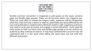
Another common convention in magazines is pull quotes on the cover, contents
page and double page spreads. These are all common within my magazine too.
These are used often to initiate the enigma codes, audiences will be intrigued by
what they read and have a desire to read on; potentially also being affected by the
uses and gratifications model by Denis McQuail model in 1987 suggesting audiences
may read on to be part of society and engage in social interaction. I have used the
same quote on both my front cover and double page spread as to not confuse my
audience as they continue to read on. It may have confused them as some may not
understand that it is the same artist telling the same story but just with two
different pull quotes.
One element of my magazine that challenges conventions of real media products is
my use of QR codes. This is often not seen in other magazines I had studied such as
Q and Mojo. I chose to use this because when asked in my survey weather my target
audience would like some electronic/online element the majority had said that they
would like to see this. Many magazines do house an online element however this is
usually created to direct the audience to enter a website themselves and then
require further login details etc. By incorporating QR codes this helps my magazine
stand out and offer something many other magazines don’t, making it appear more
modern and appeal to my target audience who love technology.
Studio pictures are a common convention of real media products as often seen on
Mojo’s front covers. I also chose to use this approach, all my images were shot in a
photography studio with a DSLR as to make them look very professional. As well as
this, many magazines I had studied from the 90’s (as that is what era I am
attempting to portray in my ‘throwback’) also used studio shots rather than action
shots of celebrities which would usually be seen in gossip magazines and magazines
that pride themselves on photos taken by the paparazzi. As seen in ‘Mojo’ the front
cover feature image is a long shot of Elvis Costello leaning on his guitar. This is also
reflected within my front cover.
As well as the set, another convention I have adhered to is using multiple sub-
images on the cover. Mojo only uses two sub-images whereas many other popular
magazines do use an abundance to show all their features. My front cover uses
three different sub-images to show the audience all the other artists who will be in
my magazine. I chose to use pictures rather than just names as seen on the cover of
‘mojo’ because my magazine is a throwback and for that reason, my audience may
not remember names as clearly as they do with artists featured in mojo who use
more ‘current’ artists.
Overall, my magazine has both challenged and developed conventions of real
media products in a number of ways such as using studio shots, QR and interactive
features, pull quotes and mastheads. I believe that this has created a strong
magazine that does follow many similar rules of popular magazines.

Evaluation question 1

  • 1.
    IN WHAT WAYSDOESYOUR MEDIA PRODUCT USE, DEVELOP OR CHALLENGE FORMS AND CONVENTIONS OF REAL MEDIA PRODUCTS? Evaluation question 1.
  • 2.
    I used magazinessuch as ‘Mojo’ and 90’s magazines to help develop my magazine. Whilst these magazines are targeted at different people, I believe that it created a good mixture of genres to help me achieve the retro-sophistication that I wanted to show in my magazine. Both these magazine styles use many typical conventions that can be seen throughout the industry. My magazine also developed and challenged some of these forms and conventions.
  • 3.
    Firstly, within manyof the magazines I studied, the masthead was consistently the second most emphasized feature on the page. The first being the feature artist and headlines. The mastheads were made memorable by using big, bold capitalized text. To illustrate this within my magazine, I took the brand name ‘Poser’ and used it to cover the majority of the first 5cm of the page. Using the font ‘Franklin gothic demi’ I developed the conventions as mentioned above. This helps the brand stand out on the page, whilst the audience do notice the feature image, the masthead is equally as noticeable. I chose to write this in black rather than a red or as an illustration seen in magazines such as Q because I feel that with the overlay I had placed under the title black did stand out very well.
  • 4.
    As well asthis, because of the art behind the masthead, this may seem childish. I chose a professional looking font as to make the magazine look a little more sophisticated as to attract the target audience. My target audience are around 25, and were children in the 90’s. This colouring is meant to bring back memories of the 90’s to the audience without being too childish. This combination is challenging conventions as often you would see a magazine that would decide to go with either sophistication or child-like features. Throughout my magazine, the masthead is in the same place. This is a common convention of magazines as to create continuity and make it more professional to see.
  • 5.
    Another common conventionin magazines is pull quotes on the cover, contents page and double page spreads. These are all common within my magazine too. These are used often to initiate the enigma codes, audiences will be intrigued by what they read and have a desire to read on; potentially also being affected by the uses and gratifications model by Denis McQuail model in 1987 suggesting audiences may read on to be part of society and engage in social interaction. I have used the same quote on both my front cover and double page spread as to not confuse my audience as they continue to read on. It may have confused them as some may not understand that it is the same artist telling the same story but just with two different pull quotes.
  • 6.
    One element ofmy magazine that challenges conventions of real media products is my use of QR codes. This is often not seen in other magazines I had studied such as Q and Mojo. I chose to use this because when asked in my survey weather my target audience would like some electronic/online element the majority had said that they would like to see this. Many magazines do house an online element however this is usually created to direct the audience to enter a website themselves and then require further login details etc. By incorporating QR codes this helps my magazine stand out and offer something many other magazines don’t, making it appear more modern and appeal to my target audience who love technology.
  • 7.
    Studio pictures area common convention of real media products as often seen on Mojo’s front covers. I also chose to use this approach, all my images were shot in a photography studio with a DSLR as to make them look very professional. As well as this, many magazines I had studied from the 90’s (as that is what era I am attempting to portray in my ‘throwback’) also used studio shots rather than action shots of celebrities which would usually be seen in gossip magazines and magazines that pride themselves on photos taken by the paparazzi. As seen in ‘Mojo’ the front cover feature image is a long shot of Elvis Costello leaning on his guitar. This is also reflected within my front cover.
  • 8.
    As well asthe set, another convention I have adhered to is using multiple sub- images on the cover. Mojo only uses two sub-images whereas many other popular magazines do use an abundance to show all their features. My front cover uses three different sub-images to show the audience all the other artists who will be in my magazine. I chose to use pictures rather than just names as seen on the cover of ‘mojo’ because my magazine is a throwback and for that reason, my audience may not remember names as clearly as they do with artists featured in mojo who use more ‘current’ artists.
  • 9.
    Overall, my magazinehas both challenged and developed conventions of real media products in a number of ways such as using studio shots, QR and interactive features, pull quotes and mastheads. I believe that this has created a strong magazine that does follow many similar rules of popular magazines.