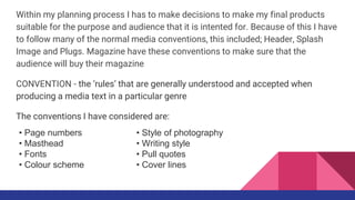
This document discusses how the media product follows several conventions of real magazines. It specifically addresses:
- Only including partial page numbers to not interfere with the design but still provide navigation.
- Placing the masthead in the top left corner for visibility and overlapping it with the cover image to save space.
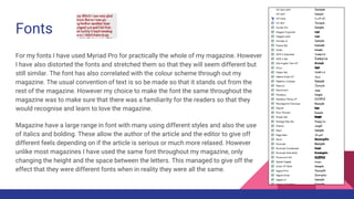
- Using the same font throughout for familiarity but distorting it occasionally for variety.
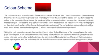
- Having a primary color scheme of red, black, and white for professionalism and accessibility.
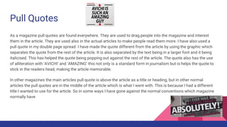
- Incorporating pull quotes into articles to highlight important excerpts and promote reading in a recognizable style.
While following many standard conventions, some elements are adapted to better suit the specific media
What is NFV and Why is it Significant to the Networking Industry?Mahindra Comviva
A lot of this rise can be attributed to NFV when telecom operators across the world are adopting the technology to gain competitive advantage. NFV will bring a sea change in how the industry works in the coming years along with fetching extra revenue.
In what ways does your media product use, develop or challenge forms and conv...S0016315
Harry Iggleden
AS Media Studies.
Evaluation Question 1: In what ways does your media product use, develop or challenge forms and conventions of real media products?
This is my first evaluation question answering: In what ways does your media product use, develop or challenge forms and conventions of real media products?
Sachpazis:Terzaghi Bearing Capacity Estimation in simple terms with Calculati...Dr.Costas Sachpazis
Terzaghi's soil bearing capacity theory, developed by Karl Terzaghi, is a fundamental principle in geotechnical engineering used to determine the bearing capacity of shallow foundations. This theory provides a method to calculate the ultimate bearing capacity of soil, which is the maximum load per unit area that the soil can support without undergoing shear failure. The Calculation HTML Code included.
Student information management system project report ii.pdfKamal Acharya
Our project explains about the student management. This project mainly explains the various actions related to student details. This project shows some ease in adding, editing and deleting the student details. It also provides a less time consuming process for viewing, adding, editing and deleting the marks of the students.
CFD Simulation of By-pass Flow in a HRSG module by R&R Consult.pptxR&R Consult
CFD analysis is incredibly effective at solving mysteries and improving the performance of complex systems!
Here's a great example: At a large natural gas-fired power plant, where they use waste heat to generate steam and energy, they were puzzled that their boiler wasn't producing as much steam as expected.
R&R and Tetra Engineering Group Inc. were asked to solve the issue with reduced steam production.
An inspection had shown that a significant amount of hot flue gas was bypassing the boiler tubes, where the heat was supposed to be transferred.
R&R Consult conducted a CFD analysis, which revealed that 6.3% of the flue gas was bypassing the boiler tubes without transferring heat. The analysis also showed that the flue gas was instead being directed along the sides of the boiler and between the modules that were supposed to capture the heat. This was the cause of the reduced performance.
Based on our results, Tetra Engineering installed covering plates to reduce the bypass flow. This improved the boiler's performance and increased electricity production.
It is always satisfying when we can help solve complex challenges like this. Do your systems also need a check-up or optimization? Give us a call!
Work done in cooperation with James Malloy and David Moelling from Tetra Engineering.
More examples of our work https://www.r-r-consult.dk/en/cases-en/
Overview of the fundamental roles in Hydropower generation and the components involved in wider Electrical Engineering.
This paper presents the design and construction of hydroelectric dams from the hydrologist’s survey of the valley before construction, all aspects and involved disciplines, fluid dynamics, structural engineering, generation and mains frequency regulation to the very transmission of power through the network in the United Kingdom.
Author: Robbie Edward Sayers
Collaborators and co editors: Charlie Sims and Connor Healey.
(C) 2024 Robbie E. Sayers
Democratizing Fuzzing at Scale by Abhishek Aryaabh.arya
Presented at NUS: Fuzzing and Software Security Summer School 2024
This keynote talks about the democratization of fuzzing at scale, highlighting the collaboration between open source communities, academia, and industry to advance the field of fuzzing. It delves into the history of fuzzing, the development of scalable fuzzing platforms, and the empowerment of community-driven research. The talk will further discuss recent advancements leveraging AI/ML and offer insights into the future evolution of the fuzzing landscape.
Cosmetic shop management system project report.pdfKamal Acharya
Buying new cosmetic products is difficult. It can even be scary for those who have sensitive skin and are prone to skin trouble. The information needed to alleviate this problem is on the back of each product, but it's thought to interpret those ingredient lists unless you have a background in chemistry.
Instead of buying and hoping for the best, we can use data science to help us predict which products may be good fits for us. It includes various function programs to do the above mentioned tasks.
Data file handling has been effectively used in the program.
The automated cosmetic shop management system should deal with the automation of general workflow and administration process of the shop. The main processes of the system focus on customer's request where the system is able to search the most appropriate products and deliver it to the customers. It should help the employees to quickly identify the list of cosmetic product that have reached the minimum quantity and also keep a track of expired date for each cosmetic product. It should help the employees to find the rack number in which the product is placed.It is also Faster and more efficient way.
Final project report on grocery store management system..pdfKamal Acharya
In today’s fast-changing business environment, it’s extremely important to be able to respond to client needs in the most effective and timely manner. If your customers wish to see your business online and have instant access to your products or services.
Online Grocery Store is an e-commerce website, which retails various grocery products. This project allows viewing various products available enables registered users to purchase desired products instantly using Paytm, UPI payment processor (Instant Pay) and also can place order by using Cash on Delivery (Pay Later) option. This project provides an easy access to Administrators and Managers to view orders placed using Pay Later and Instant Pay options.
In order to develop an e-commerce website, a number of Technologies must be studied and understood. These include multi-tiered architecture, server and client-side scripting techniques, implementation technologies, programming language (such as PHP, HTML, CSS, JavaScript) and MySQL relational databases. This is a project with the objective to develop a basic website where a consumer is provided with a shopping cart website and also to know about the technologies used to develop such a website.
This document will discuss each of the underlying technologies to create and implement an e- commerce website.
2. In what ways does your media
product use, develop or challenge
forms and conventions of real
media products?
3.
4. Within my planning process I has to make decisions to make my final products
suitable for the purpose and audience that it is intented for. Because of this I have
to follow many of the normal media conventions, this included; Header, Splash
Image and Plugs. Magazine have these conventions to make sure that the
audience will buy their magazine
CONVENTION - the ‘rules’ that are generally understood and accepted when
producing a media text in a particular genre
The conventions I have considered are:
• Style of photography
• Writing style
• Pull quotes
• Cover lines
• Page numbers
• Masthead
• Fonts
• Colour scheme
5. Page Numbers
I have included page numbers on my double page spread only. I decided to only partially follow this convention to
make sure that the look of the pages were correct. However I still needed to include some page numbers so that the
readers know what page to go to when following the contents page. The way I have presented this is very clear and
away from the main article. I have done this so that it is clear to see and won’t be confused with the other part of the
article. This will be consistent across my magazine. However I have not put the page number on the contents page
because people don’t need to know the page number for it. There is also no page number on the double page
spread with the picture. This is because people might want to use the image as a poster. It would also not fit well
with the black and white image which it holds. This is a normal convention though
The page numbers in different magazine can vary. Not only in the font of the numbers but also in the style which
they are presented. Each different page number shown below has a different background which ranges from a circle
to just a plain line. This helps present the font in the style of the magazine which then reflects the genre and
audience.
6. Masthead
The masthead is key convention in every magazine. Which is why I have included it. As the usual convention is
seen in practically every magazine, I have followed the usual of keeping the masthead to the top left hand corner.
This normality is used to catch the eye of the reader straight away as they look to the top left first. I have made my
mast head and my date has in the same space so that the space around the bar code wouldn’t look to crowded
and eye catching because I wanted to make the splash image the main focus of the front cover. I have also done
another masthead stereotype of overlapping the masthead and the splash Image, I have done thins to make it
look more professional and also to save space on the cover for other things like the cover lines
Many magazines in different genres also have the colour red in their mastheads. So, I decided to go against the
norm and make it much more monochrome. This will make it stand out in the mind of my audience and allows
then to remember the classic black title that otherwise wouldn’t get used. The use of having too many red titles
would make my audience get confused between different brands
7. Fonts
For my fonts I have used Myriad Pro for practically the whole of my magazine. However
I have also distorted the fonts and stretched them so that they will seem different but
still similar. The font has also correlated with the colour scheme through out my
magazine. The usual convention of text is so be made so that it stands out from the
rest of the magazine. However my choice to make the font the same throughout the
magazine was to make sure that there was a familiarity for the readers so that they
would recognise and learn to love the magazine.
Magazine have a large range in font with many using different styles and also the use
of italics and bolding. These allow the author of the article and the editor to give off
different feels depending on if the article is serious or much more relaxed. However
unlike most magazines I have used the same font throughout my magazine, only
changing the height and the space between the letters. This managed to give off the
effect that they were different fonts when in reality they were all the same.
8. Colour Scheme
The colour scheme is primarily made of three colours; White, Black and Red. I have chosen these colours because
they make the magazine look professional. The red symbolises the passion that people have but it also adds the
colour to the magazine. I have chosen the black and white as standard colours because they can stand out again
the red easily an I can see that they look good together. These three colours are also good for colour blind people
as they don’t clash and are of the format that people can understand. The red and white colour scheme is widely
used and is a main theme of the magazine ‘Q’ which I have heavily based my magazine off.
With other rock magazines a main theme within them is either Red or Black, one of the colours having the main
page consumption. In the case of the main colour being black (which is the case with KERRANG!) they have also
added yellow as some colour and also to make the connection of being dangerous. I have not that much colour
within my magazine, with the main being the red and also the main image on the contents being pink and purple.
9. Pull Quotes
As a magazine pull quotes are found everywhere. They are used to drag people into the magazine and interest
them in the article. They are used also in the actual articles to make people read them more. I have also used a
pull quote in my double page spread. I have made the quote different from the article by using the graphic which
separates the quote from the rest of the article. It is also separated by the text being in a larger font and it being
italicised. This has helped the quote being popping out against the rest of the article. The quote also has the use
of alliteration with ‘AVICHI’ and ‘AMAZING’ this not only is a standard form in journalism but is helps the quote to
stick in the readers head, making the article memorable.
In other magazines the main articles pull quote is above the article as a title or heading, but in other normal
articles the pull quotes are in the middle of the article which is what I went with. This is because I had a different
title I wanted to use for the article. So in some ways I have gone against the normal conventions which magazine
normally have