
Recommended
More Related Content
What's hot
What's hot (18)
Similar to Evaluation
Similar to Evaluation (20)
Recently uploaded
Recently uploaded (20)
Evaluation
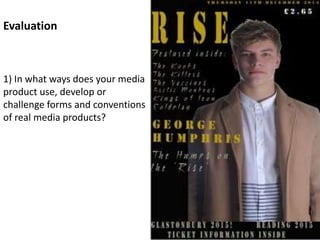
- 1. Evaluation 1) In what ways does your media product use, develop or challenge forms and conventions of real media products?
- 3. The cover matches the conventions of magazine covers as the masthead is sat in the top left hand corner of the page like most magazines. It is easy to see and easily identifiable meaning the name of the magazine is recognizable to people and stands out. I used gold as my color for the text because it gives it a sense of class and also works well with the black background. Also I used the font ‘simple time’ to give it the effect of roughness to match the genre I’m representing. The masthead is also short but also in a small font which means I was able to add more detail to the cover page but also, I was still able to make it obvious that it is the masthead. Masthead
- 4. Picture The picture is to the right hand side of the page and also has the text fitting in around it, text coming over the shoulder up to the side of the head for example. Also, the artists eyes are staring directly at the camera with little emotion shown on his face and stood up straight which gives the serious impression to the reader. This is done to meet the conventions of an artists picture on a magazine cover. The clothes are also to match the genre of music that this artist is from and is to show the type of music which this artist is replicating. Also, the effects used on the original picture is to make the artist stand out of page and also to give the effect of a glow to get the readers attention. Also, I have edited out any features of the artist that may be less attractive, like spots etc.
- 5. Text The text on the page fills up the empty space around the picture which gives the cover more detail. It also informs the reader of the features inside the magazine to get the readers attention and interest them with bands they’re interested and who they’re a fan of. There is also the date of the issue which meets the conventions. Further more, I advertised two music festivals at the bottom of the page with the text ‘Ticket information inside’ to invite the reader inside. Also, there is a headline and sub heading of the artist on the cover.
- 7. Masthead On the contents I decided to carry through the main masthead in the same place and kept it a similar font and size, I did this to maintain the genre, style and layout of the magazine.
- 8. Pictures The picture which is positioned in the right covering most of the page, I’ve added sunglasses and denim jacket with fully buttoned shirt underneath to the member of the band whom is also in this picture along side George, I dressed him look cool and up to date. The facial expression of a sly smirk doesn’t necessarily match the conventions of the artist facing the camera with a serious pose but I made sure to reinforce the uniqueness of the genre and band. The member has his left hand on his glasses and is seen to be looking at something in the distance to the right of the camera where as the face of George Humphris is staring at the camera matching the conventions wearing the same clothes as the cover picture. The picture gives a more serious and concentrated impression.
- 9. Text Firstly, the text is golden with the black background with random page numbers. This is to keep the genre format and replicate the previous the page but also to not to make them identical. There are also pages numbers which have a persuading and varied short previews of what is in that particular article. Also, the page numbers are in no particular order and range from page 2 to page 95 to show the range of pages and different articles within the magazine. This technique matches other magazines contents pages which I’ve researched and observed and also do this.
- 10. Breakdown of article page.
- 11. Picture The picture I used for my article was the artist in a grey hoodie with the hood up staring past the camera. I did this because I thought the hoodie and way he’s dressed showed the diversity of this compared to the contents and cover pages but still was part of the this particular genre. I chose to have the artist looking as if he’s looking into the distance because I felt it was important to differ from the other pictures used. The artist body is positioned in a very relaxed way to make the page more of a chilled vibe and the magazine.
- 12. Text The text is the most important part of the article page because it’s what makes the page what it is, it is the whole point of an article. The heading subheading is to catch the attention of the audience in order to get them to read on, I ensured to make mine snappy and easy on the eye to get in readers. My text is based on George Humphris and his rise to fame through music and larger font there is quotes from him which I used because it makes the text look more professional and also is a way of attracting and interesting the reader into reading this article page.
- 13. 2) How does your media product represent particular social groups? Media product = your music magazine Represent = representation Social groups = people who regularly interact and share a sense of unity and common identity
- 14. Contents Page The way I have decided to represent my chosen genre on the contents page by, like the cover, ensuring both musicians are dressed in indie styled clothing to ensure I get the chosen genre clearly across to the reader. Also, I have replicated the font style and color coordination from the cover to maintain the indie style and to try and capture people who like indie music and people who also dress in an indie style. I tried to make the artists look cool and look in a way of doing what they want when they want to the audience so to get this point across to the reader that they do what they want and dress how they like and are happy in the industry which I portrayed through the facial expression on the top right of the page. Also, the sunglasses add to this point because of the fact it looks as if he’s wearing them in a pitch black room adding to wearing what they want and not caring for other peoples opinions about them.
- 15. Genre My genre is based on indie which I’ve tried to portray through the picture of color scheme of the background and text. The artist is dressed accordingly to the genre by the clothing and general appearance and his facial expression. Also the different and creative font style of the text, it adds to the indie, unique style of the magazine to engage the reader and to stand out. The black background with golden text gives the original and special impression to the cover which is needed to show the genre and interest the reader and gage the attention of people interested in this genre.
- 16. Target Audience The target audience are people known as ‘indie’ and people who enjoy that kind of music. I’ve tried to meet the chosen genre by having my artist dressed in an indie style of clothing to have a special effect on the reader and also on my cover there are indie bands advertised which should also stand out to people who are interested in that style of music. I also used unique and original fonts on the text on the cover to also add to the whole indie feel of the magazine and make the genre of the magazine as clear as possible without specifying the actual genre.
- 17. 3) What kind of Media Institution might distribute your media product and why? The institute that may produce and distribute my media product is ‘Independent magazine’ because my type of magazine is similar to the other products they have produced and what they specialize in. The publisher is likely to distribute my magazine because my target audience and the social group aimed at, are similar to theirs because we’re both targeting the young indie audience for our media products so therefore it fits in well. Social groups = people who regularly interact and share a sense of unity and common identity.
- 18. This is Alex: He is a 19 year old single man who is at UNI and enjoys reading indie magazines . I think he would be the type of person to read my magazine and he is quite indie and fairly cool in the way he dresses. Alex is also in a band whom play indie style music which will make him interested in my magazine because it’s a perfect fit for him. His Favourite band of all time Coldplay because they make some of the best music he has heard and he believes that everyone would like this band if they gave them a chance as he says that people may have definitely listen to there music even if they didn’t know who the band are. This is because Coldplay have had many songs that have hit the charts and released multiple successful albums. 4) Who are your target audience and how did you attract and address them?
- 19. His Hero is Chris Martin: He likes Chris Martin because he’s a big fan of Coldplay and he’s the lead singer. He also thinks that Chris Martin performs amazingly well at live gigs and he’s an all round great musician and performer. The last Album he bought was by Coldplay and it was there new album called Ghost Stories. He goes to gigs about once a month and enjoys going most with his friends from UNI. He also likes going to see local gigs with unsigned bands at local pubs with his friends.
- 20. He also likes: Kings of Leon The Kooks The Vaccines The Killers
- 21. 5) How have I looked at my magazine audience? I think the way I have looked at my magazine audience is that I have targeted the more musical people. So I’ve looked at the people that go to gigs quite often or might be in a band or perform some type of indie music or are just really into music. The way I’m going to attract these kind of people to buy my magazine by some advertising techniques such as my indie colour scheme that is on my front cover with the vintage black, gold and grey. Also the vintage fonts give of a cool vibe to my magazine which would hopefully intrigue my indie audience.
- 22. 6) What have you learnt about technologies from the process of constructing this product?
- 23. 6) What have you learnt about technologies from the process of constructing this product? Hardware: The following pictures are all examples of hardware I have used throughout this course: • Apple iMac • Camera • (fuji finepix) • SD card • Strobe lights • Key board • Mouse
- 24. 6) What have you learnt about technologies from the process of constructing this product? Apple Mac Processor: 2 GHz Intel Core 2 Duo Memory: 1 GB 667 MHZ DDR2 SDRAM START UP DISK: Mac HD This is the main bit of hardware that we have used in our course, it’s what everything comes together on to make the final draft. It’s very different from the type of computer I’m used too, so it took some time to get used too but after a little while I was able to use it more efficiently and found it’s much easier and quicker to use than windows computers. It’s simpler because it’s easy to save things in places you’ll be able to find it later making it easily accessible.
- 25. 6) What have you learnt about technologies from the process of constructing this product? Key Board + Mouse MOUSE: This is one of the most vital tools to control the computer helping me to click, drag and scroll through information. Also enables me to copy and paste information and pictures that I need. KEY BOARD: The keyboard allows me to type and then use the mouse to select the things that I have typed and re type or delete them. It has also allowed me to write the text for my cover page, contents page and article page. COMMANDS: These are shortcuts which help me to get work done easier and quicker. Screenshot: ctrl + apple +4 Zoom in: Apple + Zoom out: Apple -
- 26. 6) What have you learnt about technologies from the process of constructing this product? SD Card The SD card is the memory card for the camera. It is placed inside the camera and made so that when I take my photos then the pictures will get saved to that instead of the camera so if there’s any problems with the camera then the pictures won’t be damaged. Once the pictures have been taken then I get a memory stick which I then transferred my pictures onto my mac from. Then finally I can import the photo onto my pages so I can start using them.
- 27. 6) What have you learnt about technologies from the process of constructing this product? Software Software are the programs we use to create our course work pages. There are various different software programs used for different reasons, like editing photos or creating different kinds of pages and videos. The main software we used was Photoshop, InDesign and word to create my pages as well as PowerPoint to do my evaluation on. All these software's were quick and simple to use and helped me to get the maximum amount of marks throughout my coursework.
- 28. 6) What have you learnt about technologies from the process of constructing this product? Photoshop • This is the main piece of software that we use in making our magazines because its got all the vital tools to edit and all the individual parts of my magazine pages • Once we have an A2 page up on the screen we can import pictures to it by dragging the jpeg of the desktop on the Photoshop page and then we can edit the size by dragging the corners and sides of the picture to where we want it. • Being careful you don’t stretch the picture out of focus by holding down SHIFT whilst using the mouse to stretch the picture so as to make sure you keep the picture even on all sides
- 29. 6) What have you learnt about technologies from the process of constructing this product?
- 30. 6) What have you learnt about technologies from the process of constructing this product? Spot healing tool Photoshop Also, I can use photoshop to edit someone’s facial features to clean up the little imperfections such as spots or scars ect. To do this we had to click the plaster tool and hover over the models face and click on the sports or scars. Photoshop then blurs it so that it looks much cleaner and makes the model look better. Other things we can do on photoshop are the effects which we can put onto the pictures to let them give off different vibes.
- 31. 6) What have you learnt about technologies from the process of constructing this product? InDesign InDesign is software which allows you to put text onto previous things you may have created on other softwares or on to a standard JPEG. I think this software is a bit more complicated to compared to the other software programs that we used. However this is the one I have used least so I’m not confident using it but I was still able to do some of the simpler stuff which all we needed to do was get our writing for our articles on to the JPEG so we can then transfer it onto our blogs when completed.
- 32. 6) What have you learnt about technologies from the process of constructing this product? Inserting a picture Once the document is open go to file then place and then pick the picture out of your and it should be on your page then you can fit it to the box guide lines around the outside of the A3 page so that it looks right when you export out of InDesign as a JPEG. Inserting writing To insert writing the first thing to do is create a text box and make sure it stretches over the whole space you want to place your writing to be. Then because we are making an article we have to insert columns into the text box going up to the right of the screen and then select how many columns you want which should change to what you want and what looks right on your magazine. Once you have done this you then copy and paste your articles writing from word into those columns and then adjust the writing to fit into the columns.
- 33. 6) What have you learnt about technologies from the process of constructing this product? Word Word software is the programme that we use less frequently during our coursework because it’s very limited to what you can do on there so we don’t use it as much. The only thing we are able to do is write up our article page text which is vital for the page but doesn’t require anything that text like, pictures for example. Word is very simple and easy to use because it’s not as intricate and we’ve used it plenty of times before.
- 34. My magazine cover page and prelim task cover page are very different. Firstly, my cover page is much more detailed than the prelim task because the prelim has just got a masthead and headline on it where as my cover page has multiple different bands, date, price, caption on the picture and other things which make the page look better and more professional. The picture is also better, it has been cut out properly using tools on Photoshop which throughout the course I have been able to develop where as the prelim task I had very little knowledge of how Photoshop worked and therefore the editing of the pictures isn’t very good. Also, the styles are very different between the pages and that shows how my knowledge and skill on Photoshop have developed throughout the course and my knowledge of the forms and conventions of a magazine cover page. 7) Looking back at your preliminary task, what do you feel you have learnt in the progression from it to the full product?
- 35. 7) Looking back at your preliminary task, what do you feel you have learnt in the progression from it to the full product? I had more knowledge also, of how to take good pictures and how to fit them in around my genre and how they’re used to target a specific audience. In my prelim task I just took a picture of George, Conor and Seb messing about and used it on my page as an image of bullying. Where as, on my real cover I made sure the picture was taken more carefully and that I edited it better so it looked better and fit well on my page and also, made the clothes he wore more relevant and linked it to the genre and type of magazine where as, the prelim task page the boys were just in school uniform.