Evaluation question 1
•Download as DOCX, PDF•
0 likes•144 views
The document discusses how the media product, a magazine, uses and develops conventions from the real rock music magazine Q. It uses bold serif and sans serif fonts on the cover to separate the headline from other text, mimicking Q's technique. The main cover image features a young artist to appeal to younger readers, as Q does. Dark colors are used on the cover and throughout to represent the rock genre, as with Q, but high-key lighting is used on photos atypical of rock. The layout takes influences from Q like separating information with bars and highlighting page numbers, but uses circles instead of squares for a more informal look. Only two photos are used rather than several to prevent clutter.
Report
Share
Report
Share

Recommended
Media evaluation Q2
The document discusses the design choices made for a magazine cover representing a rock artist. Key themes and elements were taken from existing rock magazine covers, including having the artist holding a guitar and wearing black clothing. The cover was also designed to focus the artist in the center of the page like professional magazines. The pose chosen for the artist was inspired by poses commonly seen on other rock magazine covers - looking directly at the camera with a friendly expression to draw readers in.
Media Evaluation Question 1.
The document summarizes the process of creating a magazine called "Rock Harder" that focuses on rock music. Key points:
1) The author researched existing rock magazines like Kerrang!, Classic Rock, and Rock Sound to understand conventions of the genre.
2) The magazine uses common rock magazine design elements like a black, red, and white color scheme and a bold masthead font.
3) While maintaining elements like focused content and complex writing for serious fans, the layout is more organized than typical "chaotic and messy" rock magazine layouts.
4) In conclusion, the magazine successfully used, developed, and challenged conventions of existing rock magazines in its genre.
Media Evaluation Question 1.
This document summarizes the key aspects of a rock music magazine created by the author for an evaluation. The author researched existing rock magazines to understand conventions of the genre. The magazine's design uses colors, fonts, and layouts common to rock magazines, including a black, red, and white color scheme. The masthead font and magazine name "Rock Harder" are intended to clearly signal the genre to readers. While maintaining elements like the color scheme, the author's magazine layout is more organized than typical rock magazines to suit its targeted readership.
Media Evaluation Question 1.
The document summarizes the process of creating a magazine called "Rock Harder" that focuses on rock music. Key points:
1) The author researched existing rock magazines like Kerrang!, Classic Rock, and Rock Sound to understand conventions of the genre.
2) The magazine uses common rock magazine design elements like a black, red, and white color scheme and a bold masthead font.
3) While maintaining elements like focused content and complex writing for serious fans, the layout is more organized than typical "chaotic and messy" rock magazine layouts.
4) In conclusion, the magazine successfully used, developed, and challenged conventions of existing rock magazines in its genre.
Media Evaluation Question 1.
This document summarizes the key aspects of a rock music magazine created by the author for an evaluation. The author researched existing rock magazines like Kerrang!, Classic Rock, Q, and Rock Sound to understand conventions of the genre. The author's magazine, called "Rock Harder", uses typical rock magazine design elements like a black, red, and white color scheme. It also features a large, bold masthead font and organized layout. While conforming to conventions like consistent colors, the author challenged conventions with an orderly presentation to represent genres like rock, blues, and soul. The magazine targets determined readers interested in artist news and music over just images and design.
Evvaluation q1
The document analyzes how the author's media product, a country music magazine, uses, develops, and challenges conventions of real country music magazines. It finds that the author's magazine follows many conventions, such as using bold mastheads, taglines, and articles about up-and-coming artists. However, it also challenges some conventions by using a colored contents page to appeal to younger audiences and having the background of a cover photo rather than a plain color, a rare approach for music magazines. Overall, the author aims to create a magazine that feels modern while still clearly being a country music publication through its use of stereotypical imagery and language.
Ev question 2
This document discusses the design choices made for a magazine targeting white British teenagers and young adults aged 16-18. On the front cover, a male model aged 18 is featured in a style of dress stereotypical of indie singer-songwriters to appeal to that audience. A double page spread features a female model in a way that goes against conventions of sexualization, aiming to appeal to both male and female readers. Shot types and layouts were selected to build relationships between readers and models while maintaining a minimalist, calming style.
Question 5
The document summarizes how the author attracted and addressed their audience through font, photography, color scheme, and page layout in their rock music magazine. For the title font, they chose a fiery red font to convey a rock feel. Photos on the cover featured an indie model to attract indie fans, while interior photos used a dark, isolated style to appeal to fans of heavier rock. Bright colors and contrast were used throughout to draw the eye, with red and grey representing softer rock and black/red representing darker rock. The simple, straightforward layout in thirds made information easy to digest for the target teenage audience.
In what ways does your media product use, develop or challenge forms and conv...
This document discusses the conventions used in an independent magazine in comparison to more mainstream publications. It notes that the independent magazine takes a more natural, realistic, and underground approach to its cover photography and articles, rather than using sensationalist or commercially intended images like some mainstream music magazines. While having some similarities to mainstream conventions like magazine title and page numbers, it also draws inspiration from other independent magazines in taking more artistic licenses with photo editing and layout. Overall, the independent magazine discussed adheres to a consistent house style and follows some general media conventions, but with a more indie magazine aesthetic.
Question 2
The document discusses the conventions and codes used in the media product of an indie music magazine. It uses technical codes like fonts, layout, and images as well as symbolic codes like posing of subjects and color schemes to identify the magazine's genre and challenge stereotypes. The cover features indie artists to attract readers interested in that genre. The black and white color scheme and lack of color on the contents page further signals the indie genre. However, a double page spread subverts expectations by posing the artist with an indirect gaze rather than a direct smile at the camera as seen in other magazines. Overall, the document examines how the magazine's forms and styles develop and challenge conventions to effectively represent its target indie music audience.
Mind map
- The document contains ideas for naming an R&B magazine, including name and font ideas such as "THE DROP" in a graffiti style font.
- It also discusses using popular R&B artists like Frank Ocean, Kendrick Lamar, and Usher on the magazine cover to appeal to fans and create star power.
- Finally, it proposes ways to build the magazine's brand identity through consistent use of social media promotion, a strapline, advertisements of luxury products, and displaying the magazine's web address.
Question 2 Presentation
Joe Trost's media product represents the social group of students. The magazine cover features a central image of a male model playing a guitar at a low angle shot, similar to covers of real music magazines. This intimidating shot represents iconic artists. The magazine's minimal pages and direct fonts appeal to busy students. The affordable price, technology-focused website, and rebellious graphic elements also aim to represent students. The primarily male target audience is reflected through masculine colors, imagery, and fonts.
Evaluation activity 5
This document provides details on the design and content of a proposed magazine aimed at younger rock music fans. It describes the cover featuring a confident guitarist to attract interest. The contents page includes stories on classic rock bands and upcoming concerts. A double-page feature profiles a teenage rock band through photos and quotes to engage younger readers. Throughout, the magazine's design uses guitar silhouettes and color schemes inspired by other rock publications to appeal to its target audience.
Q1 evaluation
The document discusses the use of codes and conventions in magazines to attract audiences. It describes three types of codes: written codes found in text elements, symbolic codes conveyed through visual elements like colors and photography, and technical codes involving design elements like layout, fonts, and graphics. The document then provides examples from the author's own music magazine and a published magazine, Kerrang!, to illustrate how they employ symbolic and technical codes to engage audiences and convey information about the genre and content. Specifically, it discusses the use of dark color schemes, photography featuring artists and street art, typography, and graphics.
Photography planning
The document discusses design choices for different elements of an indie rock music magazine. For the front cover, it will feature a female artist holding an instrument to portray the music style and attract readers. The contents page will have a darker, more grunge image to show the variation in genres while still relating to indie rock. The double page spread will link back to the front cover image and style to provide continuity and draw readers in to learn more about what interested them initially.
Conventions of my product
My media product challenges some conventions of rock magazines while also using and developing others. It challenges conventions like using a black and white cover photo instead of color and featuring a low angle shot of a musician instead of a standard medium shot. However, it also uses conventions like putting a famous musician on the cover to attract fans, including pull quotes in articles, and having a contents page with boxed summaries of each story. The black and white cover photo is meant to give the magazine a harder look fitting for rock. Red is used throughout for its rock-related connotations of danger and to attract attention. Overall, the media product both challenges and builds on standard rock magazine formats and styles.
Proposal
The document discusses creating a rock music magazine targeted at readers aged 27-37. The creator wants to design a magazine with clear layouts using a variety of images, fonts, and colors like those in Q Magazine. They plan to include both male and female models in a range of shots to make the pages visually interesting. Key details like page numbers and social media links will help readers engage more. Pull quotes and highlighting protagonist names are intended to draw readers in. The overall goal is to produce an entertaining magazine that readers will enjoy during travels.
Evaluation for music magazine in Media
The document describes a music magazine created by Kieron Mackney aimed at males aged 16-21 who enjoy rock music. The magazine features local rock bands through images and interviews. In designing the magazine, Mackney looked to other rock magazines for inspiration on layout and style. The magazine aims to attract its target audience through the use of appropriate rock-associated imagery and informal language about activities like concerts and festivals. While adopting conventions like mastheads and house style, the magazine challenges forms by not using a left third and placing images below cover lines. Through creating the magazine, Mackney improved their Photoshop and design skills.
Evaluation for music magazine
The document describes a music magazine created by Kieron Mackney aimed at males aged 16-21 who enjoy rock music. The magazine features local rock bands through images and interviews. It was designed using layouts from similar rock magazines to attract its target audience through appropriate images and language. Key forms and conventions used include a simple color scheme, masthead behind the cover image, and cover lines, while not using a left third allows the cover image to span more of the page. Creating the magazine helped the author learn Photoshop skills and the basic forms and conventions of magazines.
Question 1- media evaluation
The student created a magazine that uses conventions from real music magazines to appear authentic. Specifically, the student used color symbolism on the cover from Justin Bieber's Rolling Stone magazine cover to suggest the model's blossoming career. Inside pages include hearts in the model's hair and her holding a guitar to imply her love for music and nature. The student also included an editor's signature on the contents page and used three main colors and fonts as is typical. However, the student had the model's eyes closed on photos rather than direct address, to portray her as free-spirited. Overall, the student aimed to challenge some conventions while developing others to suit their indie pop genre and target audience.
Question 1
The document discusses the development of a print magazine called "FACE" focused on musicals. It explores how the magazine challenges conventions of existing musical magazines through fonts, layout, photography, and language. Elements like sans serif titles, model photography depicting fashion and drama, and photos from Broadway locations are used to create a vibrant atmosphere and draw in readers.
Q1. IN WHAT WAYS DOES YOUR MEDIA PRODUCT USE, DEVELOP OR CHALLENGE FORMS AND ...
IN WHAT WAYS DOES YOUR MEDIA PRODUCT USE, DEVELOP OR CHALLENGE FORMS AND CONVENTIONS OF REAL MEDIA PRODUCTS?
Question 1 of Media Evaluation
The student's music magazine uses conventions of real magazines such as a masthead, cover lines, issue date and number, main article highlight, and barcode. However, it also challenges conventions by covering a non-pop music genre and artists not typically featured. While following conventions like other magazines in its genre, the magazine aims to attract its target audience with topical cover lines and images.
Early name ideas
The document discusses early ideas for naming a music magazine. It considers titles like "goodlife" and "noir" to match the non-mainstream genre. Research on existing music magazine titles shows they often consist of a single word like "Q" or "NME". The proposed title of "noir" relates to both music and the magazine's style through concepts of feelings, emotion, and image. Pre-production ideas led the author to decide "noir" would be a suitable title as it meets requirements and complements the handwritten font and house style of the magazine.
keerang analysis
The document provides an analysis of the layout, design elements, and visual rhetoric of a magazine cover and articles. Key points analyzed include the use of contrasting colors and fonts to draw attention, masculine imagery and styles that appeal to the target male audience, and strategic placement of images and text to entice readers and convey information in an engaging manner. Visual elements like album covers, band photos, and headlines using bold phrases are discussed as techniques for promoting bands and stories to music fans in a compelling style befitting the magazine's target demographic.
Evaluation question 5
The document discusses how the author addressed their target audience in creating a magazine called Hybrid. They used direct address on the front cover to engage readers and attract them to purchase the magazine. The color scheme of red, black, grey and white was chosen to be typical of rock music magazines. Yellow was used to make a featured pug stand out in a magazine competition. Cover lines featured up-to-date information on popular artists to attract audience attention. The author created a recognizable logo or "masthead" that featured an anarchy fist, which would appeal to the target punk rock audience.
Presentation1
The document discusses how the author's media product, a rock music magazine called "Gravity", both uses conventions of real rock magazines and challenges some conventions. Some ways it follows conventions are using close-up images of bands, consistent colors across pages, and repeating key images. Some ways it challenges conventions are the price being on the left side rather than top, and having younger band members than typical magazines. The author aims to appeal to a teenage audience through their choices in layout, fonts, and band representation.
Rock Sound Magazine Analysis
This magazine cover features artists Twenty One Pilots, 5 Seconds of Summer, and Halsey to attract different audiences to the rock magazine. The contents are organized with all similar articles grouped together rather than scattered. It also includes small previews of each article. The main article on Halsey profiles her music and discusses how she has gained fans from other genres and bands, to interest readers unfamiliar with her work.
Question 6 evaluation
The document discusses the technologies the author learned about through creating their product. They improved their skills with a Digital SLR camera by learning better lighting and ISO settings in the studio, which improved the clarity and depth of their images compared to their initial project. The author also learned how to use Photoshop more proficiently to edit photos and design pages, allowing them to create higher quality work. Additionally, they became more familiar with the blogging platform Blogger by practicing uploading work, and recognized how technological convergence allows composing and presenting work chronologically from one site. The author found Slideshare easy to use for quickly converting documents into presentations to embed on their blog.
Evaluation question 7
1) Since their preliminary project, the author has improved their photography skills. They have learned to use proper lighting and camera settings to produce brighter, sharper images with subjects making eye contact.
2) The author has gotten better at image editing and manipulation in Photoshop. They have learned techniques like using the Polygonal Lasso Tool to remove backgrounds cleanly.
3) The author's layout and design skills have advanced. They now follow magazine design principles better by placing key information in prominent areas. Font choice and text effects are also more appropriate to the genre.
More Related Content
What's hot
In what ways does your media product use, develop or challenge forms and conv...
This document discusses the conventions used in an independent magazine in comparison to more mainstream publications. It notes that the independent magazine takes a more natural, realistic, and underground approach to its cover photography and articles, rather than using sensationalist or commercially intended images like some mainstream music magazines. While having some similarities to mainstream conventions like magazine title and page numbers, it also draws inspiration from other independent magazines in taking more artistic licenses with photo editing and layout. Overall, the independent magazine discussed adheres to a consistent house style and follows some general media conventions, but with a more indie magazine aesthetic.
Question 2
The document discusses the conventions and codes used in the media product of an indie music magazine. It uses technical codes like fonts, layout, and images as well as symbolic codes like posing of subjects and color schemes to identify the magazine's genre and challenge stereotypes. The cover features indie artists to attract readers interested in that genre. The black and white color scheme and lack of color on the contents page further signals the indie genre. However, a double page spread subverts expectations by posing the artist with an indirect gaze rather than a direct smile at the camera as seen in other magazines. Overall, the document examines how the magazine's forms and styles develop and challenge conventions to effectively represent its target indie music audience.
Mind map
- The document contains ideas for naming an R&B magazine, including name and font ideas such as "THE DROP" in a graffiti style font.
- It also discusses using popular R&B artists like Frank Ocean, Kendrick Lamar, and Usher on the magazine cover to appeal to fans and create star power.
- Finally, it proposes ways to build the magazine's brand identity through consistent use of social media promotion, a strapline, advertisements of luxury products, and displaying the magazine's web address.
Question 2 Presentation
Joe Trost's media product represents the social group of students. The magazine cover features a central image of a male model playing a guitar at a low angle shot, similar to covers of real music magazines. This intimidating shot represents iconic artists. The magazine's minimal pages and direct fonts appeal to busy students. The affordable price, technology-focused website, and rebellious graphic elements also aim to represent students. The primarily male target audience is reflected through masculine colors, imagery, and fonts.
Evaluation activity 5
This document provides details on the design and content of a proposed magazine aimed at younger rock music fans. It describes the cover featuring a confident guitarist to attract interest. The contents page includes stories on classic rock bands and upcoming concerts. A double-page feature profiles a teenage rock band through photos and quotes to engage younger readers. Throughout, the magazine's design uses guitar silhouettes and color schemes inspired by other rock publications to appeal to its target audience.
Q1 evaluation
The document discusses the use of codes and conventions in magazines to attract audiences. It describes three types of codes: written codes found in text elements, symbolic codes conveyed through visual elements like colors and photography, and technical codes involving design elements like layout, fonts, and graphics. The document then provides examples from the author's own music magazine and a published magazine, Kerrang!, to illustrate how they employ symbolic and technical codes to engage audiences and convey information about the genre and content. Specifically, it discusses the use of dark color schemes, photography featuring artists and street art, typography, and graphics.
Photography planning
The document discusses design choices for different elements of an indie rock music magazine. For the front cover, it will feature a female artist holding an instrument to portray the music style and attract readers. The contents page will have a darker, more grunge image to show the variation in genres while still relating to indie rock. The double page spread will link back to the front cover image and style to provide continuity and draw readers in to learn more about what interested them initially.
Conventions of my product
My media product challenges some conventions of rock magazines while also using and developing others. It challenges conventions like using a black and white cover photo instead of color and featuring a low angle shot of a musician instead of a standard medium shot. However, it also uses conventions like putting a famous musician on the cover to attract fans, including pull quotes in articles, and having a contents page with boxed summaries of each story. The black and white cover photo is meant to give the magazine a harder look fitting for rock. Red is used throughout for its rock-related connotations of danger and to attract attention. Overall, the media product both challenges and builds on standard rock magazine formats and styles.
Proposal
The document discusses creating a rock music magazine targeted at readers aged 27-37. The creator wants to design a magazine with clear layouts using a variety of images, fonts, and colors like those in Q Magazine. They plan to include both male and female models in a range of shots to make the pages visually interesting. Key details like page numbers and social media links will help readers engage more. Pull quotes and highlighting protagonist names are intended to draw readers in. The overall goal is to produce an entertaining magazine that readers will enjoy during travels.
Evaluation for music magazine in Media
The document describes a music magazine created by Kieron Mackney aimed at males aged 16-21 who enjoy rock music. The magazine features local rock bands through images and interviews. In designing the magazine, Mackney looked to other rock magazines for inspiration on layout and style. The magazine aims to attract its target audience through the use of appropriate rock-associated imagery and informal language about activities like concerts and festivals. While adopting conventions like mastheads and house style, the magazine challenges forms by not using a left third and placing images below cover lines. Through creating the magazine, Mackney improved their Photoshop and design skills.
Evaluation for music magazine
The document describes a music magazine created by Kieron Mackney aimed at males aged 16-21 who enjoy rock music. The magazine features local rock bands through images and interviews. It was designed using layouts from similar rock magazines to attract its target audience through appropriate images and language. Key forms and conventions used include a simple color scheme, masthead behind the cover image, and cover lines, while not using a left third allows the cover image to span more of the page. Creating the magazine helped the author learn Photoshop skills and the basic forms and conventions of magazines.
Question 1- media evaluation
The student created a magazine that uses conventions from real music magazines to appear authentic. Specifically, the student used color symbolism on the cover from Justin Bieber's Rolling Stone magazine cover to suggest the model's blossoming career. Inside pages include hearts in the model's hair and her holding a guitar to imply her love for music and nature. The student also included an editor's signature on the contents page and used three main colors and fonts as is typical. However, the student had the model's eyes closed on photos rather than direct address, to portray her as free-spirited. Overall, the student aimed to challenge some conventions while developing others to suit their indie pop genre and target audience.
Question 1
The document discusses the development of a print magazine called "FACE" focused on musicals. It explores how the magazine challenges conventions of existing musical magazines through fonts, layout, photography, and language. Elements like sans serif titles, model photography depicting fashion and drama, and photos from Broadway locations are used to create a vibrant atmosphere and draw in readers.
Q1. IN WHAT WAYS DOES YOUR MEDIA PRODUCT USE, DEVELOP OR CHALLENGE FORMS AND ...
IN WHAT WAYS DOES YOUR MEDIA PRODUCT USE, DEVELOP OR CHALLENGE FORMS AND CONVENTIONS OF REAL MEDIA PRODUCTS?
Question 1 of Media Evaluation
The student's music magazine uses conventions of real magazines such as a masthead, cover lines, issue date and number, main article highlight, and barcode. However, it also challenges conventions by covering a non-pop music genre and artists not typically featured. While following conventions like other magazines in its genre, the magazine aims to attract its target audience with topical cover lines and images.
Early name ideas
The document discusses early ideas for naming a music magazine. It considers titles like "goodlife" and "noir" to match the non-mainstream genre. Research on existing music magazine titles shows they often consist of a single word like "Q" or "NME". The proposed title of "noir" relates to both music and the magazine's style through concepts of feelings, emotion, and image. Pre-production ideas led the author to decide "noir" would be a suitable title as it meets requirements and complements the handwritten font and house style of the magazine.
keerang analysis
The document provides an analysis of the layout, design elements, and visual rhetoric of a magazine cover and articles. Key points analyzed include the use of contrasting colors and fonts to draw attention, masculine imagery and styles that appeal to the target male audience, and strategic placement of images and text to entice readers and convey information in an engaging manner. Visual elements like album covers, band photos, and headlines using bold phrases are discussed as techniques for promoting bands and stories to music fans in a compelling style befitting the magazine's target demographic.
Evaluation question 5
The document discusses how the author addressed their target audience in creating a magazine called Hybrid. They used direct address on the front cover to engage readers and attract them to purchase the magazine. The color scheme of red, black, grey and white was chosen to be typical of rock music magazines. Yellow was used to make a featured pug stand out in a magazine competition. Cover lines featured up-to-date information on popular artists to attract audience attention. The author created a recognizable logo or "masthead" that featured an anarchy fist, which would appeal to the target punk rock audience.
Presentation1
The document discusses how the author's media product, a rock music magazine called "Gravity", both uses conventions of real rock magazines and challenges some conventions. Some ways it follows conventions are using close-up images of bands, consistent colors across pages, and repeating key images. Some ways it challenges conventions are the price being on the left side rather than top, and having younger band members than typical magazines. The author aims to appeal to a teenage audience through their choices in layout, fonts, and band representation.
Rock Sound Magazine Analysis
This magazine cover features artists Twenty One Pilots, 5 Seconds of Summer, and Halsey to attract different audiences to the rock magazine. The contents are organized with all similar articles grouped together rather than scattered. It also includes small previews of each article. The main article on Halsey profiles her music and discusses how she has gained fans from other genres and bands, to interest readers unfamiliar with her work.
What's hot (20)
In what ways does your media product use, develop or challenge forms and conv...
In what ways does your media product use, develop or challenge forms and conv...
Q1. IN WHAT WAYS DOES YOUR MEDIA PRODUCT USE, DEVELOP OR CHALLENGE FORMS AND ...
Q1. IN WHAT WAYS DOES YOUR MEDIA PRODUCT USE, DEVELOP OR CHALLENGE FORMS AND ...
Viewers also liked
Question 6 evaluation
The document discusses the technologies the author learned about through creating their product. They improved their skills with a Digital SLR camera by learning better lighting and ISO settings in the studio, which improved the clarity and depth of their images compared to their initial project. The author also learned how to use Photoshop more proficiently to edit photos and design pages, allowing them to create higher quality work. Additionally, they became more familiar with the blogging platform Blogger by practicing uploading work, and recognized how technological convergence allows composing and presenting work chronologically from one site. The author found Slideshare easy to use for quickly converting documents into presentations to embed on their blog.
Evaluation question 7
1) Since their preliminary project, the author has improved their photography skills. They have learned to use proper lighting and camera settings to produce brighter, sharper images with subjects making eye contact.
2) The author has gotten better at image editing and manipulation in Photoshop. They have learned techniques like using the Polygonal Lasso Tool to remove backgrounds cleanly.
3) The author's layout and design skills have advanced. They now follow magazine design principles better by placing key information in prominent areas. Font choice and text effects are also more appropriate to the genre.
Evaluation question 5
- The document discusses how the author addressed their target audience for their magazine. Their market research showed the target audience should be 16 years and older to attract a wide range of readers.
- The magazine targets fans of rock music through its dark color scheme of red, black, and grey, which represents the genre. This color scheme resembles that of the rock music magazine Q.
- The main article is written in an informal interview style about a young artist to appeal to and relate to their young audience. High-key lighting and young models in the photos also enable audience identification.
- The magazine's layout is mature like Q's to attract an older audience of 16 years and over. It follows design principles to place important
Pr14 task
To prepare for an interview, one should conduct research on the topic and interviewee. This includes researching the interviewee's background like previous roles and nominations, details about the topic like the movie's plot and characters, and identifying potential questions or issues. Effective preparatory research observes past interviews and establishes key facts, dates, people involved, and others' perspectives on both the topic and interviewee. Research methods can include primary sources, as well as secondary sources like books, websites, videos, and prior interviews.
Bill grundy sex pistols
The Sex Pistols were interviewed by Bill Grundy in 1976 to promote their group, but the interview became combative as Grundy antagonized the band with provocative questions. During the interview, Grundy egged the band on to say rude things, and used active listening techniques to goad them into saying something even more offensive. While meant to widen the band's audience and success, the differences in generations took over and destroyed the productive purpose of the interview.
Music box the stone roses
The interview was combative as the band members Ian Brown and John Squire were reserved about sharing information and seemed annoyed by the interviewer's questions. When asked about his union jack tattoo and whether he was anti-royalist, Ian Brown said he wasn't ashamed of it but wasn't proud of it either since pride is a sin. The interviewer used both open and closed ended questions and actively listened and responded to the band members' answers when forming new questions. The purpose of the interview was to promote the band and their music on television.
Jeremy paxman russell brand
The interview between Jeremy Paxman and Russell Brand for News night was formal and combative in style. Paxman is known for aggressive interviews and did not hold back when questioning Brand. The interview began confrontationally when Paxman asked what qualified Brand, a comedian, to comment on politics. Though the topic was formal, the hotel room setting was informal. Brand used information from Paxman's ancestry show against him in the debate. By the end, Brand's loud personality had taken over and he declared he did not need anyone's permission to have a political voice. The purpose was for viewers to learn about Brand's political views.
Viewers also liked (7)
Similar to Evaluation question 1
Evaluation Power Point
The document discusses the process of creating a music magazine focused on UK grime and rap genres. The creator analyzed magazines like RWD to follow conventions in layout, design and visual elements. Key elements copied from RWD include the front cover layout, contents page organization, and double page spread format. The intended audience is 16-18 year old males and females, represented through urban fashion styles and images of young black male models. The goal is to attract this audience and properly represent the genres and culture.
As media course work- evaluation
The document provides an evaluation of the student's media coursework assignment to create a magazine. It summarizes the key ways the student's magazine both follows and challenges conventions of real music magazines in its design. This includes using layouts similar to Kerrang magazine but with unconventional color schemes and fonts. It also discusses how the content focuses solely on punk rock, representing that genre. Overall, the student learned important skills in using Photoshop and balancing conventions with original designs.
Media evaluation
The document discusses how the media product uses and challenges conventions of real magazines. It includes a masthead on the left like Kerrang and Q magazines. Images and limited fonts are used to attract audiences and show brand identity. Social media was used to advertise and gather audience feedback. The product represents a younger rock audience through images, articles, and price point. Distribution by Bauer Media Group was chosen for their experience with similar magazines.
Orselina evaluation
- The document is a media magazine evaluation created by Orselina Pemaj that analyzes how their magazine product uses and challenges conventions of real music magazines.
- The evaluation discusses design elements like the masthead, images, color scheme, and layout that follow conventions from magazines like NME and Kerrang.
- It also analyzes the target audience as 14-25 year old males and females, and how the images, word choices, and price point were designed to attract this group.
As media course work evaluation
The document provides an evaluation of the student's media coursework assignment creating a magazine. It discusses how the magazine challenges conventions through its sole focus on punk rock music and unique color scheme. The front cover layout draws from Kerrang magazine's conventions while using unusual fonts and colors. The contents page was inspired by both music and non-music magazines to have an edgy punk style. Double page spreads emulate NME's style but with unusual colors to represent the genre. Overall, the student learned Photoshop skills and how to construct a magazine that achieves style and attracts an audience through attention to visual details and genre representation.
As media course work evaluation
The document provides an evaluation of the student's media coursework assignment to create a magazine. It summarizes how various pages in the magazine use, develop, or challenge conventions of real music magazines. For the front cover, the student followed conventions from Kerrang magazine but challenged conventions by focusing solely on punk rock and using unusual colors. For other pages like the contents page and double page spread, the student both followed conventions from other magazines and tried to make the layouts and designs unique. The student learned various Photoshop and design skills through constructing the magazine assignment.
Eval1
This document discusses the design of a magazine called "Rock and Roll" and how it uses conventions from real music magazines. It begins by explaining how the designer studied magazines like Rolling Stone and NME to inform the layout and style. Key design elements discussed include using a black and white close-up image on the cover, a red masthead in the top right, and inclusion of articles, reviews, and a gig listing. Color schemes and fonts were chosen to represent the target audience and genre of soft rock music. Overall the document analyzes how the magazine design adheres to typical magazine conventions to create a realistic product.
As media course work- evaluation
The document provides an evaluation of the student's media product, which is a magazine focused on punk rock music. The student summarizes how different elements of the magazine use, develop, or challenge conventions of real music magazines. For the front cover, the student followed conventions from Kerrang magazine but challenged conventions through an unusual color scheme and font. The contents page was inspired by both music and non-music magazines to have a unique look. Double page spreads were similarly inspired by conventions from NME but challenged through color scheme and graphic elements. The magazine represents working class backgrounds and young adults interested in punk rock music. It could be distributed by IPC Media to compete with magazines from Bauer Media. The target audience is described as well.
As media course work evaluation
The document provides an evaluation of the student's media magazine project. It summarizes how each component (front cover, contents page, double page spread) draws from conventions of real magazines like Kerrang and NME while also attempting to challenge conventions. For example, the front cover takes its layout from Kerrang but uses unusual colors. The student learned Photoshop and design skills through constructing the project and improving their skills from a preliminary task. Overall, the evaluation reflects on how the project both followed and pushed boundaries of typical magazine design.
As media course work- evaluation
The document provides an evaluation of the student's media magazine project. It summarizes how the front cover, contents page, and double page spread use conventions from real magazines like Kerrang and NME while also attempting to challenge conventions. For the front cover, the student emulated Kerrang's layout but used unconventional colors. For the contents page, the student combined conventions from Q and a skateboarding magazine. The double page spread followed NME's format but with unusual colors representing the punk genre. Overall, the student aimed to both follow and push boundaries of typical magazine design.
Question one
The document summarizes how the author's magazine product both follows and challenges conventions of real music magazines.
It discusses similarities between the author's magazine and professional magazines like using pull quotes and coverlines to attract readers. It also discusses differences, like the background images and color schemes used.
The author explains how they followed conventions like using a masthead, cover image focusing on the featured band, and a color scheme implying the rock genre. However, the author also developed some conventions by using a female band as the cover image and a varied color scheme to attract female readers and subvert stereotypes.
Question 1 powerpoint
The document discusses how the media product, a music magazine called Wireless, uses many forms and conventions of real magazines to make it recognizable. Some ways it follows conventions include using a large masthead on the contents page and including a "puff" describing what's inside. However, it also challenges some conventions, such as putting the masthead at a diagonal angle and using two cover photographs that bleed off the page instead of one. The magazine is also in landscape orientation rather than portrait to appeal to higher society classes. While it uses conventions like black and white photographs, it aims to have an indie appeal and be recognizable as its own unique product through small rule-bending design choices.
Evaluation of coursework
- The document discusses the design process for a music magazine called ROUNDSOUND, including researching existing magazines like NME and Q for inspiration.
- Specific elements like the memorable masthead, font choices, and cover layout were carefully considered to portray the rock genre and stand out from other magazines.
- Feedback from peers confirmed the magazine appealed to and appropriately represented its target audience of 16-25 year olds.
Final magazine evaluation presentation
The document discusses the research Mohamed Cyuzuzo conducted on the magazine RWD to inspire the layout of their own magazine covering grime and rap music. They followed RWD's conventions for the front cover and contents page layout, using fewer words and more images as their target audience is young with less time. For the front cover, they reduced advertisements to make it less cluttered. They took a mid-shot image of a model in a suit for the cover to represent moving "Back to business" and used colors and fonts consistently throughout.
1 evaluation
The document discusses how a magazine cover and contents page conform to and challenge conventions of rock music magazines.
The magazine cover conforms by using dark colors and a model posing in a "rock out" style to appeal to rock fans. It challenges conventions by featuring a sole female artist rather than multiple images.
The contents page conforms through consistent branding, a letter from the editor, and categorized content similar to Kerrang! magazine. It provides page numbers and variety of smaller artist images organized neatly.
The double page feature conforms with a large central image, eye-catching title, and 3-box article format like Kerrang! to emphasize the focus artist and intrigue readers. Consistent branding is
AS Media Evaluation
The document describes a music magazine created by the author for an assignment. The magazine follows conventions of real music magazines in its layout, design and content. Specifically, it uses bright colors and includes sections like interviews and album reviews that are typical of music magazines. The author also learned new skills in photography, design software and publishing while creating the magazine.
Evaluation Q1
This document discusses how the media product uses and develops conventions of real music magazines. It describes using conventions like a large central image of a recognizable artist and eye contact to connect with audiences. Color schemes and artists were chosen to suit the target genre and demographic. Some conventions like consistent branding were challenged to make the magazine more entertaining. Overall, the product develops conventions by tailoring aspects to audiences while also challenging things like house style to prevent things from being too bland.
Evaluation Q1
This document discusses how the media product uses and develops conventions of real music magazines. It describes using conventions like a large central image of a recognizable artist and eye contact to connect with audiences. Color schemes and artists were chosen to suit the target genre and demographic. Some conventions like consistent branding were challenged to add variety and appeal to more readers. Overall, the product develops conventions by researching successful magazines but also challenges some to broaden appeal and entertainment.
In what way does your media product use
This document summarizes how a media product uses, develops, and challenges conventions of real music magazines. It discusses:
1) The music magazine "Grunge" was modeled after Kerrang! and Q magazines, using similar layouts, covers, and content types but with a unique color scheme and focus on grunge music.
2) Photographs were styled like images in Kerrang! to look professional but featured a grunge band to challenge conventions.
3) Elements like coverlines, banners, and contents pages borrowed formats from real magazines but used different colors and fonts or informal language to develop conventions.
4) The double page spread interviewed an imaginary grunge band "
Evaluation Q1
The document discusses how the media product uses and develops conventions of real music magazines. It summarizes how the cover, layout, images, and content draw from conventions of magazines like Billboard and Q, such as large central images of recognizable artists and bold mastheads. However, it also challenges some conventions, such as using varied color schemes throughout instead of a single house style. The goal is to make the magazine entertaining while still appealing to its target audience within the chart music genre. In conclusion, the media product follows many major music magazine conventions but also innovates in some areas to broaden its appeal and entertainment value.
Similar to Evaluation question 1 (20)
More from LaurenCooney97
Evaluation question 7
1) Since their preliminary project, the author has improved their photography skills. They have learned to use proper lighting and camera settings to produce brighter, sharper images with better composition.
2) The author has gotten better at image editing and manipulation in Photoshop. They have learned techniques like using the Polygonal Lasso Tool to remove backgrounds more cleanly.
3) The author's layout and design skills have improved. They now better apply principles like the Guttenberg Design to draw the reader's eye to key information. Font selection and use is now more appropriate to the magazine genre.
Evaluation question 7
1) Since their preliminary project, the author has improved their photography skills. They have learned to use proper lighting and camera settings to produce brighter, sharper images with subjects making eye contact.
2) The author has gotten better at image editing and manipulation in Photoshop. They have learned techniques like using the Polygonal Lasso Tool to remove backgrounds cleanly.
3) The author's layout and design skills have advanced. They now follow magazine design principles better by placing key information in prominent areas. Font choice and text effects are also more appropriate to the genre.
Evaluation question 7
1) Since their preliminary project, the author has improved their photography skills. They have learned to use proper lighting and camera settings to produce brighter, sharper images with the subjects making eye contact.
2) The author has gotten better at image editing and manipulation in Photoshop. They have learned techniques like using the Polygonal Lasso Tool to remove backgrounds cleanly.
3) The author's layout and design skills have advanced. They now follow principles like Guttenberg for magazine design, placing important elements in optimal areas while still creatively breaking some rules for their specific magazine genre.
Evaluation question 7
1) Since completing their preliminary project, the author has improved their photography skills. They have learned to use proper lighting and camera settings to produce brighter, sharper images with better composition.
2) The author has also improved their image editing skills in Photoshop. They have learned how to more precisely remove backgrounds using the Polygonal Lasso Tool and alter textures.
3) Additionally, the author has developed their typography skills. They now choose fonts specific to their magazine's genre and manipulate them using effects like strokes to make the text stand out better.
Band image manipulation
The document discusses editing a photograph of a musician, Jordan Dale, to use on the cover of a magazine. It was inspired by an image of the band Neon Trees that uses high-key lighting. The photographer used aspects of the band image like a dark coat to symbolize the rock genre. Editing included removing the background to draw attention to the image, lightening the face to create a welcoming feel, and using tools to smooth the skin and enhance warm colors, making it consistent with the inspiration image of Neon Trees. The mid-shot portrait was chosen to cover space on the cover and allow identification with the artist.
Double page article
Alternative rock band House of Lights split up after six successful years together due to internal disagreements over their musical direction and the drummer David checking into rehab for an alcohol addiction. Lead singer and guitarist Jord discusses the band's break up, saying that while David's issues were a factor, they had grown apart creatively with different visions for their sound. Though rumors suggest Jord and David have turned against the other bandmate Ron, Jord denies this and says they all remain friends despite going their separate ways. Jord now plans to pursue a solo career to continue making music while keeping some of the House of Lights style that fans loved.
Double page analysis q
The document analyzes the design elements of a magazine page profile on an artist named Labrinth. It discusses how various typographic and graphical elements are used to guide the reader's eye, convey information, and maintain a consistent style. These include the bold sans-serif masthead that stands out, different font styles used for the text and captions, a large central image of the artist on stage, and colors and layout consistent with the magazine's house style. The page employs techniques like the rule of thirds and Gutenberg design principle to create a balanced and readable layout.
Contents analysis kerrang
The document analyzes the design of a magazine contents page. It discusses four key aspects:
1) Imagery - The large main image uses dark lighting and costumes to represent the rock genre, while secondary images use brighter lighting to seem less intimidating.
2) Design Principle - The main image is in the primary optical area to get attention, while the masthead and articles are in other areas readers are likely to view.
3) House Style - The color scheme, fonts, and three column layout continue the magazine's style and make the contents easy to read and recognize.
4) Design Balance - The page is evenly balanced with images and text, though there is no clear divide between the
Artist image research
This document analyzes and summarizes images of several musical artists, describing how elements of the images portray either the pop or rock music genres. For each image, it discusses aspects like lighting, positioning of subjects, colors, facial expressions and whether the image is balanced. Key elements that suggest pop include bright colors, high-key lighting, relaxed settings and direct eye contact with the audience. Features tied to rock include dark colors, serious expressions and intimidating postures. The document examines how various compositional techniques and stylistic choices in the photos communicate the genres associated with each musical act.
Artist image research
This document analyzes and summarizes several images of artists to determine the genres they represent. It discusses elements like lighting, backgrounds, costumes, poses and facial expressions to classify the images as representing genres like pop, rock, or a combination. Key attributes noted include bright lighting and settings for pop, darker tones and serious expressions for rock, and symmetrical composition and group identities for balanced images.
Contents analysis q
The document analyzes the design of a magazine contents page based on several principles:
- The large image of Simon Pegg in the top left draws attention to a main article and reinforces a lighthearted tone through its depiction of him riding a bicycle and drinking tea.
- Placement of articles follows the Guttenberg Design Principle, with new articles in prominent areas and regular monthly features in a less noticed terminal area.
- Colors and fonts continue the magazine's house style from the cover to depict its rock genre and be recognizable to readers.
- While not perfectly balanced, the large image and greater text on the right side provide a reasonable informal balance to engage the reader.
Market research survey results
The survey results showed that:
1) The target audience for the magazine is 16-20 year olds and the content should focus on younger rock artists.
2) The magazine should be released on a weekly basis to match readers' habits of weekly magazine reading and be priced at £2.99.
3) The most popular genres are rock and indie rock, so the magazine should focus on these styles of music.
Market research survey results
The survey results show that the target audience for the music magazine is 16-20 year olds who listen to rock and indie music. Most read magazines weekly and access music through YouTube. The magazine should focus on new rock bands, include many photographs, and be released weekly for £2.99 to attract young readers interested in discovering new music online.
More from LaurenCooney97 (13)
Recently uploaded
Your Skill Boost Masterclass: Strategies for Effective Upskilling
Your Skill Boost Masterclass: Strategies for Effective UpskillingExcellence Foundation for South Sudan
Strategies for Effective Upskilling is a presentation by Chinwendu Peace in a Your Skill Boost Masterclass organisation by the Excellence Foundation for South Sudan on 08th and 09th June 2024 from 1 PM to 3 PM on each day.BÀI TẬP BỔ TRỢ TIẾNG ANH 8 CẢ NĂM - GLOBAL SUCCESS - NĂM HỌC 2023-2024 (CÓ FI...
BÀI TẬP BỔ TRỢ TIẾNG ANH 8 CẢ NĂM - GLOBAL SUCCESS - NĂM HỌC 2023-2024 (CÓ FI...Nguyen Thanh Tu Collection
https://app.box.com/s/y977uz6bpd3af4qsebv7r9b7s21935vdNatural birth techniques - Mrs.Akanksha Trivedi Rama University
Natural birth techniques - Mrs.Akanksha Trivedi Rama UniversityAkanksha trivedi rama nursing college kanpur.
Natural birth techniques are various type such as/ water birth , alexender method, hypnosis, bradley method, lamaze method etcISO/IEC 27001, ISO/IEC 42001, and GDPR: Best Practices for Implementation and...
Denis is a dynamic and results-driven Chief Information Officer (CIO) with a distinguished career spanning information systems analysis and technical project management. With a proven track record of spearheading the design and delivery of cutting-edge Information Management solutions, he has consistently elevated business operations, streamlined reporting functions, and maximized process efficiency.
Certified as an ISO/IEC 27001: Information Security Management Systems (ISMS) Lead Implementer, Data Protection Officer, and Cyber Risks Analyst, Denis brings a heightened focus on data security, privacy, and cyber resilience to every endeavor.
His expertise extends across a diverse spectrum of reporting, database, and web development applications, underpinned by an exceptional grasp of data storage and virtualization technologies. His proficiency in application testing, database administration, and data cleansing ensures seamless execution of complex projects.
What sets Denis apart is his comprehensive understanding of Business and Systems Analysis technologies, honed through involvement in all phases of the Software Development Lifecycle (SDLC). From meticulous requirements gathering to precise analysis, innovative design, rigorous development, thorough testing, and successful implementation, he has consistently delivered exceptional results.
Throughout his career, he has taken on multifaceted roles, from leading technical project management teams to owning solutions that drive operational excellence. His conscientious and proactive approach is unwavering, whether he is working independently or collaboratively within a team. His ability to connect with colleagues on a personal level underscores his commitment to fostering a harmonious and productive workplace environment.
Date: May 29, 2024
Tags: Information Security, ISO/IEC 27001, ISO/IEC 42001, Artificial Intelligence, GDPR
-------------------------------------------------------------------------------
Find out more about ISO training and certification services
Training: ISO/IEC 27001 Information Security Management System - EN | PECB
ISO/IEC 42001 Artificial Intelligence Management System - EN | PECB
General Data Protection Regulation (GDPR) - Training Courses - EN | PECB
Webinars: https://pecb.com/webinars
Article: https://pecb.com/article
-------------------------------------------------------------------------------
For more information about PECB:
Website: https://pecb.com/
LinkedIn: https://www.linkedin.com/company/pecb/
Facebook: https://www.facebook.com/PECBInternational/
Slideshare: http://www.slideshare.net/PECBCERTIFICATION
How to Add Chatter in the odoo 17 ERP Module
In Odoo, the chatter is like a chat tool that helps you work together on records. You can leave notes and track things, making it easier to talk with your team and partners. Inside chatter, all communication history, activity, and changes will be displayed.
ANATOMY AND BIOMECHANICS OF HIP JOINT.pdf
it describes the bony anatomy including the femoral head , acetabulum, labrum . also discusses the capsule , ligaments . muscle that act on the hip joint and the range of motion are outlined. factors affecting hip joint stability and weight transmission through the joint are summarized.
The History of Stoke Newington Street Names
Presented at the Stoke Newington Literary Festival on 9th June 2024
www.StokeNewingtonHistory.com
How to Fix the Import Error in the Odoo 17
An import error occurs when a program fails to import a module or library, disrupting its execution. In languages like Python, this issue arises when the specified module cannot be found or accessed, hindering the program's functionality. Resolving import errors is crucial for maintaining smooth software operation and uninterrupted development processes.
বাংলাদেশ অর্থনৈতিক সমীক্ষা (Economic Review) ২০২৪ UJS App.pdf
বাংলাদেশের অর্থনৈতিক সমীক্ষা ২০২৪ [Bangladesh Economic Review 2024 Bangla.pdf] কম্পিউটার , ট্যাব ও স্মার্ট ফোন ভার্সন সহ সম্পূর্ণ বাংলা ই-বুক বা pdf বই " সুচিপত্র ...বুকমার্ক মেনু 🔖 ও হাইপার লিংক মেনু 📝👆 যুক্ত ..
আমাদের সবার জন্য খুব খুব গুরুত্বপূর্ণ একটি বই ..বিসিএস, ব্যাংক, ইউনিভার্সিটি ভর্তি ও যে কোন প্রতিযোগিতা মূলক পরীক্ষার জন্য এর খুব ইম্পরট্যান্ট একটি বিষয় ...তাছাড়া বাংলাদেশের সাম্প্রতিক যে কোন ডাটা বা তথ্য এই বইতে পাবেন ...
তাই একজন নাগরিক হিসাবে এই তথ্য গুলো আপনার জানা প্রয়োজন ...।
বিসিএস ও ব্যাংক এর লিখিত পরীক্ষা ...+এছাড়া মাধ্যমিক ও উচ্চমাধ্যমিকের স্টুডেন্টদের জন্য অনেক কাজে আসবে ...
The Diamonds of 2023-2024 in the IGRA collection
A review of the growth of the Israel Genealogy Research Association Database Collection for the last 12 months. Our collection is now passed the 3 million mark and still growing. See which archives have contributed the most. See the different types of records we have, and which years have had records added. You can also see what we have for the future.
LAND USE LAND COVER AND NDVI OF MIRZAPUR DISTRICT, UP
This Dissertation explores the particular circumstances of Mirzapur, a region located in the
core of India. Mirzapur, with its varied terrains and abundant biodiversity, offers an optimal
environment for investigating the changes in vegetation cover dynamics. Our study utilizes
advanced technologies such as GIS (Geographic Information Systems) and Remote sensing to
analyze the transformations that have taken place over the course of a decade.
The complex relationship between human activities and the environment has been the focus
of extensive research and worry. As the global community grapples with swift urbanization,
population expansion, and economic progress, the effects on natural ecosystems are becoming
more evident. A crucial element of this impact is the alteration of vegetation cover, which plays a
significant role in maintaining the ecological equilibrium of our planet.Land serves as the foundation for all human activities and provides the necessary materials for
these activities. As the most crucial natural resource, its utilization by humans results in different
'Land uses,' which are determined by both human activities and the physical characteristics of the
land.
The utilization of land is impacted by human needs and environmental factors. In countries
like India, rapid population growth and the emphasis on extensive resource exploitation can lead
to significant land degradation, adversely affecting the region's land cover.
Therefore, human intervention has significantly influenced land use patterns over many
centuries, evolving its structure over time and space. In the present era, these changes have
accelerated due to factors such as agriculture and urbanization. Information regarding land use and
cover is essential for various planning and management tasks related to the Earth's surface,
providing crucial environmental data for scientific, resource management, policy purposes, and
diverse human activities.
Accurate understanding of land use and cover is imperative for the development planning
of any area. Consequently, a wide range of professionals, including earth system scientists, land
and water managers, and urban planners, are interested in obtaining data on land use and cover
changes, conversion trends, and other related patterns. The spatial dimensions of land use and
cover support policymakers and scientists in making well-informed decisions, as alterations in
these patterns indicate shifts in economic and social conditions. Monitoring such changes with the
help of Advanced technologies like Remote Sensing and Geographic Information Systems is
crucial for coordinated efforts across different administrative levels. Advanced technologies like
Remote Sensing and Geographic Information Systems
9
Changes in vegetation cover refer to variations in the distribution, composition, and overall
structure of plant communities across different temporal and spatial scales. These changes can
occur natural.
Azure Interview Questions and Answers PDF By ScholarHat
Azure Interview Questions and Answers PDF By ScholarHat
The simplified electron and muon model, Oscillating Spacetime: The Foundation...
Discover the Simplified Electron and Muon Model: A New Wave-Based Approach to Understanding Particles delves into a groundbreaking theory that presents electrons and muons as rotating soliton waves within oscillating spacetime. Geared towards students, researchers, and science buffs, this book breaks down complex ideas into simple explanations. It covers topics such as electron waves, temporal dynamics, and the implications of this model on particle physics. With clear illustrations and easy-to-follow explanations, readers will gain a new outlook on the universe's fundamental nature.
Advanced Java[Extra Concepts, Not Difficult].docx
This is part 2 of my Java Learning Journey. This contains Hashing, ArrayList, LinkedList, Date and Time Classes, Calendar Class and more.
How to Manage Your Lost Opportunities in Odoo 17 CRM
Odoo 17 CRM allows us to track why we lose sales opportunities with "Lost Reasons." This helps analyze our sales process and identify areas for improvement. Here's how to configure lost reasons in Odoo 17 CRM
BBR 2024 Summer Sessions Interview Training
Qualitative research interview training by Professor Katrina Pritchard and Dr Helen Williams
Recently uploaded (20)
Your Skill Boost Masterclass: Strategies for Effective Upskilling
Your Skill Boost Masterclass: Strategies for Effective Upskilling
BÀI TẬP BỔ TRỢ TIẾNG ANH 8 CẢ NĂM - GLOBAL SUCCESS - NĂM HỌC 2023-2024 (CÓ FI...
BÀI TẬP BỔ TRỢ TIẾNG ANH 8 CẢ NĂM - GLOBAL SUCCESS - NĂM HỌC 2023-2024 (CÓ FI...
Natural birth techniques - Mrs.Akanksha Trivedi Rama University
Natural birth techniques - Mrs.Akanksha Trivedi Rama University
ISO/IEC 27001, ISO/IEC 42001, and GDPR: Best Practices for Implementation and...
ISO/IEC 27001, ISO/IEC 42001, and GDPR: Best Practices for Implementation and...
বাংলাদেশ অর্থনৈতিক সমীক্ষা (Economic Review) ২০২৪ UJS App.pdf
বাংলাদেশ অর্থনৈতিক সমীক্ষা (Economic Review) ২০২৪ UJS App.pdf
Digital Artefact 1 - Tiny Home Environmental Design
Digital Artefact 1 - Tiny Home Environmental Design
LAND USE LAND COVER AND NDVI OF MIRZAPUR DISTRICT, UP
LAND USE LAND COVER AND NDVI OF MIRZAPUR DISTRICT, UP
Azure Interview Questions and Answers PDF By ScholarHat
Azure Interview Questions and Answers PDF By ScholarHat
The simplified electron and muon model, Oscillating Spacetime: The Foundation...
The simplified electron and muon model, Oscillating Spacetime: The Foundation...
How to Manage Your Lost Opportunities in Odoo 17 CRM
How to Manage Your Lost Opportunities in Odoo 17 CRM
Evaluation question 1
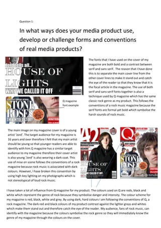
- 1. Question 1: In what ways does your media product use, develop or challenge forms and conventions of real media products? The fonts that I have used on the cover of my magazine are both bold and a contrast between serif and sans serif. The reason that I have done this is to separate the main cover line from the other cover lines to make it stand out and catch the eye of the reader so that they know that it is the focal article in the magazine. The use of both serif and sans serif fonts together is also a technique used by Q magazine which has the same classic rock genre as my product. This follows the conventions of a rock music magazine because the serif fonts are formal yet bold which symbolise the harsh sounds of rock music. Q magazine font example The main image on my magazine cover is of a young artist ‘Jord’. The target audience for my magazine is 16 years and over therefore I felt that my main artist should be young so that younger readers are able to identify with him.Q magazine has a similar target audience to my magazine therefore their cover artist is also young.‘Jord’ is also wearing a dark coat. This use of mise en scene follows the conventions of a rock magazine because rock music is associated with dark colours. However, I have broken this convention by using high-key lighting on my photographs which is not stereotypical of loud rock music. I have taken a lot of influence from Q magazine for my product. The colours used on Q are reds, black and white which represent the genre of rock because they symbolise danger and intensity. The colour scheme for my magazine is red, black, white and grey. By using dark, hard colours I am following the conventions of Q, a rock magazine. The dark red and black colours of my product contrast against the lighter greys and whites which make them stand out and therefore catch the eye of the reader. My audience, fans of rock music, can identify with the magazine because the colours symbolise the rock genre so they will immediately know the genre of my magazine through the colours on the cover.
- 2. The layout of my contents page is similar to that of Q in the way that I have separated the information using bars. Another technique I have used inspired by Q magazine is highlighting the page numbers using a shape tool. I used circles rather than squares for this as I felt that this shape worked better for the younger audience because it gives the page a more informal look. I have broken the conventions of a typical rock magazine by only using two photographs rather than several. I did this because I felt that the page would look too busy if I added more photographs. Q magazine have written their article in a formal, biographical style which is more applicable to their older target audience. The main article on my double page spread is informal which is appropriate to my younger target audience because it is ‘chatty’ and in the style of an interview. By doing this I have broken the conventions of a rock magazine in order to suit the younger members of my target audience. I have, however, given my article a mature, formal feel by using serif font for the article which also depicts the seriousness of the article’s subject.