1) Since their preliminary project, the author has improved their photography skills. They have learned to use proper lighting and camera settings to produce brighter, sharper images with subjects making eye contact.
2) The author has gotten better at image editing and manipulation in Photoshop. They have learned techniques like using the Polygonal Lasso Tool to remove backgrounds cleanly.
3) The author's layout and design skills have advanced. They now follow magazine design principles better by placing key information in prominent areas. Font choice and text effects are also more appropriate to the genre.


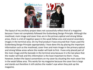


![[SLIDES] Internet of Things presentation at AEI (Sept 2014)](https://cdn.slidesharecdn.com/ss_thumbnails/c85cf877-6b22-4a36-889c-bb860c9c2472-141211134657-conversion-gate02-thumbnail.jpg?width=640&height=640&fit=bounds)


