
Recommended
More Related Content
What's hot
What's hot (19)
Viewers also liked
Similar to Contents analysis kerrang
Similar to Contents analysis kerrang (20)
More from LaurenCooney97
More from LaurenCooney97 (15)
Recently uploaded
Recently uploaded (20)
Contents analysis kerrang
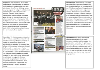
- 1. Imagery: The large image across the top of the page is low-key lit and the models are all wearing similar black outfits and are holding union jacks with skulls on them. This use of lighting, costume and props suggests the rock genre as it is dark and intimidating. This reflects the genre of the magazine. The use of similar outfits also represents that they are a band as they have a group identity. The secondary images show the other artists that feature in the magazine. Highkey lighting has been used in these images which makes the models seem less intimidating than the band in the main image. The secondary image directly below the main image uses a shallow depth of field on the model’s head which makes him stand out as the featured artist. Design Principle: The main image is located in the primary optical area which is the first place that the audience will look to. This is appropriate use of the Guttenberg Design Principle because it is one of the main articles and is so given more attention. The masthead is positioned in the strong fallow area which is effective as it is one of the first places that the reader is likely to look. The rest of the page is filled with information on the articles in the magazine and their pages. The terminal area has the least information in it and only contains two small secondary images. This is because it is the last place that the reader is likely to look and so it contains less important information. House Style: The black, orange and yellow colour scheme that was used on the cover is continued onto the contents page. Bold, sans serif fonts are used on the masthead and on the article descriptions. This represents the rock genre as it is harsh and the masthead font is messy. Although the font is bold it is easy to read and so the audience is able to recognise it easily. The text is in 3 columns which is typical of a magazine layout. This makes the contents page easy to read and navigate. The same or very similar layout is used in each issue of Kerrang which allows the audience to recognise it and is then able to navigate it easily because it is familiar. This is important to a magazine as it persuades the reader to purchase it regularly because it is familiar. Design Balance: The page is well balanced because the images and text are evenly distributed across both sides of the page. The position of the masthead on the right balances the large image on the left. It could, however, be argued that the page is not balanced as there is no clear divide between the left and right sides. But if the page was to be split into two, neither side contains more than the other in terms of imagery or text.