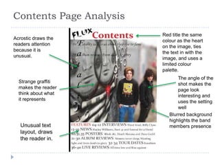
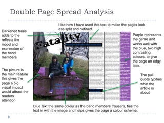
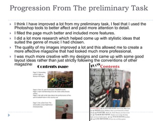
The document provides an evaluation of the student's media magazine project. It summarizes how each component (front cover, contents page, double page spread) draws from conventions of real magazines like Kerrang and NME while also attempting to challenge conventions. For example, the front cover takes its layout from Kerrang but uses unusual colors. The student learned Photoshop and design skills through constructing the project and improving their skills from a preliminary task. Overall, the evaluation reflects on how the project both followed and pushed boundaries of typical magazine design.