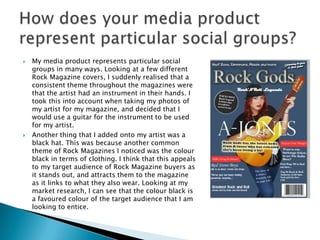
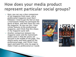
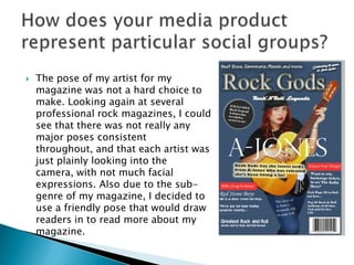
By Dariusz Murray
 My media product represents particular social
groups in many ways. Looking at a few different
Rock Magazine covers, I suddenly realised that a
consistent theme throughout the magazines were
that the artist had an instrument in their hands. I
took this into account when taking my photos of
my artist for my magazine, and decided that I
would use a guitar for the instrument to be used
for my artist.
 Another thing that I added onto my artist was a
black hat. This was because another common
theme of Rock Magazines I noticed was the colour
black in terms of clothing. I think that this appeals
to my target audience of Rock Magazine buyers as
it stands out, and attracts them to the magazine
as it links to what they also wear. Looking at my
market research, I can see that the colour black is
a favoured colour of the target audience that I am
looking to entice.
 Here, you can see a clear comparison
of my magazine front cover, and a
professional magazine cover that I
followed. I tried to get the feel on how
a mainstream media has portrayed the
genre of Rock, and then input this into
my magazine. As you can see, I have
similar features to the professional
magazine, and I think that this shows
in my magazine quite well.
 Another comparison between my
magazine cover and the mainstream
media cover is that the artists are
focused in the middle of the page. This
clearly works and looks good on the
professional page, and I think I have
again portrayed this onto my page to
make it look as professional as I could.
 The pose of my artist for my
magazine was not a hard choice to
make. Looking again at several
professional rock magazines, I could
see that there was not really any
major poses consistent
throughout, and that each artist was
just plainly looking into the
camera, with not much facial
expressions. Also due to the sub-
genre of my magazine, I decided to
use a friendly pose that would draw
readers in to read more about my
magazine.

Media evaluation Q2

  • 1.
  • 2.
     My mediaproduct represents particular social groups in many ways. Looking at a few different Rock Magazine covers, I suddenly realised that a consistent theme throughout the magazines were that the artist had an instrument in their hands. I took this into account when taking my photos of my artist for my magazine, and decided that I would use a guitar for the instrument to be used for my artist.  Another thing that I added onto my artist was a black hat. This was because another common theme of Rock Magazines I noticed was the colour black in terms of clothing. I think that this appeals to my target audience of Rock Magazine buyers as it stands out, and attracts them to the magazine as it links to what they also wear. Looking at my market research, I can see that the colour black is a favoured colour of the target audience that I am looking to entice.
  • 3.
     Here, youcan see a clear comparison of my magazine front cover, and a professional magazine cover that I followed. I tried to get the feel on how a mainstream media has portrayed the genre of Rock, and then input this into my magazine. As you can see, I have similar features to the professional magazine, and I think that this shows in my magazine quite well.  Another comparison between my magazine cover and the mainstream media cover is that the artists are focused in the middle of the page. This clearly works and looks good on the professional page, and I think I have again portrayed this onto my page to make it look as professional as I could.
  • 4.
     The poseof my artist for my magazine was not a hard choice to make. Looking again at several professional rock magazines, I could see that there was not really any major poses consistent throughout, and that each artist was just plainly looking into the camera, with not much facial expressions. Also due to the sub- genre of my magazine, I decided to use a friendly pose that would draw readers in to read more about my magazine.