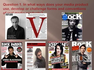
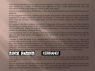
This document summarizes the key aspects of a rock music magazine created by the author for an evaluation. The author researched existing rock magazines to understand conventions of the genre. The magazine's design uses colors, fonts, and layouts common to rock magazines, including a black, red, and white color scheme. The masthead font and magazine name "Rock Harder" are intended to clearly signal the genre to readers. While maintaining elements like the color scheme, the author's magazine layout is more organized than typical rock magazines to suit its targeted readership.


![Planning power point [autosaved]](https://cdn.slidesharecdn.com/ss_thumbnails/planningpowerpointautosaved-170226154859-thumbnail.jpg?width=640&height=640&fit=bounds)


