In what ways does your media product use, develop or challenge forms and conventions of real media products?
•Download as PPTX, PDF•
0 likes•144 views


Recommended
More Related Content
What's hot
What's hot (20)
Similar to In what ways does your media product use, develop or challenge forms and conventions of real media products?
Similar to In what ways does your media product use, develop or challenge forms and conventions of real media products? (20)
Recently uploaded
Recently uploaded (20)
In what ways does your media product use, develop or challenge forms and conventions of real media products?
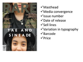
- 1. Masthead Media convergence Issue number Date of release Sell lines Variation in typography Barcode Price
- 2. It can be said that my magazine does stray away from generic media conventions. When you look at my magazine in comparison to the Q magazine with the Lady Gaga cover, you will see that the one that it is different. Q features a very revealing costume that could be for the male gaze as men are very large part of the consumer population of music magazines. My cover has a very natural and realistic approach. the photo in Q is more and more and artificially produced with commercial intent to either shock or interest which can be seen in the mise-en-scene. Also the photo also the sell lines are very sensationalist in comparison to my very simple and transparent approach. The use of red does make magazine stand out though apart from the red the magazines theme of grey with a lot of white font is similar to mine. The use of star marketing is also very present in q magazine as there is use of a mainstream artist to sell the magazine whereas my models are supposed to be underground and relatively unknown artists.
- 3. But when you look at other independent magazines they do seem to follow the same suit as mine. Take for example the wire magazine. my magazine took a lot of inspiration from this magazine and at times they can be seen to edit their photos in an unusual way also the location in setting of the photo on the front cover does seem to be in very realistic and urban environments. They also seem to take a very artistic approach in layout end in the framing of their photos on the front cover and even in the way the front cover is presented. this is common in independent magazines other examples of independent magazines that do take artistic license in the presentation of the front cover of little white lies, phoenix magazine, and the skinny. although these are not music magazines these are independent magazines that do seem to follow the conventions of independent magazines that I followed which are the ability to take artistic license.
- 4. In terms of general media convention, my magazine does follow a house style. Though it does follow more indie magazine layout. It does follow conventions such as magazine title on the bottom page and page numbers. There are photo credits and on the feature article there is an intro to the piece. There are photo’s on both pages and page number on the contents to indicate where the article is. There is an issue number on the contents page and the date of release and it obvious which article is the main one. There is also a form of media convergence in the website.