EVALUATION
Question 1: In what ways does your product
use, develop or challenge forms and
conventions of real media products?
My music magazine is somewhat very stereotypical
    when it comes to following the usual forms and
 conventions of a magazine. However in some ways
 I've challenged them also. The music genre I chose
 isn't a 'pop genre' and its articles aren't full of artists
that fill up todays pop charts. The music and artists I
  cover are slightly different and not everyone is into
      them so if anything it would be better for my
 magazine to challenge the typical techniques every
       magazine uses. Although I did study other
    magazines already on the market covering my
    music genre and tended to use techniques the
                     same as them.
My media product uses conventions of
real media products…
On my cover I used the typical magazine design features such as a masthead, puffs and
plugs, reversed out cover lines, issue date and number, a main article, a barcode and price. I
also included an image of a feature in the magazine. I also used sans serif fonts to make it
easier to read.

Other features I used in my magazine:

• The masthead is larger than the rest of the text and is in a bold font and a colour that stands out.
• I used capital letters to make the main article stand out as it is a point of interest in the magazine.
• I also used the first name of my artist, and put it in a bolder, contrasting coloured font to make it
    stand out.
•   I also included a made up price, date, issue number, barcode, to make the magazine seem more
    realistic.
•   I used cover lines that would attract my specific target audience as they were cover lines that were
    topical to the music genre.
•   I used an appropriate front image, that wasn’t too busy so that the writing on top could not be seen.
•   I used a circle, to make the main cover line stand out, and also used boxes to make the smaller
    cover lines more obvious to the reader.
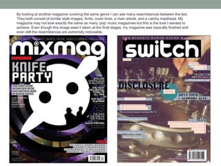
By looking at another magazine covering the same genre I can see many resemblances between the two.
They both consist of similar style images, fonts, cover lines, a main article, and a catchy masthead. My
magazine may not look exactly the same as many ‘pop’ music magazines but this is the look I wanted to
achieve. Even though this image wasn’t taken at the final stages, my magazine was basically finished and
even still the resemblances are extremely noticeable.

Question 1 of Media Evaluation

  • 1.
    EVALUATION Question 1: Inwhat ways does your product use, develop or challenge forms and conventions of real media products?
  • 2.
    My music magazineis somewhat very stereotypical when it comes to following the usual forms and conventions of a magazine. However in some ways I've challenged them also. The music genre I chose isn't a 'pop genre' and its articles aren't full of artists that fill up todays pop charts. The music and artists I cover are slightly different and not everyone is into them so if anything it would be better for my magazine to challenge the typical techniques every magazine uses. Although I did study other magazines already on the market covering my music genre and tended to use techniques the same as them.
  • 3.
    My media productuses conventions of real media products… On my cover I used the typical magazine design features such as a masthead, puffs and plugs, reversed out cover lines, issue date and number, a main article, a barcode and price. I also included an image of a feature in the magazine. I also used sans serif fonts to make it easier to read. Other features I used in my magazine: • The masthead is larger than the rest of the text and is in a bold font and a colour that stands out. • I used capital letters to make the main article stand out as it is a point of interest in the magazine. • I also used the first name of my artist, and put it in a bolder, contrasting coloured font to make it stand out. • I also included a made up price, date, issue number, barcode, to make the magazine seem more realistic. • I used cover lines that would attract my specific target audience as they were cover lines that were topical to the music genre. • I used an appropriate front image, that wasn’t too busy so that the writing on top could not be seen. • I used a circle, to make the main cover line stand out, and also used boxes to make the smaller cover lines more obvious to the reader.
  • 4.
    By looking atanother magazine covering the same genre I can see many resemblances between the two. They both consist of similar style images, fonts, cover lines, a main article, and a catchy masthead. My magazine may not look exactly the same as many ‘pop’ music magazines but this is the look I wanted to achieve. Even though this image wasn’t taken at the final stages, my magazine was basically finished and even still the resemblances are extremely noticeable.