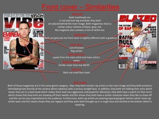
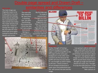
1) The document summarizes the similarities and differences between the front cover of the student's media product and the front cover of an existing magazine called "The Vibe." Both magazines share conventions like mastheads, cover lines, and featuring intimidating images of rappers. However, the student's cover lacks a strap line and puff that "The Vibe" uses.
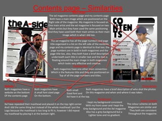
2) When summarizing the contents page, the document notes key similarities like featuring the artist's image, website, and page numbers/titles. Differences include the number of images used and the student adding social media links.
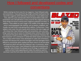
3) In developing their own covers and pages, the student strived to follow conventions but also challenged norms by having