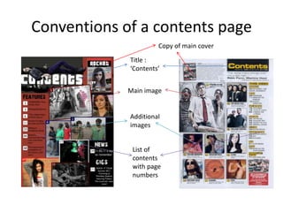
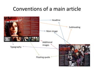
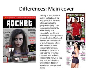
This document discusses the conventions of magazine design and how the media product challenges or develops certain conventions to suit its genre.
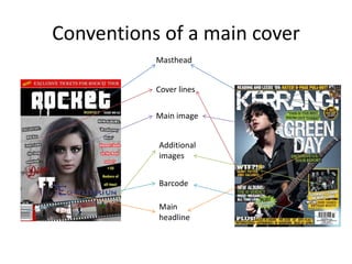
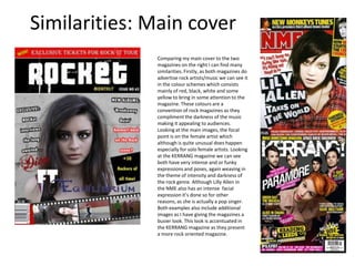
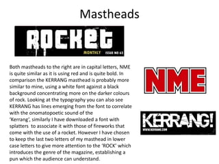
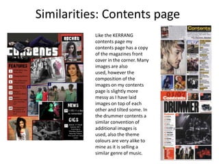
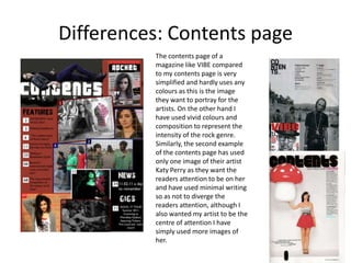
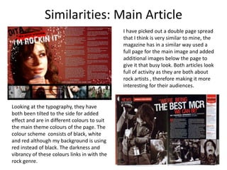
It identifies similarities between the product's design and conventions used in rock music magazines, such as bold mastheads, intense cover images, and use of dark colors. Differences from other genres' conventions are also noted, such as simpler designs for R&B magazines.
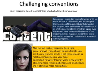
The document highlights ways the product develops conventions, such as placing an image over the contents title and using a female solo artist as the focus despite the rock genre typically featuring males. This challenges conventions while appealing to wider audiences.