
Recommended
More Related Content
What's hot
What's hot (20)
Viewers also liked
Similar to Contents page anlysis
Similar to Contents page anlysis (20)
More from Alessia Teresko
More from Alessia Teresko (15)
Recently uploaded
Recently uploaded (20)
Contents page anlysis
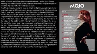
- 1. When analysing a contents page there needs to be a minor focus on the meaning behind the choices that have been made and a deeper analysis on how this choices are functional to the readers. This Mojo magazine contents page is simple and plain , everything is found on a single page and from the start we can understand that this determinate choices have been made to make the information easily available to the reader. There’s only one image on this contents page, and it’ of the main singer/artist that features in this Mojo magazine issue; by only inserting one image of the main artist of the magazine, it’s emphasizing the importance of the article to the reader and it’s making the artist dominant over the issue. The size of the image is very big , once again emphasising the greatness of the story that she has to tell; the interesting thing about the picture is the way it’s been modified and placed next to the list of features; the picture is surrounding and following the shape of how the text has been laid out , the head of the singer is in line with the first listed feature which connotes to the reader that the first feature is the dominant article of the magazine and therefore it’s easy for the reader to be able to find the article; furthermore the rest of her body carries on following the curved shape to connote the importance of the rest of the features and cover story articles , it’s connoting that the most important features are found at the top where her upper body is , and then the importance becomes less as the features are aligned to the rest of her body which don't really have that much importance.
- 2. The layout of this contents page as previously said is fairly simple, it follows the codes and conventions of a music magazine . There is one long column which includes two different headings, “Features” and “Cover story”, this was chosen to make the information easy to find and locate. The attention is directed primarily to the main image , which will be the main article of the magazine and then to the features column which include the most important articles of the entire magazine. The information thanks to the simple layout is easy to read and find ; this is also thanks to the different colours and types of fonts used. By using a bolder font for the start of each article on the contents page , is what will stand out to the readers eyes , this will make it easier for the reader as they will only dedicate most of their time and attention to the articles that interest them the most. The masthead of the magazine can also be found on the contents page to constantly remind the reader which magazine they are reading and to emphasize the importance of the name ; moreover by neatly placing the three names of three different cities underneath the masthead it instantly gives the reader the impression that “Mojo” is an excellent music magazine as it’s well known all around the world. The date and issue number are also found on this page , again to provide the most important information to the reader and to help the reader understand which issue they are reading.
- 3. The sections used to categories the articles are only two – “Features” and “Cover Story”. This two categories are used to subdivide different articles depending on their meanings and information; this once again makes it easier for readers to find specific articles to read about. For the “feature” category there are 5 articles, connoting that these are the top 5 most important articles of the entire magazine. For the “cover story” category there’s only one , connoting the the most important cover story is “Florence” , making the reader concentrate only on her; furthermore this also creates less confusion for the reader to understand the main articles of the magazine and therefore not miss out on important articles and information. Articles- The shortened articles are all laid out one after the other, creating a column like style , which is a fairly easy layout to comprehend. The heading of each article is written in capitals and a bold font is used , this is done to make the reader read faster through the articles and select the ones that interest them the most , furthermore the colour font of the heading and the rest of the article is the same to make it as simple as possible for the reader to understand. Each page number is placed next to the designated article, this choice was made so that the reader knows which page to turn to and find the article, once again this was done to make everything faster to the reader. The page numbers are the same red shade as the font used for the two categories , this was done firstly to follow the colour scheme of the magazine and secondly to link the page numbers to the “Mojo” and making the magazine dominant; however Florence's article has some red font to make the reader understand that she’s dominating this Mojo magazine issue. The selected articles include never heard before information about famous artist and celebrations.
- 4. Images- There are many images on this Q contents page. Each picture links to one of the articles that can be found in the magazine; every picture is different and includes different artists. The image size varies, the size of the image determines the importance of the story of the article, the biggest image found on this contents page is the one featuring the main article of the magazine, this was done so that the reader can easily find the articles. Instead of including articles on the contents page they’ve used images, this is a better choice as readers are more likely to look at the images first and then read through the articles. Looking at an image also makes the reader more interested in what the article would be about and therefore it’s more likely that they’ll read the entire issue. The main image is found by itself on a separate page, this it’s important as the reader would be mainly focused on that particular article; the fact that the picture is black and white also connotes the years that have gone by and makes the reader understand that this is an important articles due to the long history that they’ve had. All of the images are boxed , in order to make sure they each represent a different article. There’s no text to support the images, however there are page numbers found on the pictures written in a big font to indicate to the reader where the article can be found in the magazine. There’s and image that represents and alternative front cover, this was done so that the reader knows there are different versions of the same magazine and therefore this will lead to the selling of more magazines; moreover there are also two snapshots of one of the exclusives articles in the magazine, this was done to make the reader want to read on.
- 5. Layout- The layout of this contents page is more lively due to having a lot of information including articles, images, reviews etc.. all over the double spread. This however could come across as being more confusing for someone trying to find a specific article and at the same time this can be really useful as there are articles flying all over the contents page which provide more information for the reader and this enables the reader to find extra information and therefore it’s more intrigued to read the rest of the articles. Even thought the pages are filled the information is still laid out neatly and in an organized way , which still makes it easier for the reader to read through the articles. As readers we’re more drawn to the first page of the double spread as it includes the main image and less information; this is also the page where the most critical information is found as the most important articles are listed on that page ; furthermore the second page includes more information , articles and images, these are the less important articles and the information is less uniform in compare to the first page.
- 6. Sections- There are two main sections; “Features” and “Regulars” , this two are the two different categories in which the articles have been divided into. Under each sections there are various articles listed, however the majority are underneath the regulars, this is because the magazine always has specific articles which have to feature regularly as it’s what makes the magazine sell. By dividing the articles in different sections it makes it easier for the reader to locate specific articles which they want to read. The listed articles are the most important articles found on this Q magazine issue. There is an extra section, which is the review sections, this is found on every Q magazine contents page. Articles- The articles found on this contents page all have a subheading of the same colour as the rest of the text . However they are written in capital letters with a bold font in order to catch the readers attention and to make it easier for the reader to read through. The heading of each article is underlined in red, which is the same shade of red as the Q logo, this was done to create a colour scheme and to make the reader understand that the featured articles have been written by Q magazine. The page numbers next to each of the articles , are placed to make the reader find the correct page easily and fast, the numbers are written in a bold font , using a black colour in order to keep the colour scheme the same and create less confusion in the readers mind. The chosen articles are a selection of awards, charts, exclusive articles and articles from legendary singers.
- 7. Images- This Billboard magazine contents page includes few pictures , including the one of the main article. The different sizes represent the greatness of the articles, to present the main article on the contents page the image used is much bigger in compare to the scale of the other three. The other images are placed next to each other in a row and have roughly the same size , this connotes that the following articles are less important than he main article and have roughly the same importance between them and this is due to the size of the images ; however you can also say that the three articles are the most important ones after the main article in compare to the rest that can be found in the magazine as pictures have been used to represent them. The main image acts almost as a full bleed , this is because the text and the different articles overlap the image , and the picture acts as a background , this is important as it catches the readers attention creating a central focus on the main article and this will make the reader want to find out more. The pictures on this contents page unlike the others are pictures which have been taken in different locations , none of them have been taken in a studio, creating a different representation of the artist, connoting that this is a free, verisimilitude and open minded music magazine which includes many different artists , connoting to the reader that this music magazine is aimed for everyone.
- 8. Layout- The layout of this contents page is fairly simple and easy to understand and read through, this is important as it will make it easier for the reader to find what they are looking for. Moreover the page is also very organized and structured, this is because certain types of information are grouped together depending on how they are similar and linked between each other. The number one billboard chart once again is easy to read and follow, this is due to how the headings and different information have been laid out vertically underneath each other, using a small font to enable the maximum use of the space on the page ; by having a different colour scheme to the rest of the page , this makes it stand out to the reader and facilitates the findings of wanted information. Moreover the rest of the contents page is separated into two sections, this choice is also important as the reader will understand more and find less confusing dealing with information grouped separately. The first section is dedicated to everything which can be found in the magazine and the second section is dedicated more to the internet and live events, this is found at the bottom as it’s less important information , however the reader can easily get hold of it due to being separately grouped creating less confusion between the rest of the information. The attention is mostly directed to the middle section of the contents page , where the image of the main artist can be found , this is important as it’s what the magazine is aiming to do, their main article is what is going to sell the magazine and by organising and laying out the images in the way they have been , it creates a focus on the main article. Furthermore where there is the greatest attention it’s also where the most critical information is found , this makes the reader informed about all the different information which can be found in the magazine and therefore it’s important as they will be able to find the information that they need.
- 9. Sections- All over this contents page there are many different sections that have been used to organise the different articles in order to make the information as easy as possible to read and find. The main sections are found in the middle, you can find “Upfront”, “Features”, “Music” and ”In every issue”, this are the main sections in which all of the articles have been divided and categorised into. Moreover there is also a “Home front” section where all of the media and events are found , this is separate to connote to the reader that this information will only be found on this page. Lastly , the Billboard music top chart could also be considered as a separate section to the rest of the page, due to being distinctive and completely different also in terms of style and colour to the rest of the contents page. This choice has been made to make the reader faster in finding information. Articles- There are many different articles present on this contents page ,and all of them represent a small taste of what the entire article will be about , therefore the articles chosen to feature on this page are fun, entertaining and exciting ; you can find exclusives with famous singers, interesting stories of celebrities, everything about modern music and lastly online exclusives , tours and live events. This choice was done in order to make the reader as interested as possible in what they are about to read and also create a fun and exciting atmosphere for the reader when reading the magazine. All of the articles are neatly laid out in different sections one under the other , as this contents page follows the codes and convention of a music magazine, however the style in which they have been laid out is completely different and original to other magazines. The heading of each article is in a different colour and font , written in capitals to highlight to the reader what the main story of the article is, this is done so that the reader knows what interests them and finds exciting to read, once again the magazine is following the codes and conventions of a music magazine. The different colour fonts relate to the colours of the masthead of the magazine, connoting to the reader that the main dominant figure still remains “Billboard” , making the reader feel more secure and comfortable when reading the magazine. Furthermore the page numbers have been placed next to each article in order for the reader to easily find the page where they want to read the full article, this feature makes it much easier and comfortable for the reader and will make the reader want to buy more magazines.